
Data-driven Investment Research | Follow to learn about markets & global economy | Get swing trade ideas & market ana...
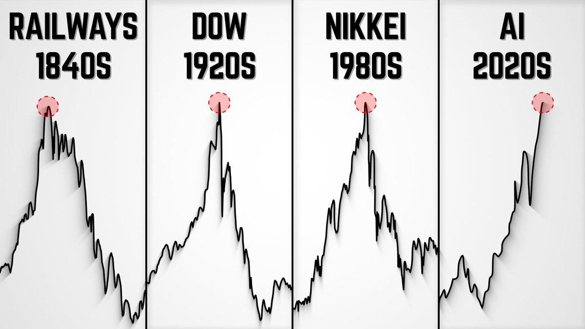
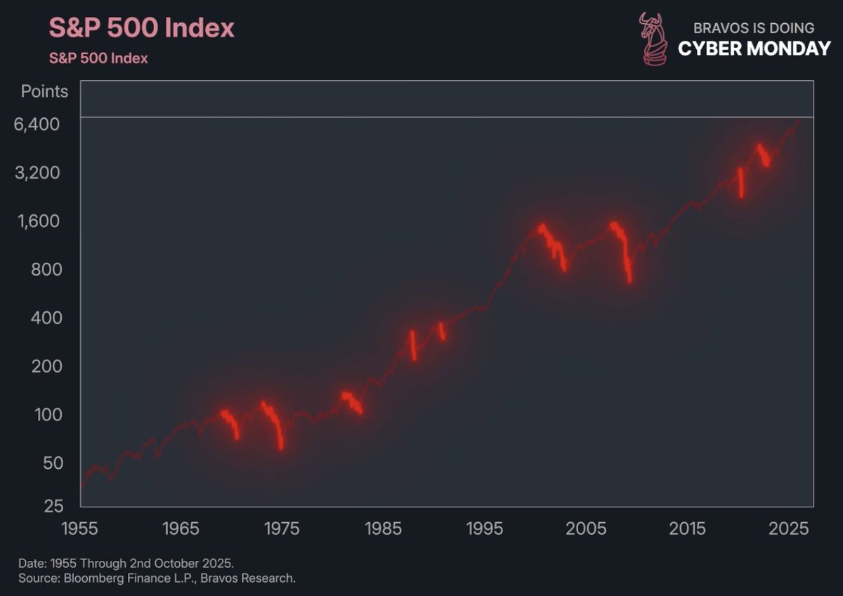
 2/ 1929, 1965, and 2000 marked some of the highest stock market valuations in modern history.
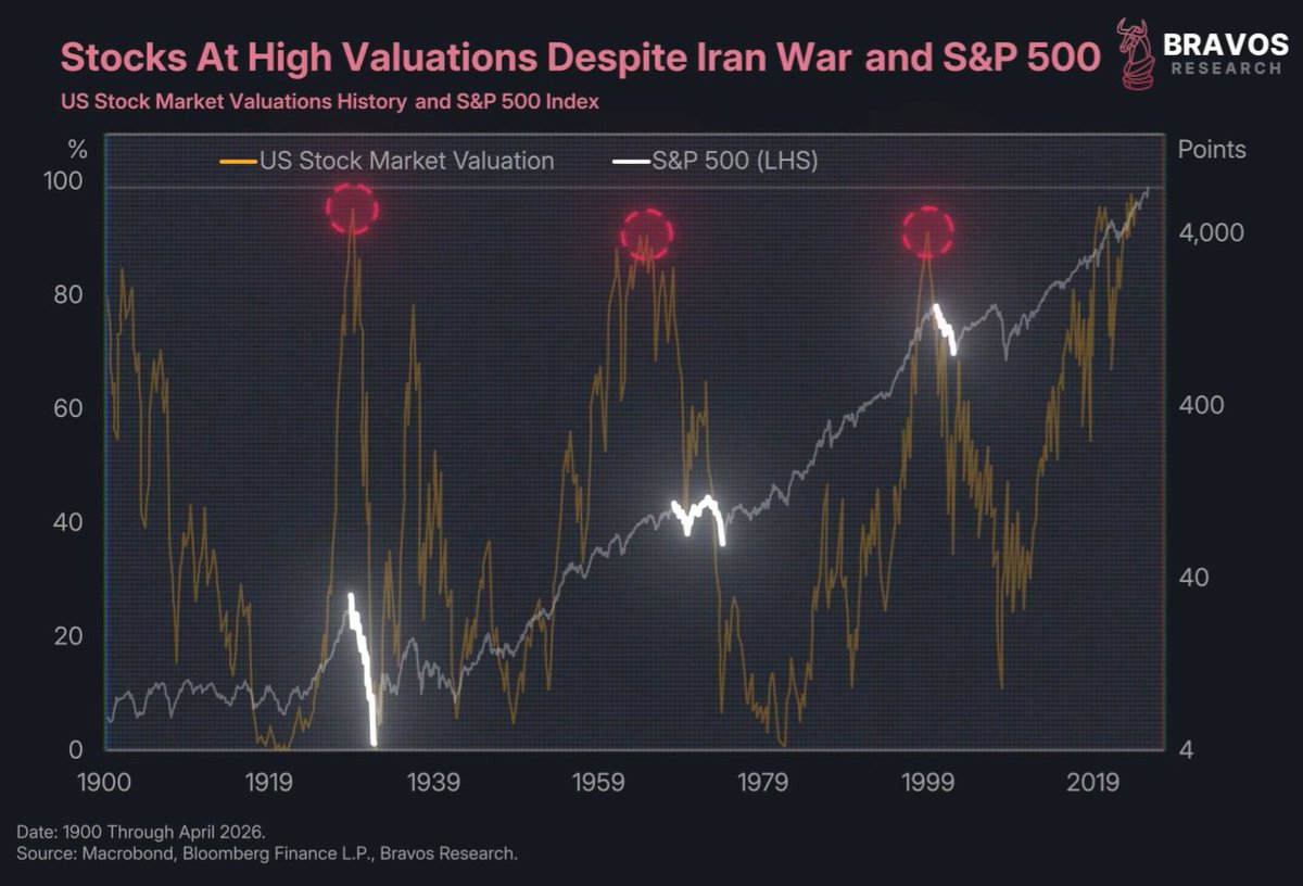
 2/ This line represents the probability of the Fed raising their interest rates in 2026 based on bond market expectations.
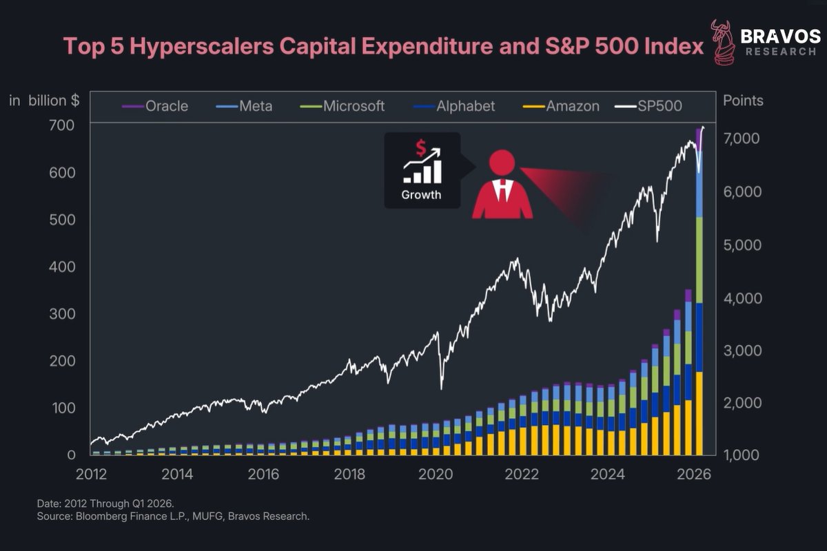 2/ Microsoft, Amazon, Meta, Alphabet, and Oracle are expected to spend $700 billion this year alone on AI infrastructure.
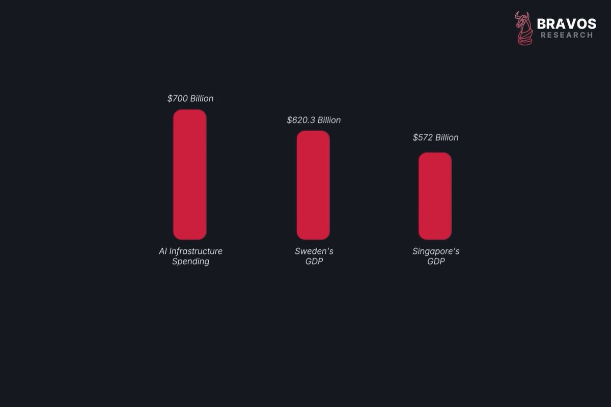
 2/ The stock market has often recovered quickly from major macro shocks, including:
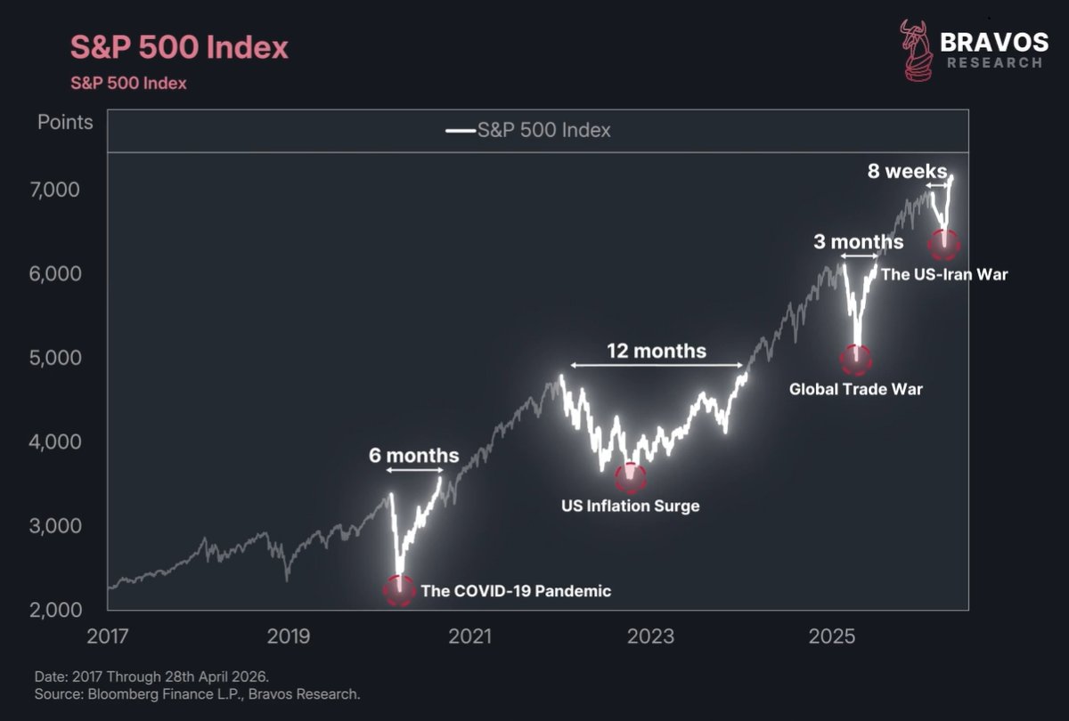
 2/ The US stock market has just made its fastest 10% jump since May 2025.
 2/ After some talks of a ceasefire, oil prices went down and stocks reached new ATHs.
 2/ The price of oil is up nearly 70% over the last few months.
 2/ Since the start of the war in Iran the price of US treasury bonds have declined by nearly 5%.
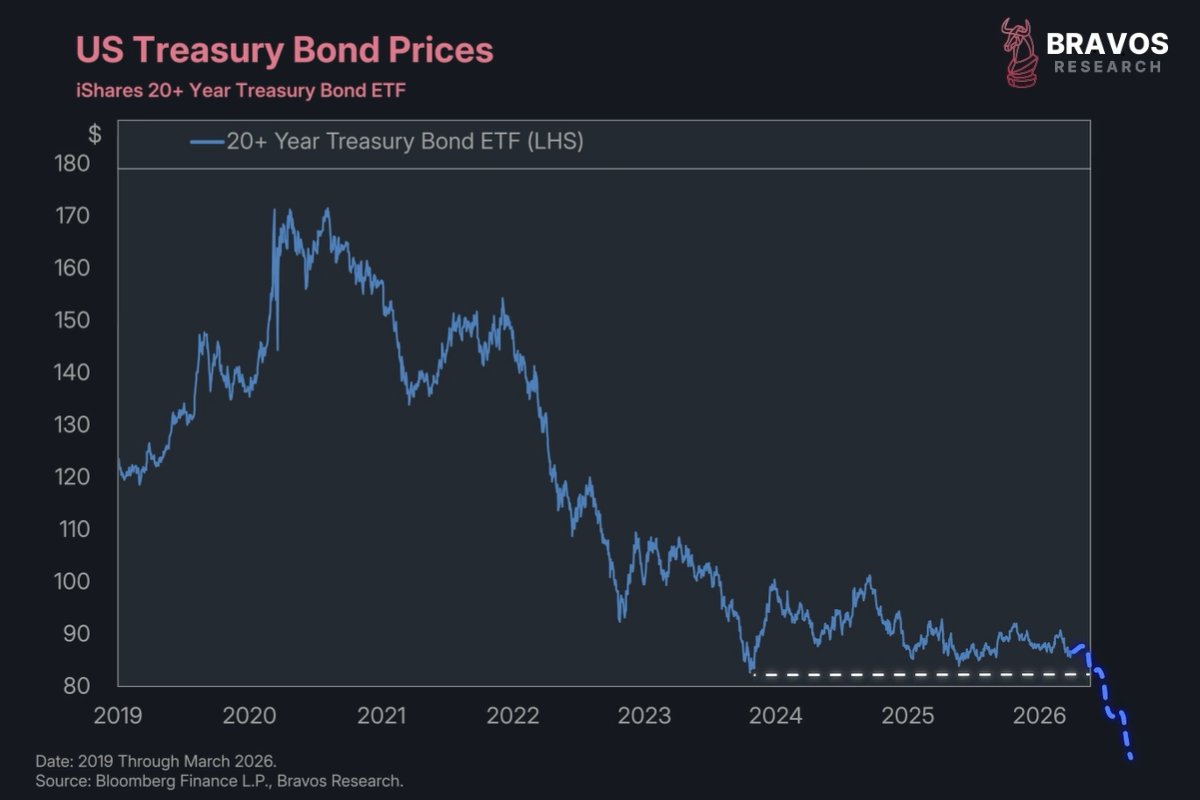
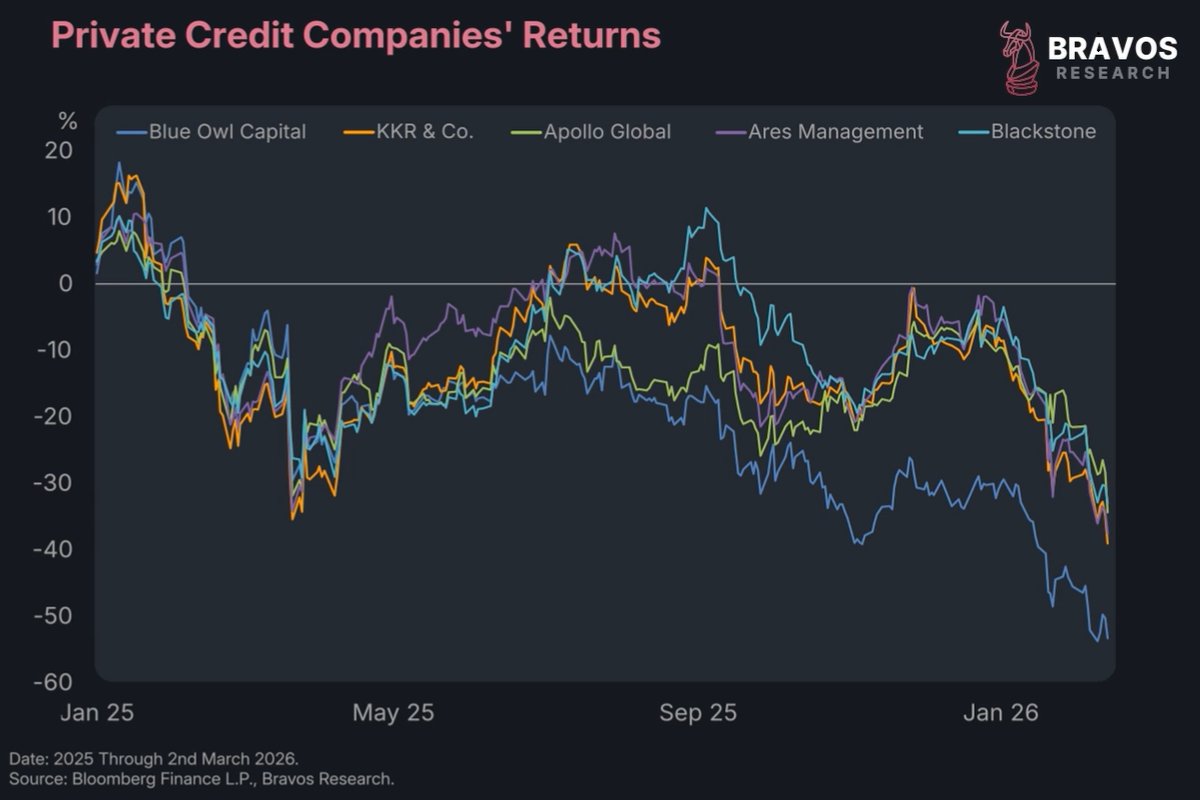 2/ This is what it looks like when a $2 trillion industry collapses in real time.
 2/ In the next 12-months, nearly $10 trillion worth of US government debt is coming due.
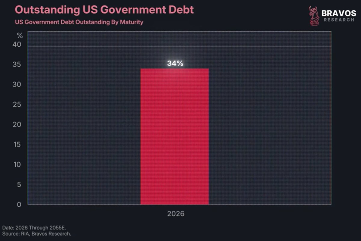
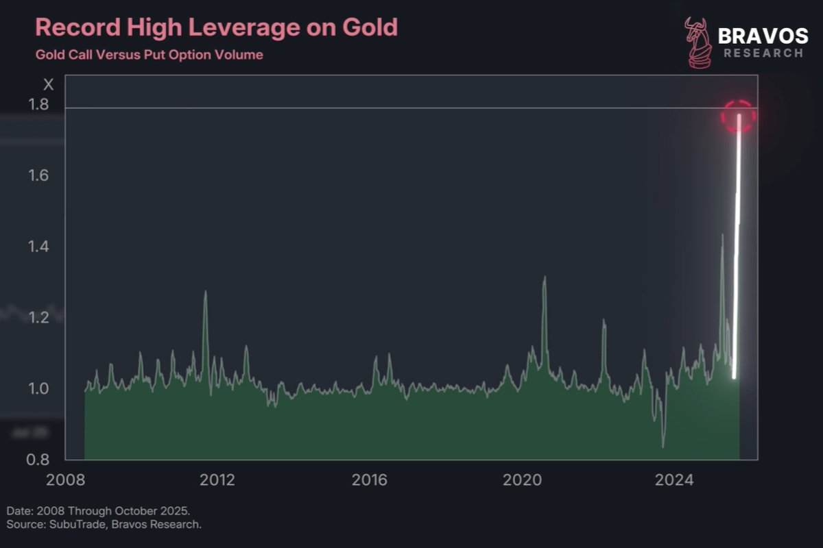 2/ Since the start of 2026, gold has added roughly $4 trillion to its market capitalization.
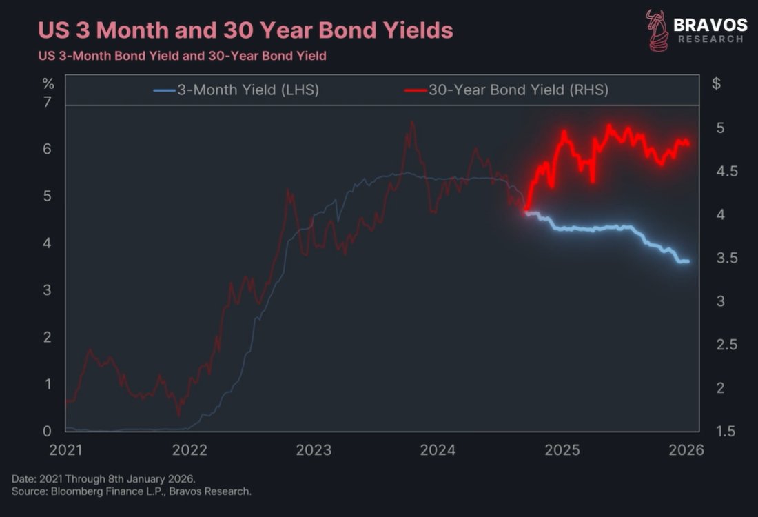
 2/ Something quite rare has been happening on the US treasury market.
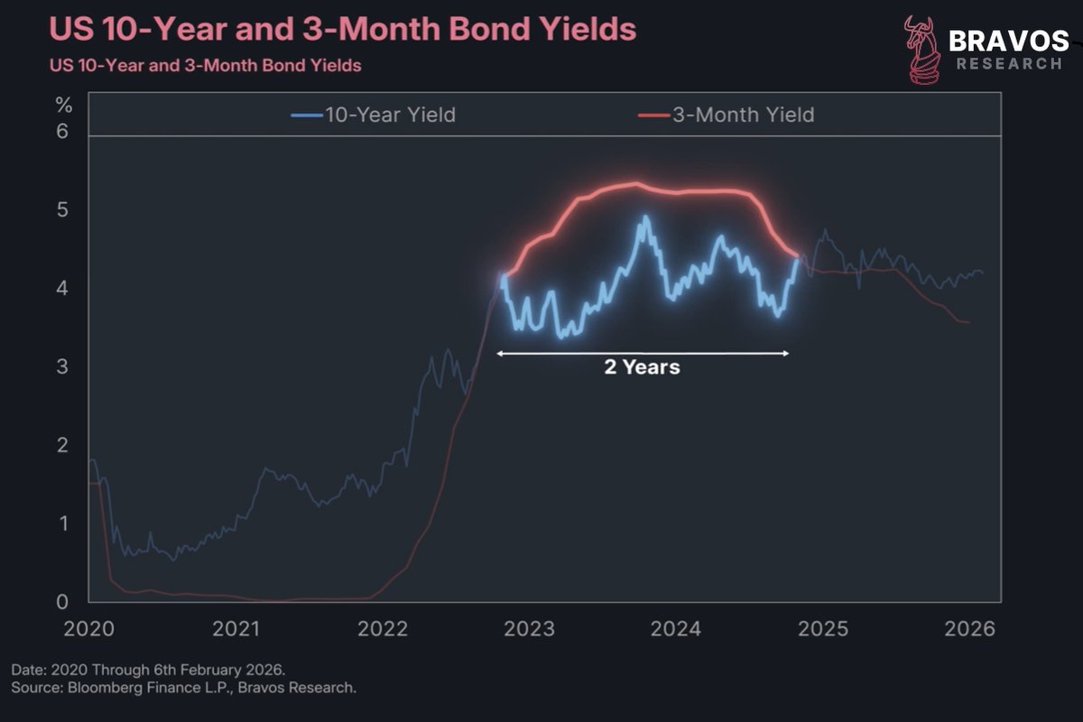
 2/ The National Bureau of Economic Research has 3 specific conditions to define an asset bubble:
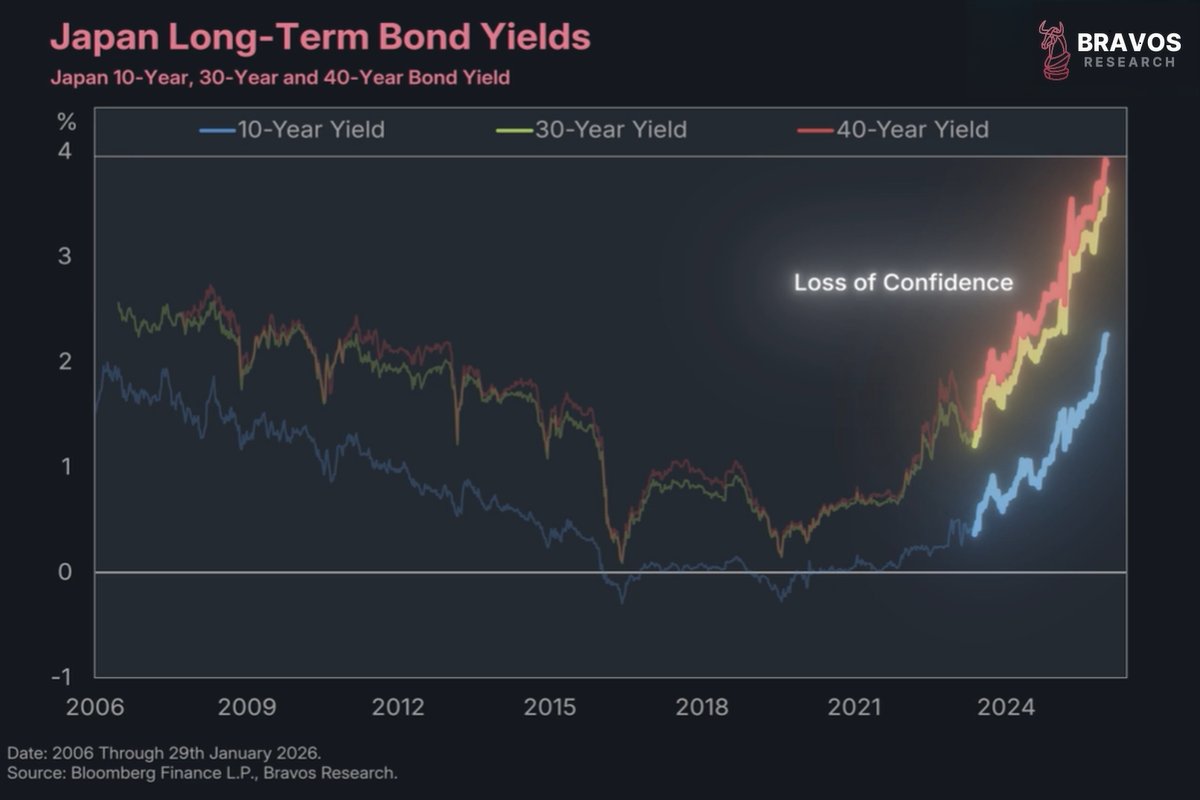 2/ For years, Japan was seen as the epicenter of global sovereign debt risk, but this has now changed.
 2/ The shifts unfolding today in the global monetary system, the geopolitical order, and global trade have major implications for the markets.
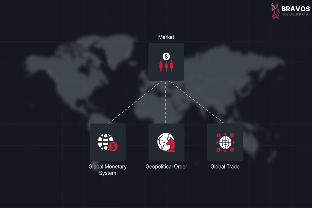
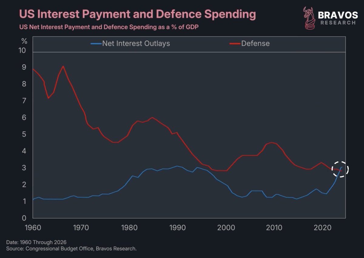
 2/ The US government has a problem.
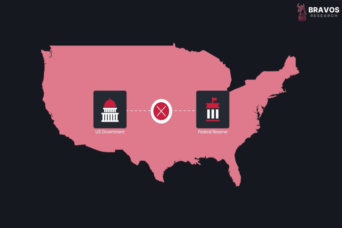
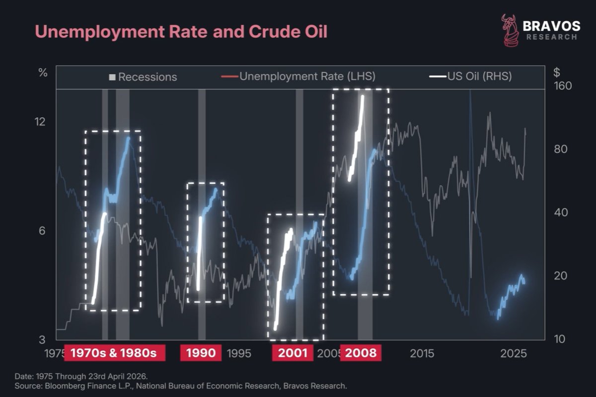
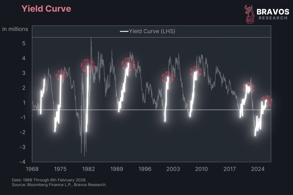
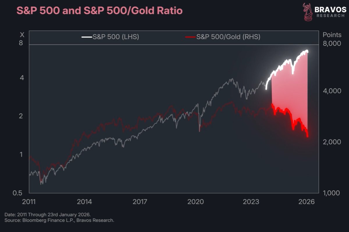
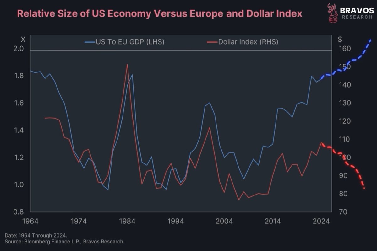
 2/ 1 of the most fundamental relationships in financial markets is breaking right now.
 2/ This chart shows the aggregate economy index.
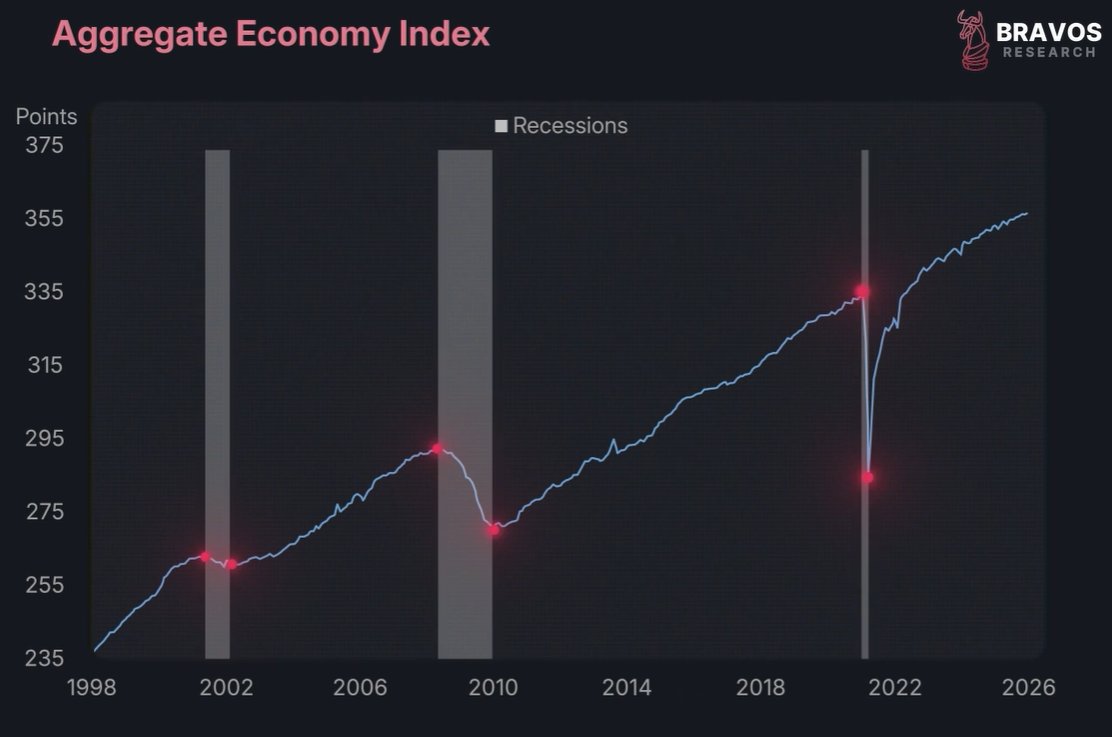
 2/ The yield on Japan’s 30-year bond is starting to close in on the yield of the US 30-year bond.
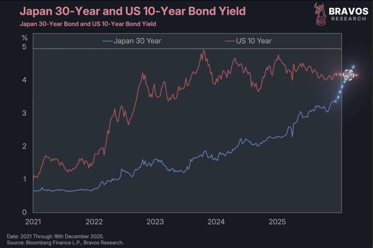
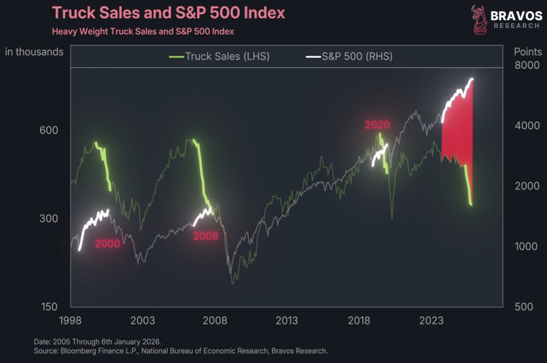
 2/ Something unusual is happening in the stock market right now.
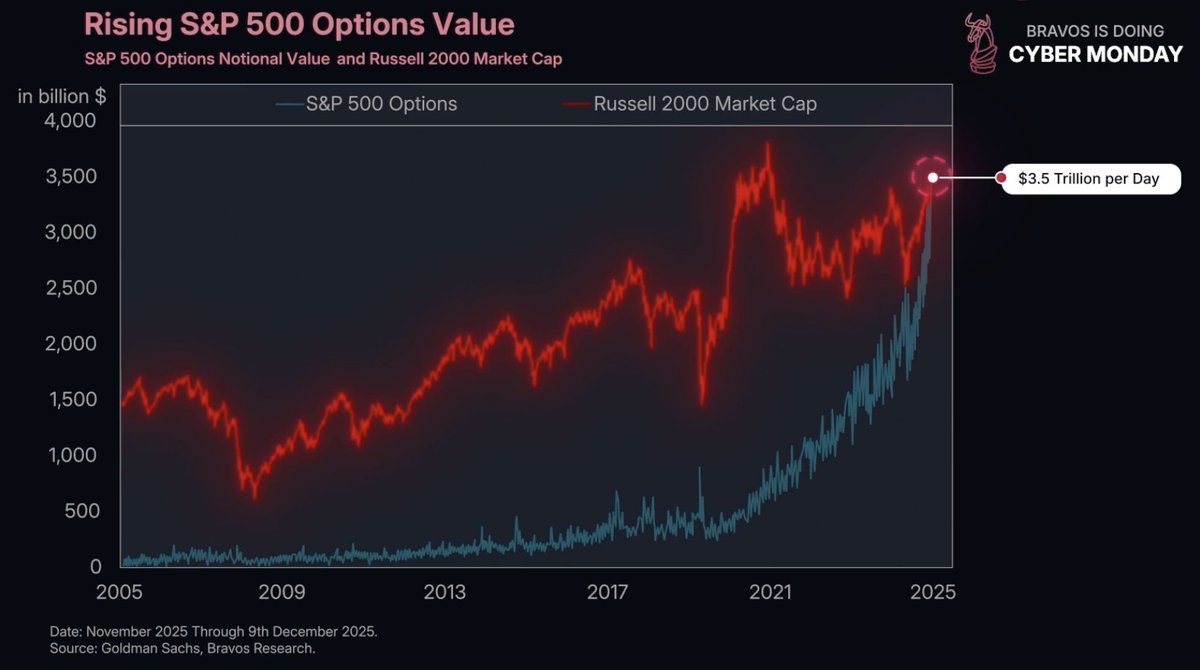
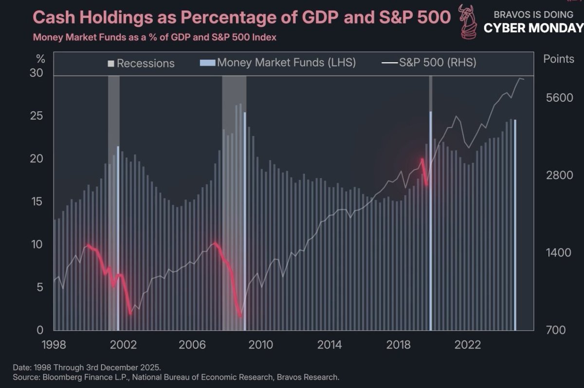 2/ This chart shows us the share of total US GDP comprised of cash.