Calling Bullshit Profile picture
We're all drowning in bullshit From @CT_Bergstrom and @JevinWest at the @UW. https://t.co/4i2HzzPPtc Book now available: https://t.co/QF3nsQ3Wrs.
3 subscribers
Apr 7, 2022 6 tweets 3 min read
nytimes.com/2022/04/05/tec… Where have we heard this before?
Mar 13, 2022 5 tweets 2 min read
Campbell's Law states that "The more any quantitative social indicator is used for social decision-making, the more subject it will be to corruption pressures and the more apt it will be to distort and corrupt the social processes it is intended to monitor." Even the most elite institutions succumb.

Here's a beautiful example of how one tracks down and debunks quantitative malfeasance.

Dec 13, 2021 5 tweets 2 min read
Some of you may have seen this before, but if you haven't: This slide from Moderna compares their flu mRNA vaccine to the one from Sanofi.

Can you spot the misleading dataviz trick? Image This was a fascinating exercise. People pointed out a lot of important issues.

The different age groups, while not a dataviz trick per se, do smack of the sort of apples-to-oranges comparison we worry about.
Dec 10, 2021 6 tweets 2 min read
In our course, we spend a lot of time talking about selection bias and related phenomena. These issues can be extremely subtle. Example:

The question is whether you are better protected against COVID if you've first vaccinated then reinfected, or first infected then vaccinated. To answer that, you might look at data such as those in a recent medRxiv paper by Goldberg et al.

Comparing infection rates, it *appears* you are better off 6-8 months after being infected then vaccinated ( RtV) than you are 6 months after being vaccinated then infected (VtR).
Sep 22, 2021 6 tweets 3 min read
Obviously the murder rate in the US is a dreadful thing and we want to find ways to reduce it.

But I find the graph below, which is making the rounds today on social media, to be quite misleading.

Let's take a look at why.

nytimes.com/2021/09/22/ups… Image The first thing to notice is that this graph shows annual *change* in murder rate. Showing changes is fine, when there's a good reason to—and there may be one here.
But notice the consequence. The much larger decrease, spread over many years from the late 90s, is backgrounded.
May 24, 2021 9 tweets 3 min read
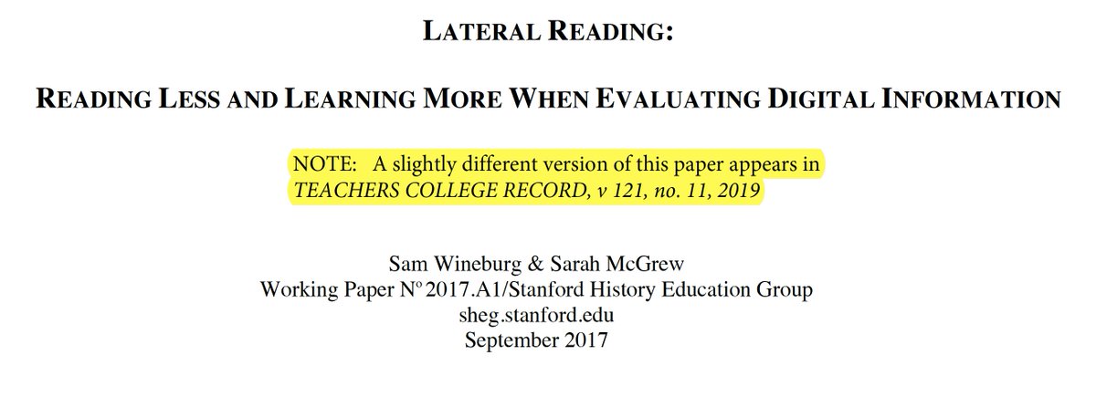
I just read a *great* paper on digital literacy.

The authors explore how three different groups—Stanford students, professional academic historians, and fact checkers—evaluate the reliability of online information.

papers.ssrn.com/sol3/papers.cf… tl;dr — the fact checkers are very good at this, whereas the students and history professors alike are terrible.

What's the difference? Fact checkers read laterally instead of vertically.
May 21, 2021 6 tweets 2 min read
Via @FreddieSJohnson, a remarkable 1807 letter in which Thomas Jefferson lays out his thoughts on the threat that misinformation represents to society.

founders.archives.gov/documents/Jeff… Jefferson ruthlessly condemns newspapers: "To your request of my opinion of the manner in which a newspaper should be conducted so as to be most useful, I should answer ‘by restraining it to true facts & sound principles only.’ yet I fear such a paper would find few subscribers."
May 9, 2021 5 tweets 3 min read
In our course, we teach a very simple method for bullshit detection.

When you hear a claim, ask yourself

1) Who is telling me this,
2) How do they know it, and
3) What are they trying to sell me?

Let's try it out. Who is telling me this?

@bopinion is the opinion arm of a major financial news source, Bloomberg @business.

Here they are parroting information from @DeBeers, a diamond company and the world's second largest diamond mining operation.
May 2, 2021 26 tweets 9 min read
In our course, we spend a couple of lectures talking about how tell whether scientific research is legit.

callingbullshit.org/tools/tools_le… Appearing in a journal from a reputable scientific publisher is a good start. But it's no guarantee.

@lastpositivist pointed us a paper from a journal produced by the largest scientific publisher, Elsevier.

sciencedirect.com/science/articl…
May 1, 2021 6 tweets 3 min read
Here's an interesting example of how many of our lessons you can pack into one story.

We start with a forward reference headline. (Answer: Yellow).

Then a completely meaningless subhead, unless by perfect combination they mean minimal supply, maximal demand. (They don't). To be fair, the FOX story manages not to claim that color has a causal effect on resale value, though the implication seems to be there.

The study itself, run by an online car sales site, fails this test badly, using causal language throughout.

iseecars.com/car-color-study
Mar 19, 2021 14 tweets 5 min read
Nobel Laureate Michael Levitt is worried about declining sperm counts, but he says he hasn't done any reading yet.

Should he panic? Let's dig a little deeper.

He links to an article by Erin Brockovich. (Yes, *that* Erin Brockovich!)
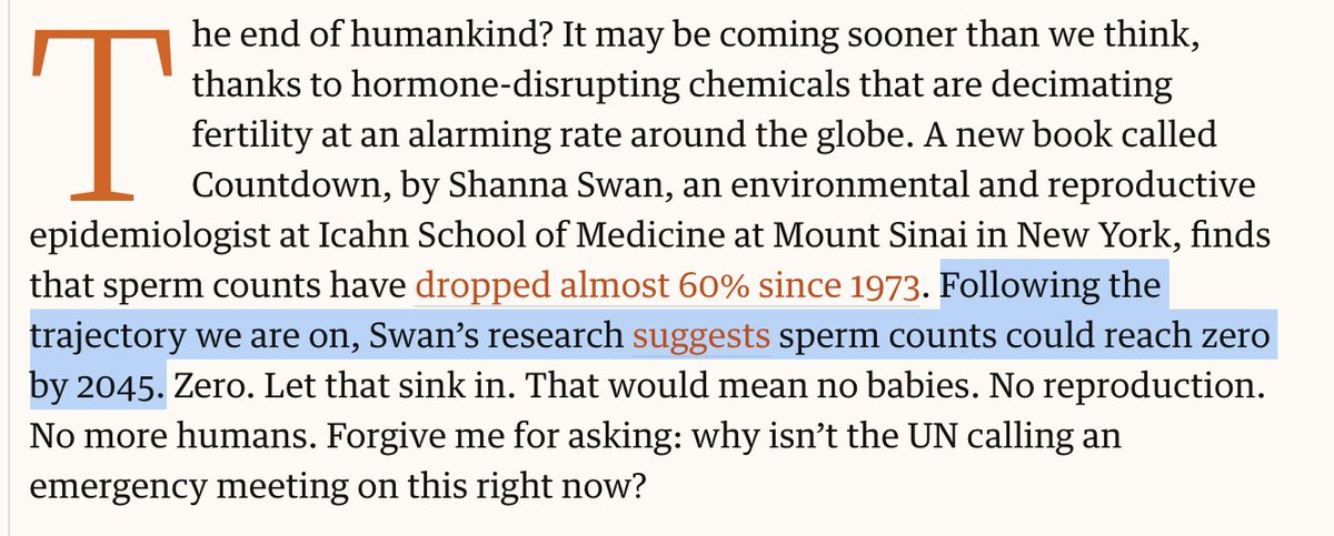
Here's the money quote.
Mar 3, 2021 15 tweets 5 min read
My colleague, epidemiologist @joel_c_miller, has done a great job of debunking mis- and disinformation throughout the pandemic. In this great thread, he takes on the claim that COVID is basically harmless, and any excess deaths are due to fear and stress from social precautions. Instead of calling the person an idiot, he does nice job of explaining how you might test such a hypothesis — and then looks to the data to show that this story about fear and stress is entirely unsupported. The whole thing is well worth a read.
Feb 18, 2021 9 tweets 6 min read
I love seeing journalists do a textbook job of calling bullshit on the misleading use of quantitative data.

Here's a great example. @RonDeSantisFL claimed that despite having schools open, Florida is 34th / 50 states in pediatric covid cases per capita.
nbcmiami.com/news/local/des… I don't know for certain what set off their bullshit detector, but one rule we stress in our class is that if something seems too good or too bad to be true, it probably is.

DeSantis's claim is a candidate.

Below, a quote from our book. Image
Dec 5, 2020 23 tweets 7 min read
In science, people tend to be most interested in positive results — a manipulation changes what you are measuring, two groups differ in meaningful ways, a drug treatment works, that sort of thing. Journals preferentially publish positive results that are statistically significant — they would be unlikely to have arisen by chance if there wasn't something going on.

Negative results, meanwhile, are uncommon.
Dec 3, 2020 15 tweets 7 min read
Jevin West was away today so in lecture I was able to sneak in one my favorite topics, observation selection effects.

Let's start a little puzzle.

In Portugal, 60% of families with kids have only one child. But 60% of kids have a sibling.

How can this be? People are all over this one! And some are out ahead of me (looking at you, @TimScharks). We'll get there, I promise!

There are fewer big families, but the ones there are account for lots of kids.

If you sampled 20 families in Portugal, you'd see something like this.
Sep 20, 2020 8 tweets 4 min read
One of our key pieces of advice is to be careful of confirmation bias.

There's a thread going around about how the crop below is what happens when Twitter's use of eye-tracking technology to crop images is fed with data from a misogynistic society. I almost retweeted it. But… …that story fits my pre-existing commitments about how machine learning picks up on the worst of societal biases. So I thought it was worth checking out.

Turns out, it's not Twitter at all.

Here's the @techreview tweet itself:
Jul 26, 2020 50 tweets 14 min read
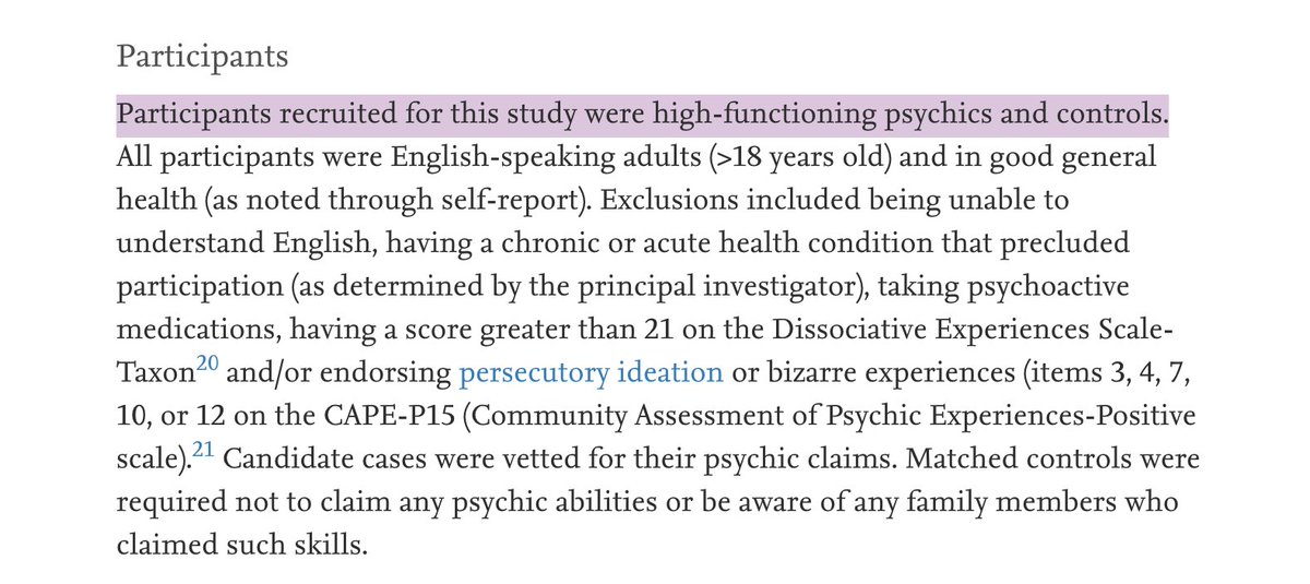
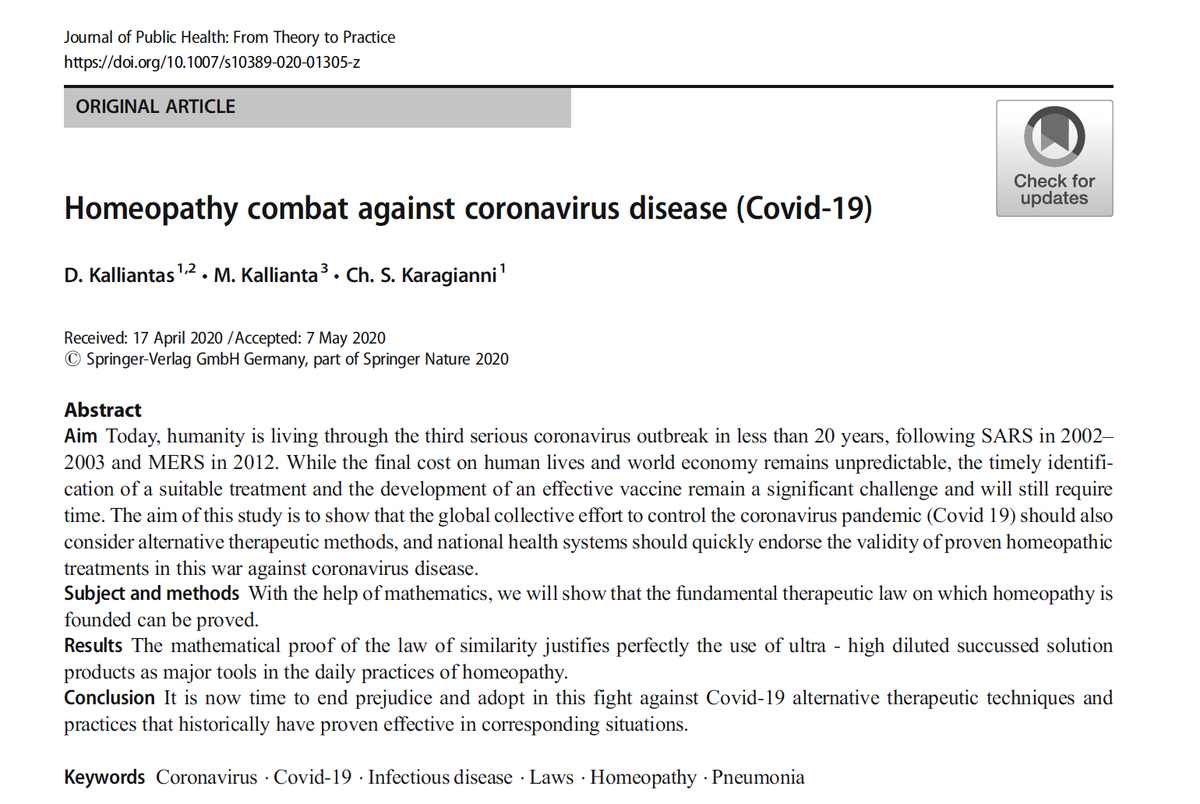
A couple of months ago, an almost unfathomably bad paper was published in the Journal of Public Health: From Theory to Practice.

It purports to prove—mathematically—that homeopathy will provide and effective treatment for COVID-19.

link.springer.com/article/10.100… While it would be fish in a barrel to drag this paper as a contribution to the pseudoscience of homeopathy, we'll largely pass on that here. More interestingly, this single paper illustrates quite a few of the points that we make in our forthcoming book.
Jul 17, 2020 5 tweets 1 min read
A truly remarkable example of misleading data visualization from the Georgia department of public health. In our book we suggest that one never assume malice when incompetence is a sufficient explanation, and one never assume incompetence when an understandable mistake could be the cause.

Can we apply that here?
Jun 25, 2020 11 tweets 4 min read
We've written several times about what we describe as Phrenology 2.0 — the attempt to rehabilitate long-discredited pseudoscientific ideas linking physiognomy to moral character — using the trappings of machine learning and artificial intelligence. For example,, we've put together case studies on a paper about criminal detection from facial photographs...

callingbullshit.org/case_studies/c…
May 10, 2020 7 tweets 3 min read
R is a dimensionless constant. Infections is measured in individuals. So what the f*ck are the units then?

This is the kind of bullshit we call “mathiness” in our forthcoming book.

H/t @merz. From the book: "Mathiness refers to formulas and expressions that may look and feel like math—even as they disregard the logical coherence and formal rigor of actual mathematics."

(Admittedly the shock-and-awe factor is minimal here in this sum of two quantities)
Aug 3, 2019 26 tweets 9 min read
1. I recently tweeted about a particularly poor piece of science reporting in the science/tech news site @BigThink. In that article, they describe a new study as showing that spending two hours a week in nature is essential for happiness.
bigthink.com/surprising-sci… 2. In our course, we encourage our students to question as strongly those claims that support their beliefs as those that challenge them.

I believe myself that time in nature improves well-being, so in the spirit of following my own advice, let’s look closely at this story.