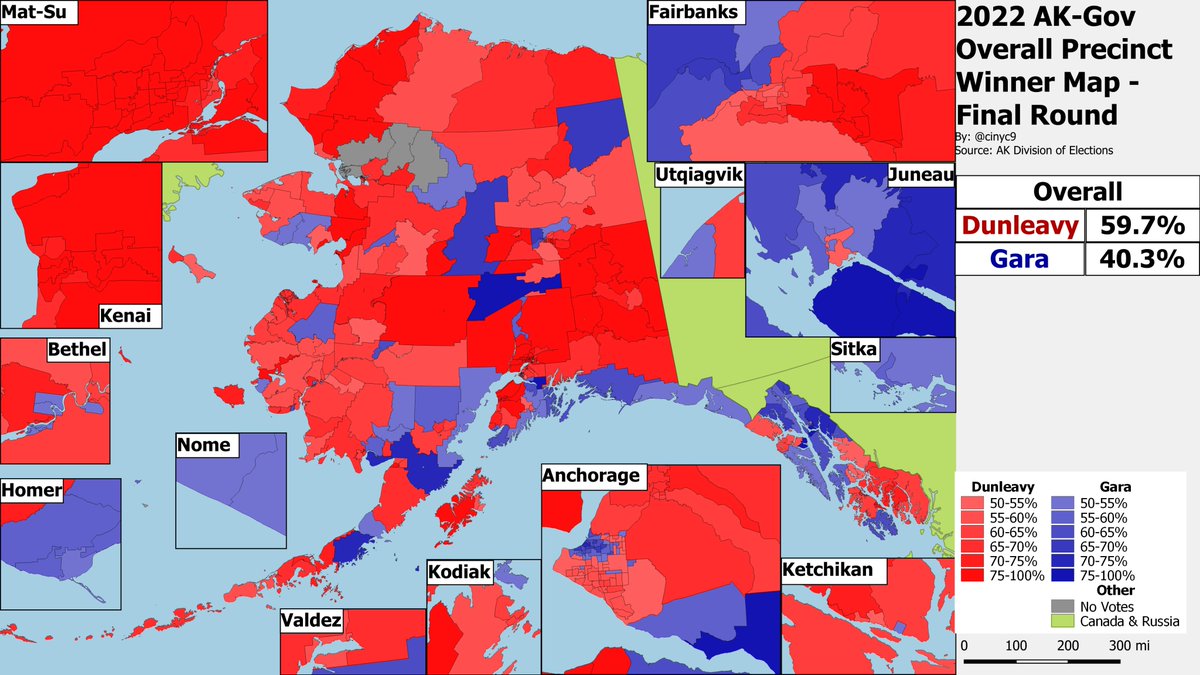
cinyc Profile picture
Maps and politics and stuff. Usually, it's just maps. Disclosure: Conservative Republican. Maps: https://t.co/zKDAwsogJY.
Feb 22 16 tweets 4 min read
I'm not one for nostalgia: Election Twitter was never a perfect place free of silly drama and fights. But the events have the past day, where @SocalPopulist and "friends" defamed me by posting fake DMs I never sent, have moved the nonsense to a whole new level.

A thread:

1/? This wasn't the first time someone defamed me using fake Tweets I never sent. That was actually on May 1. 2023, when now-banned @FuckYouGute posted fake DMs suspiciously similar to the ones posted last night. Let me be clear: I never sent any of these DMs.
Naively, I replied.
2/? Image
Nov 8, 2023 8 tweets 3 min read
Republican @KristyforNY Marmorato flipped an East Bronx NYC City Council seat tonight. The precinct winner map.

She cleaned up in traditionally Italian-American areas like Country Club and Throggs Neck, and kept margins down in the more Hispanic parts, too.

@PatrickRuffini Image 
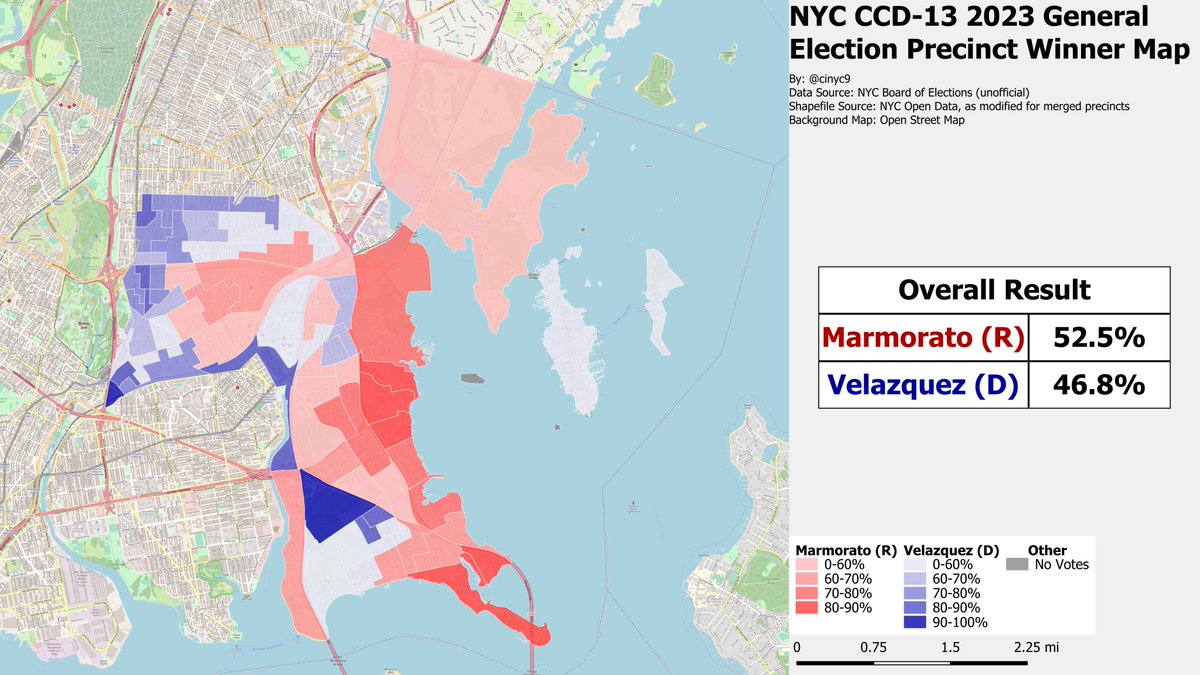
Meanwhile, in Queens, incumbent Republican City Councilwoman @VickieforNYC Paladino easily won her rematch against @TonyAvella by about 20 points. Paladino won almost every precinct in the process.

@RyanGirdusky @GavinWax @aaronfoldenauer @Stef4NewYork Image
Nov 7, 2023 5 tweets 3 min read
VA Beach is one of the few VA localities that reports election day checkins. A gif of VA Beach turnout as of about 9AM (EV + ED). Citywide, 16.8% of RVs have voted - about 34% of the 2021 vote.

It appears relative turnout is generally higher in Youngkin-voting areas - but this pattern definitely isn't uniform.
The static maps:


Image
Image
Image
Image
Sep 23, 2023 63 tweets 21 min read
The U.S. Census Bureau finally released the 2020 Census ancestry and racial subgroup data on Thursday. More on this to follow in this thread.

My interactive map of the Top Ancestry or Racial or Hispanic subgroup in every US census tract is now live:

cinycmaps.com/index.php/ance… Like Boston, Greater Philadelphia's top AHR is largely Irish. And like in Boston, the Irishness fades the further you get from the city center. Pennsylvania (German) Dutch Country - and arguably the Midwest - starts in the PA exurbs. Image
May 21, 2023 91 tweets 61 min read
Welcome to the weekend of never-ending town population change maps!

Census released its 2022 incorporated placepop estimates on Thursday, so here comes a cartographic cavalcade.

First, the nationwide 2020-22, 2020-21 and 2021-22 town pop change gif. S & W generally gained. Static nationwide maps, for those who don't want to play stop a gif: ImageImageImageImage
May 18, 2023 5 tweets 4 min read
Census released its 2022 incorporated place population estimates. I now have an interactive version of this map. The default map is 2020-22 PCT Change. Click the Menu button to toggle between PCT or Numerical change and the years you want to see.

cinycmaps.com/index.php/popu… FYI - @JMilesColeman @DrewSav @Thorongil16 @greggiroux @SeanTrende @PatrickRuffini @orcasaccount @Shane_maps @XNeonXO @xenocryptsite @HdxConservative @ChazNuttycombe
May 18, 2023 4 tweets 3 min read
Census released its 7-1-2022 incorporated place population estimates today. Thus, my annual weekend of endless incorporated place population change maps is almost upon us!

For now, here's the static 2020-2022 city population change map. Purple = pop loss; green = gain. Image I'll eventually get around to turning this into an interactive, too.

Here's a preview of this weekend - 2020-22 pop growth in the NYC CSA. NYC itself and the inner suburbs have lost pop, while some outer suburbs have grown.

Estimate is for the city as a whole, not the boroughs. Image
May 16, 2023 4 tweets 2 min read
Is this quick map anything?

Left: Jacksonville Mayoral GE turnout vs the primary. Citywide, 98.2% of primary voters voted as of 1:40PM. Purple precincts = < 98.2% of Primary; green precinct = > 98.2% of Primary.
Right: unofficial primary results from ED with 182/186 reporting ImageImageImage 3:40PM Update: Citywide turnout is now at 107.4% of the first election. Not a ton changed on the vs citywide pct map (Green = > 107.4%' of primary votes; purple = < 107.4%). Beaches are still deep green. Image
Mar 29, 2023 5 tweets 7 min read
At the request of @nas9860, @lrishConservNat and others, here's the estimated 2004 #Alaska U.S. Senate result by the 30 current county equivalents (boroughs & census areas). @lisamurkowski won 48-45 after a recount.

Again, this is an ESTIMATE using the traditional method to... ...allocate absentees to precincts. 2004 had a bunch of weird multi-HD early/?/ABS vote types, making this a bit more difficult than usual to decipher.

Here's the chart itself, if that's too small to decipher. Anchorage was more or less average for the state.
Mar 27, 2023 5 tweets 8 min read
How long were Dewey's coattails in 1944?

Queens had 4 fairly competitive Congressional races in its 4 1944 CDs. As the precinct winner gif shows, Dewey far outran the congressional candidates in most of Queens (green) - except Far Rockaway and Kew Gardens. Static maps, for those who prefer - with a bonus map on the bottom right showing the number 1944 voters relative 2020 voters. The green and gold precincts have grown a lot since 1944; purple had fewer voters.
Mar 26, 2023 4 tweets 5 min read
As requested by @MarionStefan - an estimate of the Dewey 1944 - Trump 2020 NYC swing (on the 1944 precinct map). Purple areas swung from Trump to Dewey (are more Dem today); green areas swung from Dewey to Trump (are more R today).

I spot a few patterns.... Image 
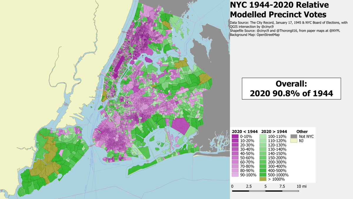
The deepest green areas are where Orthodox Jewish voters bloc voted for Trump today and/or where Jewish voters bloc voted FDR in 1944 - plus the 2020 cop & firefighter vote in Southern SI & the (non-Far) Rockaways.

Deepest purples in '44 White areas now Afr Am - like SE Queens.
Mar 8, 2023 6 tweets 2 min read
Polls on the OK Recreational Marijuana referendum are now closed. Data and shp willing, I'll be livemapping the result here (if the Twitter card isn't greyed out, it's test data until results come in):

cinycmaps.com/index.php/2023… We have some early results on the map now. No is leading, roughly 60-40. It's all early vote, though.
Jan 14, 2023 4 tweets 7 min read
AK @GovDunleavy won outright by getting a majority of first preferences. What would have happened had the RCV algorithms been run?

As the gif below shows, @BillWalkerAk would have been eliminated in the penultimate round, and Dunleavy would have beaten @Les_Gara_InAk by about 19 Static precinct winner maps of the hypothetical RCV rounds.

(It's pretty Walker gold outside of Anchorage until the final round - proving once again that land doesn't vote, especially in Alaska. ImageImageImageImage
Jan 9, 2023 6 tweets 7 min read
Gif of the overall precinct winner map for the various RCV (and non-RCV) rounds of the AK-AL November GE. @MaryPeltola lead wire-to-wire.

1st map is of the results before any second prefs were allocated; 2nd - 2nd prefs allocated; 3rd - WI eliminated; 4th - bye bye Bye.
#AKpol I've also updated the spreadsheets for the AK-AL race and hypos. This fixes a few minor precinct results errors. They're here:

Actual (Begich eliminated):
docs.google.com/spreadsheets/d…

Palin eliminated hypo:
docs.google.com/spreadsheets/d…

Pelotla eliminated hypo:
docs.google.com/spreadsheets/d…
Jan 6, 2023 8 tweets 5 min read
I've finally preliminarily parsed the AK US House and Senate CVRs. Things add up, but still may be off at the edges.

Unlike in the special, had Palin been eliminated, Begich would have lost 55.4-44.6%. This is slightly worse than Palin's 55-45% actual performance. Beigich would have won a head-to-head against Palin 60.6-39.4%.
Dec 7, 2022 8 tweets 5 min read
Map of the NYC @leezeldin - 2020 Trump "swing" on the 2022 precinct map. The redder the precinct, the better Zeldin did vs Trump '20.

The reddest areas were in NE Queens, S Brooklyn and the whitest parts of Bronx.

Overall, Zeldin improved on Trump's 2-party PCT by 7.2 points. Image Same map, this time using the 7.2 point citywide swing as the dividing line between red and blue, to put things into sharper perspective. Image
Dec 6, 2022 4 tweets 2 min read
NYC's results are now official. @LeeZeldin received 30.2% of the citywide vote. Here is the precinct winner map: Corporate wants you to spot the differences from the election night results map by using this gif:

(No, the Assembly district overlays, graying out Long Island and making NJ the same piss yellow color as their license plates doesn't count.)
Nov 11, 2022 4 tweets 2 min read
My first very rough cut projection of where things will probably land in Alaska after the uncounted absentee, early and questioned votes are counted. This was a very simple calculation assuming the abs and early votes broke as prior ones did or...

1/3 Image ...in the HDs where no absentees have been counted, as the overall vote did. I assumed questioned will vote as overall vote, too, for lack of data thus far (0 have been counted.

@MikeDunleavyGov likely gets over 50% and wins outright; @MaryPeltola comes close, but needs RCV

2/3
Nov 9, 2022 5 tweets 2 min read
Now that the dust has settled (sort of) and I’ve caught up in making my interactive precinct maps (again - sort of) here’s a list of the maps I was up to making last night:

Starting with the last - always - Alaska: AK-AL, AK-Sen, AK-Gov by Precinct & HD:

cinycmaps.com/index.php/22-l… Oklahoma Gov & State Superintendent of Public Instruction. Governor Stitt won big, despite some polls showing a close race (Twitter card is still test data):

cinycmaps.com/index.php/22-l…
Nov 9, 2022 4 tweets 2 min read
The Virginia trilogy is finally precinct mapped. The state did NOT allocate absentees to precincts yet, so things are a little bit redder than they actually are, since it only picks up the election day vote.

Kiggins beat Luria in VA-2 by about 4 points. Image In VA-7, Spanberger (D) beat Vega (R) by about 4 points. Image
Nov 7, 2022 9 tweets 3 min read
Final cumulative NYS early vote stats by region:
-1,178,674 total Early Vote checkins, ~47% of 2020
-Mid-Hudson, LI are closest to 2020 at over 64%
-NYC signifciantly lags at 38.66%
-Every other region is about at the statewide average Day 9 chart:
-Sunday was a very good day, at 72.5% of 2020.
-Long Island blew past its 2020 D9 totals; Mid-Hudson & Northern suburbs were close
-Every other region below average at or around 60%.