Jordan Moore Profile picture
working backwards from magic
Dec 27, 2022 100 tweets 21 min read
1/ THREADAPALOOZA: INTUITION, HERETICS & THE CREATION OF NEW VALUE

As software is eating the world, software becomes the default platform for human progress.

The problem: I believe, people have forgotten how to aim towards meaningful, monumental leaps in software design. Image 2/ This is really, REALLY bad news.

If the world becomes software, and software is simply going through the motions, then just as life imitates art, human progress is only as good as the software that enables it.
Sep 18, 2021 18 tweets 5 min read
A short thread on why you (and all of humanity) will never escape Plato's Cave... First, a quick recap Plato's Allegory of the Cave. I'll skip many details to cover the broader themes. For a more detailed look, or if it's your first time encountering Plato's Cave, read this instead: en.wikipedia.org/wiki/Allegory_…
Sep 17, 2021 4 tweets 1 min read
I would go as far to say that as soon as humans begin to socialise from an early age, their sensemaking abilities become compromised. Perhaps even as soon as you’re given a name - the first fiction from which all the others build upon.
Jul 24, 2021 6 tweets 2 min read
Speculating about operating systems without reasoning from legacy patterns like windows and menus.

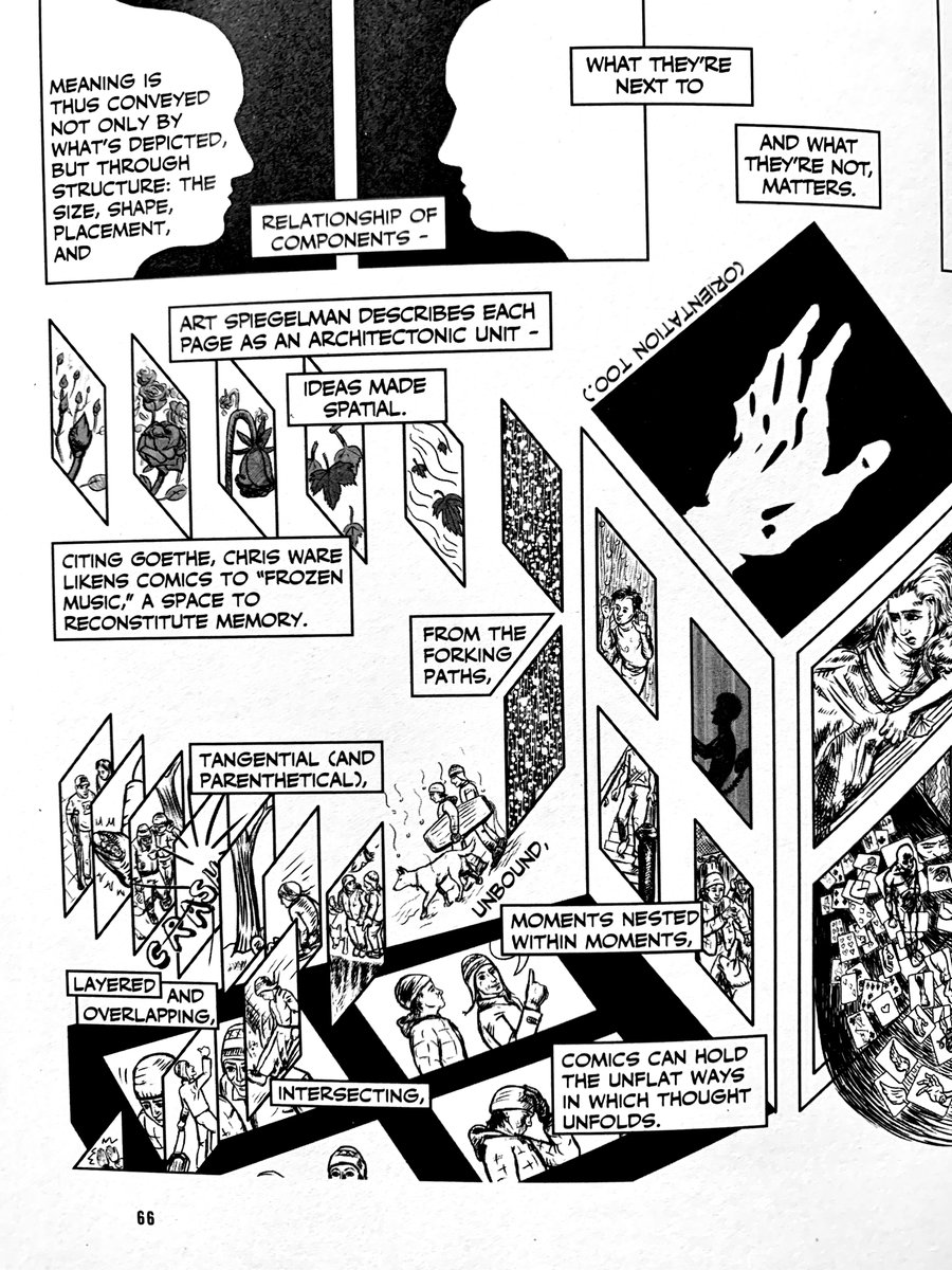
I like the idea of applications being “unbound” without limits on the space they can occupy.

Positioning adds meaning, eg some Wikipedia articles might inform research in docs… Image Unbound apps could overlap, exist in the same space, unbound again into additional instances…

Zooming in to a particular context (eg this is where I solve email tasks and todos) would give you contextual toolbars of available actions in that space. Image
Apr 23, 2021 4 tweets 2 min read
Contemplating this turns any ordinary day into a GREAT day...

“We won the cosmic lottery. We are the end state of millions of years of success. We wouldn’t be here if the genetic structures that created us didn’t succeed.”

@jposhaughnessy Quoted from his mind-blowing podcast with @Dan_Jeffries1 containing all the good stuff: deconstructing yourself and your beliefs, reconstructing, using your illusion, the simulation etc...

pca.st/podcast/5c8576…
Jan 30, 2021 4 tweets 1 min read
WORKING BACKWARDS FROM MAGIC: a powerful mental model for breaking through creative problems.

↓ Start from “what would the solution look like if it worked like magic?”

Take all technical limitations and design restrictions out of the picture — they are impediments to getting to the best solution. Leave bias at the door.

Dec 31, 2020 5 tweets 1 min read
What would a discovery-driven web look like? Current web experiences are intent-driven, i.e the user is looking for something specific via search or direct to a domain/web address.

A discovery-driven web wouldn't need search or domains because they're too _exact_. Or at least, domains might behave more intuitively than a "dot com" <- meaningless jargon which requires some level of onboarding for first time usage.

You might have [brand/entity/whatever].[category/domain], or [category/domain].[brand/entity/whatever]...
Dec 19, 2020 100 tweets 22 min read
1. Act One — The Mountain King

The Witness (2016) is a puzzle game by Jonathan Blow and it changed my world. It features over 500 puzzles on grid panels where you begin at one point of the panel (a circle) and finish at the exit point of the grid. 2. The game teaches a symbolic language through non-verbal communication in sequences of puzzle panels. Take this panel for example... Image
Dec 12, 2020 5 tweets 2 min read
Related: design is a game of importing meaning/association/metaphor on to the blank canvas to be decoded by others. A transfer of concepts by visual means. Hieroglyphs → the original design system
Nov 22, 2020 14 tweets 4 min read
Collected techniques that I have used for defeating creative blocks and summoning a muse. Image 1/ Pacing

Low-effort and good for pumping blood to your head. I find that Any activity which increases blood flow has a creative payoff on the other side.

Stack pacing with swearing for a quick gear change for triggering insight (hat tip to @EricRWeinstein)
Sep 5, 2020 15 tweets 5 min read
A theme running through my recent thinking is that layout on the web is in a mediocre phase which is counterintuitive to the recent advances in layout technology (eg CSS Grid).

Layouts should be getting more ambitious, but the opposite is true.

Why make ambitious layouts? For starters, layout can be so much more than simply placing blocks on a page in a top to bottom hierarchy of information.
Aug 4, 2020 22 tweets 7 min read
Making progress with multi-directional notes (heavily based on @andy_matuschak's notes) where a note link stacks to the right by default but can also be placed via W, A, S and D keys + click as a directional modifier for above, left, below and right. CSS scroll-snap feels better on the vertical notes rather than the horizontal channels. Going to look into "saving" a session so that all previously open notes and the current scroll position can be restored.
Jul 12, 2020 10 tweets 4 min read
Thought experiment: what happens if we expand @Mappletons and @tomcritchlow’s digital garden metaphors to digital towns and cities?

I’ve found an unlikely combination of inspiration between:

1. Digital gardens
2. Webrings
3. Stanley Donwood’s artwork for Hail to the Thief Stanley Donwood described the process of making the cover for Hail to the Thief as Thom providing the lyrics and themes for the album, Stanley cutting them up and building “a canvas of real estate”.
Jul 12, 2020 5 tweets 1 min read
One of my many takeaways from this is how products can utilise their community as an extended product team for HUGE growth.

The unlocking question that every product team should be asking is “what would an App Store look like for this?” The core product team focuses on core product features for the majority of users, the community becomes the R&D arm building features for the everyday user all the way up to the power user’s niche needs.

The roadmap begins to design itself to some degree.
May 1, 2020 11 tweets 3 min read
Browser history as nodes for useful recall

- Nodes automatically spawn when new tabs opened
- Subsequent navigation is likely related to parent node (as that’s how links work within content)
- Paths can be labelled for categorisation
- Days as root for nodes? Image Browsing history becomes browsing memory. More meaningful and useful, particularly during research. Distractions or undesirable branches can be cut/collapsed/pruned
Dec 29, 2019 10 tweets 2 min read
Here’s a thing we don’t talk about or give much attention to in the industry...

Individuals who hold stock in a particular way of doing things are incentivised differently to everyone else.

I’ve observed troubling patterns that emerge from this scenario. Unpacking “a particular way of doing things” for a moment: this could be anything from a framework, a language, a methodology, a tool, a technique, a deliverable - there are many more parts of a project process that this could apply to.
Dec 5, 2019 8 tweets 2 min read
I'm going to temporarily break my no politics on Twitter rule for just a moment to talk about this tweet from @Conservatives.

This is genius.

You can guarantee that this tweet ended up in more Labour social media timelines than Conservative feeds. What's so clever about it? It's a Trojan horse loaded with persuasion techniques.

For starters, this is NOT designed for a Tory supporter's timeline. They're giving Labour supporters all the pieces they need to mock the message...
Sep 29, 2019 20 tweets 7 min read
A short thread on why Radiohead are the closest thing we have to a modern Beatles.

Besides the obvious comparisons of seamlessly traversing musical styles and releasing controversial records at the height of their fame, both bands dabbled with something else: secrets. 1/ They had a knack for hidden messages in album artwork. They rewarded curiosity. People who looked hard enough for secrets would find them, like this message found inside OK Computer after the CD tray is removed.
Dec 31, 2018 10 tweets 1 min read
A few things I learned in retail e-commerce this year:

- Physical store design can teach you a lot about e-commerce information architectures - The most trivial AB test such as changing colours can unearth ridiculous amounts of hidden value. Test the unexpected
Nov 19, 2018 16 tweets 3 min read
A responsive design should preserve and protect _content_ across different conditions. A responsive design owes little to the preservation of an _interface_ across different conditions. I'll unpack this a bit more in a blog post.