MDS Profile picture
MDS
Shapeshifter @shiftnudge
May 28 15 tweets 6 min read
I've been designing websites, apps, and interfaces professionally since 2005 and I've boiled my design process down into 8 steps.

First I'll list them all, then explain them all... Image 1. Understand the problem
2. Determine the complexity
3. Complex? Use lists, content maps, and user flows to help guide the project
4. Complex? Design in low-fidelity (wireframes) to get everyone on same page about the same features
5. Set design direction
6. Present early and often
7. Explore, iterate, and exploit
8. Systematize

Let's dissect each one...
Jan 13, 2023 8 tweets 3 min read
📦 Every interface design element is a rectangular box.

Icons? A box
Buttons? A box
Headlines? A box
Form labels? A box
Negative space? Most definitely, a box

If you don't already... using the box model will drastically improve the way you design.

Here's why... Imagine you had a bunch of random rectangular boxes and were instructed to stack them up neatly...
Jan 3, 2023 7 tweets 2 min read
Saying "Yes" to most things in your early career can help expose you to a ton of new opportunities and accelerate your growth.

But eventually you will need to start saying "No" to keep focused on the most important things.

Here's a quick example that just landed in my inbox... A well written request from someone who wanted me to make some videos for them.
Jan 2, 2023 17 tweets 4 min read
8 quick tips to improve your Typography skills... 1. Size
Use as few font sizes as possible. No more than 3 or 4 per viewable section—or in total if you can help it.
Dec 13, 2022 11 tweets 5 min read
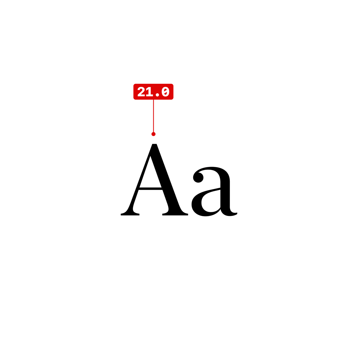
If you're using a non-standard font, compare its x-height to SF Pro before you lock in all of your font sizes. This will help you create more legible interfaces.

Why? Thought you'd never ask... Image SF Pro was designed by Apple specifically for mobile interfaces (you likely already know this), so we're going to make the assumption that they know what they're doing and we can safely use SF Pro as a rule of thumb. Image
Dec 2, 2022 8 tweets 2 min read
1/ As a designer, it's important to always be striving to improve your skills and become the best designer you can be. But what does it take to become a truly great designer? Here are some tips to help you on your journey to becoming a top-notch designer. 2/ First and foremost, focus on developing a strong foundation in the principles of design. This includes things like balance, contrast, hierarchy, alignment, and proximity. By mastering these principles, you'll be able to create visually appealing and effective designs.
Nov 14, 2022 5 tweets 1 min read
3 great bare–minimum user scenarios to account for in your new app.

👶 New user
😃 Repeat user
😎 Power user

👇 👶 New user

Never heard of you. Doesn't have much context. Doesn't have an account. Has mostly questions. Looking for value. About to leave at all times. Needs a reason to continue. Needs reason to offer personal info.

Onboarding needs to be on point.
Nov 8, 2022 8 tweets 4 min read
I made a killer auto layout tutorial for @figma. There are three critical things you need to understand in order to use it efficiently... To create an auto layout component. Select literally anything and hit SHIFT A. That's it.
Oct 24, 2022 17 tweets 3 min read
I've been designing websites, apps, and interfaces professionally since 2005 and I've boiled my design process down into 8 rough steps. Sometimes I use all of them, sometimes only a few.

First I'll list them all, then explain them all... 1. Understand the problem
2. Determine the complexity
3. Use lists, content maps, and user flows to help guide the project
4. Wireframe or not based on project complexity
5. Set design direction
6. Present early and often
7. Explore, iterate, and exploit
8. Systematize
Oct 17, 2022 8 tweets 1 min read
The job of any great UI is to support a great UX. Too many people think great UI is purely eye-candy, but they're wrong.

Like my good friend Merriam Webster always says... in·​ter·​face

the place at which independent and often unrelated systems meet and act on or communicate with each other
Oct 17, 2022 4 tweets 1 min read
Good UI creates good UX. Rob gets it
Oct 11, 2022 21 tweets 10 min read
Make your design life 10X easier and use these 5 color contrast score ranges for specific UI elements.

👇Here's the breakdown...

(I started writing this after the recent @usecontrast launch) Full white on black and vice versa is the highest contrast—clocking in at 21 on a scale of 1-21. This is typically great for punchy headlines, but not for everything else.
Jun 15, 2022 24 tweets 8 min read
"From Broke at 26 to $100 Million net worth by 31"

I had never heard of @AlexHormozi until a few weeks ago when @thesamparr and @ShaanVP interviewed him on their podcast.

Last weekend I had dinner with Alex and @LeilaHormozi.

👇 This is the story of how it happened... me and alex hormozi with arms around each other Just for reference, here's the @myfirstmilpod video I watched...

May 19, 2019 6 tweets 1 min read
I’ve witnessed so many people struggle with creating design systems. The root cause is nearly always the desire (or the directive) to define the system before the possibilities have been explored in a non-systematic way. Explore THEN define. Rinse and repeat.