John Kennedy Profile picture
Climate scientist, diagram monkey, probabilistic historian. All views and opinions are my own. Not, sadly, a promise of novelty but a disclaimer. He/him
Dec 1, 2023 30 tweets 8 min read
So, the WMO’s provisional State of the Global Climate 2023 report is out. Long-term the story hasn’t changed: world warming, sea rising, ice melting, as well as everything that goes with that. There are details of course, so thread… 1/n Graph of global annual temperature anomalies (difference from the 1850-1900 average) from 1850 to 2023. Five datasets are shown: HadCRUT5, NOAAGlobalTemp, GISTEMP, JRA-55 and ERA5. You can read the report here:
And the press release:
2/nwmo.int/resources/publ…
wmo.int/news/media-cen…
Aug 3, 2022 18 tweets 3 min read
When an article says "some scientists think" then remember this: I, a scientist, once thought I could fit a whole orange in my mouth. I could, it turns out, get it in there, but I hadn't given sufficient thought to the reverse operation. I should also, on reflection, have practiced in private. I had an audience, which grew as my initial satisfaction at an hypothesis well proven, slipped rapidly through stages of qualm, disquiet, then alarm (mild through severe) and ended in full blown panic.
Mar 10, 2020 26 tweets 13 min read
Thread. WMO statement on the State of the Global Climate in 2019 in partnership with UN agencies and many others. Some key points... library.wmo.int/index.php?lvl=… 1. Carbon dioxide, methane and nitrous oxide - the three main greenhouse gases - reached record levels in 2018, according to data from the World Data Centre for Greenhouse Gases. Individual site series suggest they increased further in 2019. gaw.kishou.go.jp Carbon dioxide concentration (parts per million) in the atmosphere from three data sets: Mauna Loa, NOAA and the World Data Center for Greenhouse Gases. All three show a clear upward trend that is much larger than the annual cycle and year to year changes.
Oct 18, 2019 4 tweets 1 min read
Confused by different baselines for global mean temperature? Print out this handy graph and put it in your small money bag. Now with bonus baselines. Global mean temperature graph showing temperature differences between commonly-used temperature baselines: 1850-1900, 1880-1900, 1961-1990, 1981-2010, 1986-2005, 1995-2014 and 2010-2019. 
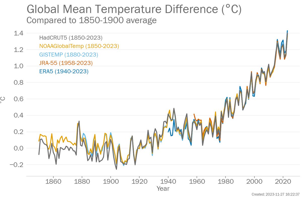
1850-1900: stand in for "pre-industrial", used by the IPCC SR 1.5 and WMO annual statements.
1880-1900: "pre-industrial" for those whose datasets start in 1880.
1961-1990: WMO recommended normal for climate change assessment
1981-2010: WMO recommended normal for everything else