Simon Nicholls Profile picture
Father, quant researcher, blogger & medium editor, utilitarian, political pragmatist
Aug 3, 2021 16 tweets 9 min read
Did lockdown reduce infections in 🏴󠁧󠁢󠁥󠁮󠁧󠁿?

In this🧵we'll try to line up the data.

1) Plot all-cause byOccurence excess from PHE's Flu/C19 report bit.ly/36nVBQE, lagging it back 19dys (based on this bit.ly/3xeFOOA) to imply infs

2) Add to this key dates

1/15 Image Doing so we see the popular charge that 1st/3rd🌊infs peaked before LD, and that the 2nd LD had no effect.

Do other death measures line up?

Adding byOcc C19 deaths from:
3) ONS counts from doctors certs bit.ly/2YrIg58
4) PHE 28dy ests bit.ly/3sQUp10

2/15 Image
Jul 7, 2021 5 tweets 7 min read
@my_own_RESEARCH @greg_travis @Marco_Piani @jneill @kallmemeg Calcing a rolling IFR is tricky, with vaccines make measuring it now harder.

IFR = deaths/true-infs

But, what are true infs?

Cases are not, as testing never finds all infs.

You can use AB rates by 10yr band to calc IFRs to est cases by age, to create a denominator...

1/5
@my_own_RESEARCH @greg_travis @Marco_Piani @jneill @kallmemeg ... but, vaccines lower these, and it's not clear if Delta has raised them at the same time by being more fatal than Alpha.

Trouble is vaccines mean you can't sample these ABs anymore and distinguish between the real cases, and vaccine induced cases.

2/5
Jun 10, 2021 5 tweets 3 min read
Did LDs work?

To Jun11 for🏴󠁧󠁢󠁥󠁮󠁧󠁿
👉Lon/Manc/Liv Google Mobility
👉Infs implied from ONS/PHE deaths/cases
👉Gradient of infs from deaths
👉Its correl to Lon mobility
Plotting detail👇


LD rsq 0.82, high

Do infs fall before LDs?
If we look at each LD...

1/5 
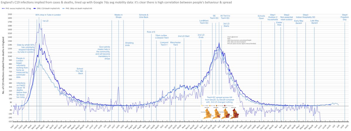
Taking each LD in turn.

👉1stLD: as this zoom in shows, its reduction occured before so was voluntary, fear induced, but without furlough, and business grants, how could it have been sustained without bankruptcy? If we compare on this outcome to 🇸🇪, our strategy was better.

2/5
Feb 11, 2021 11 tweets 5 min read
We've all sorted worldometer's table by deaths/1m, seen the data in the blue bars (to Feb6), and thought, wow 🇬🇧's pretty bad.

But, we're all getting our comparisons so wrong.
i.e. red bars are d/1m just for 50-59yr olds.

Why so different?

Follow me to open your eyes.

1/10 Image 
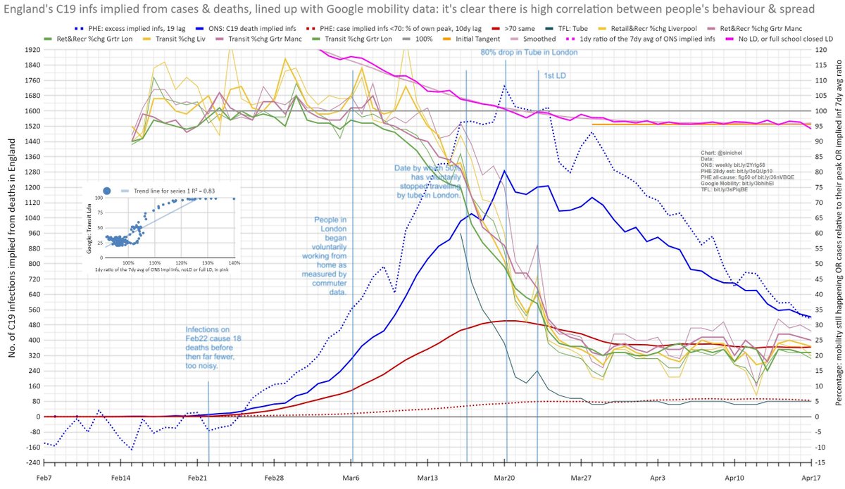
Main cause, 2🔑factors:
▶️Demographic: a pop's d/1m figure is still wgted by age, so fewer 80+ it's lower
▶️Policy: e.g. 🇩🇪's just managed spread better

Re-ranking most2least aging, a pattern emerges.

For a younger pop to have a high d/1m, it's had more spread & deaths.

2/10 Image
Jan 14, 2021 10 tweets 4 min read
Most 🌍 comparisons for C19 go wrong as they don't considering demographics.

For countries I've managed to src detailed death data for, here's total d/1m numbers.

Sure,🏴󠁧󠁢󠁥󠁮󠁧󠁿🏴󠁧󠁢󠁷󠁬󠁳󠁿 look similar to 🇧🇷🇵🇪, but just look at the differences <60, 🇵🇪 4x larger.

So what does this mean?

1/9 Image Basically, fewer >80, means they've had⏫spread, and ⏫younger deaths, but👀equal.

Here ranking⏫2⏬by age are:
▶️20 countries
▶️NY city
▶️The World
That I've 👀at so far.

50% marks the median age, e.g.
🇮🇹 47
🏴󠁧󠁢󠁥󠁮󠁧󠁿🏴󠁧󠁢󠁷󠁬󠁳󠁿41
🌍30
🇳🇬18

So expecting similar deaths overall is silly.

2/9 Image
Jan 11, 2021 7 tweets 4 min read
Trend to Mar was dashed blue in🥇📈, since accruing 75k excess deaths.

But, as🥈📊from bit.ly/3nCSOsh covers, accelerated deaths will've been missed in🥇🌊, and accrued deaths will be lowering nonC19 ones now.

So how many were accelerated if this an underestimate?

1/7 
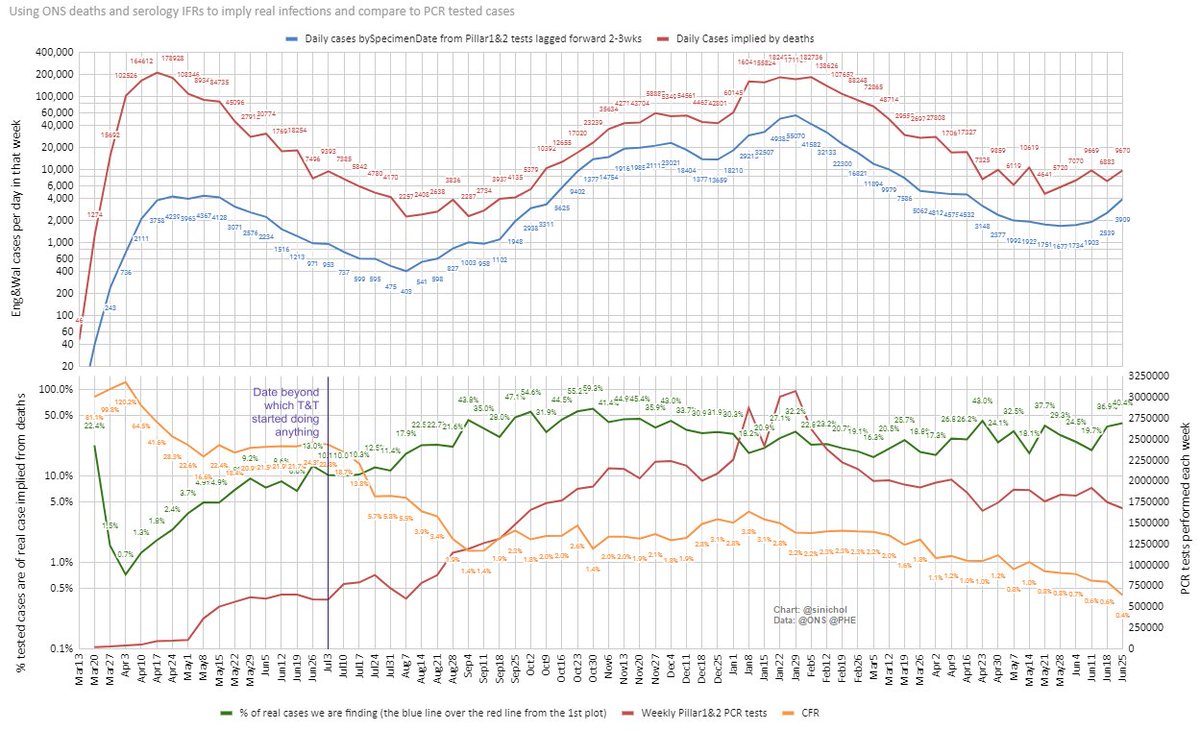
With testing now⏫the compounding effect we missed in🥇🌊is much clearer in the🥈.

NonC19 (orange) are dropping as wks progress, likely due to many of🥈🌊deaths only accelerating expected ones by a few wks.

This likely happened🥇🌊, but⏬testing meant we couldn't track it.

2/7