Prof. of Geographic Information & Cartography @UCLgeography; Director @UCLSocialData; Co-author: @atlasinvisible, @whereanimalsgo & @theinfocapital.
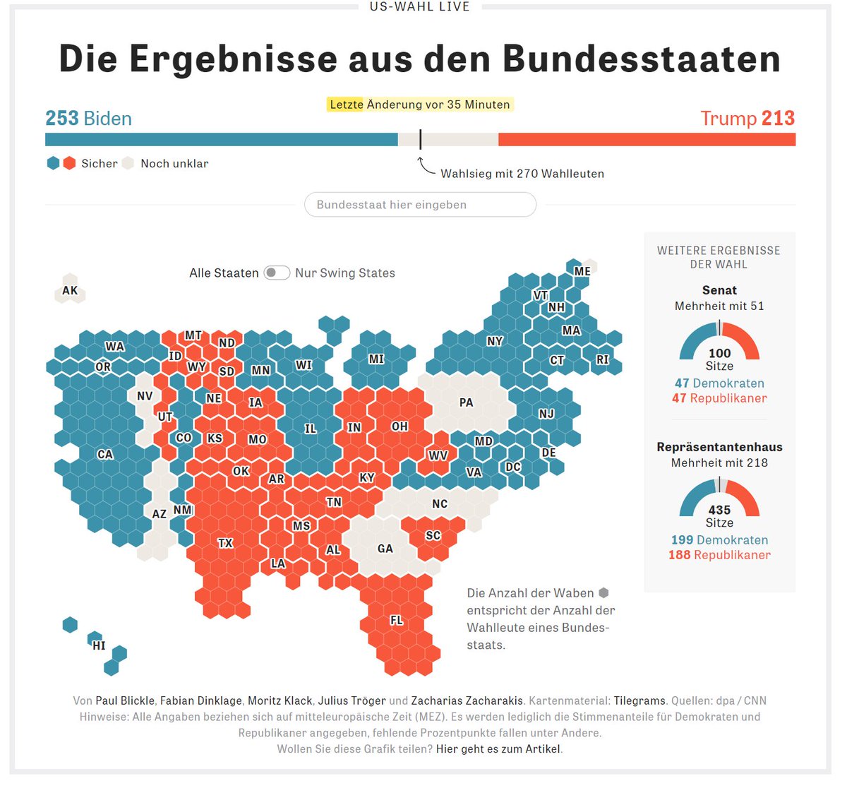
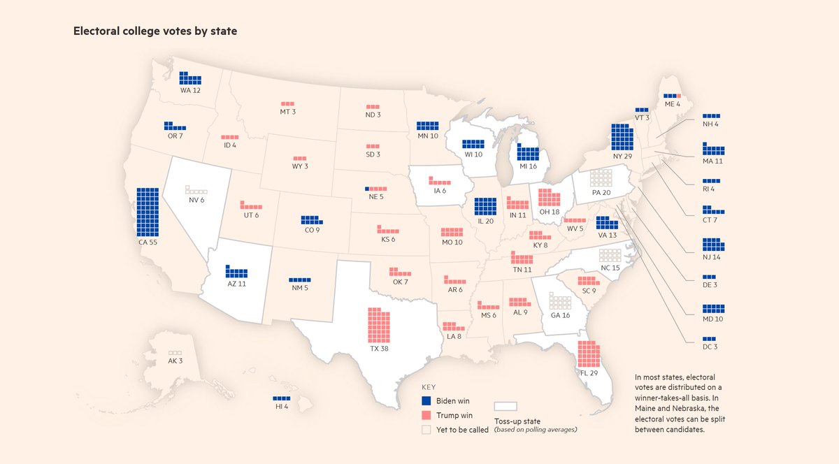
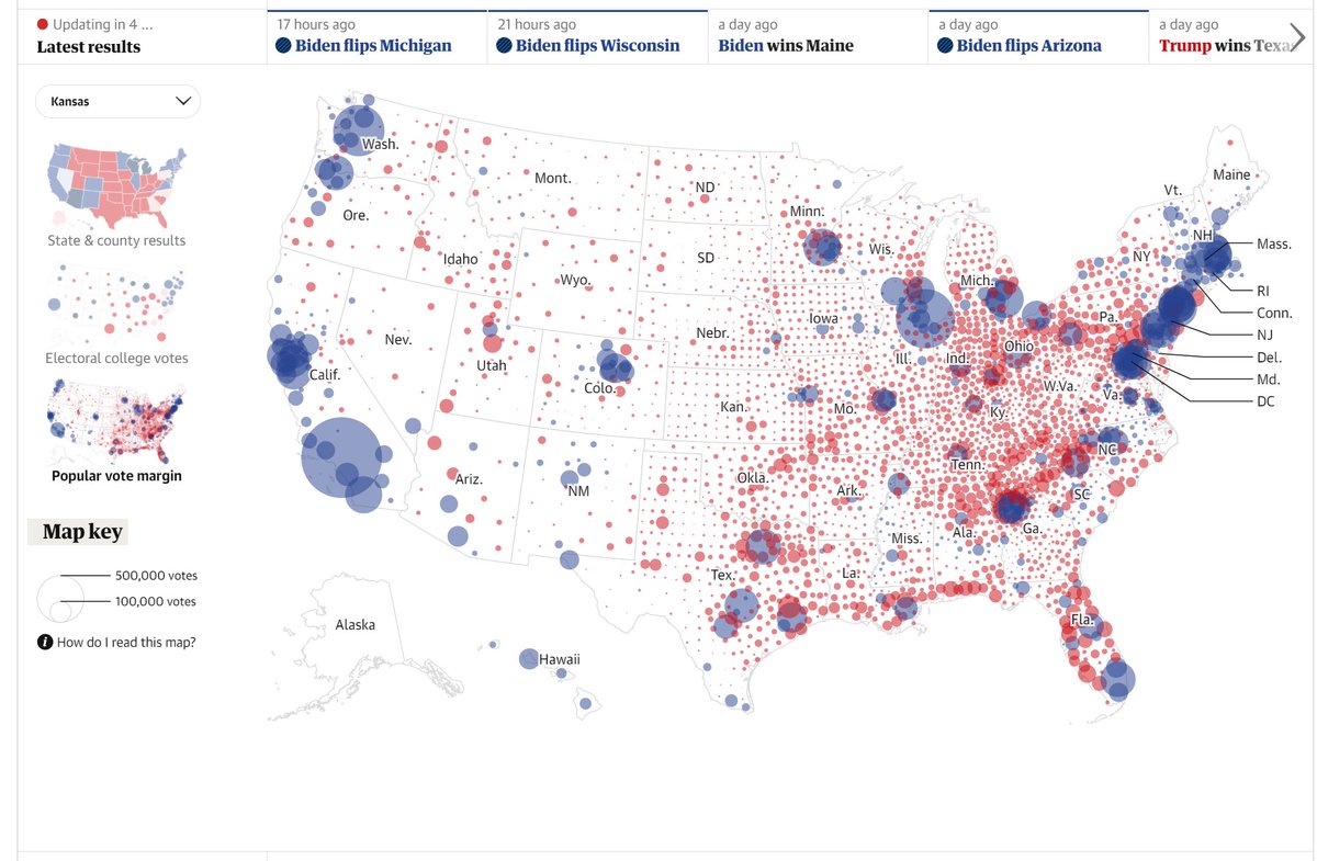
 First an honourable mention for Trump Jr's map prediction tweet since it was the first map I saw on election day. Certainly an original idea, poor choice of map projection though.
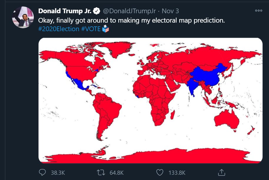
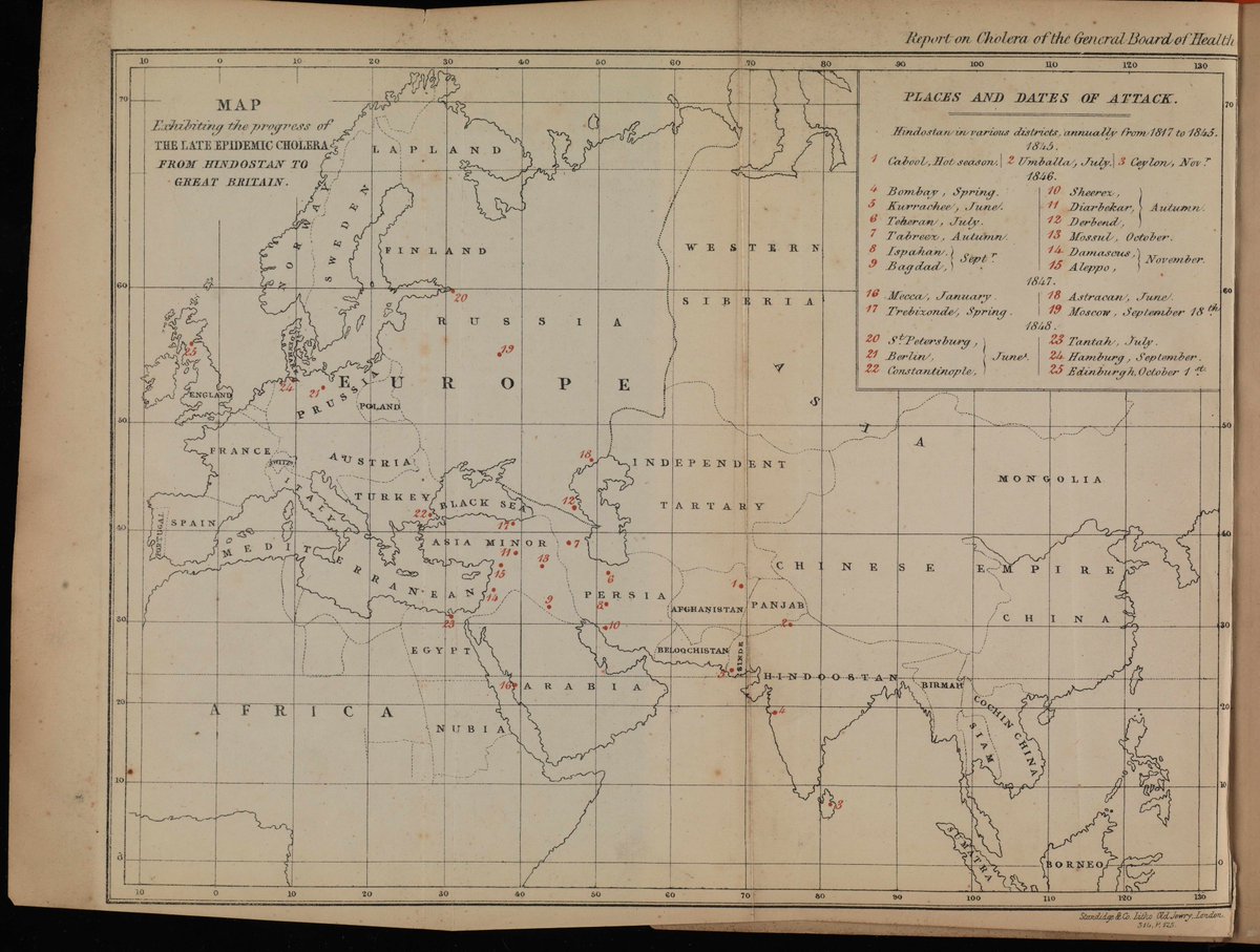
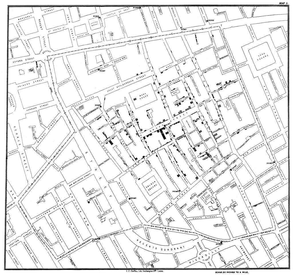 Of course, cholera remains a global issue killing tens of thousands a year.