How to get URL link on X (Twitter) App


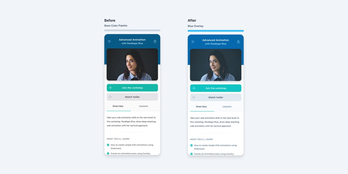
 [1/6] To try this, it will be easier to experiment if your design is finalized with your color palette defined up front.

 It’s a popular opinion that you simply just need to invert the colors.

 In a 24 x 24 pixel artboard, use the rectangle tool (R) to draw a 18 x 10 pixel rectangle positioned horizontally centered and 6 pixels from the top of the artboard.

 In a 24 x 24 pixel artboard, use the rectangle tool (R) to draw a 13 x 18 pixel rectangle.

 In a 24 x 24 pixel artboard, use the ellipse tool (O) to draw a 18 x 18 pixel circle with a centered stroke.