
Topdown Charts is a chart-driven macro research house covering global asset allocation and economics. We primarily serve multi-asset investors and institutions.
3 subscribers
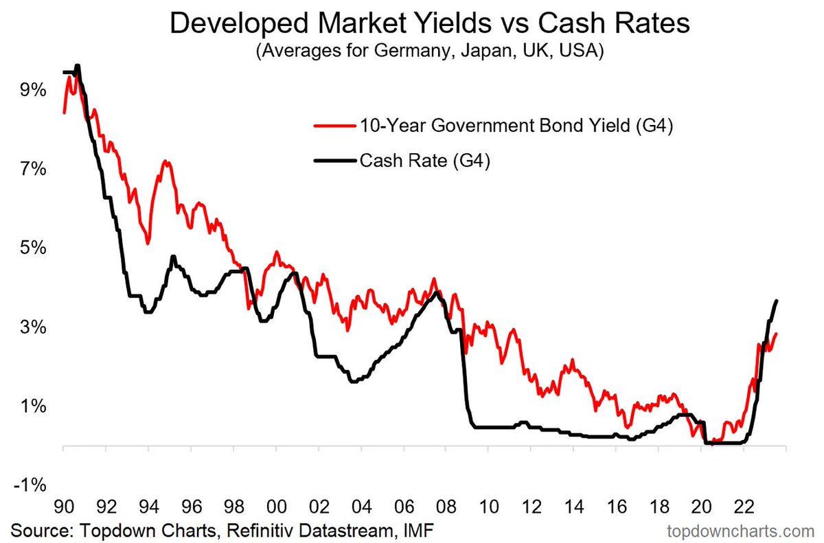 Last week we looked at a few different indicators, but one of the more interesting charts is this one here showing developed market 10-year government bond yields vs monetary policy rates.
 We can clearly see how it was justified for the Fed to cut rates into the pandemic (perhaps even more than it did)… but that they should have removed the emergency measures shortly after reopening
 Before we get into this chart, check out the original post here, for reference: topdowncharts.substack.com/p/chart-of-the…
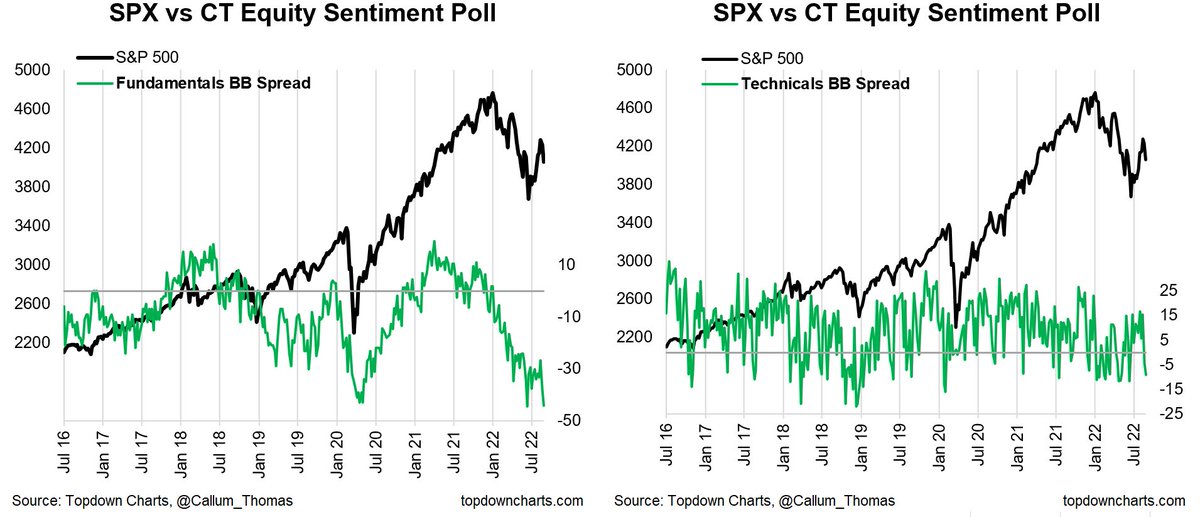
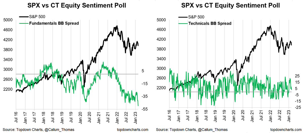 This is the result of both "Bearish (Fundamentals)" reaching a new high, and "Bullish (Fundamentals)" reaching a new low.
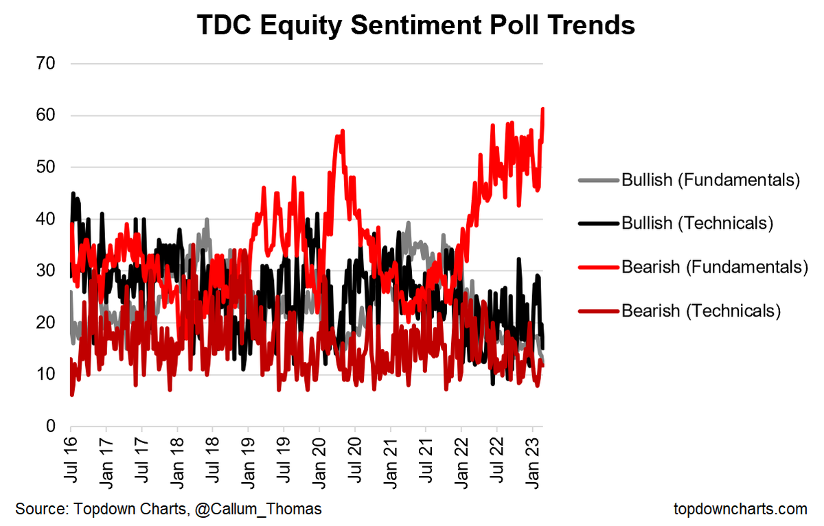
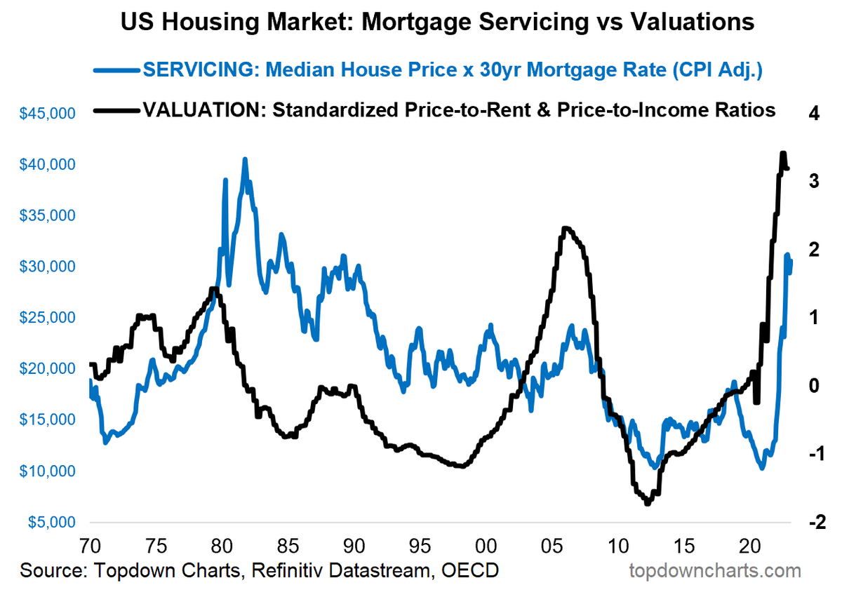 It’s remarkable to note how the inflation-adjusted servicing cost indicator for new mortgages (after rising 3x off the lows) is now on par with levels seen during the 80’s …back when housing market valuations were slightly cheap vs record expensive now
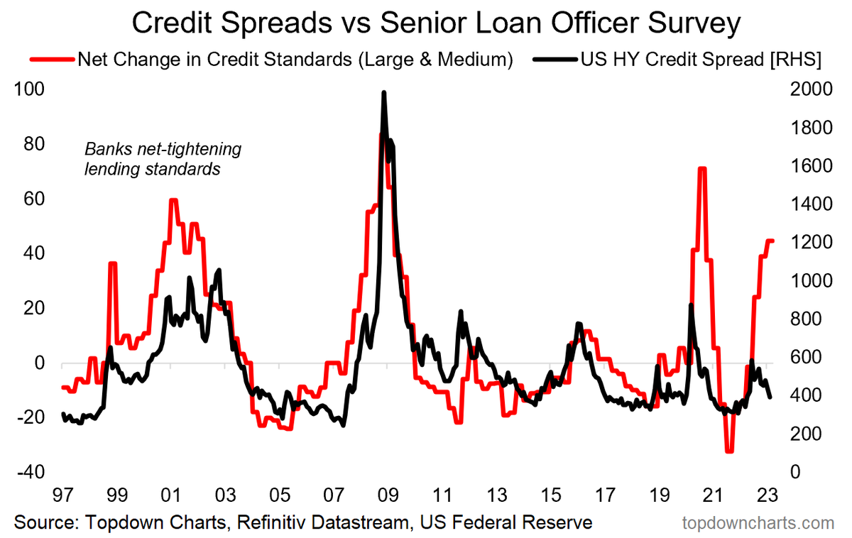 The just released quarterly bank loan officer survey showed banks continuing to tighten lending standards across the board and likewise expecting lower demand for new loans as economic storm clouds loom...
 Bond fundamentals sentiment sharply lower (thanks to strangely resilient economic data e.g. payrolls, ISM services)
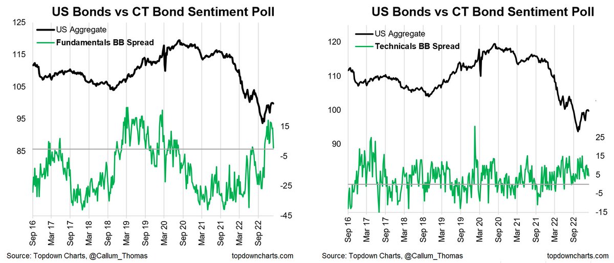
 I could probably leave it there as the chart itself speaks volumes, but a few points to ponder…
 When sentiment gets that depressed it doesn't take much of an excuse to turn things around, even at least if just short-term (and risks do remain).
 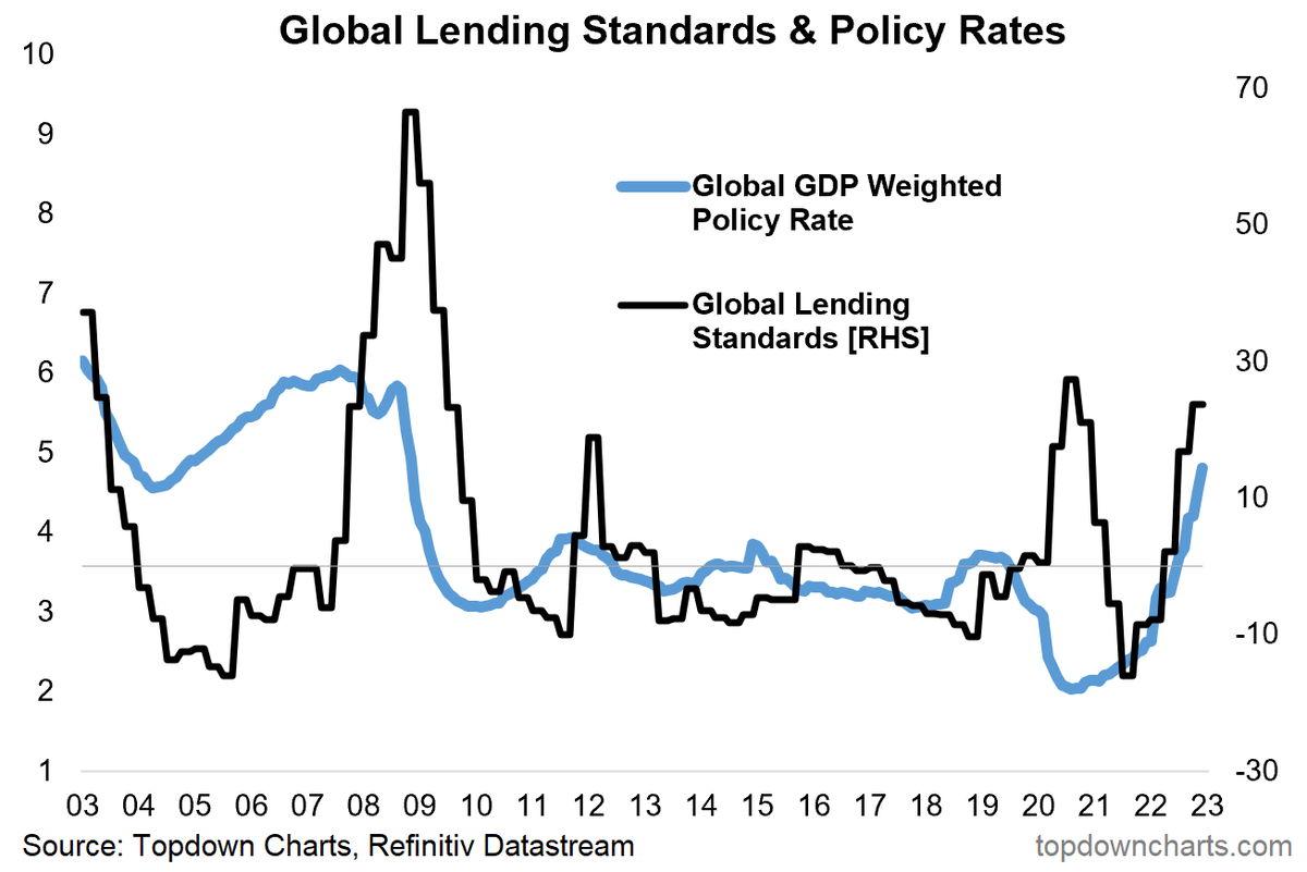 So it's a situation of even if you can get a loan, you might not be able to afford it!
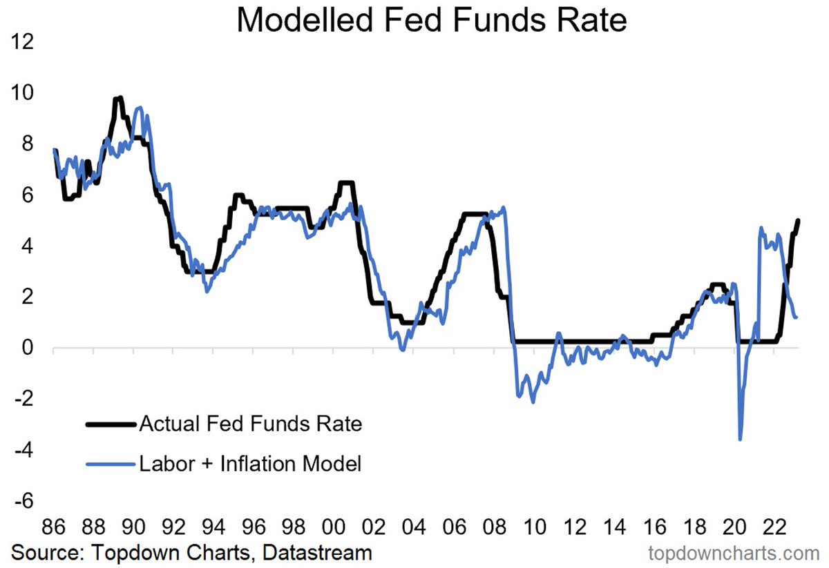
 The key takeaway from that is whether you group leading indicators by type/factor, geography, or forecast window — they are all unanimous in pointing to a sharp downturn heading into early-2023.
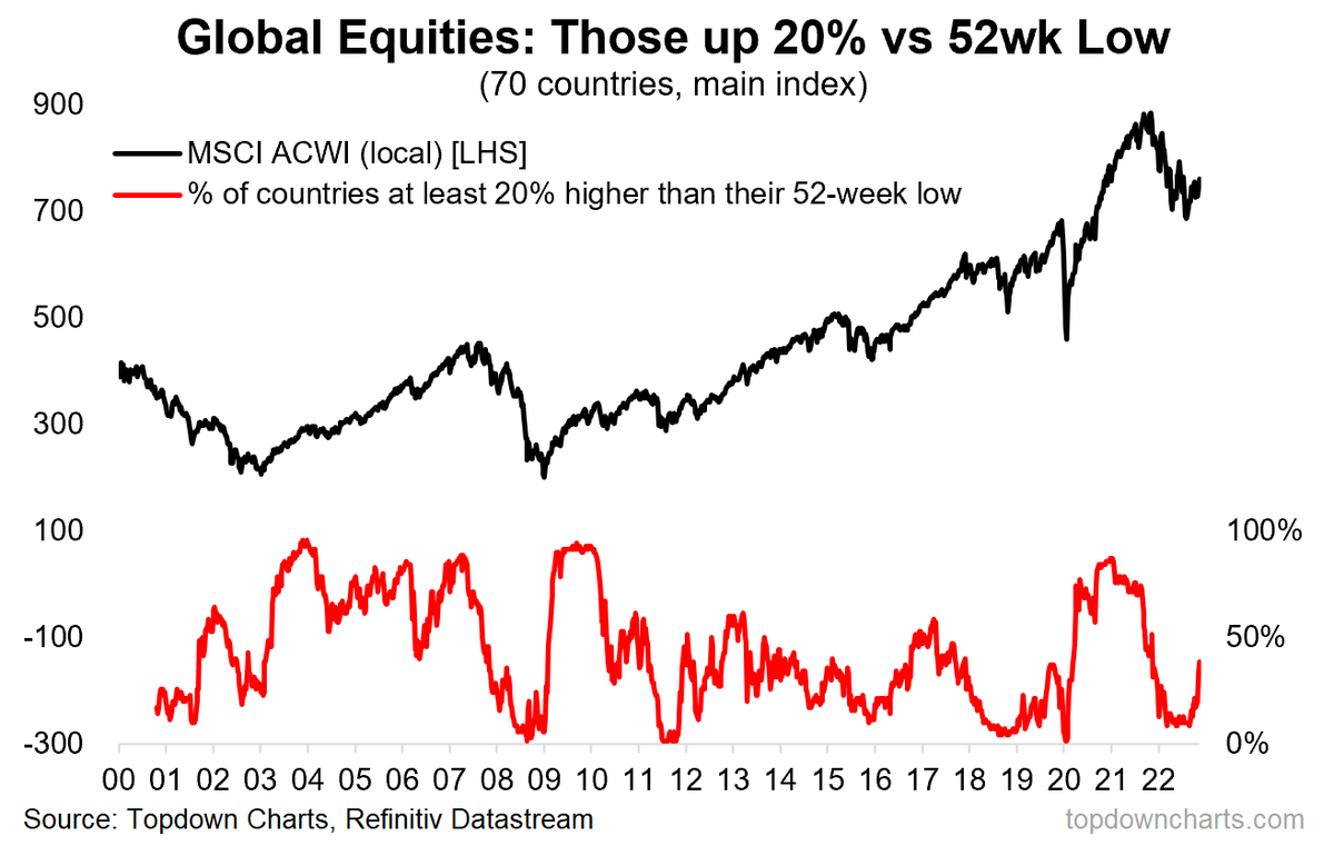 By itself it is an interesting observation, and it’s quite a mix of countries too (from LatAm, Europe, Middle East, Asia)
 The latest developed markets flash manufacturing PMI
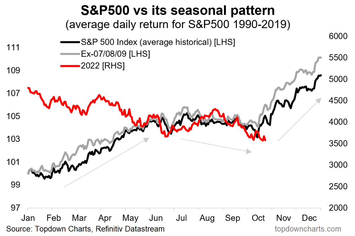
 The chart shows aggregated trading activity in inverse/short equity ETFs which seek to benefit from declines in stock prices.
 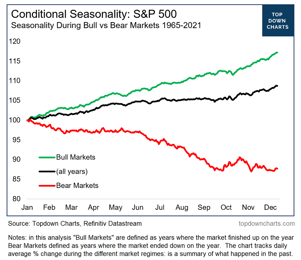 All of those sayings are based on statistical analysis of historical movements in stock prices..
 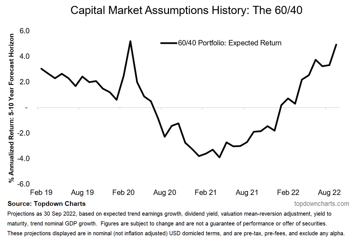 You might recall I shared a chart a couple of weeks ago which showed the 60/40 weighted average valuation indicator going from record expensive in December last year to now slightly cheap.
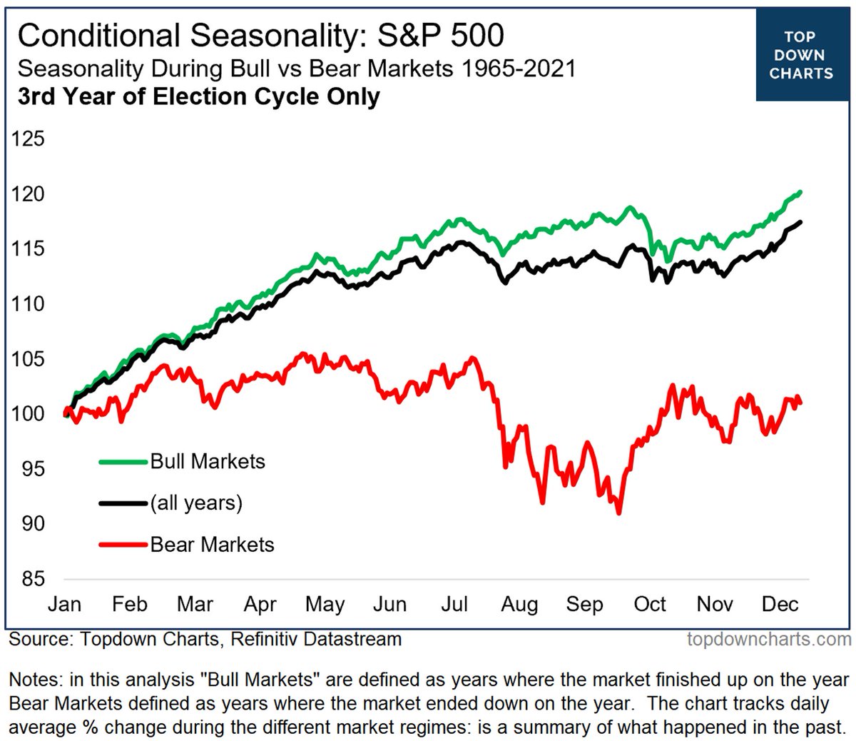
 The typical tendency for stocks is to rally in Q4.
 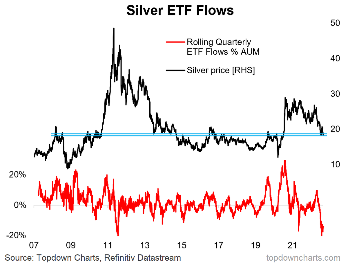 Silver Shock: As you might have seen, silver had a dream run in 2020. And well, to be fair, most markets mooned back then riding the tides of extreme monetary stimulus and a hoard of newly minted day traders...
 Bond survey saw fundamentals sentiment dip on tighter Fed, inflation risk, but technicals sentiment ticked up (and trending higher).
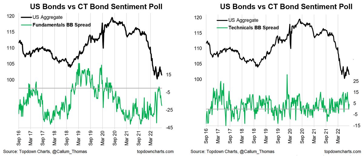
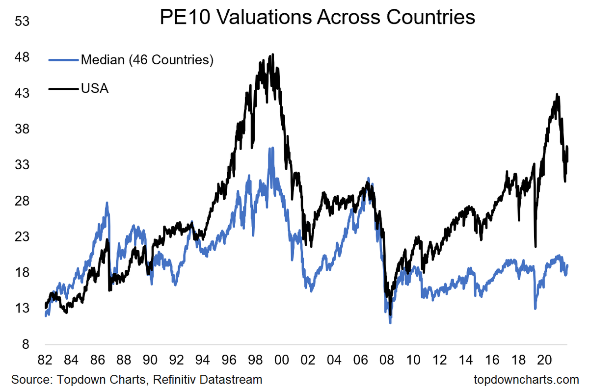 This chart shows the price vs trailing 10 year average earnings (in order to smooth out the distortive effects of cycles and shocks) for the USA, and for the median of the 46 countries I keep track of.
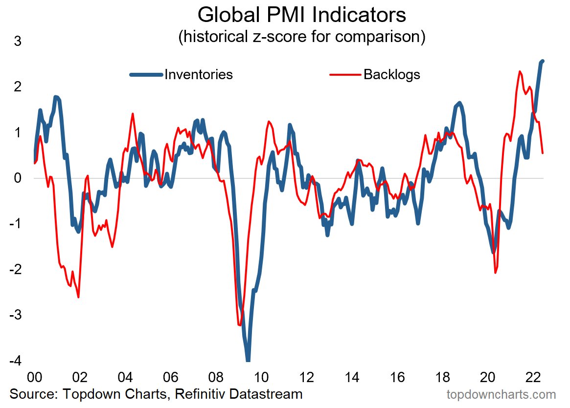 Part of this may well be a transition from the old “Just in Time“ method of inventory management, which was one of many reasons/vulnerabilities that contributed to the chaos and disarray of the pandemic supply chain hell… to more of a “Just in Case“ inventory management strategy