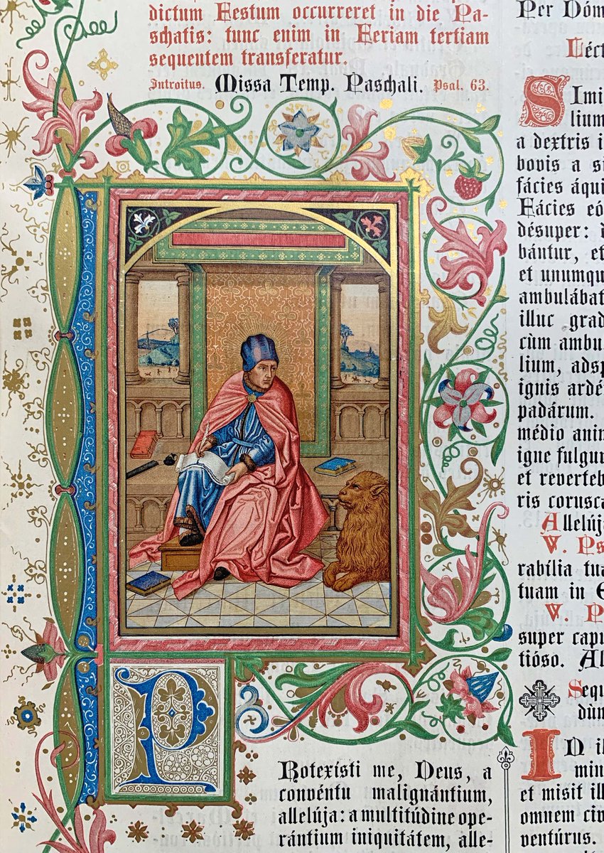
Heinrich Reiss's Missale Romanum, printed in Vienna in 1872, is a breathtaking masterpiece of Neo-Gothic book production which is astonishingly little known today even in the German-speaking world. 1/6
Reiss spent years studying medieval manuscripts and illuminated incunabula at the former Vienna Court Library and in libraries in Bavaria. He synthesised this all to produce his missal, which incorporates an astonishing variety of chromolithographed ornament and illumination. 2/6
The quality and perfection of the illumination, the artistic taste with which it's all put together, and the superb printing on fine paper - all this puts this book in a class of its own, far superior to anything produced by the much better known liturgical printer Pustet. 3/6
It seems likely to me that Reiss based his gorgeous sinuous vine borders on the work of the Fust Master, renowned as one of the illuminators of the Gutenberg Bible, the 1457 Psalter and other early products of the Mainz press. 4/6
The quality of the printing throughout is remarkable. The main text printed in jet-black, red and blue is beautifully typeset, and the chromolithographs are magnificently detailed with remarkably vibrant colours - look at the brilliant orange robe of St Barnabas below! 5/6
Reiss died just three years after completing the book, without ever achieving the Europe-wide recognition he deserved.
My copy of his remarkable folio missal was bound in crushed red morocco by Antoine Chatelin, a French book binder who relocated to London in around 1852. 6/6
I can't resist posting a few more illuminations from Reiss's magnum opus.
The richness, elegance, and refinement of the illuminations take your breath away. This is no crude medieval pastiche, but a reimagining of the illuminated missal imbued with the self-confidence of 19th century technical innovation. Reiss, quite simply, created a masterwork.
• • •
Missing some Tweet in this thread? You can try to
force a refresh
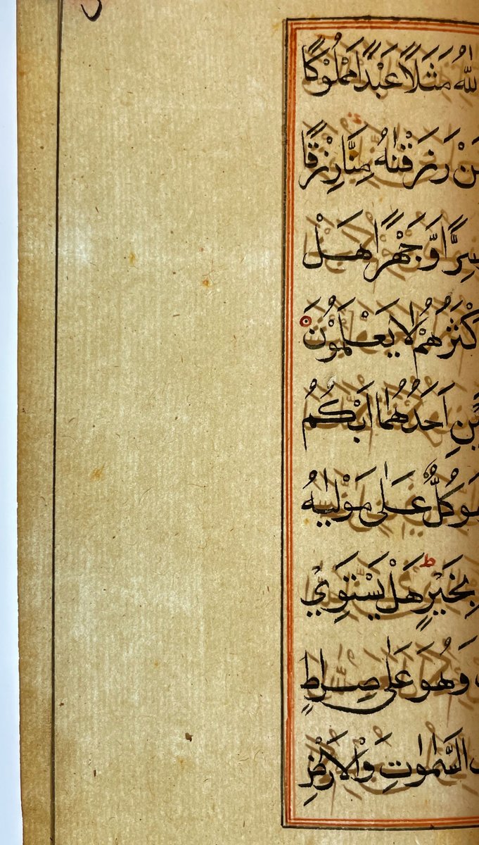
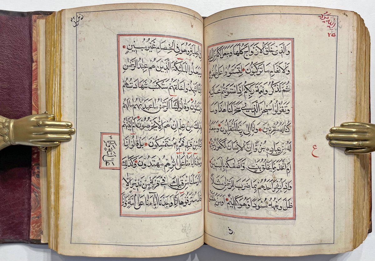
A large and luxurious finely-bound 18th century Qur’an, written in black and red in very fine naskhi in an austere, entirely undecorated style, described by Maggs in 1939 as "in the style peculiar to the islands of the Indian Ocean." Possibly originating from the Maldives. 1/
The binding is 18th century red Morocco with a fore-edge flap, very elaborately gilt-tooled with floral designs. The design shows some non-Islamic influences, and may have been executed in a workshop in southern India, possibly one attached to a mission press. 2/
It's a massive tome, 650 folios, on good quality burnished unwatermarked paper, almost certainly of Indian manufacture. The essentially complete absence of any decoration throughout is unusual and very striking. 3/
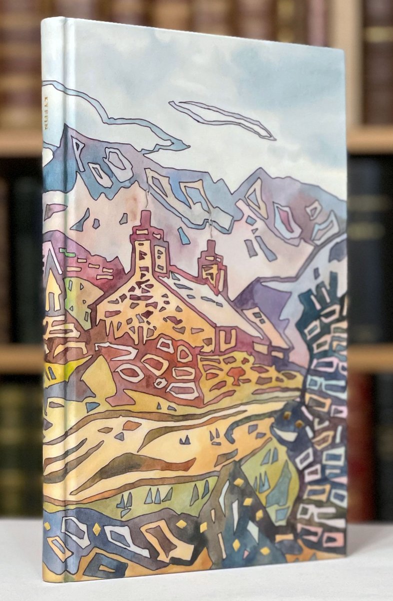
Kyffin: A Celebration - Gwasg Gregynog, 2007.
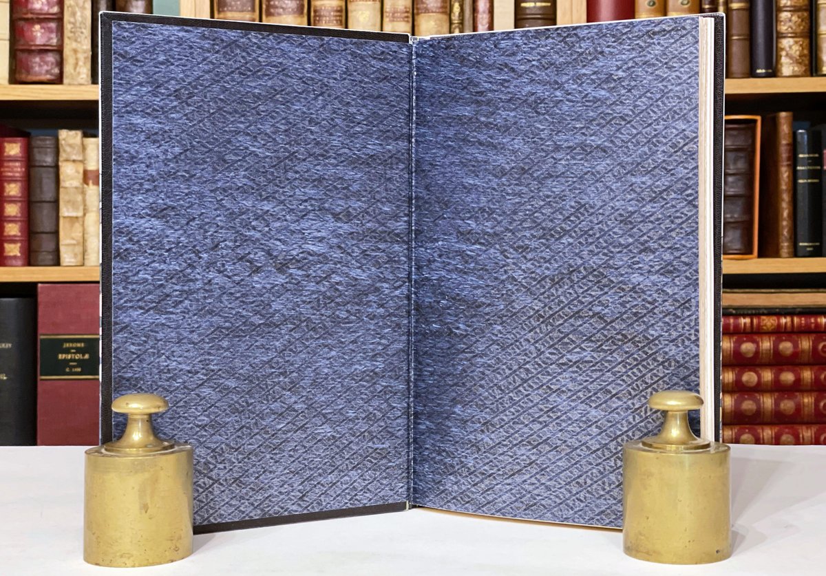
Bound by Stuart Brockman in 2007 in translucent vellum over an original watercolour painting and tooled with chimney smoke in palladium, punctuated with gilt diamond shaped tooling; deep blue and silver patterned endpapers. 1/
A tribute to Kyffin Williams's art with a striking image of a Welsh village stretching across both boards.
Brockman has here brought the "vellucent" technique of translucent vellum over painted boards - first developed by Chivers of Bath around 1903 - into the 21st century. 2/
The Bath bookbinder Cedric Chivers first patented his "vellucent" method of art-bookbinding in 1898. An artist would paint on a thin surface medium; then a sheet of vellum, shaved to translucent thinness, was laid over it, giving the underlying painting a luminous warmth. 3/
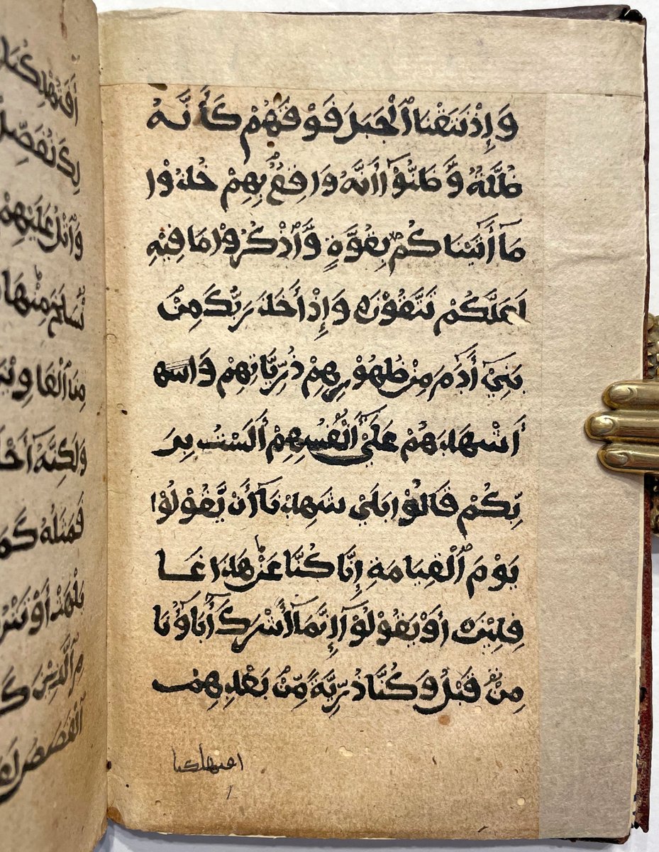
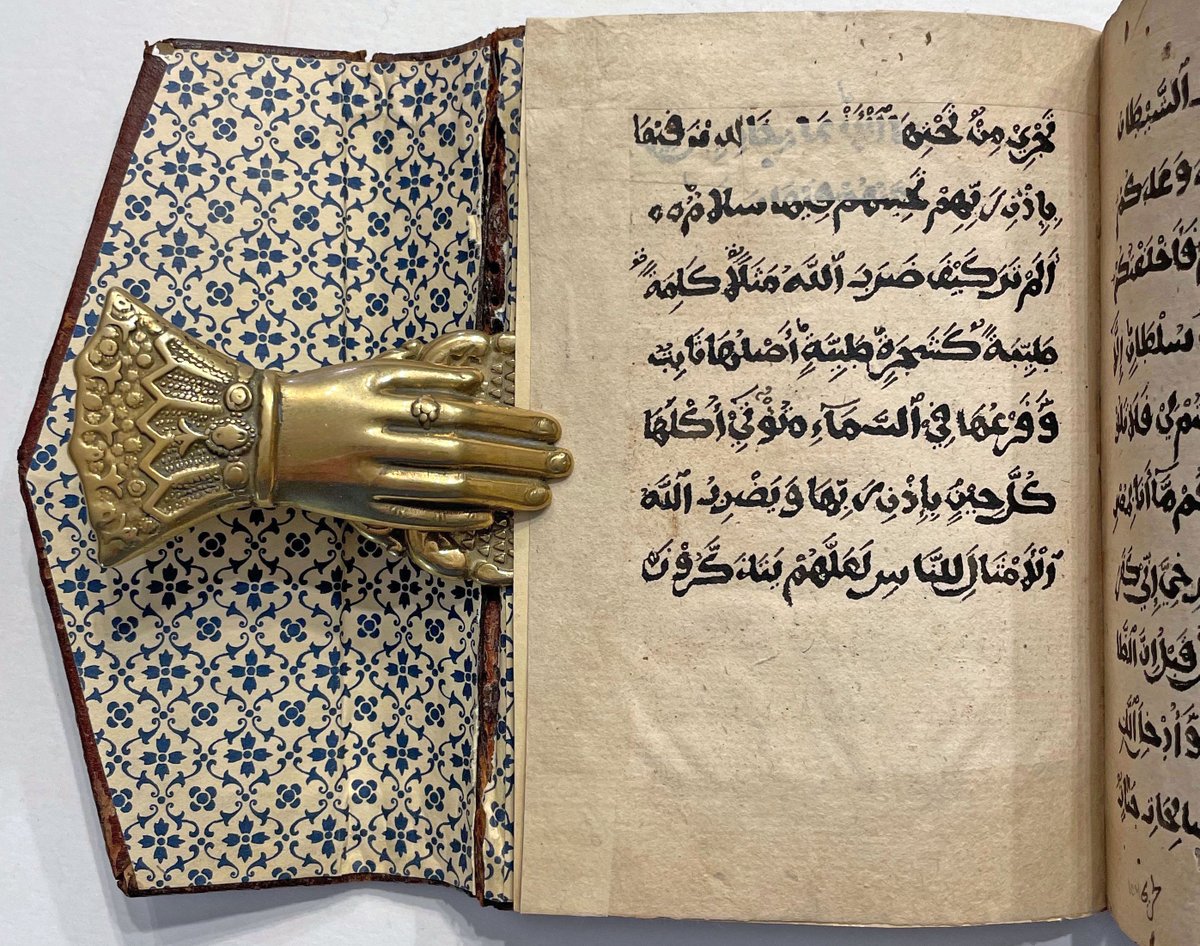
An unusual Somali Qur’an section, copied in a script quite distinct from the majuscule Arabic scripts used either along the Swahili coast or in West Africa, carefully but austerely written by an unnamed holy man in the town of Afgoi in the late 19th or early 20th century. 1/
The text is presented as a continuous block, 10 lines of thick majuscule per page, intended for a reader familiar enough with the Qur’an that it foregoes division markers of any kind - there are no marginal division markers, surah headings, or verse markers. 2/
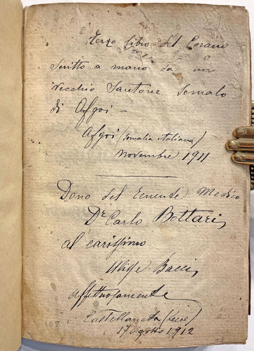
There's a half-page of Arabic prayers on f.1r and two Italian inscriptions at the end: the first records that this Qur’an section was copied by a holy man in the town of Afgoi in Nov. 1911; the second is a presentation inscription from Dr. Carlo Bottari, dated 17 August 1912. 3/
Joumana Medlej's @joumajnouna "The Canticle of Creatures", a calligraphic rendering of St Francis of Assisi’s Canticle of Creatures in Arabic, in the Eastern Kufic style and materials of the Qarmatian Qur’an, written using mineral, foraged earth & plant pigments, 2021. 1/
Also called Laudes Creaturarum [Praise of the Creatures] or the Canticle of the Sun, Francis' work was composed around 1224 in Umbrian, his native Italian dialect. The script Joumana has used here is based on that of the Qarmatian Qur’an, made in Central Asia, circa 1180. 2/
"Praised be, o God, for Sister Air and the wind and clouds, and clear skies and all weathers, with which you nourish Your creatures.
Praised be, o God, for Brother Water, who is useful and humble, precious and pure." 3/
Kaladlit Okalluktualliait - edited by Hinrich Rink & printed by Lars Møller at Godthåb in Greenland in 1859-63.
These 4 volumes of Greenlandic folktales, illustrated with remarkable woodcuts by an Inuit artist, are amongst the rarest & most extraordinary of exotic imprints. 1/
The text is in both Danish & the Kalaallisut dialect of the Greenlandic language. In the first two vols the illustrations - 30 woodcuts - were supplied by an Inuk named Aron of Kangeq, a sealer & walrus hunter who lived at the Moravian mission at the trading station of Kangeq. 2/
This set has the ex-libris of the great Anglo-Danish collector Bent Juel-Jensen, who wrote: "this is far and away the biggest and the most important undertaking of the little early press at Godthaab, Greenland. Its importance rests on the Greenlandic tales which otherwise... 3/
This is the 2001 English first edition of the - utterly batshit -Ruhnama (Book of the Soul), written by Saparmurat Niyazov, President of Turkmenistan from 1990 to 2006, intended to serve as the "spiritual guidance of the nation" and the "centre of the Turkmen universe". 1/
The Ruhnama was introduced to Turkmen culture in a gradual but eventually pervasive way. Niyazov first placed copies in the nation's schools and libraries but eventually went as far as to make an exam on its teachings an element of the driving test. 2/
It was mandatory to read Ruhnama in schools, universities and governmental organisations. New governmental employees were tested on the book at job interviews. 3/