Alasdair Rae Profile picture
Dec 13, 2019 6 tweets 3 min read Read on X
An updated constituency/deprivation chart for England for the 2019 general election - looks quite different to before. See following tweets for comparison with 2017 and 2001 #ge2019 #ge2019data Image
@BrownPhilip here are the 2017 and 2001 versions of the same chart, side by side (2001 on the right stands out visually as proper red wall stuff) Image
@BrownPhilip and here's a quick and dirty gif comparing 2001, 2017 and 2019 (2 seconds per frame)
@BrownPhilip and note these bits from my piece on the earlier versions of this graphic citymetric.com/politics/i-ran… ImageImage
just need to add that what we refer to in the UK as 'deprivation' is similar to what others might call disadvantage or similar - so in US context, for example, areas on the left of the chart would be perhaps rust belt towns, parts of Appalachia, Mississippi and so on
the so-called red wall in 2001 was interrupted by just a single orange block, quite striking from today's vantage point Image

• • •

Missing some Tweet in this thread? You can try to force a refresh
 

Keep Current with Alasdair Rae

Alasdair Rae Profile picture

Stay in touch and get notified when new unrolls are available from this author!

Read all threads

This Thread may be Removed Anytime!

PDF

Twitter may remove this content at anytime! Save it as PDF for later use!

Try unrolling a thread yourself!

how to unroll video
  1. Follow @ThreadReaderApp to mention us!

  2. From a Twitter thread mention us with a keyword "unroll"
@threadreaderapp unroll

Practice here first or read more on our help page!

More from @undertheraedar

Apr 4
I saw this Met Office 'UK climate districts map' online so naturally I decided to try and figure out the population of each area whilst eating my lunch and these are the incredibly interesting results
Image
Image
there is also the Met Office "climate regions" map but that's a can of worms that I don't want to open, not least because of the unwavering England N / England S line

metoffice.gov.uk/research/clima…
Image
when you plonk the Met Office climate districts on top of a map then you get something like this Image
Read 10 tweets
Feb 6, 2023
Okay, some European population density stuff now - starting with the top 100 1km grid squares by population across Europe, based on the most recent Eurostat data - more to follow
these are the top 3 by density, but I've shared a web folder with all 1km grid squares with more than 30,000 people living in them, as well as the top square in each of the 38 countries in the dataset

drive.google.com/drive/folders/…
they're all really interesting to me, but I particularly liked Gijón, Bucharest and Valletta
Read 35 tweets
Jan 13, 2023
Topical retweet because I've been watching The Rig but also the news - I remember first seeing these when I was about 10 when playing football in Invergordon and we couldn't believe the size of them
if you want to get a sense of the scale, look at the size of the people cutting up this old rig in Invergordon last summer
the Cromarty Harbour folk have done some nice street view imagery of the firth, e.g.

google.com/maps/@57.68775…
Read 4 tweets
Jan 13, 2023
Another very interesting recent England and Wales Census 2021 release is the passport data, so here's a map of % with no passport at MSOA level, will add a couple more below
these are all the different columns in the dataset (TS005Passports held) and the patterns are quite interesting, although I've only done a few maps as a way to explore the data

nomisweb.co.uk/sources/census…
the % with Irish passport map looks like this - probably about what I'd have expected
Read 11 tweets
Jan 6, 2023
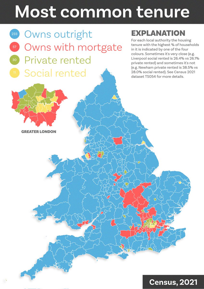
Today's census map shows the most common housing tenure in each local authority in England and Wales 🏡
I'm working on my spelling of mortgage, probably due to the shock of seeing how many households own without a mortgage!
most common by area is of course a very first-past-the-posty representation of things but I'm interested in the pattern precisely because of this - will fix typo later, perhaps I should do by constituency too
Read 11 tweets
Jan 5, 2023
More Census age data today - a little animation of % by single year of age in each local authority. Probably needs a few watches to sink in - lots in here - but the final 10 seconds I find quite sombre, and you'll NEVER guess when lots of people leave home
and, just to go all dataviz retro, here are all the frames as small multiples
nerd note: lots of ways to make small multiples from image sets but I tend to use ImageMagick, and the image above was created using this command:

montage *.png -tile 10x10 -geometry +5+5 age-by-year.png

Once you have a set of files it only takes a few seconds to run
Read 4 tweets

Did Thread Reader help you today?

Support us! We are indie developers!


This site is made by just two indie developers on a laptop doing marketing, support and development! Read more about the story.

Become a Premium Member ($3/month or $30/year) and get exclusive features!

Become Premium

Don't want to be a Premium member but still want to support us?

Make a small donation by buying us coffee ($5) or help with server cost ($10)

Donate via Paypal

Or Donate anonymously using crypto!

Ethereum

0xfe58350B80634f60Fa6Dc149a72b4DFbc17D341E copy

Bitcoin

3ATGMxNzCUFzxpMCHL5sWSt4DVtS8UqXpi copy

Thank you for your support!

Follow Us!

:(