Portfolio advice, from a lead who hires #ConceptArt
I wrote this after a weekend of portfolio reviews,
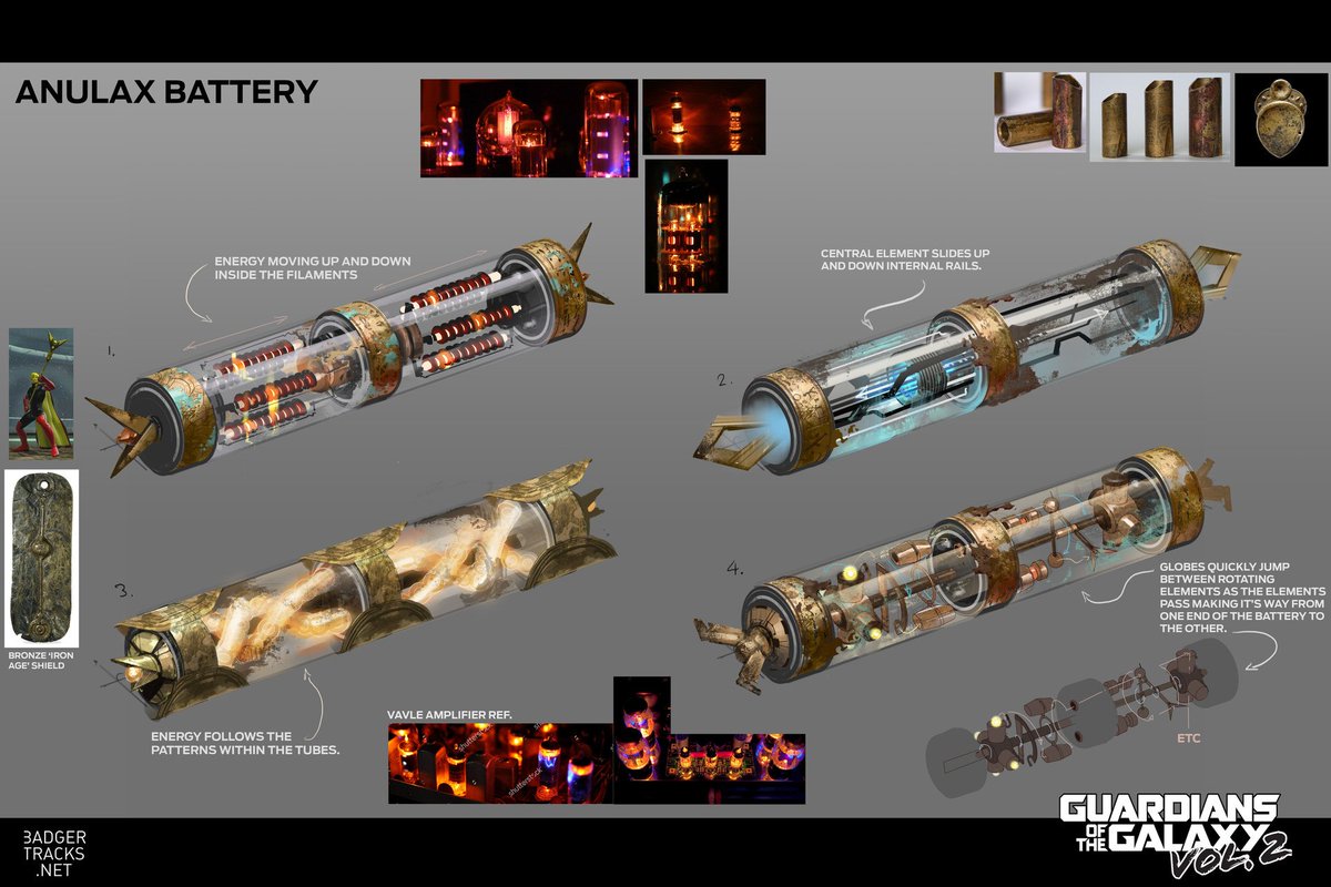
1. Like a maths exam, please please show your working. I want to see thumbs options, mid options and of course a final design.
#gamedev


I wrote this after a weekend of portfolio reviews,
1. Like a maths exam, please please show your working. I want to see thumbs options, mid options and of course a final design.
#gamedev


2. Arrange your portfolio, I don't want to bounce about between subject matter and pipeline.
Your portfolio's narrative should be as strong as your work...
Your portfolio's narrative should be as strong as your work...
3. Please make worlds that excite the viewer, make them want to go in and explore them, explain to them the interesting parts of the town, or the way the character's hat unfolds. How will this draw the viewer in?
4. As I've said before the majority of your project work is explanatory not mood, make sure your portfolio contains explanatory work.
Explained here -
Explained here -

5. A lot of beautiful post apocolyptic paintings, , but 80% of realistic games and film, we just give the environment artists photo ref, they are capable artists in their own right.
Different work in stylised where you do need to create rules for how things can be translated.
Different work in stylised where you do need to create rules for how things can be translated.
6. Production art contains call out sheets, material references and flat graphics. This doesn't have to be your final image, but it should support it. 


7. Design characters on a swatch(es) of the environment they will be viewed in. Not on white.
I make swatch backgrounds from screenshots, it avoids assumptions that damage readability.
I make swatch backgrounds from screenshots, it avoids assumptions that damage readability.
8. Reverse of this, put people in your environments, show me the scale.
9. It's not a deal breaker for a review, but if you intend to get a job, please show me your work on a screen larger than a smartphone (print outs probably the cheapest option with the best battery life)
10. Please have your contact details clearly visible, and by that I mean email address, I will not pass your social media contact on, I cannot input your form into my tracking system.
EMAIL ADDRESS emblazoned and bake it in, sometimes recruiters do funky stuff to pdfs
EMAIL ADDRESS emblazoned and bake it in, sometimes recruiters do funky stuff to pdfs
11. Your portfolio will never feel done, not to you anyway. You will have learnt from your latest pieces and want to apply it to older work.
But we know art is a journey. Send your portfolio anyway.
I've been in the industry 10+ years and my portfolio is still not 'finished'.
But we know art is a journey. Send your portfolio anyway.
I've been in the industry 10+ years and my portfolio is still not 'finished'.
12. If you are applying to an environment centric Concept Art position then please vary your times of day!
Golden hour is cool but show me some happy sunny days, looming overcast days, what about at night?
Vary your weather too! Sunny snowy day? Rainy Spring day? Stormy night?
Golden hour is cool but show me some happy sunny days, looming overcast days, what about at night?
Vary your weather too! Sunny snowy day? Rainy Spring day? Stormy night?
13. If you are applying for a character centric Concept Art role then please ensure your portfolio shows a variety of body types and ethnicities.
14. Designing characters for games? Please show back views and feet (!)
Many potfolios contain only front views. This is a problem because:
1. You haven't shown you are considering the design from all angles.
2. In many games rear view is the main view.
3. Stop cropping feet.
Many potfolios contain only front views. This is a problem because:
1. You haven't shown you are considering the design from all angles.
2. In many games rear view is the main view.
3. Stop cropping feet.
15. If you are entry / graduating and looking at Portfolios to compare content and standard of yr own work too, look at hired grad/junior artists as opposed to seniors
Seniors and leads often have old or personal work in their portfolio which isnt representative of the day job
Seniors and leads often have old or personal work in their portfolio which isnt representative of the day job
16a. Show clearly the intended use case for your Concept Art.
Mention the game type in the description.
Are these player character designs for a 3rd person adventure game? Then more back views please. Bonus points for diagetic ways of showing health / equipment / role etc.
Mention the game type in the description.
Are these player character designs for a 3rd person adventure game? Then more back views please. Bonus points for diagetic ways of showing health / equipment / role etc.
16b. Are these designs for an FPS? Then really the player view of the gun needs to sell the player style/ choices, in an FPS your weapons are almost your character.
Are these world designs? What's the view distance? For an RTS your shapes need to read from above & a distance.
Are these world designs? What's the view distance? For an RTS your shapes need to read from above & a distance.
16c. The lack of clarification means I am judging the design in isolation, which both harms the design (you might be considering the backview of a char as the main adventure character.) Or an NPC, their waist up expressions may be important for conveying exposition and mechanics.
16d. Concept art is not separate from gameplay, great concept art serves the game team before it is a good illustration.
• • •
Missing some Tweet in this thread? You can try to
force a refresh


