
Everyone knows about the importance of volume but how can we detect anomalous volume on the charts?
The goal of this thread is to discover just that
The goal of this thread is to discover just that
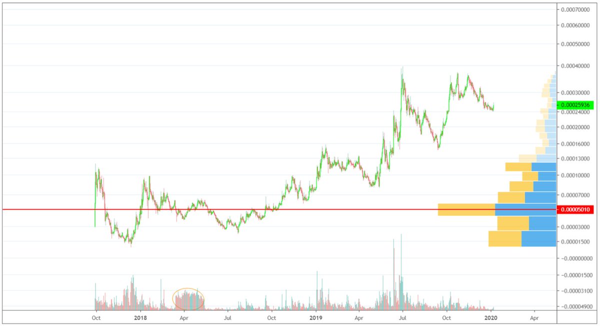
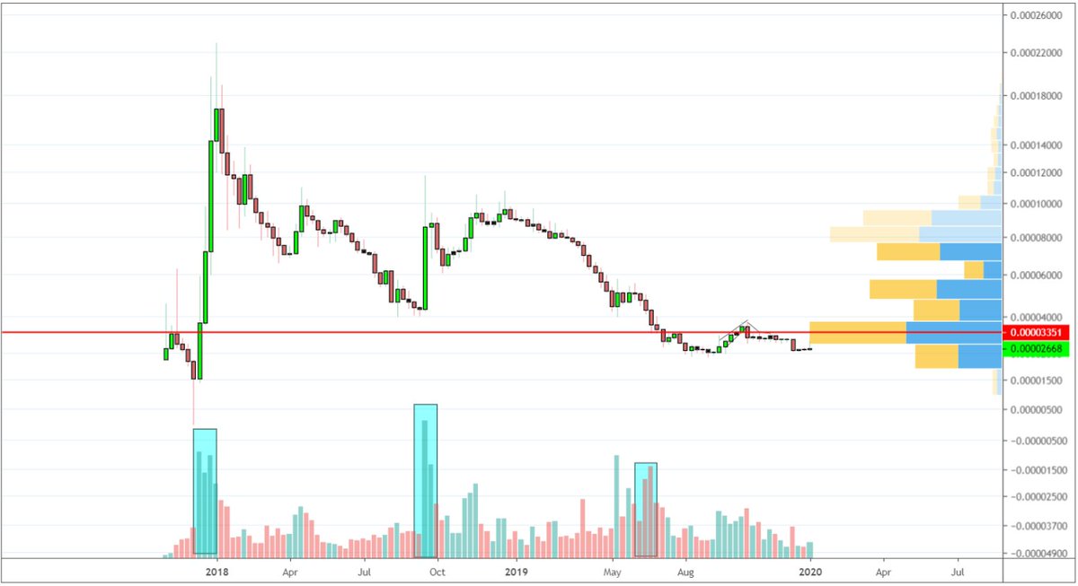
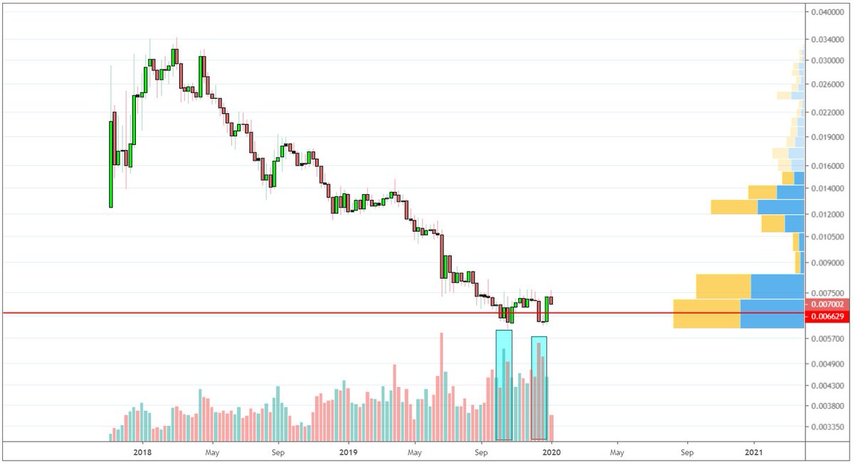
This idea came about after coming across the following chart
You can see clear signs of accumulation in the form of those high volume spikes coming into 2020 but how can we automate such process?
Is anomalous volume for 1D enough? Or do we need to aggregate into 3D? Maybe 1W?
You can see clear signs of accumulation in the form of those high volume spikes coming into 2020 but how can we automate such process?
Is anomalous volume for 1D enough? Or do we need to aggregate into 3D? Maybe 1W?

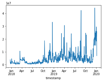
First we need to get the data from the exchange, in this case #Binance
Having a quick glance on data retrieval from Binance using Python, it took me about 1h to get the volume data from this pair
Here it is
Hmm so spiky and unclear, let's see if we can make sense of it
Having a quick glance on data retrieval from Binance using Python, it took me about 1h to get the volume data from this pair
Here it is
Hmm so spiky and unclear, let's see if we can make sense of it
Currently attempting to plot basic statistical analysis on this however I believe the trigger lies somewhere in variance and the normal distribution graph
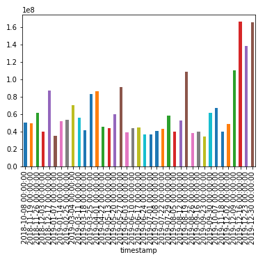
Currently I managed to select the trading weeks with above average volume but that is not very sophisticated
Currently I managed to select the trading weeks with above average volume but that is not very sophisticated
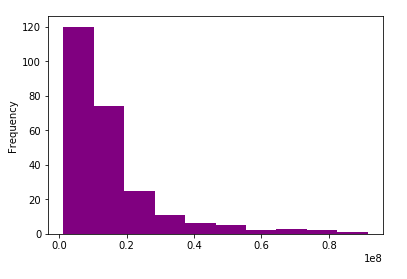
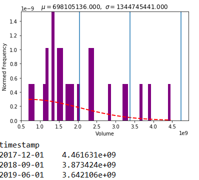
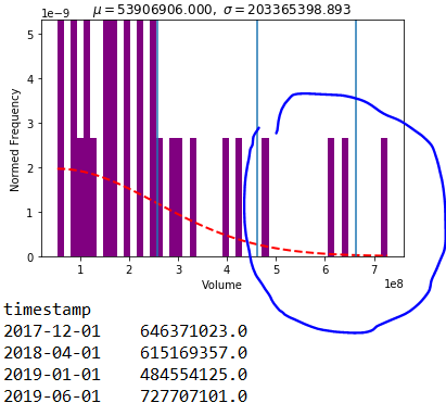
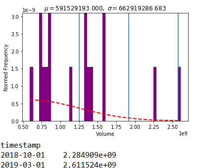
Taking a look at the 3D volume distribution
We clearly see in the following histogram that there is a pattern in here :)
We clearly see in the following histogram that there is a pattern in here :)
The current point I'm stuck is which probability distribution function should I use to measure the volume outliers
At the moment I'm considering the following distributions:
-normal
-half normal
-exponential
At the moment I'm considering the following distributions:
-normal
-half normal
-exponential
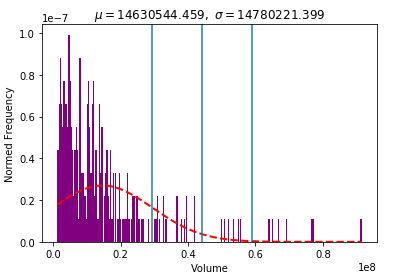
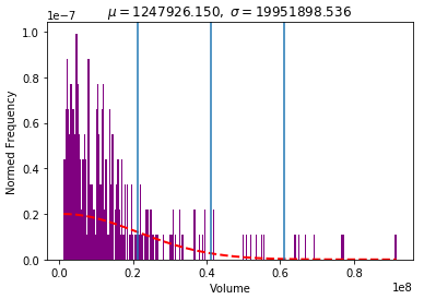
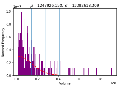
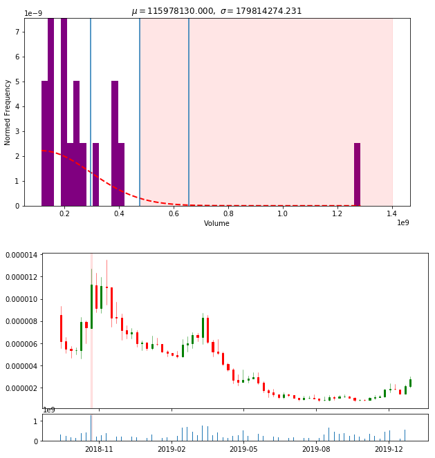
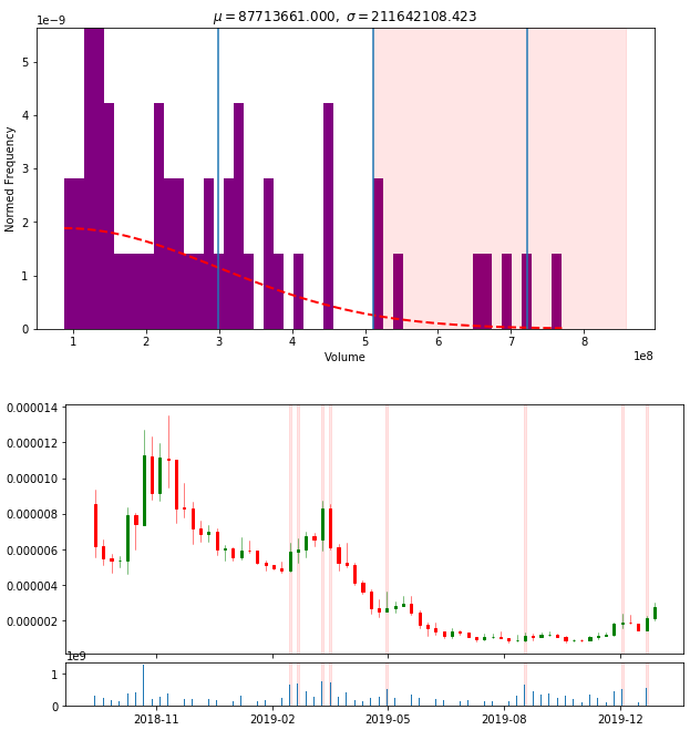
And here are the three charts.
The blue vertical lines represent σ, 2σ and 3σ respectively.
Interestingly all whilst the norm and half norm show 7 outliers, the exponential shows 15
Outlier here is a value higher than 3σ
The blue vertical lines represent σ, 2σ and 3σ respectively.
Interestingly all whilst the norm and half norm show 7 outliers, the exponential shows 15
Outlier here is a value higher than 3σ
The biggest mind bending concept is that these outliers are dependent on
Timeframe selected & chosen prob distribution
The first will impact the number of events found and the latter, will impact the 3σ and thus the level at which the event is considered an outlier
Timeframe selected & chosen prob distribution
The first will impact the number of events found and the latter, will impact the 3σ and thus the level at which the event is considered an outlier
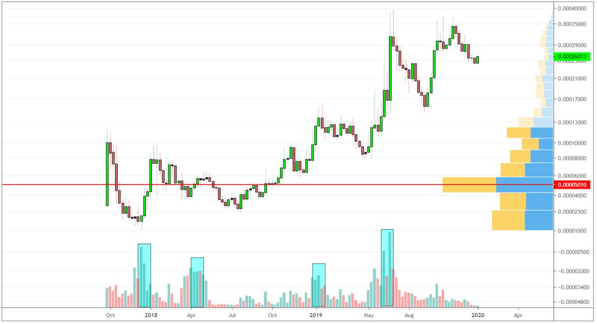
Also, the current algorithm will not find the highlighted region because historically it does not hold the highest volume days
At the same time, we can see that someone turned on the bot button and was accumulating this coin for a while
The challenge is to spot these too..
At the same time, we can see that someone turned on the bot button and was accumulating this coin for a while
The challenge is to spot these too..
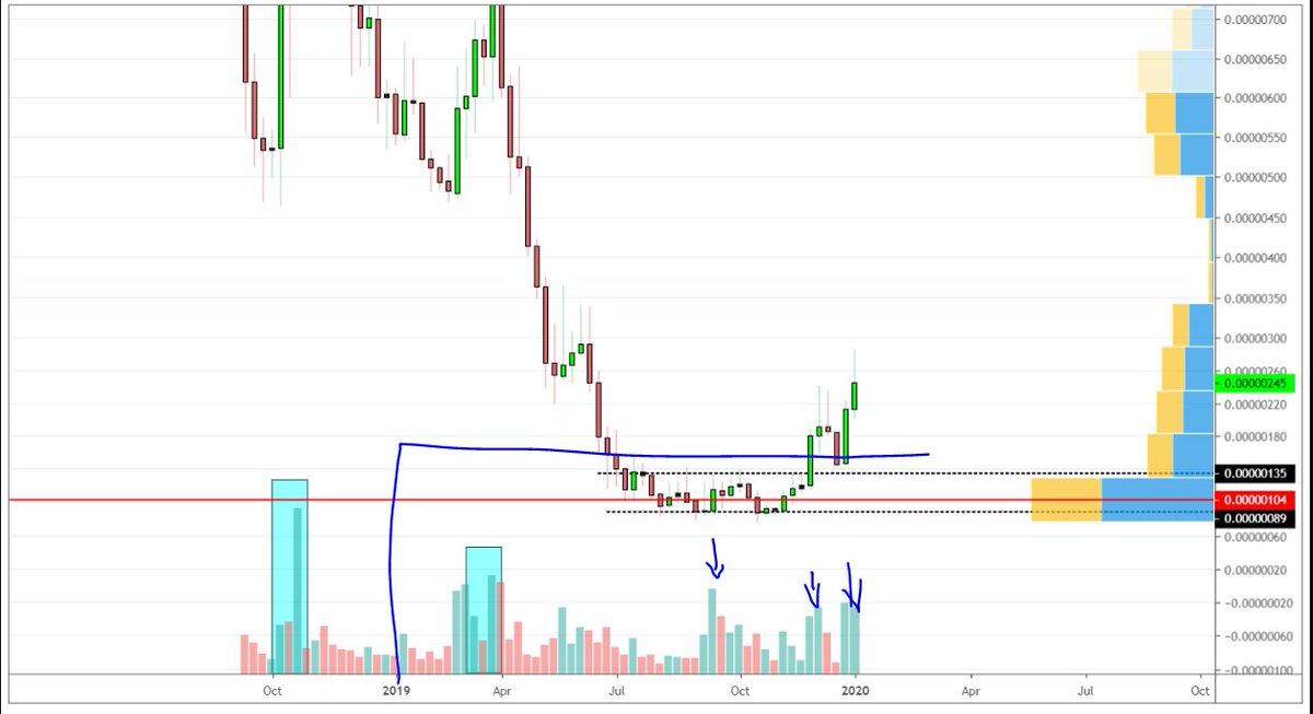
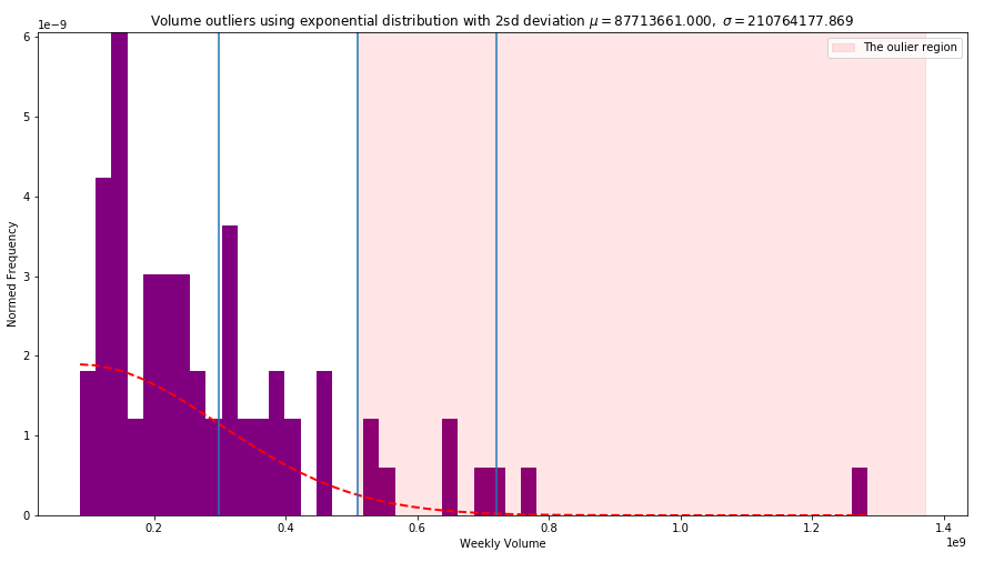
Alright, after playing with settings for a while, the monthly timeframe seems to be giving the desirable results in combination with the exponential distribution and changing the outlier setting to 2σ (previously it was set at 3σ
The outlier >2σ region is highlighted below
The outlier >2σ region is highlighted below
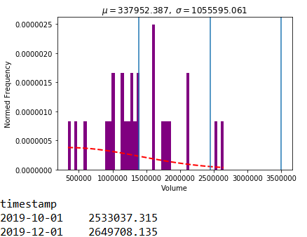
The second example here does not show the volume to be significant however
Perhaps if the dataset was split and analysed for each year, the highlighted arrows would be caught by our algorithm
Will try this out next, as well as graph the chart itself in Python so.. 1/
Perhaps if the dataset was split and analysed for each year, the highlighted arrows would be caught by our algorithm
Will try this out next, as well as graph the chart itself in Python so.. 1/
..2/ I don't have to draw these rectangle highlighting the volume each time
I'm feeling challenged and engaged but have other things to finish
Day has 2:30hr more
Let's see what I can do :)
I'm feeling challenged and engaged but have other things to finish
Day has 2:30hr more
Let's see what I can do :)
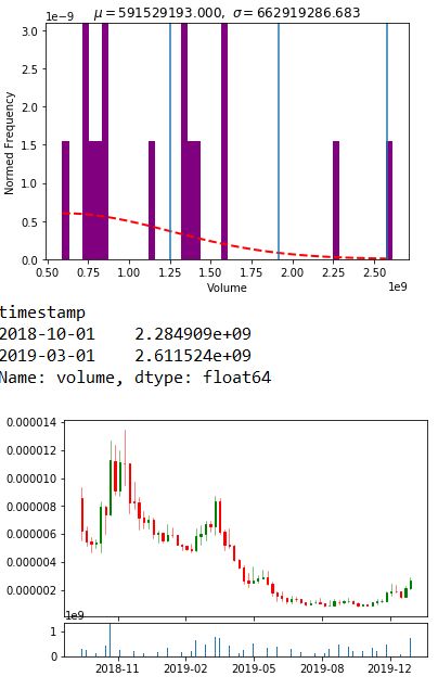
It took me a bit too long than I would like to but finally managed to graph the chart ohlc with volume as well
Next, I aim to highlight the outliers on the chart below
So I don't have to do it manually on TradingView
Everytime
Next, I aim to highlight the outliers on the chart below
So I don't have to do it manually on TradingView
Everytime
#feelsgoodman
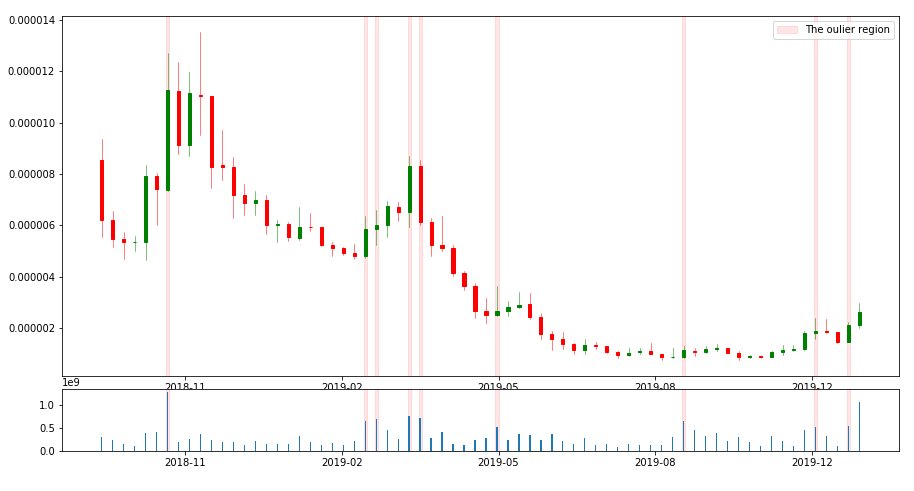
Outliers are highlighted on the histogram showing abnormal volume levels on chart n1
Below it, the outliers are highlighted historically
Outliers are highlighted on the histogram showing abnormal volume levels on chart n1
Below it, the outliers are highlighted historically
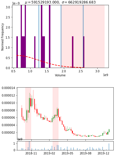
Outlier candles with 2 standard deviations using the exponential distribution on the weekly timeframe
Chart is plotted only for the year of 2019
ie. the highlighted regions represent outstanding weekly volume ONLY in 2019
Working on some presentation looks :)
Chart is plotted only for the year of 2019
ie. the highlighted regions represent outstanding weekly volume ONLY in 2019
Working on some presentation looks :)
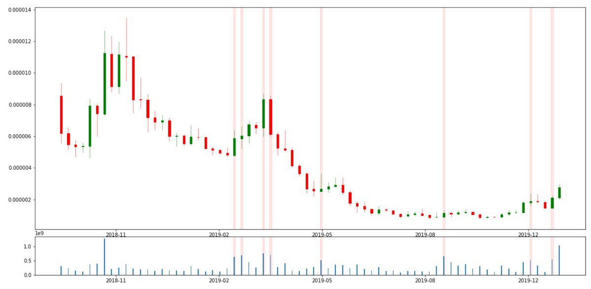
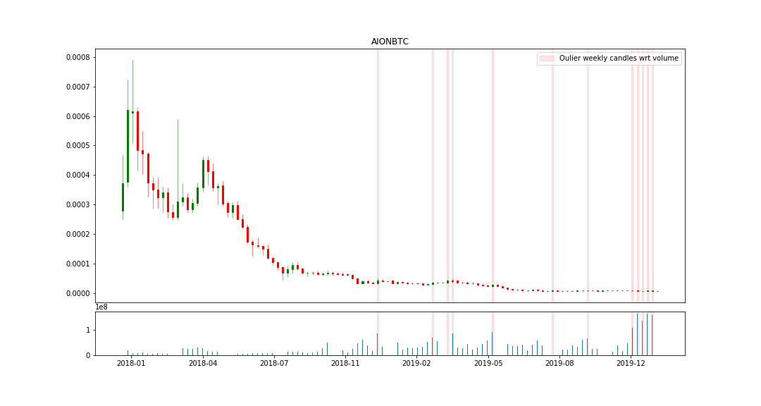
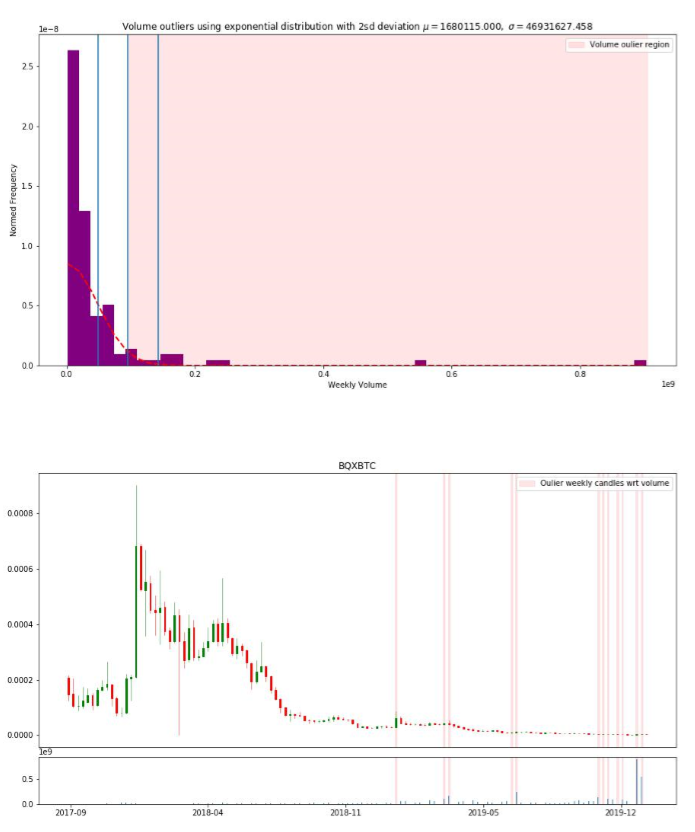
Lastly, just need to combine weekly outlier volume for 2018 and 2019 (bottom graphs)
Here is the final result, arriving at 9 weekly volume candles during the entire price history of this coin that are of significance
The chart clearly shows why
Particularly interested in identifying weeks such as the one after 2019-08
The chart clearly shows why
Particularly interested in identifying weeks such as the one after 2019-08
The wonders of automation 😍🙏🏼
Recalling that the goal of the thread was to find anomalous volume
Think the goal is achieved
Now need to be creative and specific of what I want as triggers otherwise there will be too many
Think the goal is achieved
Now need to be creative and specific of what I want as triggers otherwise there will be too many
Added a progress bar in the algorithm and reports are outputted in PDF's
Both histogram and chart are present for ease of visualization
Happy with what I've accomplished here
Takes around 6/7 minutes to run, relatively quick if you're scanning weekly candles
Both histogram and chart are present for ease of visualization
Happy with what I've accomplished here
Takes around 6/7 minutes to run, relatively quick if you're scanning weekly candles

This was the end of this challenge
Have a clear look at my progress during this week as well as my reasoning for reaching this point
With the help of @threadreaderapp unroll
Have a clear look at my progress during this week as well as my reasoning for reaching this point
With the help of @threadreaderapp unroll
@threadreaderapp Here is a review video of the entire process and how I did it
Hope you enjoy
Like & RT appreciated
Hope you enjoy
Like & RT appreciated
• • •
Missing some Tweet in this thread? You can try to
force a refresh


