My Authors
Read all threads
So thought I would make a #ACNH design tip sheet for you guys!

These are things I have noticed from designing many outfits and flags. The editor can offer you a lot of customization if you work around its mechanics and get creative!

#AnimalCrossing #AnimalCrossingNewHorizons Image
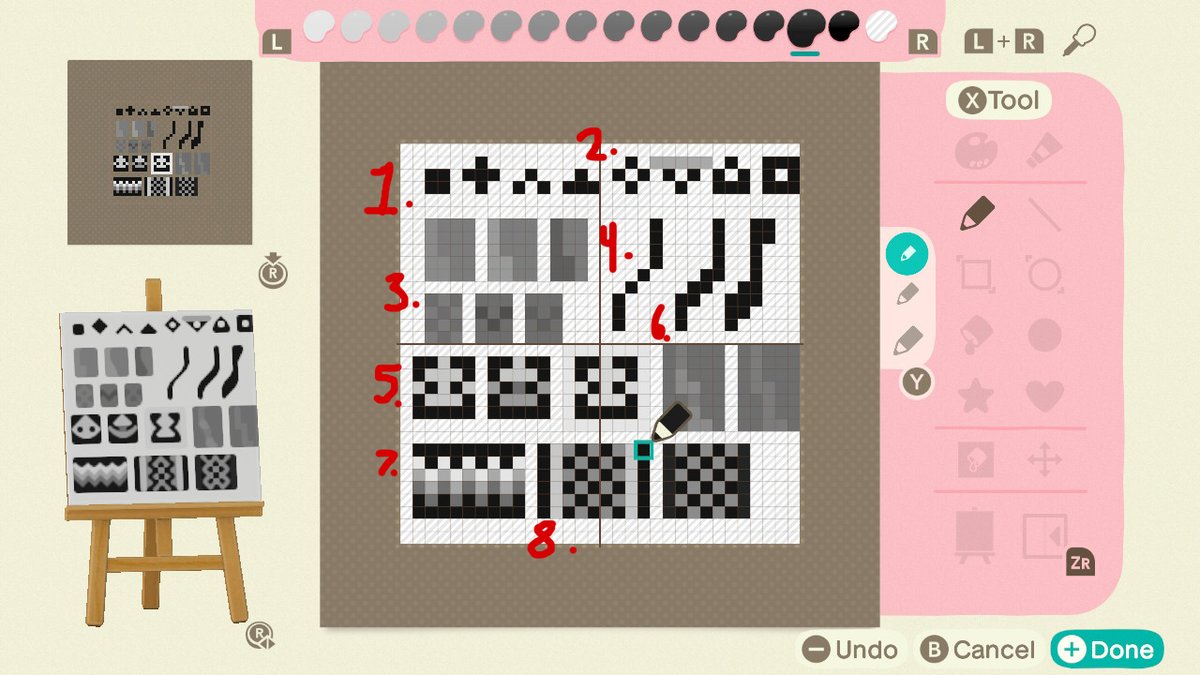
Opted for a B&W color palette, easier to digest

1.) Standard basic shapes! I use most of these when I am making any outfit.

2.) adding thicker line borders (or removing some pixels)/other colors can create a variant of shapes/designs as well to your simple shapes!
3.) When shading if you pick a color that is one shade lighter/darker than your base shade it will remain pixely but if you pick one that is two shades difference it will smooth out the line, depending on your art style either work for adding some dimension/texture to your art.
4.) Lines like these a lot for borders, fragmented pixels offer clean thin lines, connected pixels give a standard thickness line and the more you add to certain sides of your line can give a pressured line look!
5.) When creating complex shapes they can change depending on the shades/colors you are using. For the first box I used the same color for each pixel, no shading and it creates a flat shape design. Adding shading to it changes to shape and make the bottom have the curve to it.
Also by adding the same color you were using for your complex shape to the edge border of your design it can also create a different shape, reason for this is the lines will blend into whatever color is closest to its on and has more of that same shade in a section/cluster.
6.) Sometimes you want to have highlights/shadows that are only one shade off but don't want it to look pixely on the design, in order to fix this add a slightly darker/lighter shade at the point where your lines begin to bend, it will create a smooth transition to the next color
7.) So long as the same colors are touching one of the corners of the color you are working with it will connect to it, you can use this to create nice designs like this gradient zig-zag stripe.
8.) Checkered pixel print is a great way to mimic detail in clothing and as I said before the borders of your design will determine which way your outer checkered color will go, the colors bleed into similar colors of their own and vise versa will separate from contrasting ones
Hope these tips help you out at all! Get out there and create some neat stuff!

Or if you don't wanna...you can always commission me ~ <3
Missing some Tweet in this thread? You can try to force a refresh.

Enjoying this thread?

Keep Current with Nipah 🐣 ACNH commissions

Profile picture

Stay in touch and get notified when new unrolls are available from this author!

Read all threads

This Thread may be Removed Anytime!

Twitter may remove this content at anytime, convert it as a PDF, save and print for later use!

Try unrolling a thread yourself!

how to unroll video

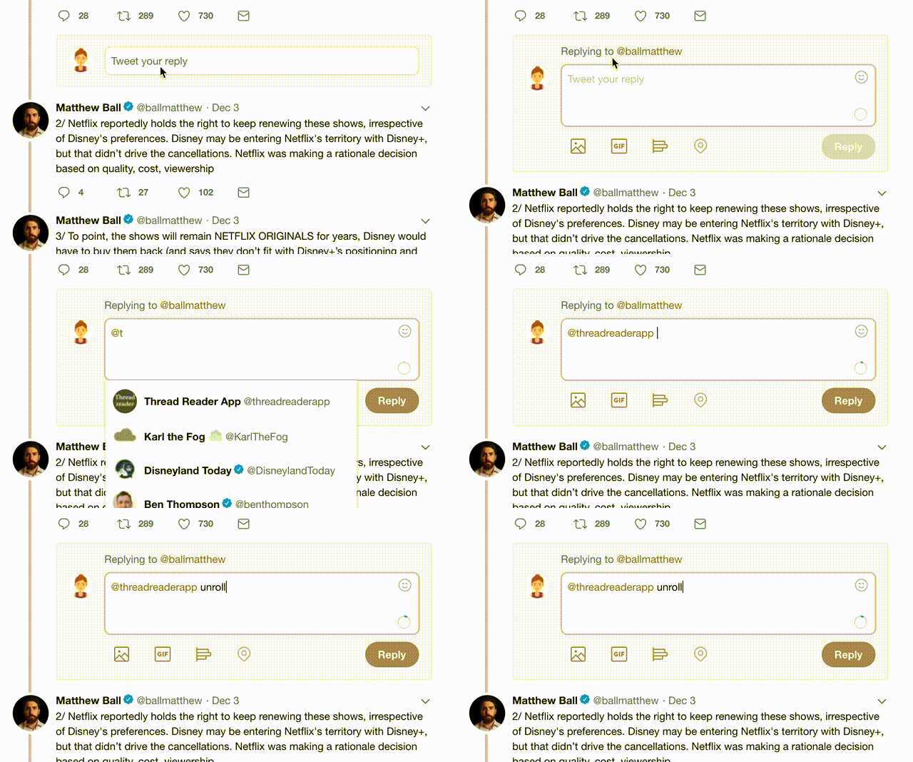
1) Follow Thread Reader App on Twitter so you can easily mention us!

2) Go to a Twitter thread (series of Tweets by the same owner) and mention us with a keyword "unroll" @threadreaderapp unroll

You can practice here first or read more on our help page!

Follow Us on Twitter!

Did Thread Reader help you today?

Support us! We are indie developers!


This site is made by just two indie developers on a laptop doing marketing, support and development! Read more about the story.

Become a Premium Member ($3.00/month or $30.00/year) and get exclusive features!

Become Premium

Too expensive? Make a small donation by buying us coffee ($5) or help with server cost ($10)

Donate via Paypal Become our Patreon

Thank you for your support!