
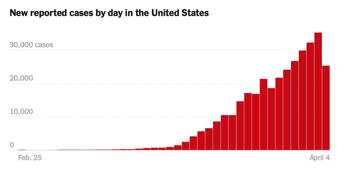

First, let's acknowledge that the number of cases in the U.S. is proportional to the number of tests — we most definitely still have cases out there that are unaccounted for due to a lack of testing. For these analyses, I used the NYT data set (available to the public!).
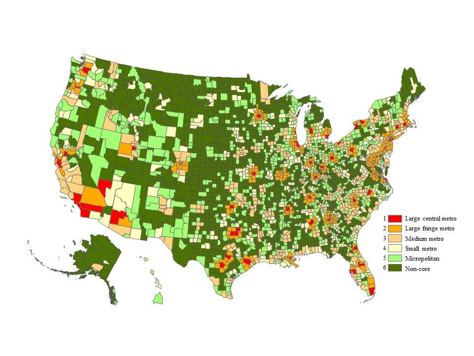
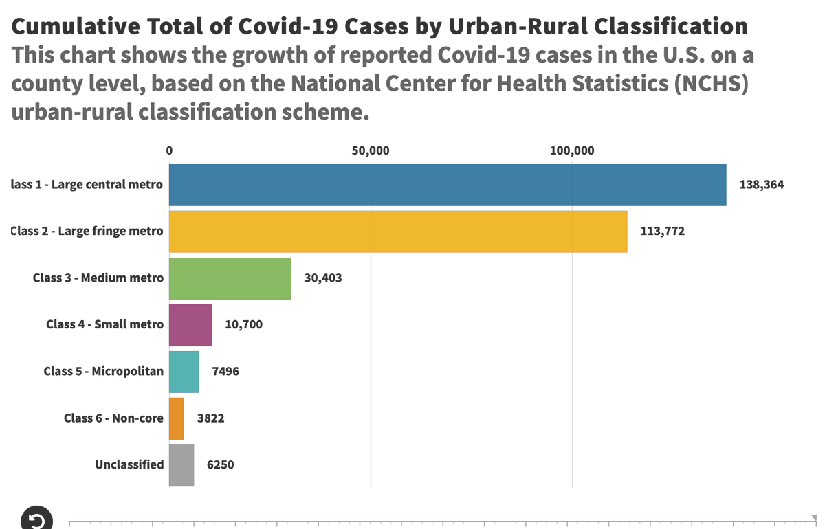
I wanted to see how the coronavirus affected urban areas vs. rural areas. To do this, I classified each county with a rating of 1-6 based on the NCHS' urban-rural classification scheme, as seen here. A value of 1 indicates a metropolitan area, while a value of 6 is "non-core." 
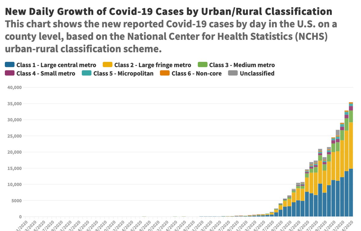
As seen here, the coronavirus has impacted large central metro areas the most. The first case in the U.S. was in Snohomish County, WA on January 21. It took until March 6 to report a case in a Class 6 county. Note: Unclassified = cases reported at the state level (anomalies).
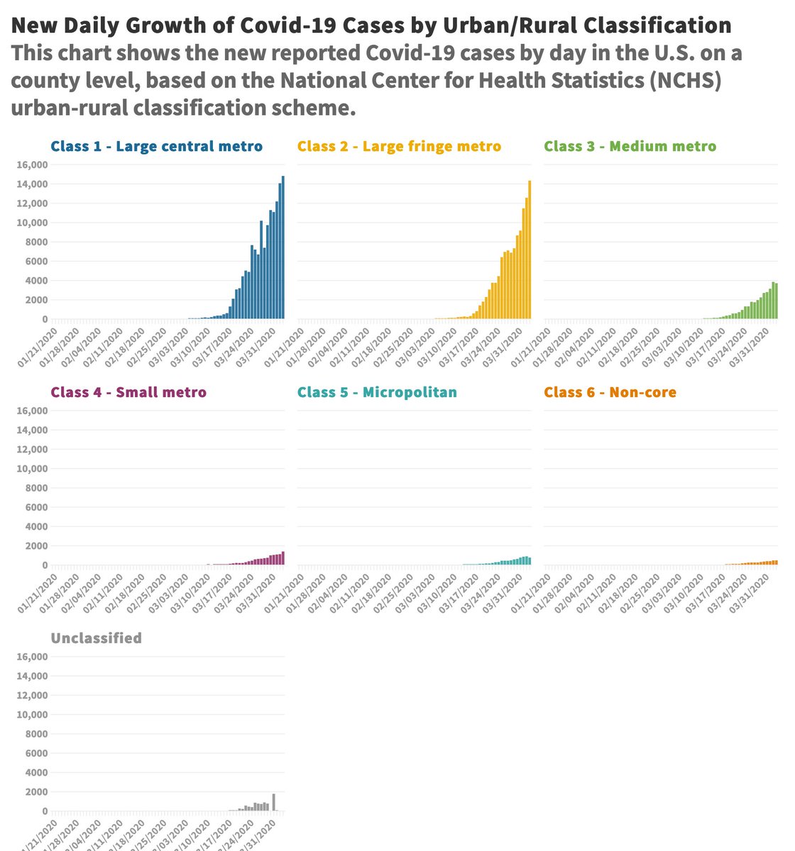
The visualization at this link shows the cumulative total of cases over time. See how cases shoot up in metro areas and remain relatively low in rural areas.
public.flourish.studio/visualisation/…
public.flourish.studio/visualisation/…
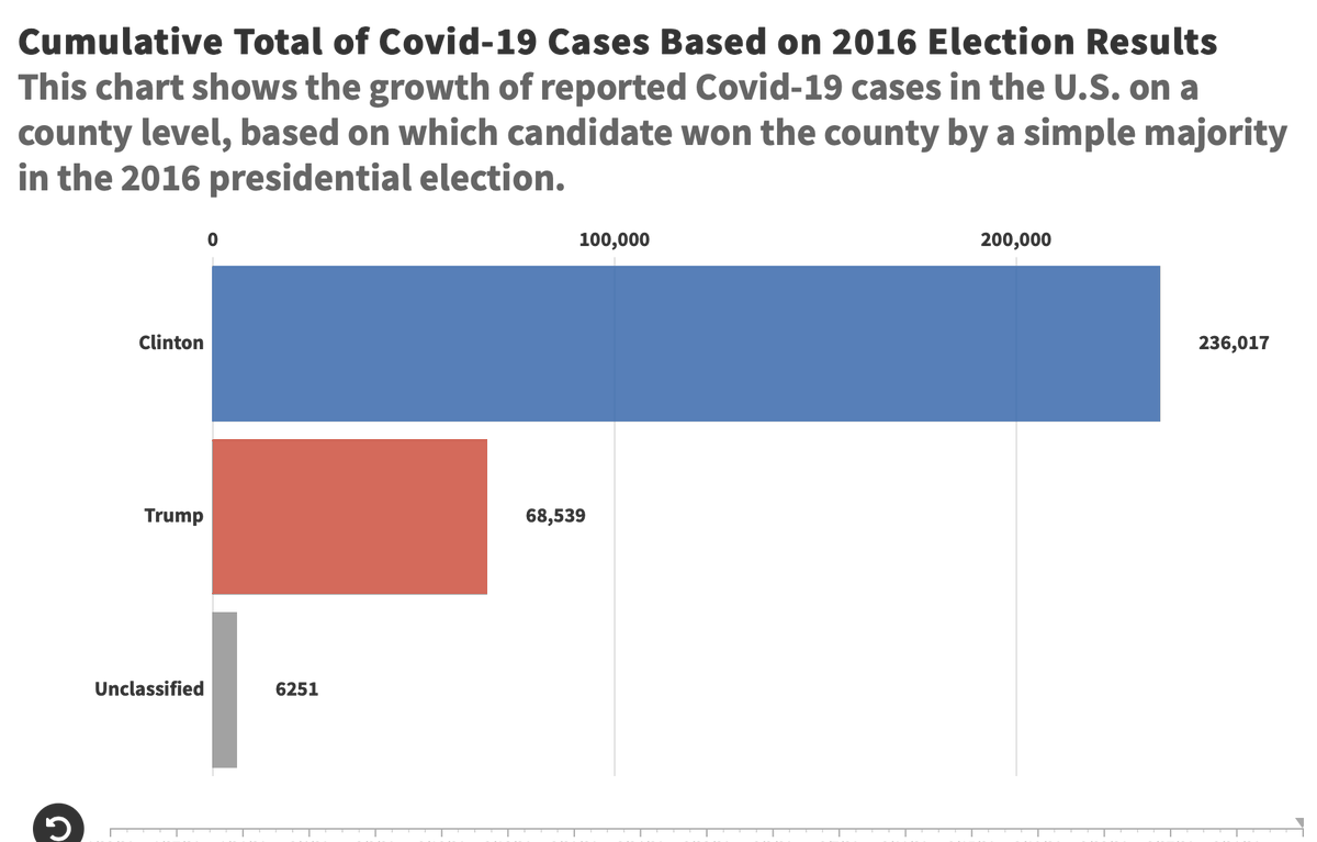
Now, let's get political. I created an election map by county based on which candidate won a simple majority in the county during the 2016 presidential election. Here are the numbers of [confirmed] cases combined with that election map.
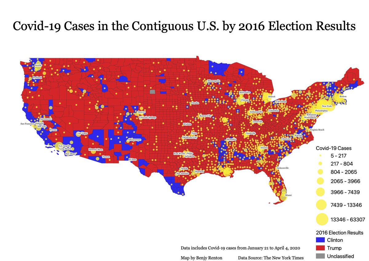
Some observations:
- The virus seems to disproportionately affect "Clinton" counties since many of those are metropolitan areas.
- 856/3233 (26.5%) of counties have yet to report a case.
- Very few cases have been reported near the border (immigrants don't want testing?).
- The virus seems to disproportionately affect "Clinton" counties since many of those are metropolitan areas.
- 856/3233 (26.5%) of counties have yet to report a case.
- Very few cases have been reported near the border (immigrants don't want testing?).
More observations:
- @CharlesMBlow wrote a column about how #COVID19 disproportionately affects minority communities since less than 20% of black workers are able to work from home. This could explain a city like Atlanta.
- Few cases in Appalachia (WV).
nytimes.com/2020/04/05/opi…
- @CharlesMBlow wrote a column about how #COVID19 disproportionately affects minority communities since less than 20% of black workers are able to work from home. This could explain a city like Atlanta.
- Few cases in Appalachia (WV).
nytimes.com/2020/04/05/opi…
How to explain Florida? I believe it was "snowbirds" who carried the virus from NY, where widespread community transmission was present.
I've believed that Trump has shown indifference to the virus since the start because it has yet to greatly affect "Trump country."
I've believed that Trump has shown indifference to the virus since the start because it has yet to greatly affect "Trump country."
From this map, this theory has some truth. The next biggest threats to "Trump country" are Florida and Louisiana. These are possible upcoming outbreak sites.
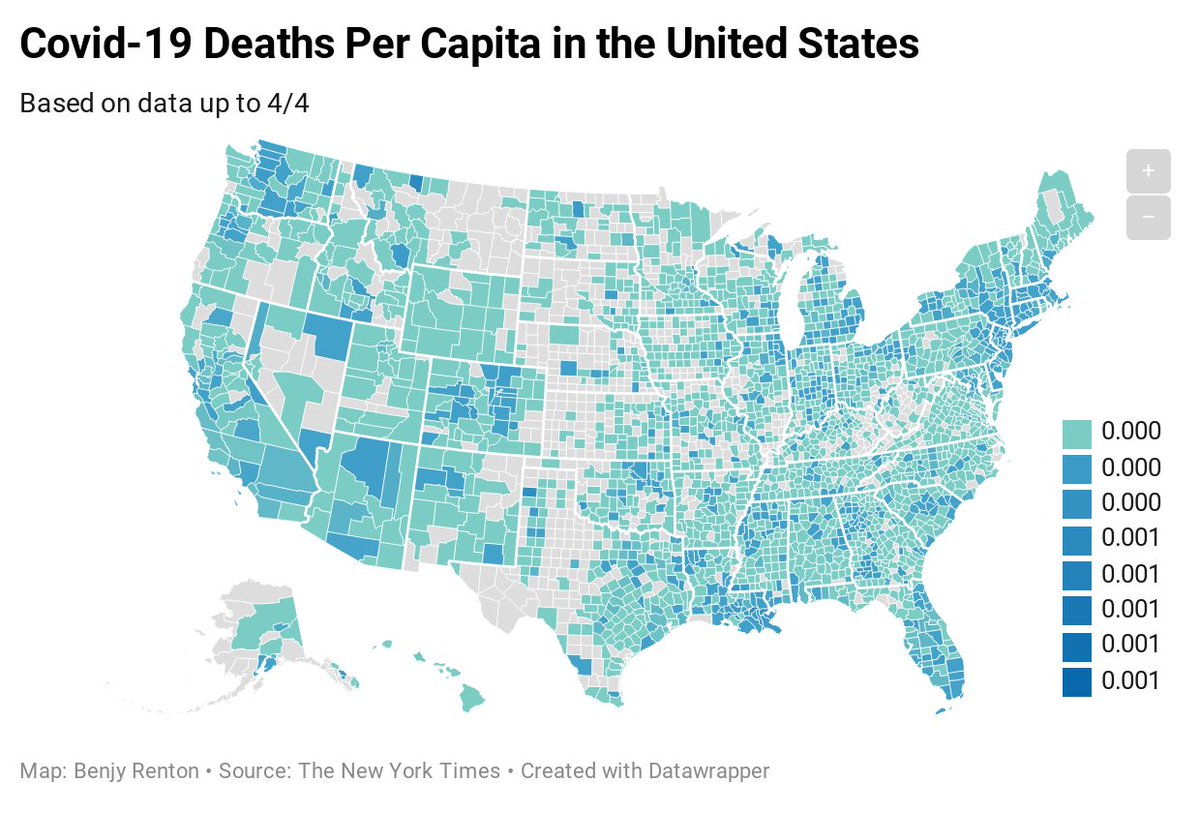
At the request of @rjamesfinn, I created a map of the deaths per capita, since an area with facilities could indicate widespread community transmission. While the ratios are so low the legend is unable to display them, the visualization is interesting.
datawrapper.dwcdn.net/w2dXr/2/
datawrapper.dwcdn.net/w2dXr/2/
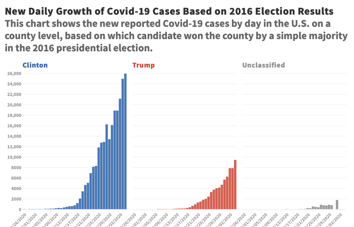
More on politics. This graph shows the reported cases by day in "Clinton" and "Trump" counties. The difference is rather striking. Note: Unclassified = cases reported at the state level (anomalies).
Here is the most striking visual (in my opinion). This graph shows the cumulative total cases by "Clinton" and "Trump" counties. Clinton counties have 3.4 times more cases than Trump counties. The link will allow you to see the growth over time.
public.flourish.studio/visualisation/…
public.flourish.studio/visualisation/…
This is obviously just a start, but hopefully could present some interesting questions for discussion and analysis. Thank you to @LibbySeline and @jbenton for their help and inspiration. Let me know what you think of this analysis. My thoughts go out to all affected by the virus.
Maps can be political. So can public health. Hope these charts and maps make that clear.

