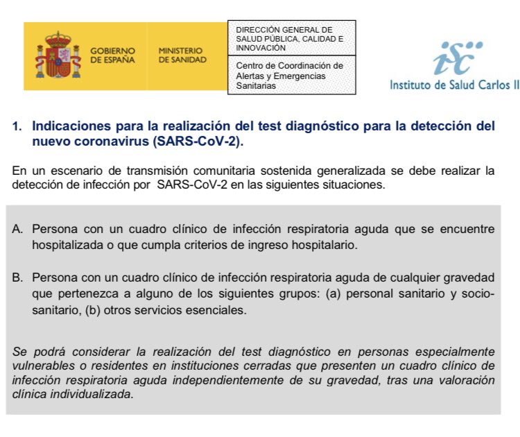
Esta gráfica sobre la distribución de los casos de coronavirus por edad es interesantísima:
- En rojo Holanda, cuando solo haces test a los pacientes que precisan ingreso (similar a España).
- En azul Islandia, cuando haces test a toda la población incluyendo asintomáticos.
- En rojo Holanda, cuando solo haces test a los pacientes que precisan ingreso (similar a España).
- En azul Islandia, cuando haces test a toda la población incluyendo asintomáticos.

Similar distribución cuando comparamos Italia (en verde, realiza test sólo en pacientes ingresados como Holanda o España) y Corea del Sur (en rojo, realiza test masivos incluyendo a asintomáticos como Islandia):

Varias ideas:
👉 Los adultos con cuadros leves (o asintomáticos) serían los principales transmisores de la enfermedad.
👉Los mayores de 60 años son los que sufren cuadros más graves que precisan ingreso.
👉Dudas sobre el papel de los niños en la transmisión de la enfermedad.
👉 Los adultos con cuadros leves (o asintomáticos) serían los principales transmisores de la enfermedad.
👉Los mayores de 60 años son los que sufren cuadros más graves que precisan ingreso.
👉Dudas sobre el papel de los niños en la transmisión de la enfermedad.
Las piramidales poblacionales de los países en cuestión: