NEW story: data from @Google shows that people in the UK were broadly adhering to the lockdown during the first two weeks, but an @FT analysis finds that warm sunny weather over the last week saw Brits flocking back to green spaces ft.com/content/3a6541…
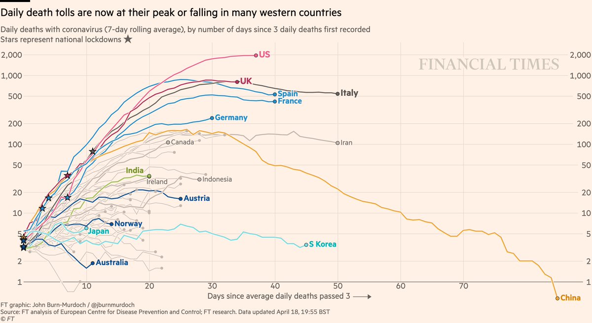
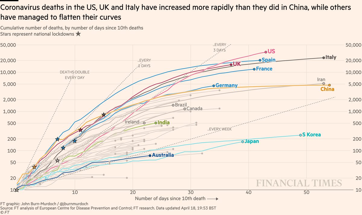
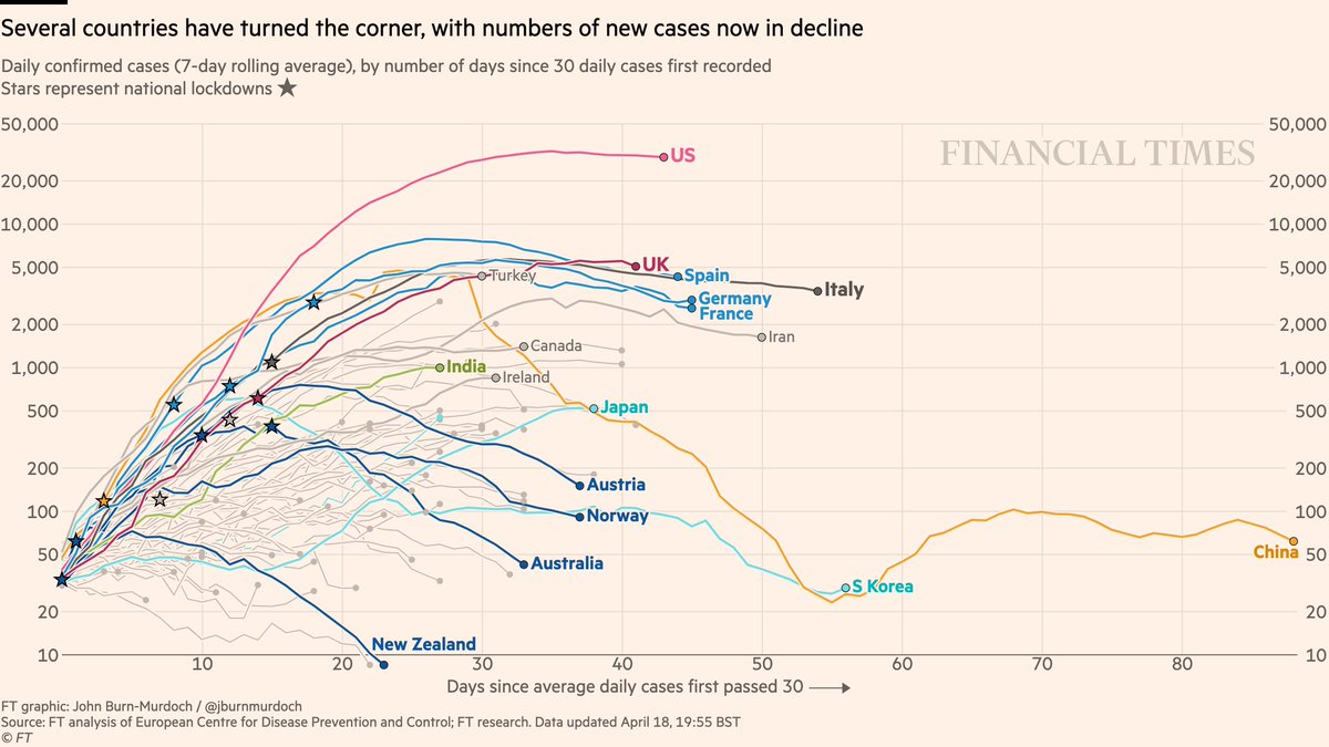
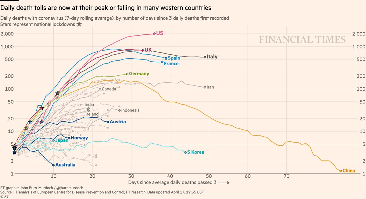
Chart thread:
Chart thread:
1) Google’s public data on this lags by about a week.
It shows that by Sunday 5 April, Britons were trailing only hard-hit Spain, France and Italy in terms of avoiding retail and restaurants etc.
Locking down more comprehensively than Germany, US and Sweden
It shows that by Sunday 5 April, Britons were trailing only hard-hit Spain, France and Italy in terms of avoiding retail and restaurants etc.
Locking down more comprehensively than Germany, US and Sweden
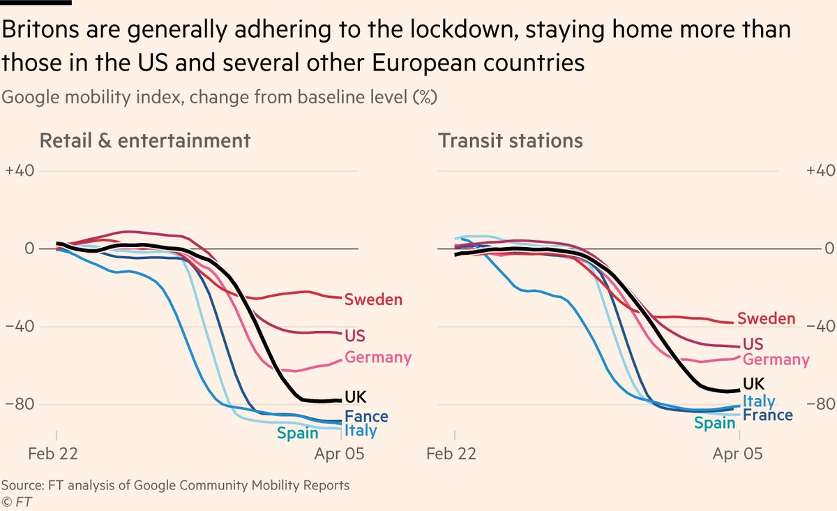
2) The same is true of public transport. Britons are avoiding discretionary travel more than people in Germany, US and Sweden, and almost as much as Spain etc.

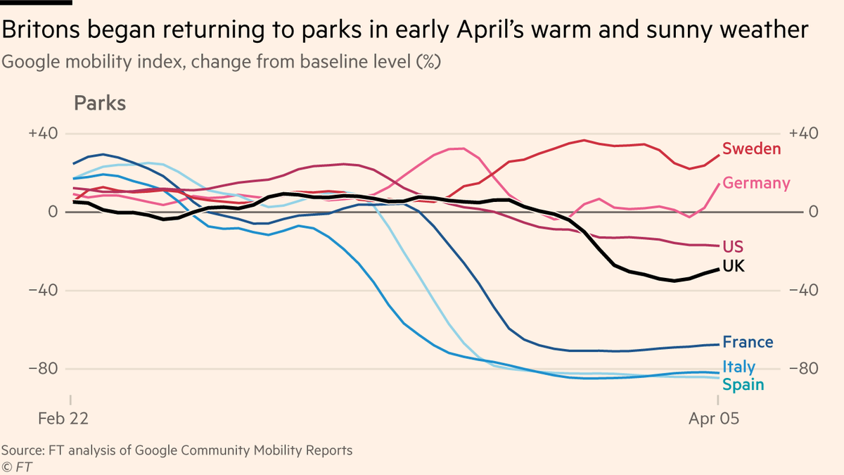
3) Parks have been harder for us to quit.
By early April we were beginning to stay away, but as sun came out over wknd of 4/5 April, we started going back out to enjoy green spaces (as did Germans & Swedes).
Contrast to Spain, Italy, France where most parks are strictly closed.
By early April we were beginning to stay away, but as sun came out over wknd of 4/5 April, we started going back out to enjoy green spaces (as did Germans & Swedes).
Contrast to Spain, Italy, France where most parks are strictly closed.
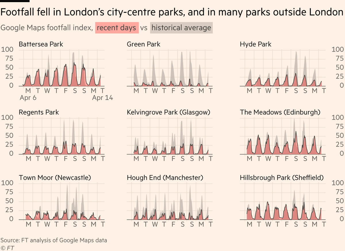
4) As I said, public Google data lags by ~a week, but we wanted to know what’s happened since then, as warm weather continued.
Our analysis of footfall in dozens of UK parks suggests the trend continued: Britons flocked back to parks. In fact, many parks were busier than average
Our analysis of footfall in dozens of UK parks suggests the trend continued: Britons flocked back to parks. In fact, many parks were busier than average
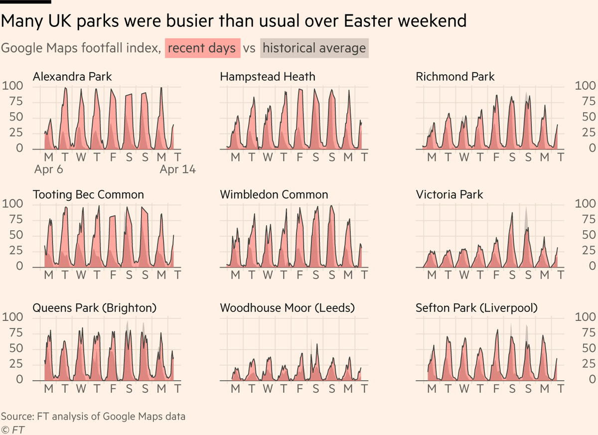
5) But in around half of the parks we analysed, footfall was down on typical levels (especially city-centre parks away from residential areas and without tourist influx).
On average, we found UK parks were about as busy over the weekend just passed as in a non-lockdown year.
On average, we found UK parks were about as busy over the weekend just passed as in a non-lockdown year.
7) Now for some methodology:
I wrote a script that takes the Google Community Mobility reports (google.com/covid19/mobili…) and extracts the data from the charts in the PDFs, giving you a full time series for any country.
It’s here for anyone to use: gist.github.com/johnburnmurdoc…
I wrote a script that takes the Google Community Mobility reports (google.com/covid19/mobili…) and extracts the data from the charts in the PDFs, giving you a full time series for any country.
It’s here for anyone to use: gist.github.com/johnburnmurdoc…
8) How does it work?
It takes each PDF, converts pages to images, then scans the pixels from left-to-right on each chart, extracting the vertical position of the blue line on each date and converting it from a pixel row to a y-axis value.
I’m unreasonably pleased with myself 🤓
It takes each PDF, converts pages to images, then scans the pixels from left-to-right on each chart, extracting the vertical position of the blue line on each date and converting it from a pixel row to a y-axis value.
I’m unreasonably pleased with myself 🤓