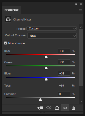
- Red
- Green
- Blue
And secondary colors:
- Magenta (R+B)
- Yellow (R+G)
- Cyan (G+B)
The result? A uniform 50% gray. Non-sense.
sciencemag.org/news/2017/02/y…
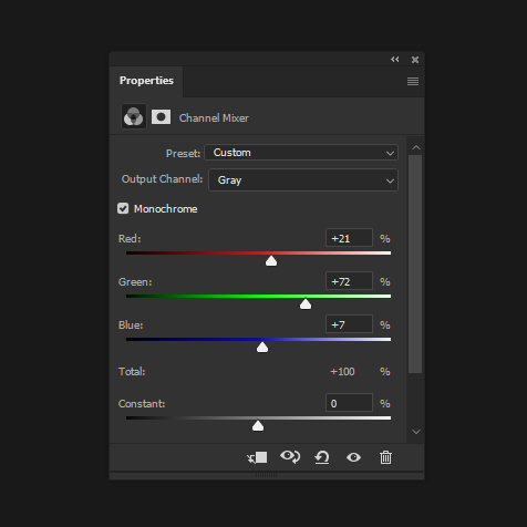
It's not perfectly accurate, but it's a valuable approximation of the human perception of brightness across the color spectrum.
wikiwand.com/en/Luminosity_…
&
wikiwand.com/en/Relative_lu…
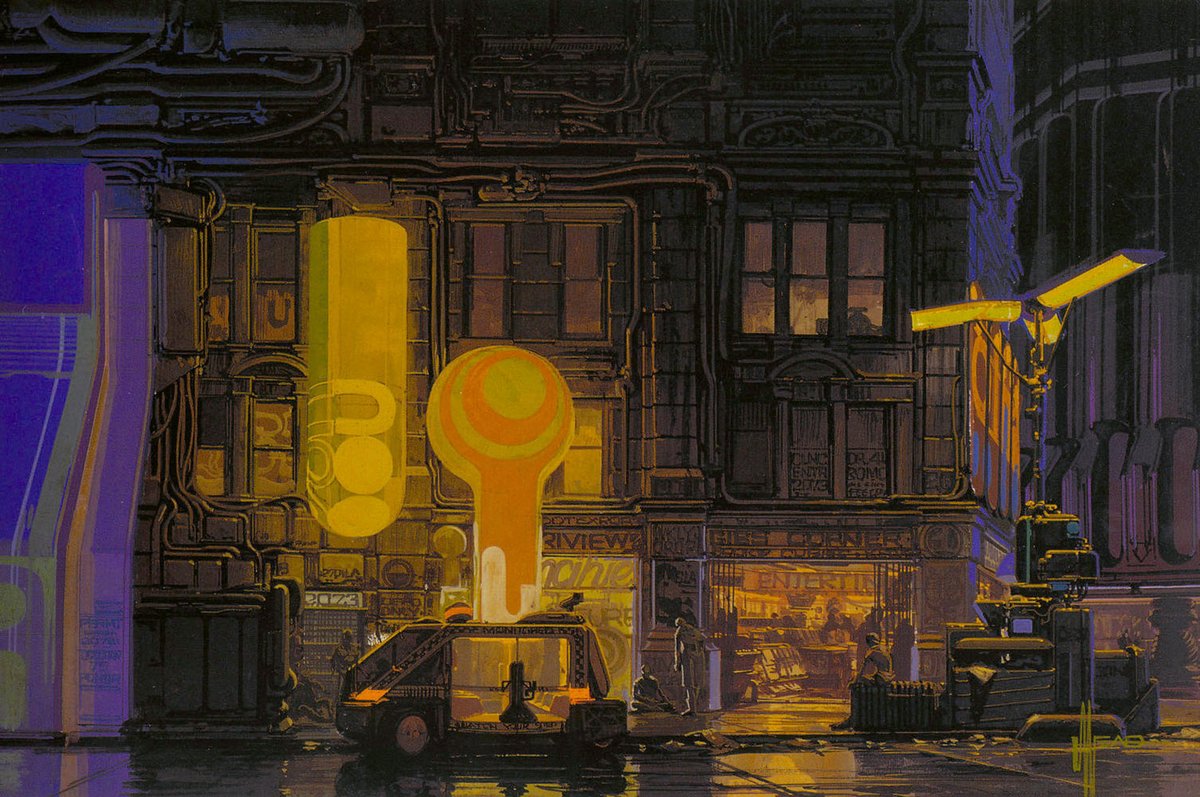
Now we can discern hues in black & white, and often we can even guess the original color with some experience.
This is why you probably saw a lot of teachers telling you about "values" and it never felt like a reliable technique to you.
-------------------------------------------------------
We can let Photoshop approximate the work for us:
Trick #1
- Create a black layer on top
- Set its blending mode to "Color"
- That's it. You can toggle it on/off.
-------------------------------------------
- Setup a custom color proofing
- Select "Gray Gamma 2.2" on Windows
"Gray Gamma 1.8" on Mac
(sGray & Dot Gain 20% also acceptable)
- Quickly toggle luminance ("values") with CTRL+Y at any time
A nice reminder of what social media should be - it makes me want to tweet more knowledge, less thoughts & comments.
Thread update later today 🤞


