Emmanuel de Margerie Profile picture
Apr 21, 2020 5 tweets 3 min read Read on X
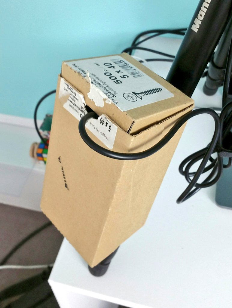
should I update this weather station logger box design ? 🤔 probably. ImageImage
work in progress (fusion360) Image
V1.0 design is ready. The box is sized to host a #RaspberryPi, a 10 Ah Powerbank and USB connectors. It should be both rain-proof and easy to open manually (disclaimer: most of the time a V2 is needed... before the V3). We'll see ! Time to send to 3D printing ... 😋 Image
There is a strange satisfaction associated with 3D design: a feeling of full control on a simple, self-contained concept (coming from biology it is like being on holiday).
I can use this at the moment !
Hey this looks pretty good ! 😊
(Thank you abeille3d.com for the printing) ImageImage

• • •

Missing some Tweet in this thread? You can try to force a refresh
 

Keep Current with Emmanuel de Margerie

Emmanuel de Margerie Profile picture

Stay in touch and get notified when new unrolls are available from this author!

Read all threads

This Thread may be Removed Anytime!

PDF

Twitter may remove this content at anytime! Save it as PDF for later use!

Try unrolling a thread yourself!

how to unroll video
  1. Follow @ThreadReaderApp to mention us!

  2. From a Twitter thread mention us with a keyword "unroll"
@threadreaderapp unroll

Practice here first or read more on our help page!

More from @flight_behav

Nov 16, 2021
Do current Delta🦠waves in Europe correlate with temperature change?🌡️

Here's a graph for all 35 countries with > 1M population 👇

thread 🧵, 1/n
🔵Blue is the 7-day mean outdoor temperature.
⚪️White is the 7-day case ratio (i.e. new cases detected on a given date, divided by new cases detected 7 days earlier). This ratio can also be used as a rough estimation of R (i.e. the number of persons infected by a single case).
There are a couple tricks to align both variables :

👉 the temperature is plotted on a reversed axis (low temp. on top), as cold air is suspected to facilitate virus transmission (more on this below).
Read 29 tweets
Apr 15, 2021
Météo ⛅️ + mobilité🚗: une carte 🗺️ pour essayer de ne plus naviguer à vue avec le #covid19.

Un fil (très) exploratoire 🔽🔽🔽 Image
Comme vous avez pu le lire ici dans de multiples fils, en suivant de près le R de l’épidémie (le nombre de personnes contaminées par malade) et les courbes de température et d’humidité, il semble qu’un air froid et sec favorise la transmission.
Le “problème” c’est que ce qui détermine le R en premier lieu, ce sont les mesures de restrictions sociales, confinements etc.
On peut voir que les corrélations climatiques se “cassent la gueule” dès que le niveau des restrictions varie.
germain-forestier.info/covid/meteo.ht… Image
Read 51 tweets
Mar 6, 2021
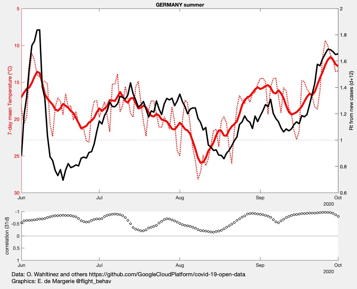
Here's a quick-and-dirty attempt at transposing plots of covid transmission vs. weather to another country : Germany 🇩🇪

Plots for R vs. Temperature, and R vs. Absolute Humidity during summer :
As I don't have access to new hospitalization data, I had to estimate R from new cases, and shifted it by a delay of ~12 days to account for incubation, testing and reporting delays.

Remember the weather axes are flipped upside down.
The bottom plot is 1-month floating-window correlation (Pearson's r, y axis also inverted). Note how the correlation varies but remains always negative.
Read 16 tweets
Feb 6, 2021
Covid-19 🦠 vs. Weather ⛅️ in the U.S., a thread.

[disclaimer: I work as a biologist, but am no epidemiologist, so please use results with caution]
If weather influences covid19 transmission, it should show in reported cases with a delay, that is ~5 days from infection to symptoms + maybe 1 week for getting tested, receiving the results and get reported in state data.
The variable putatively influenced by weather is not directly case count, but Reproduction number R, the number of people infected by each sick person.
Read 18 tweets
Sep 27, 2020
Covid19 en France : combien de jeunes à l'hôpital ? ImageImageImage
il y a des données officielles sur les hospitalisations par classe d'âge, mais elles sont rarement représentées graphiquement. data.gouv.fr/fr/datasets/do…
Pourtant, à l'heure où une bonne partie des clusters ont lieu en milieu scolaire et universitaire, où les protocoles sanitaires sont discutés, il peut être utile de suivre les données hospitalières par classe d'âge.
Read 18 tweets
Sep 20, 2020
Question aux habitués des data Covid data.gouv.fr
Je m'attends à ce que que les nouvelles hosp (en noir) = la somme des variations journalières d'hosp. en cours, de retours et de décès (en cyan)
@gforestier @eorphelin @starjoin @Panda31808732 @GuillaumeRozier 1/ Image
Par ex le 15/09, pour que le n d'hospit en cours augmente de 181, alors qu'il y a eu 384 retours et 36 décès depuis la veille, il faudrait que le nombre d'entrées à l'hopital ait été de (181 + 384 + 36) = 601. Or le chiffre de nouvelles hospit donné pour ce jour là est de 642. Image
Cette différence sur le site d'information, je la retrouve dans les fichiers (fichier "nouveaux" vs. fichier "classe d'âge" en prenant la classe total "0") : la somme des var. journalières d'hospit en cours + retours + décès n'atteint en moyenne que 90% des nouvelles hospit. ImageImage
Read 4 tweets

Did Thread Reader help you today?

Support us! We are indie developers!


This site is made by just two indie developers on a laptop doing marketing, support and development! Read more about the story.

Become a Premium Member ($3/month or $30/year) and get exclusive features!

Become Premium

Don't want to be a Premium member but still want to support us?

Make a small donation by buying us coffee ($5) or help with server cost ($10)

Donate via Paypal

Or Donate anonymously using crypto!

Ethereum

0xfe58350B80634f60Fa6Dc149a72b4DFbc17D341E copy

Bitcoin

3ATGMxNzCUFzxpMCHL5sWSt4DVtS8UqXpi copy

Thank you for your support!

Follow Us!

:(