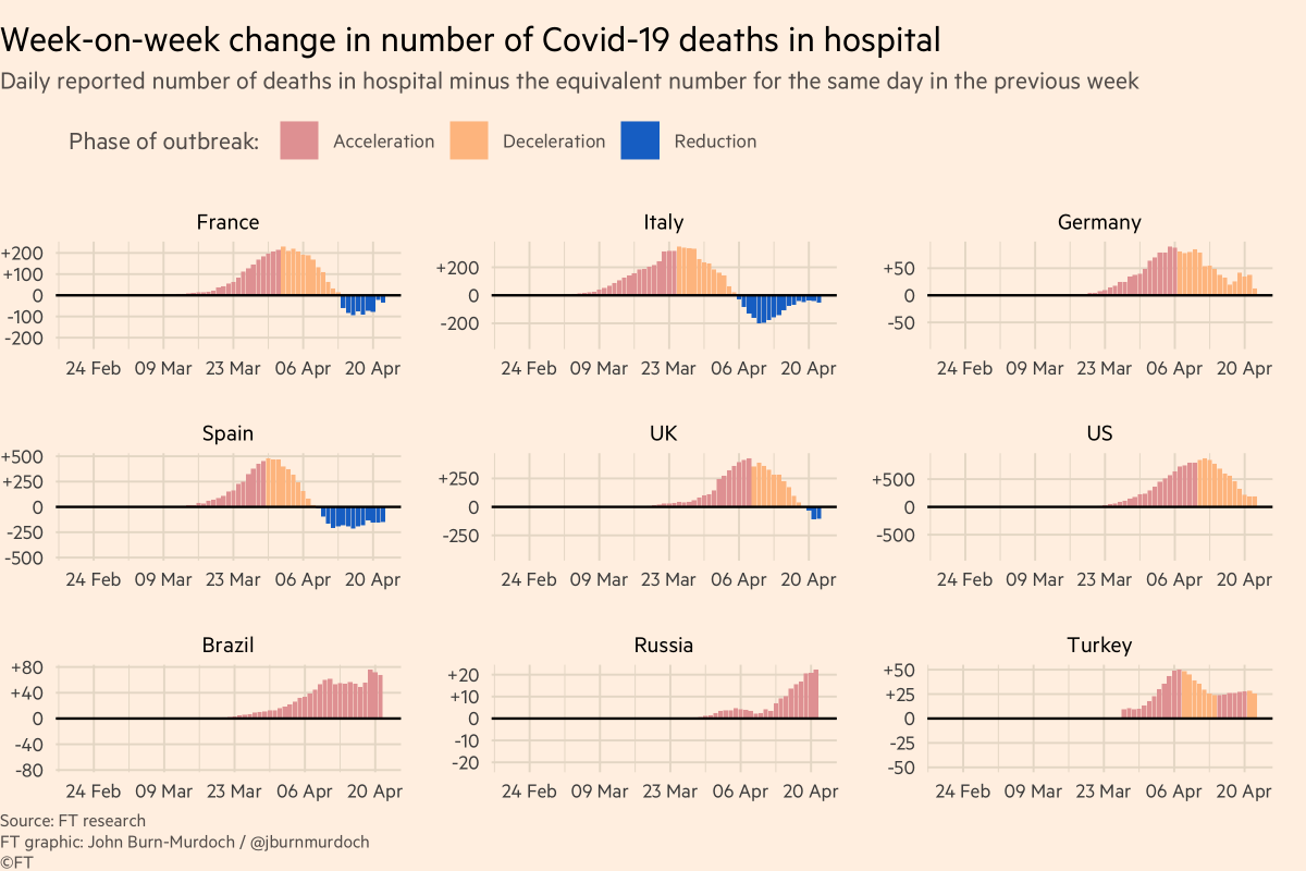
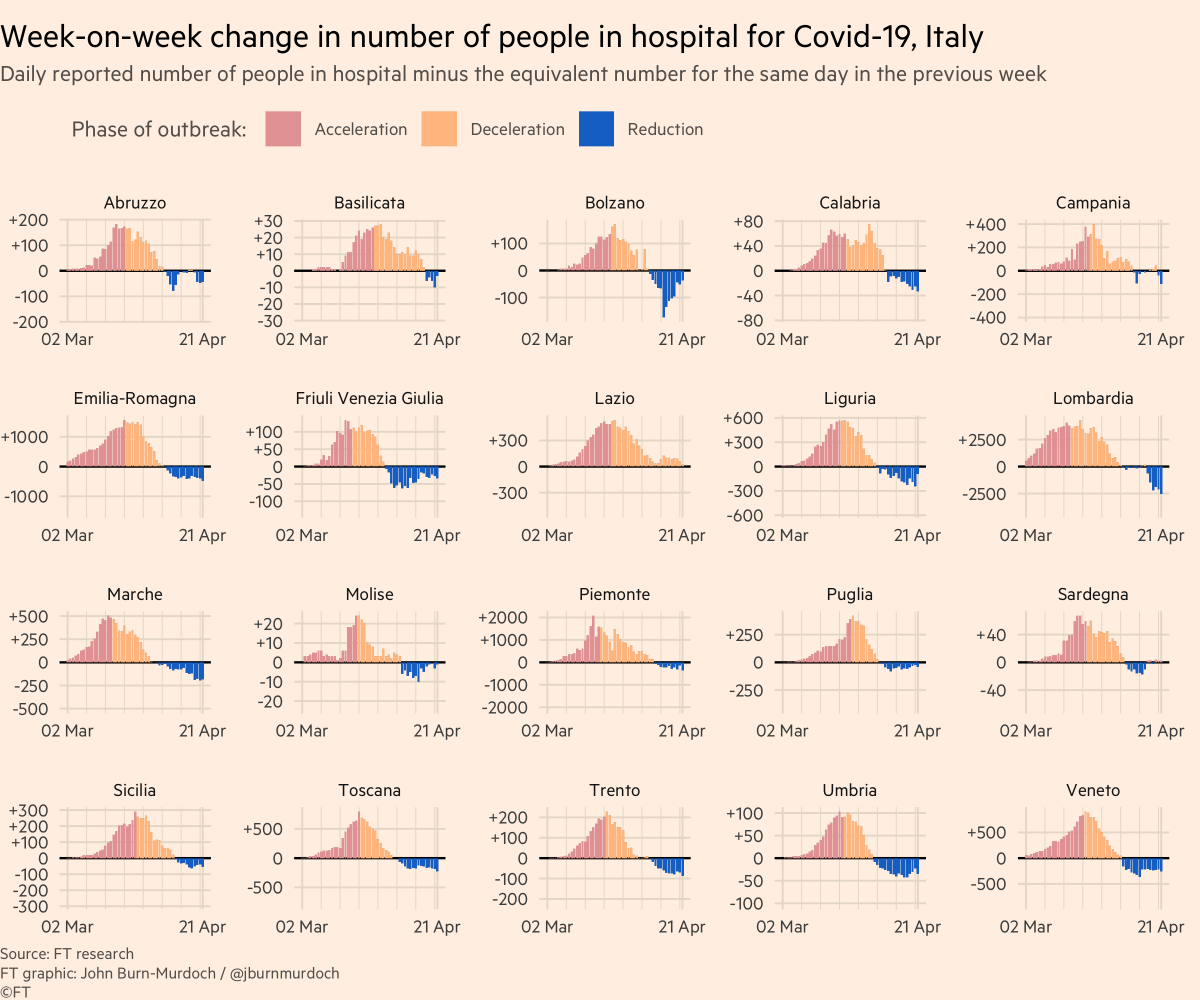
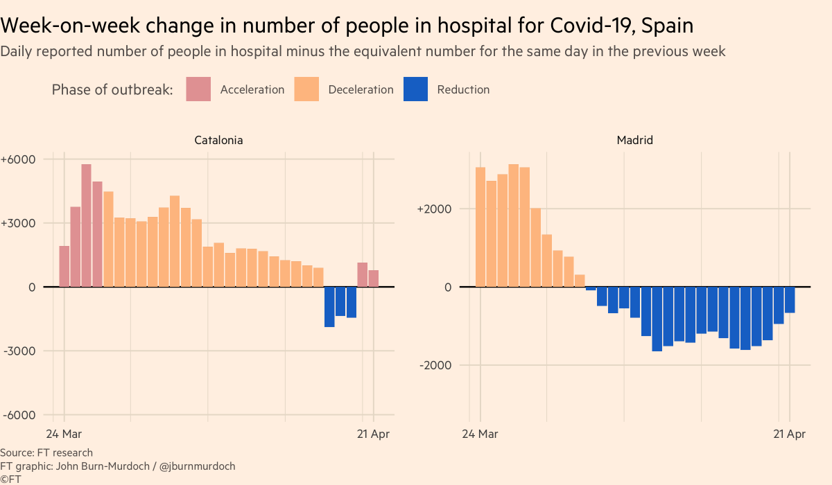
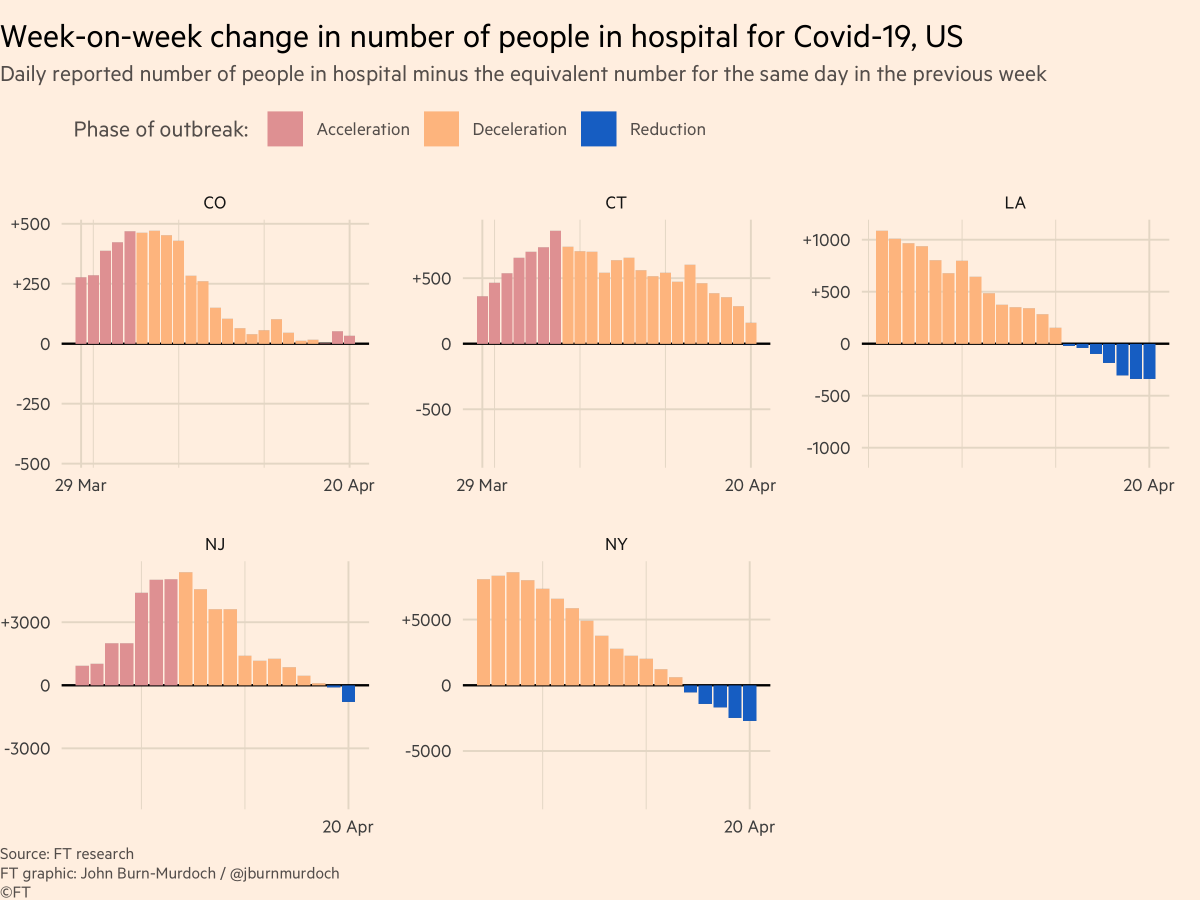
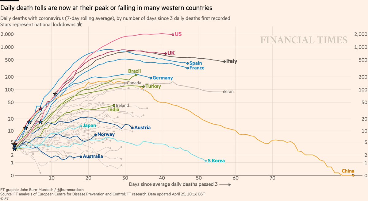
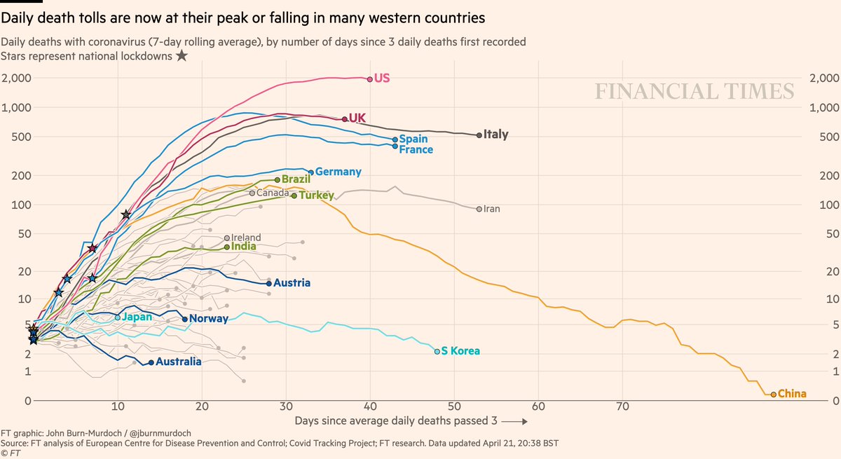
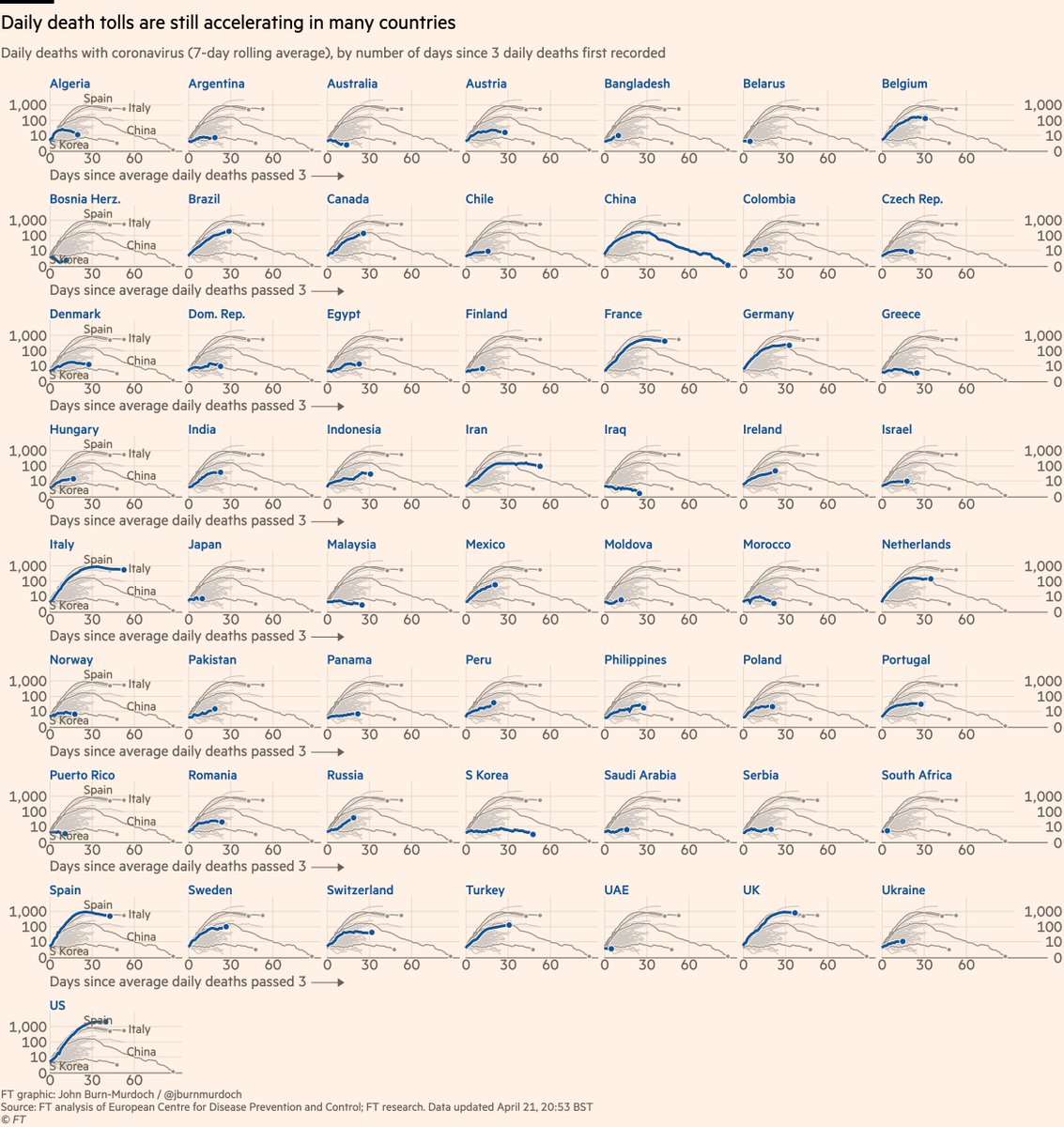
Daily deaths:
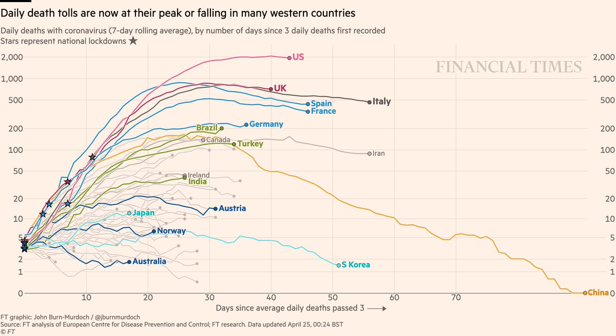
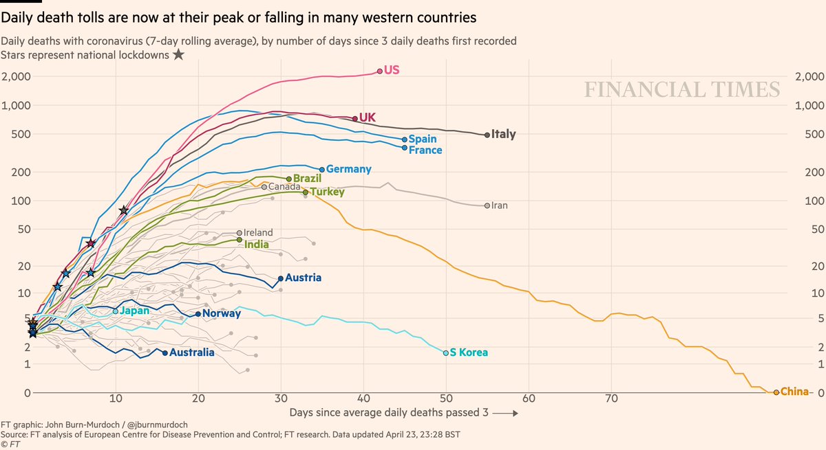
• Still too early to say if US has peaked
• Beginning to look like UK has
• But descents look much slower than ascents
• Successes in dark blue: Australia, Norway, Austria
Live charts ft.com/coronavirus-la…
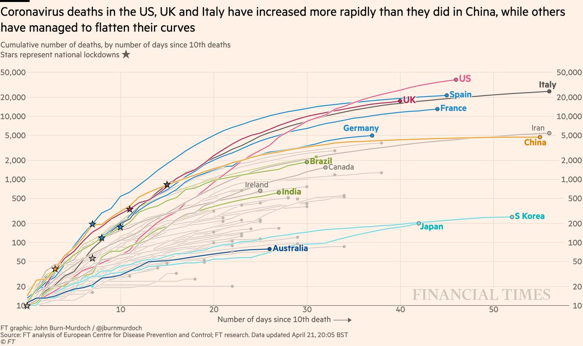
• US death is highest worldwide and still rising fast 📈
• UK curve still matching Italy’s
• Australia still looks promising
All charts: ft.com/coronavirus-la…
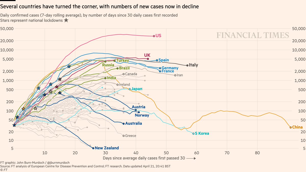
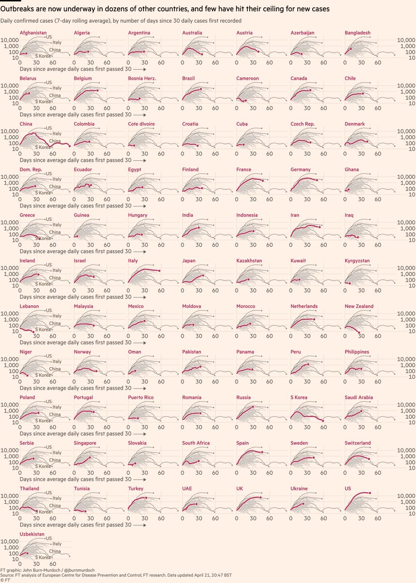
• Feels increasingly safe to say daily confirmed infections in US have peaked, though descent from peak is slow
• New cases falling in four countries that acted early: New Zealand, Australia, Norway, Austria (also 👋 Greece)
All charts: ft.com/coronavirus-la…
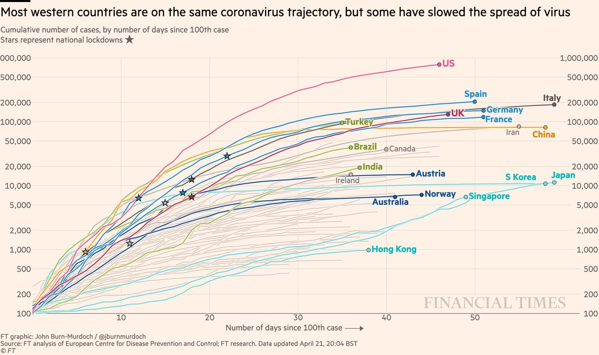
• US curve beginning to taper?
• Turkey still battling a severe outbreak
• Japan has passed Korea’s total, Singapore has passed Japan’s curve: both show the danger of thinking a country has dealt with covid
All charts: ft.com/coronavirus-la…
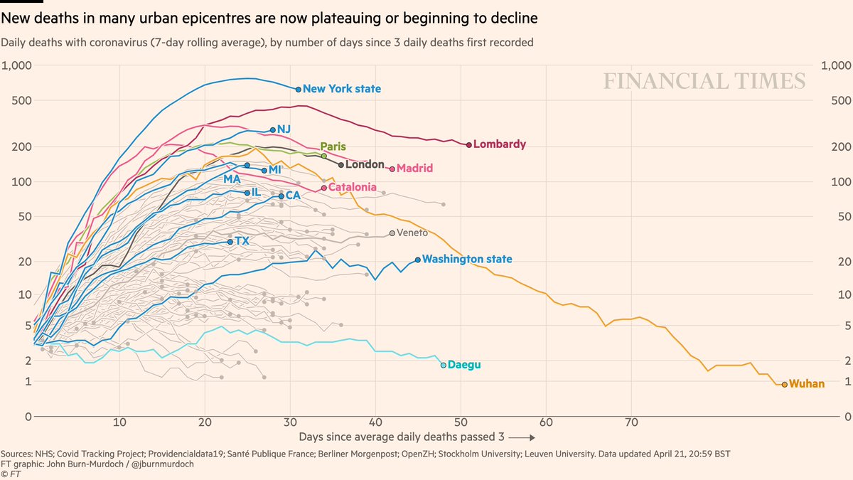
• NY daily confirmed covid deaths now descending (we’re excluding nursing homes for consistency)
• Daily London deaths also appear to have peaked
• Most Western cities/regions now in plateau or decline phase
All charts: ft.com/coronavirus-la…
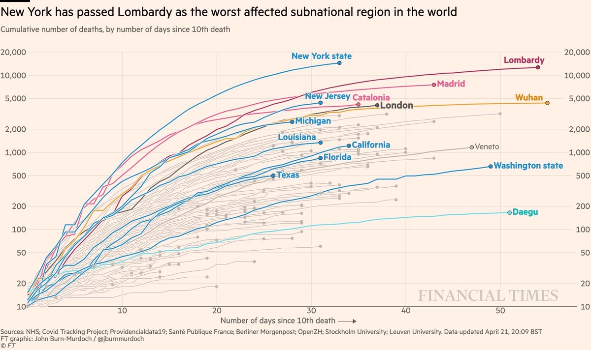
• NY curve tapering, but has passed Lombardy for world’s highest subnational death toll
All charts: ft.com/coronavirus-la…
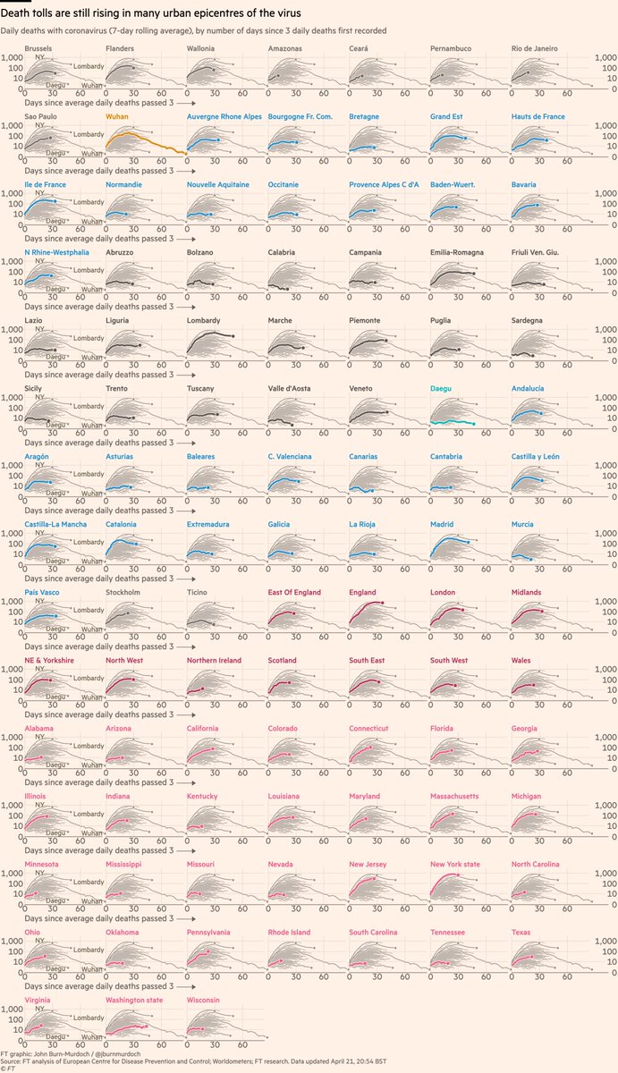
• Rio de Janeiro 📈
• 31 US states now shown
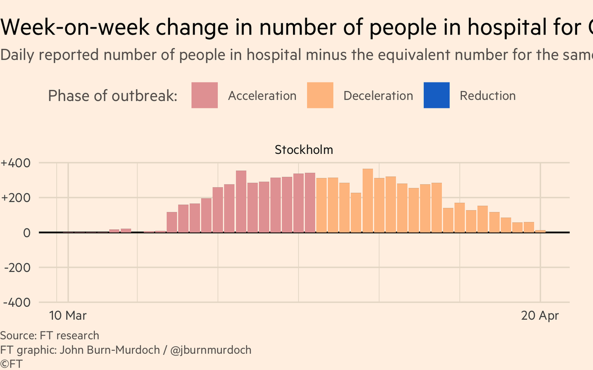
• Stockholm yet to peak?
• Sicily, Sardinia, Balearics, Canaries all low curves: do islands fare better?
All charts: ft.com/coronavirus-la…
• Norway locked down while Sweden didn’t; Norway’s daily death toll rising much more slowly than Sweden’s
• Australia faring well
• In Europe: Austria, Denmark, Greece, Norway faring well
All charts: ft.com/coronavirus-la…
• 10 African countries
• Early action in Australia & New Zealand may have turned corner 🇦🇺🇳🇿📉
• Austria & Norway locked down early; new cases falling
• Watch as countries relax lockdowns 👀
All charts: ft.com/coronavirus-la…
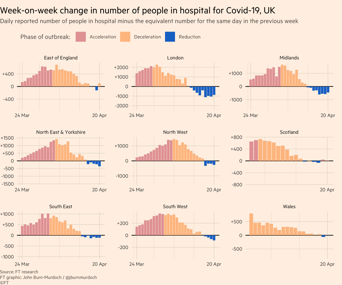
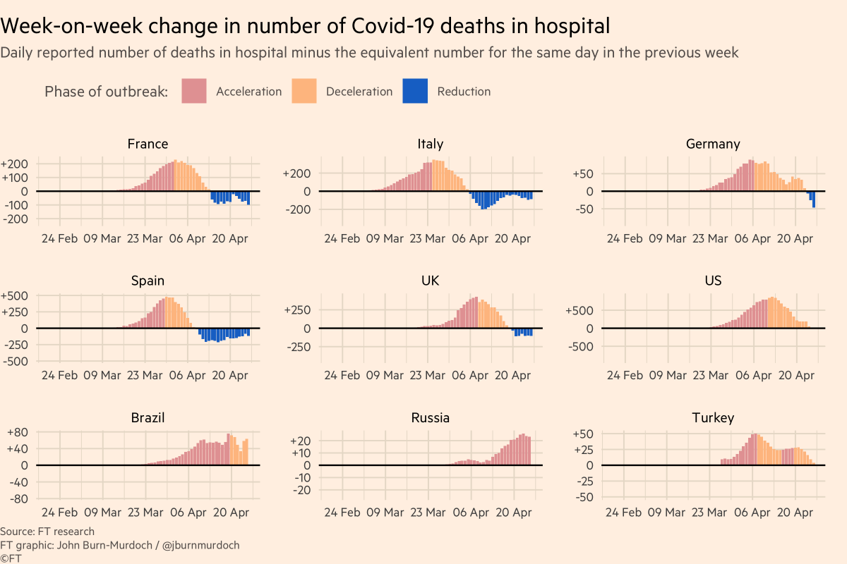
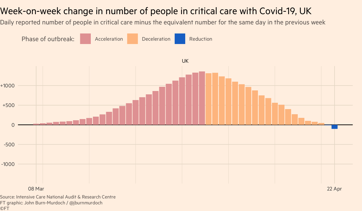
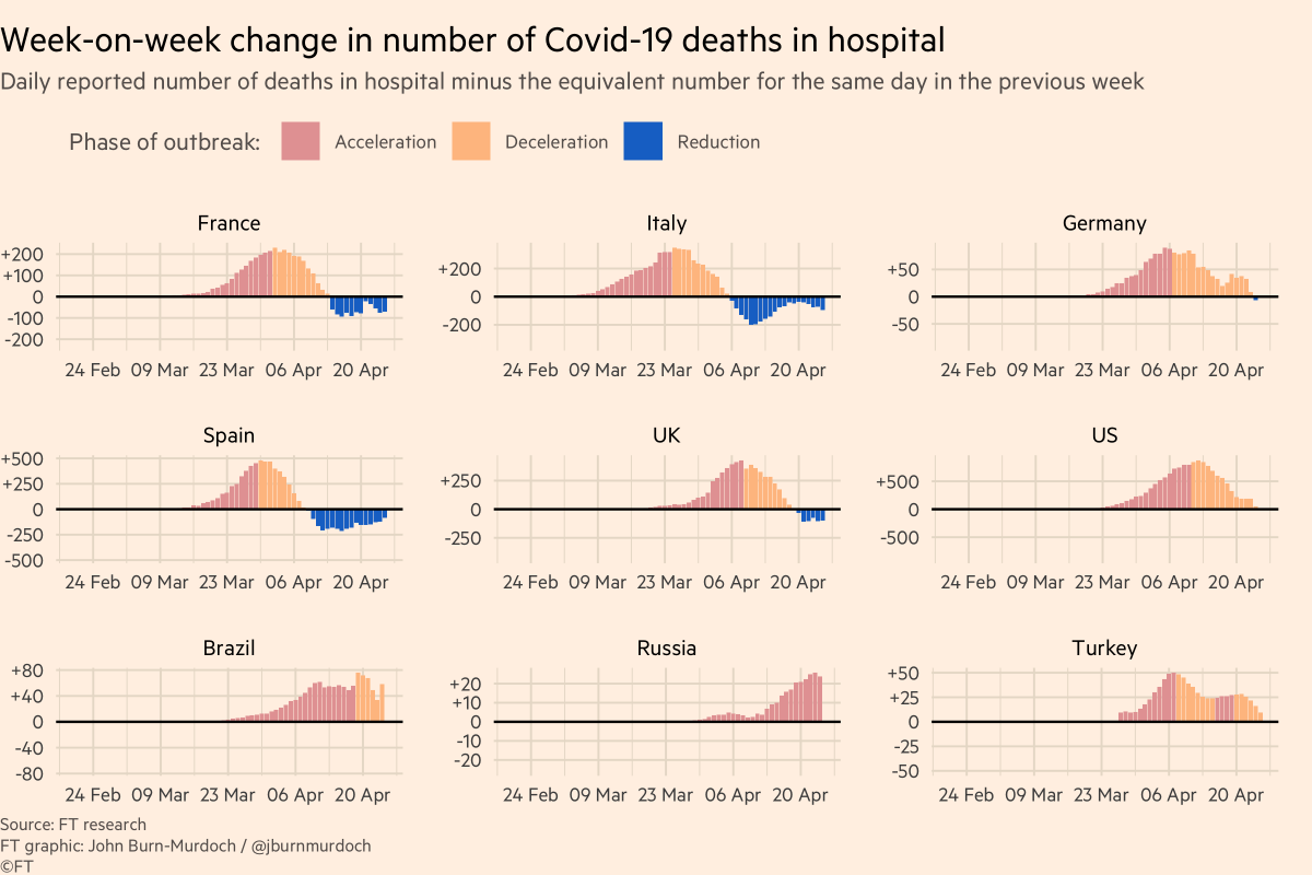
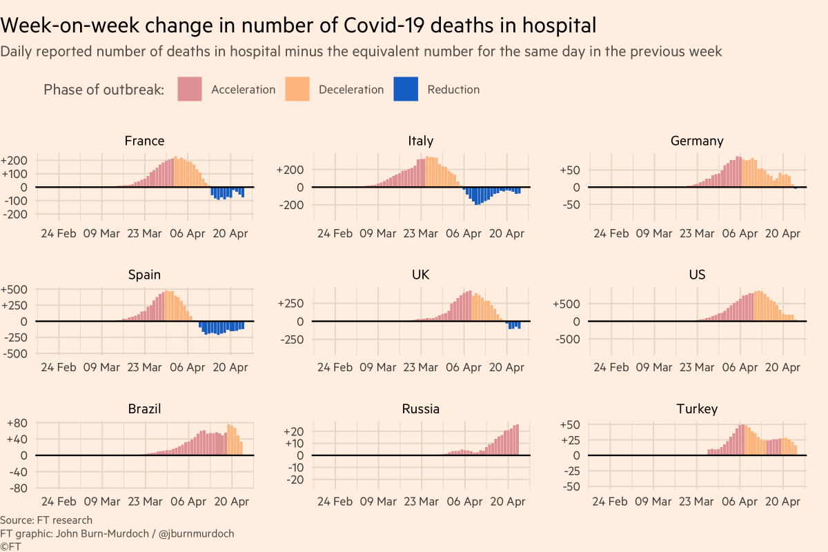
A good metric for this is hospitalisations:
• More reliable than confirmed cases (not influenced by testing regimes)
• Shorter lag than deaths
So here are some charts showing hospitalisations in various countries:
So my call-out tonight is:
Reply here, email coronavirus-data@ft.com or add a link to this spreadsheet: docs.google.com/spreadsheets/d…
Here’s a video where I explain why we’re using log scales, showing absolute numbers instead of per capita, and much more:
All of these are invaluable, and we incorporate your suggestions and data every day.
We’ll keep getting back to as many people as possible.
Have a good night, folks :-)
y-axis now log(n+1) instead of log(n) so we can include zero, meaning China etc don’t drop off the bottom
Doesn’t change anything in terms of how to read them, just makes them cleaner 🤓😀

