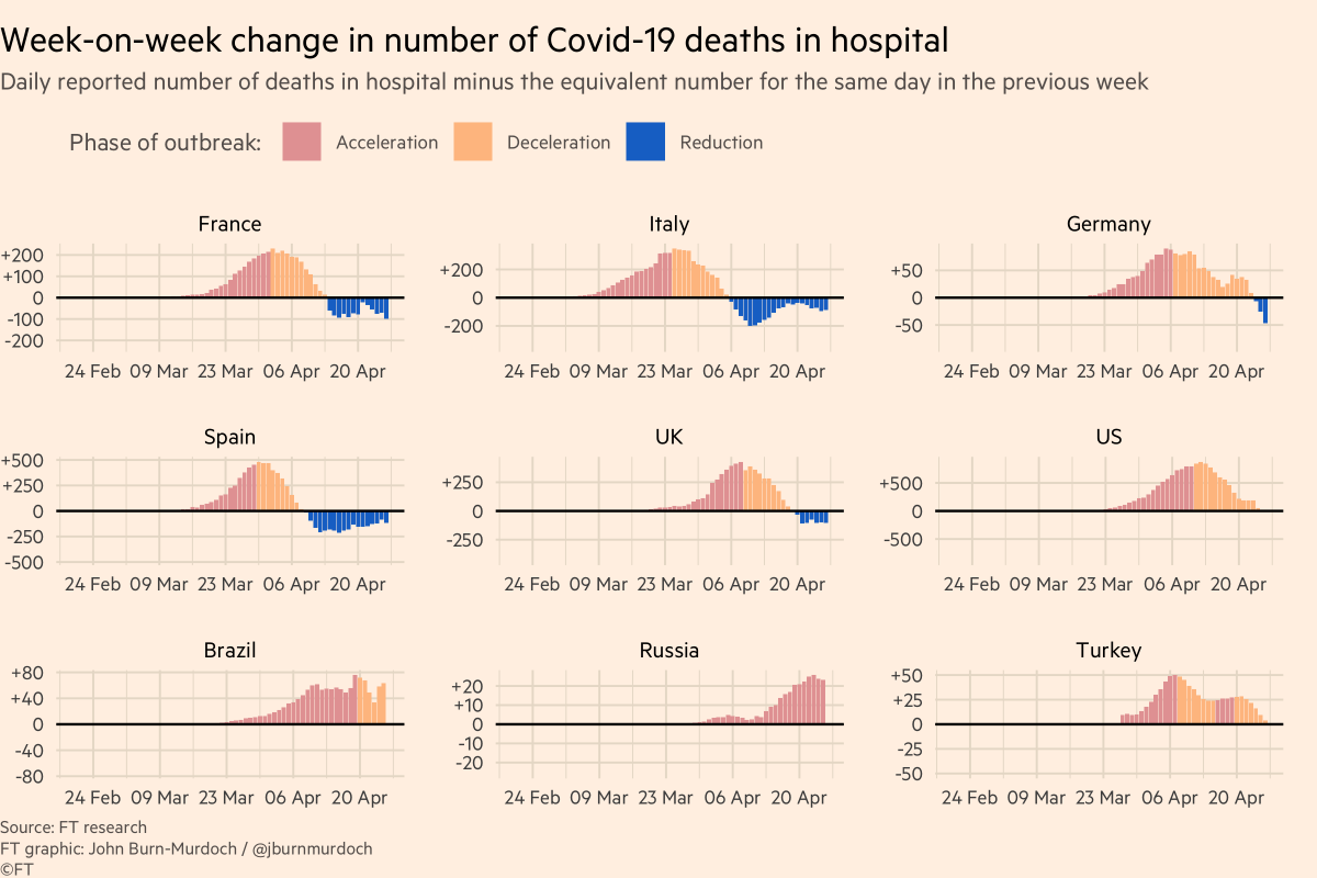
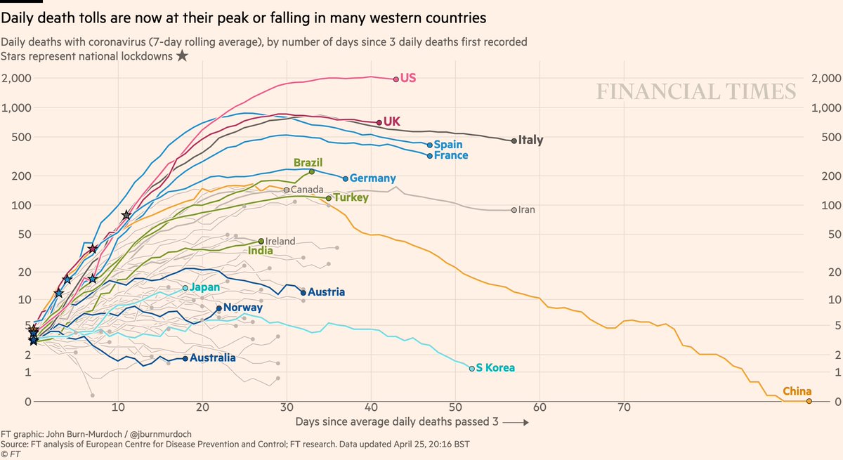
Daily deaths
• Brazil 📈
• Still too early to say if US has peaked
• Looks like UK has
• But descents look much slower than ascents
• Successes in dark blue: Australia, Norway, Austria
Live charts ft.com/coronavirus-la…
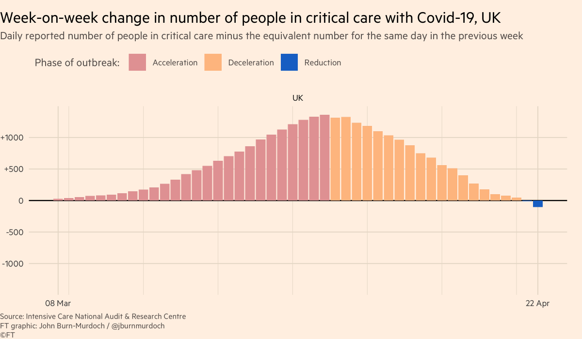
This chart shows net change in Covid patients in intensive care (data from the @ICNARC sample).
UK now has fewer people in intensive care beds than the same time last week 👍
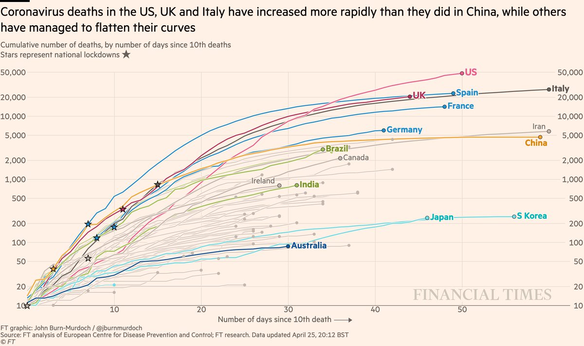
• US death is highest worldwide and still rising fast
• Japan set to pass S Korea
• UK curve still matching Italy’s
• Australia still looks promising
All charts: ft.com/coronavirus-la…
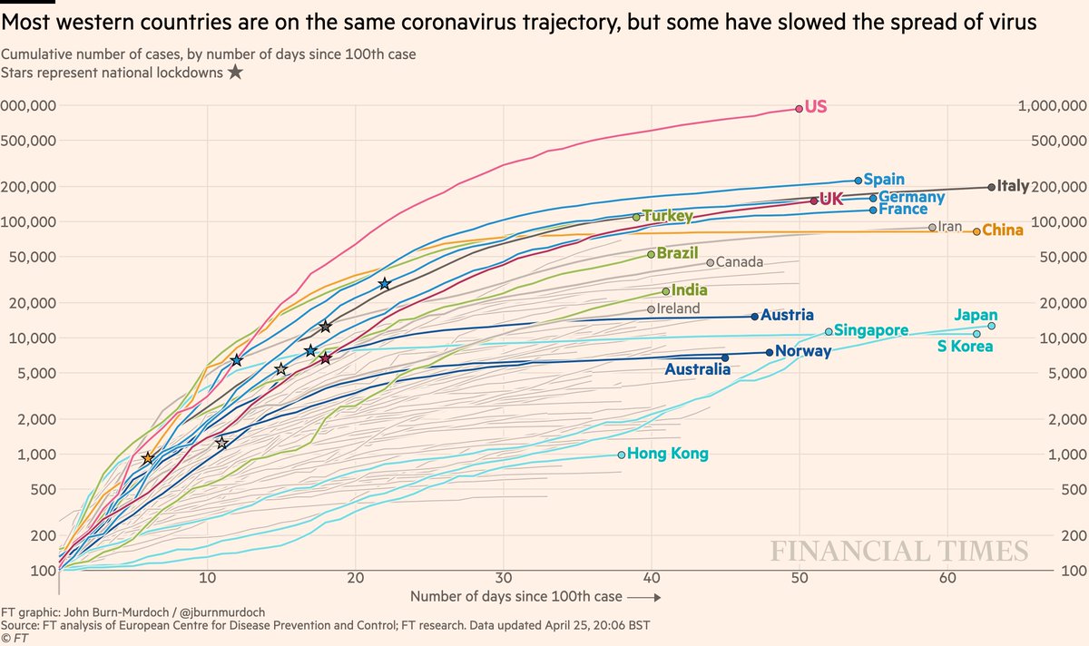
• US curve beginning to taper?
• Turkey still battling a severe outbreak
• Japan has passed Korea’s total, Singapore has passed Japan’s curve: both show the danger of thinking a country has dealt with Covid
All charts: ft.com/coronavirus-la…
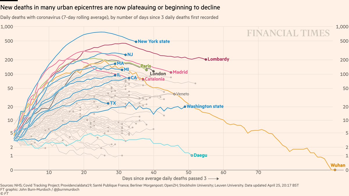
• NY daily confirmed Covid deaths now descending (we’re excluding nursing homes for consistency)
• Daily London deaths also appear to have peaked
• Most Western cities/regions now in plateau or decline phase
All charts: ft.com/coronavirus-la…
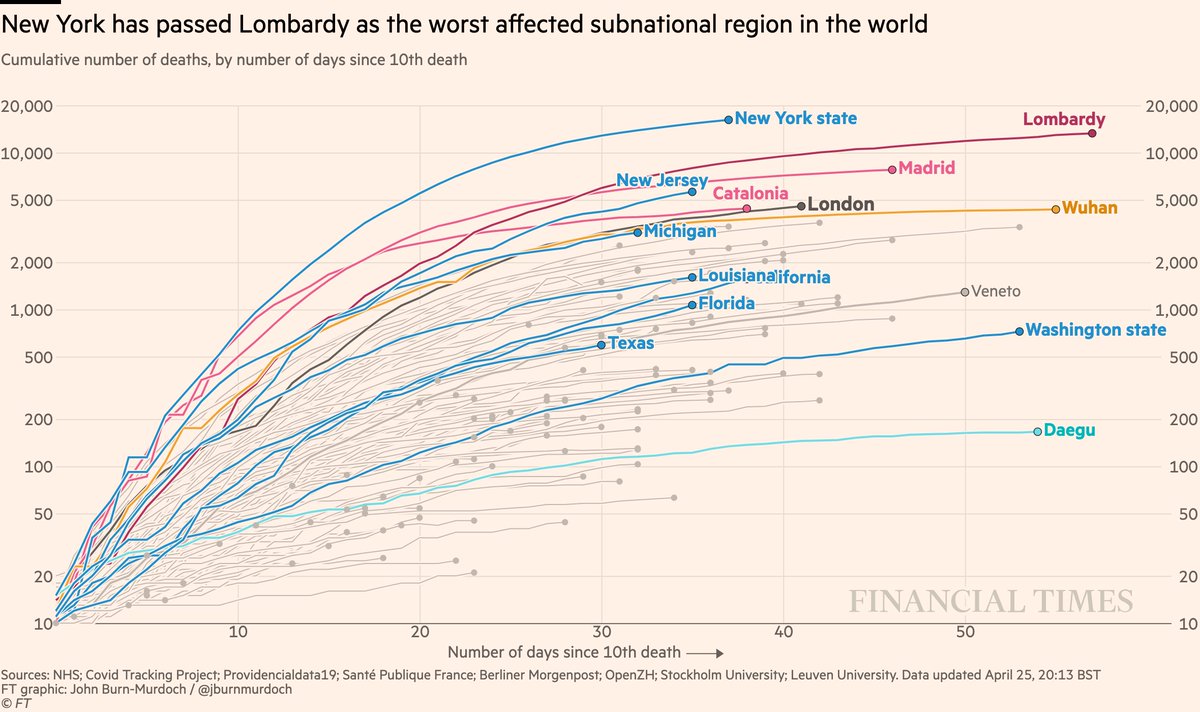
• NY curve tapering, but has passed Lombardy for world’s highest subnational death toll
All charts: ft.com/coronavirus-la…
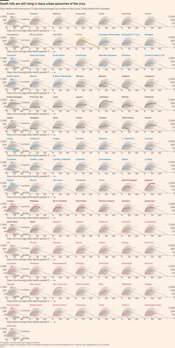
• 35 US states now shown
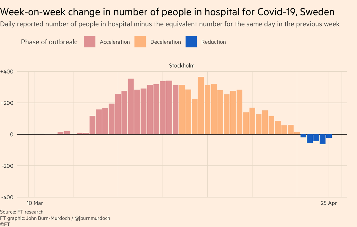
• Stockholm peaking?
• Sicily, Sardinia, Balearics, Canaries all low curves: do islands fare better?
All charts: ft.com/coronavirus-la…
• Norway locked down & Sweden didn’t; Norway daily death toll rose much more slowly than Sweden
• Australia faring well
• In Europe, Austria, Denmark, Norway faring well
All charts: ft.com/coronavirus-la…
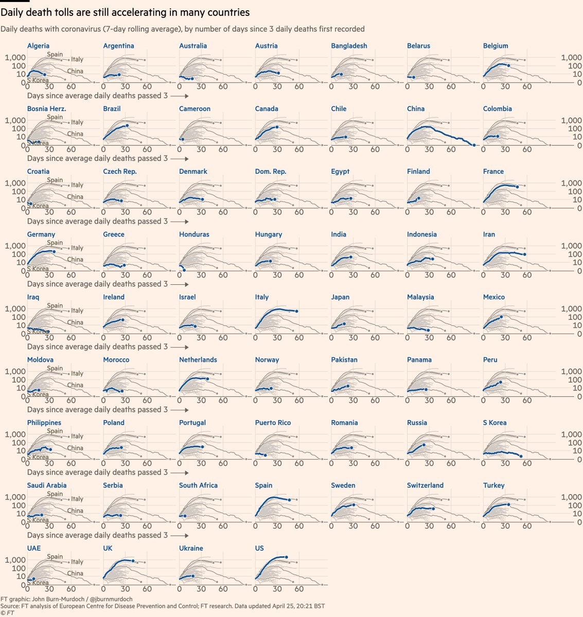
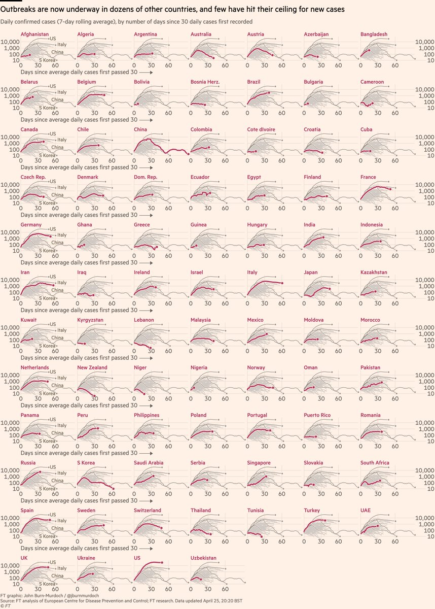
• Adding more African and other emerging-market countries every day
• Bangladesh 📈
• Early action in Aus & NZ may have turned corner 🇦🇺🇳🇿📉
• Watch as European countries ease lockdowns 👀
All charts: ft.com/coronavirus-la…
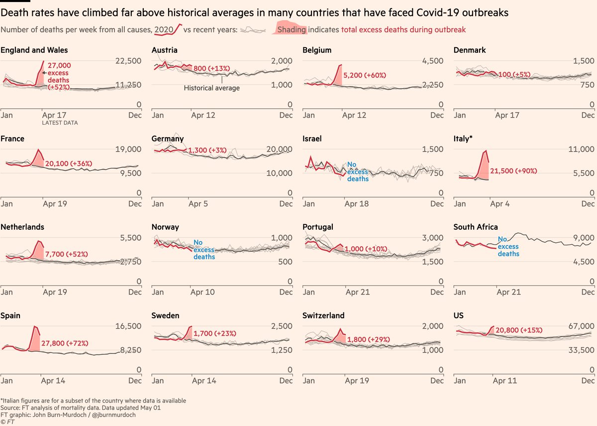
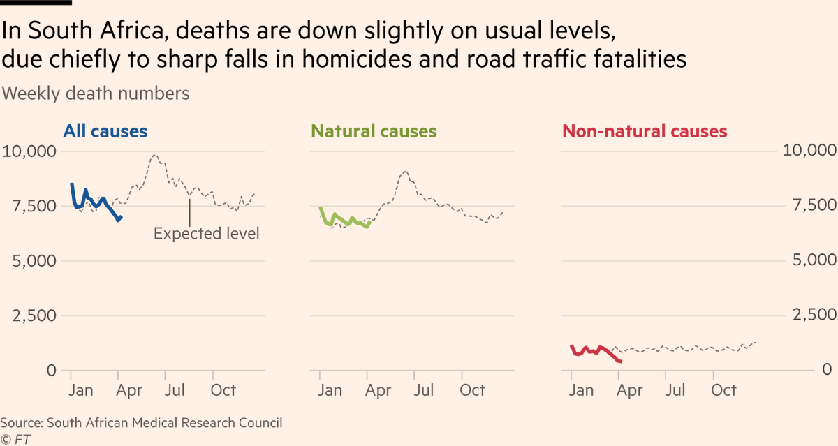
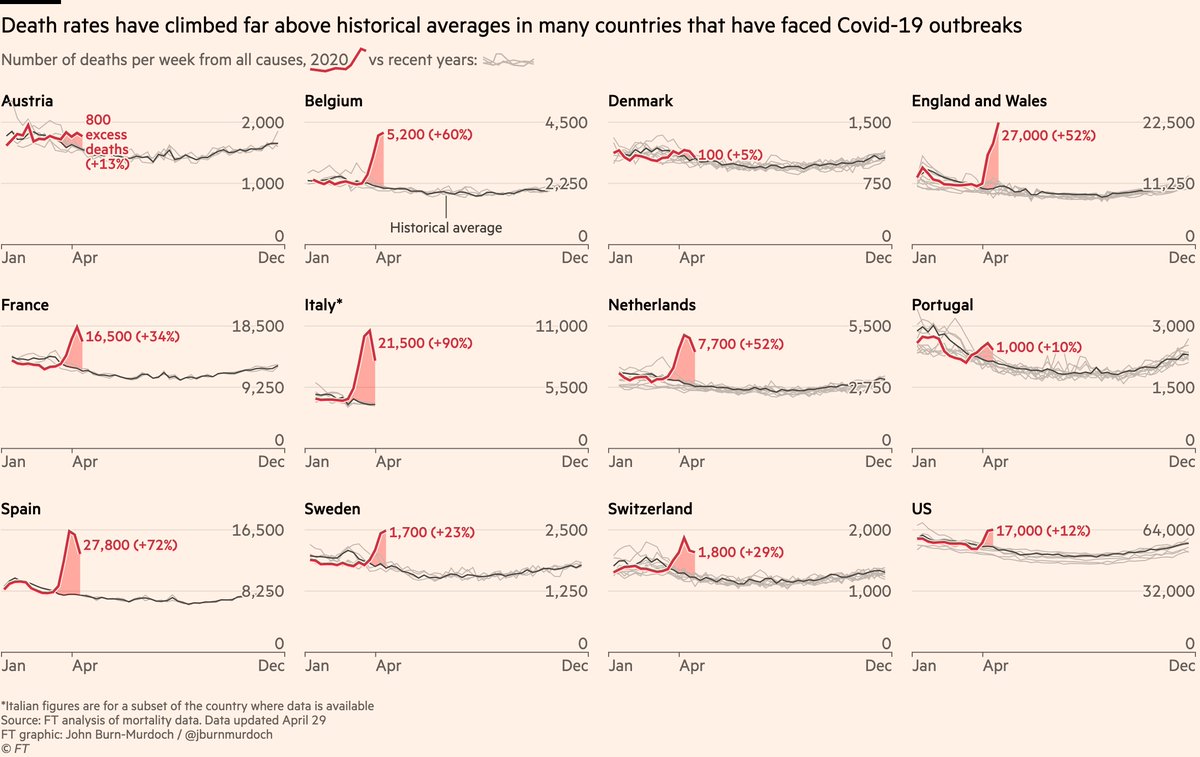
My colleague @ChrisGiles_ estimates UK excess deaths linked to Covid far exceed daily reported numbers
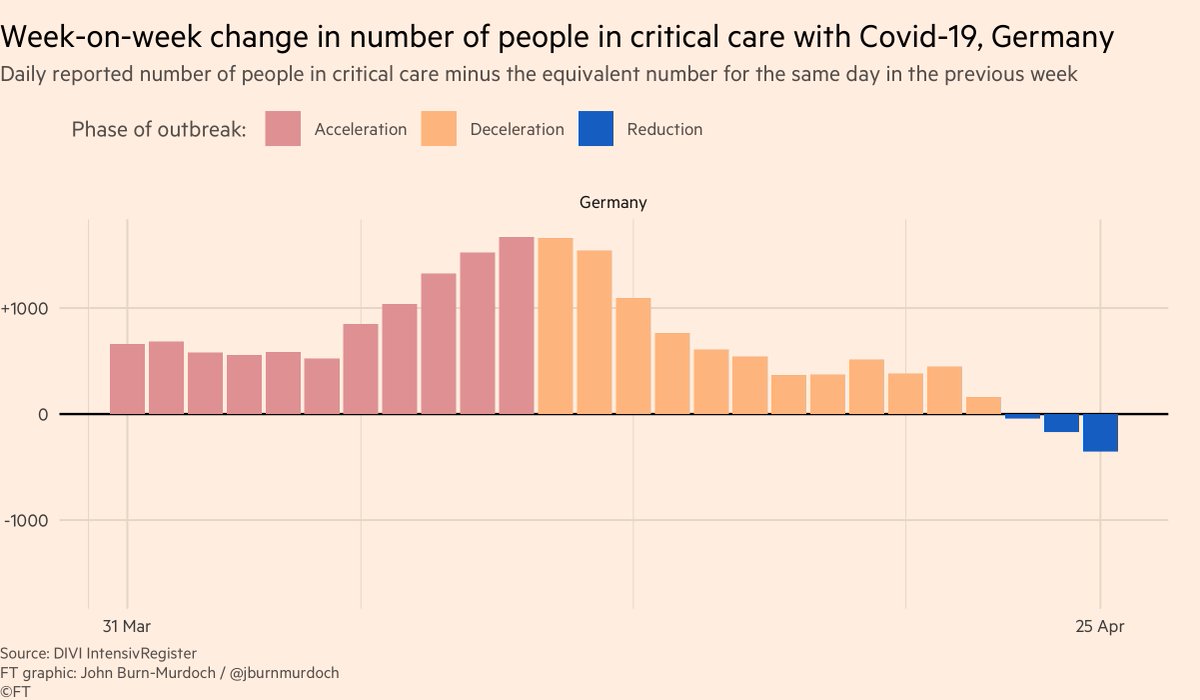
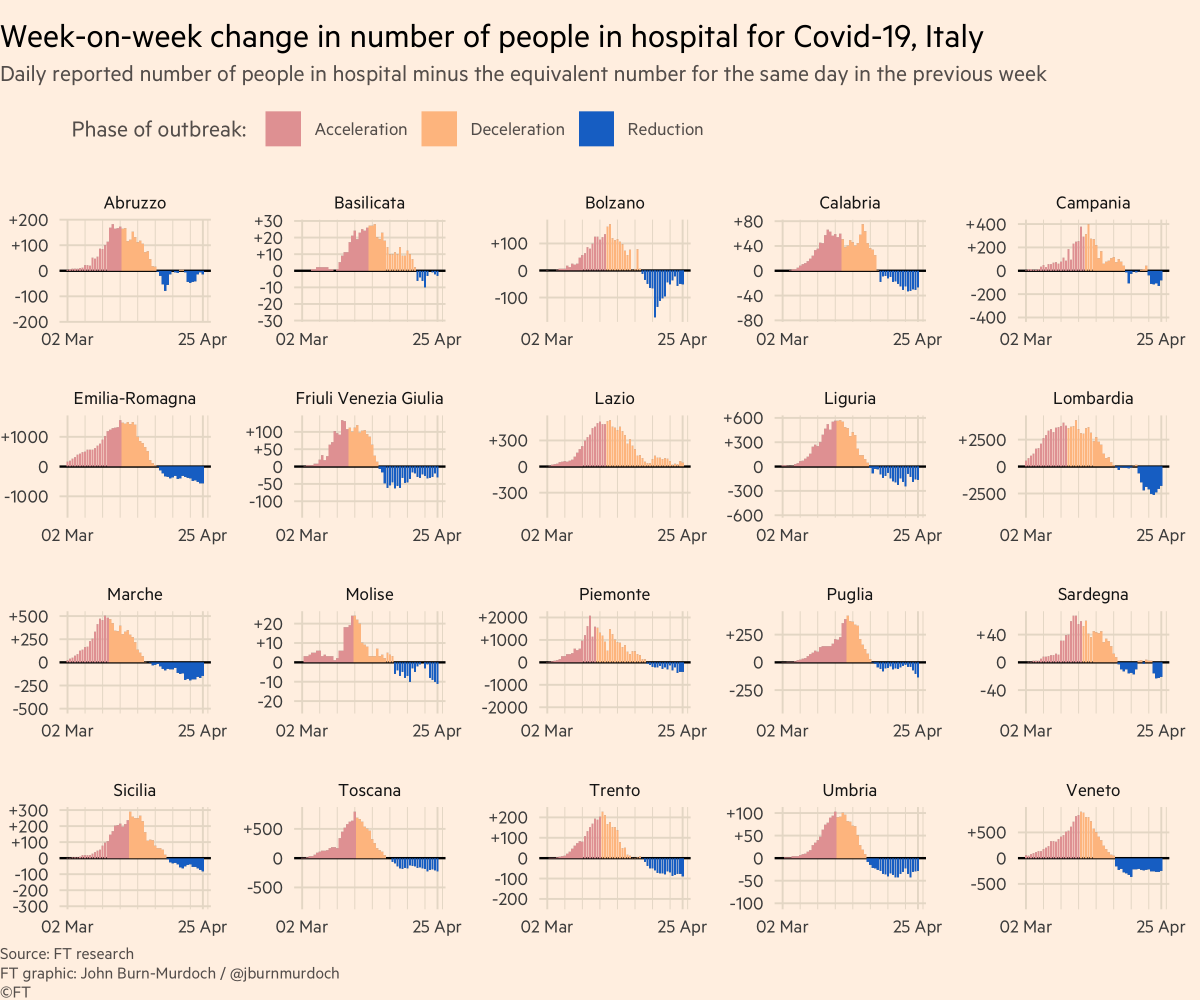
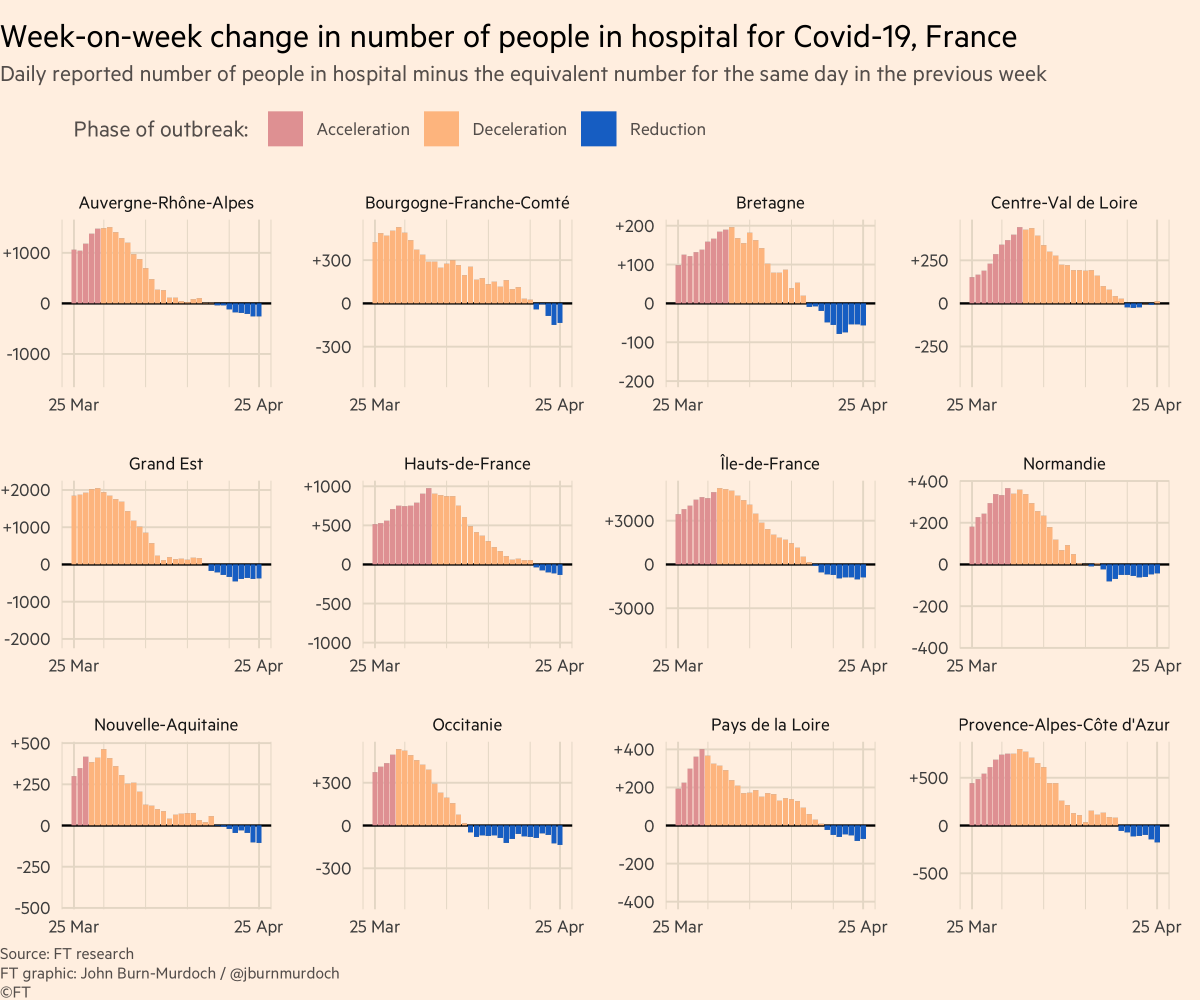
A good metric for this is hospitalisations:
• More reliable than confirmed cases (not influenced by testing regimes)
• Shorter lag than deaths
So here are some charts showing hospitalisations in various countries:
So my call-out tonight is:
Reply here, email coronavirus-data@ft.com or add a link to this spreadsheet: docs.google.com/spreadsheets/d…
Here’s a video where I explain why we’re using log scales, showing absolute numbers instead of per capita, and much more:
All of these are invaluable, and we incorporate your suggestions and data every day.
We’ll keep getting back to as many people as possible.
Enjoy the rest of your Saturday, folks :-)

