Scott Berkun Profile picture
May 12, 2020 7 tweets 3 min read Read on X
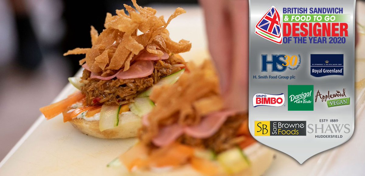
1. Since I care about all kinds of design, I was excited to discover this sandwich design competition by @BritSandwich! But there are problems, as you can see. #designmtw Image
2. Of course people argue about "what is a sandwich" and I'm on the side that if it's open faced, it's reaaaally not a sandwich but that's besides the point.

The main design issue is usability: how do you eat this without it going all over the place? Image
3. This seems trivial, but food that is impossible to eat without making a mess has design problems.

As does food that really shouldn't need a knife and fork, like a hamburger, but is so overloaded or tall that it can't legitimately be held. Image
4. It's a classic "design to sell" vs. "design to use" problem - it sounds great & might look interesting at first but it's not a sandwich anymore. It's more like casserole out of its pan.

I'm not making a categorization argument: some "food" isn't designed to eat. Not really.
5. I'm from NYC so of course I have opinions about Pizza.

Say what you will about NYC vs. Chicago, but one is designed to be easy to eat and even walk with. Travolta eats two in Saturday Night Fever.

It becomes a sandwich, by design. No forks, no plates. No confusion. Image
6. How do you eat this? What is the design intent?

Nachos are based on "chip delivery of other food items." But this one is like JENGA - try to extra a chip without making a mess by toppling the tower, reinsert and then eat.

(a loaded chip is an open faced Sandwich, no?) Image
7. There are exceptions: when it's clear you will be eating with your hands and it will be messy.

Example: Crab boils where you get bibs, hammers, crackers (shown - a cool design on it's own) etc.

There's no pretense and no pretending to be a sandwich either. Thumbs up. ImageImage

• • •

Missing some Tweet in this thread? You can try to force a refresh
 

Keep Current with Scott Berkun

Scott Berkun Profile picture

Stay in touch and get notified when new unrolls are available from this author!

Read all threads

This Thread may be Removed Anytime!

PDF

Twitter may remove this content at anytime! Save it as PDF for later use!

Try unrolling a thread yourself!

how to unroll video
  1. Follow @ThreadReaderApp to mention us!

  2. From a Twitter thread mention us with a keyword "unroll"
@threadreaderapp unroll

Practice here first or read more on our help page!

More from @berkun

Sep 25
1. The main idea of Why Design Is Hard is that designers in organizations need to reframe the way we think about our work.

We have many valid complaints - but we have misplaced faith that complaining changes anything for anyone.

#designishard #ux #design Image
2. In a recent poll it was clear that the hard part of design work is RELATIONAL. It's not about our talents or skills.

We are in denial: we want to believe our creative ideas and smart opinions can conquer all. That's not how people in organizations behave. Image
3. Design, as a verb, requires power. If you are not the decision maker, you are an ADVISOR. You give advice and suggestions.

The DECIDER is actually the person who determines what the final design that ships is or is not. This is often a VP, a director or a team leader. Image
Read 6 tweets
Sep 15, 2021
Study decisions, not just ideas. It's decisions and the people who make them that define how ideas are evaluated.

If you only care about ideas you'll stay mystified and angry about why "the best" idea never gets chosen.

Study decisions. Learn how to influence them.
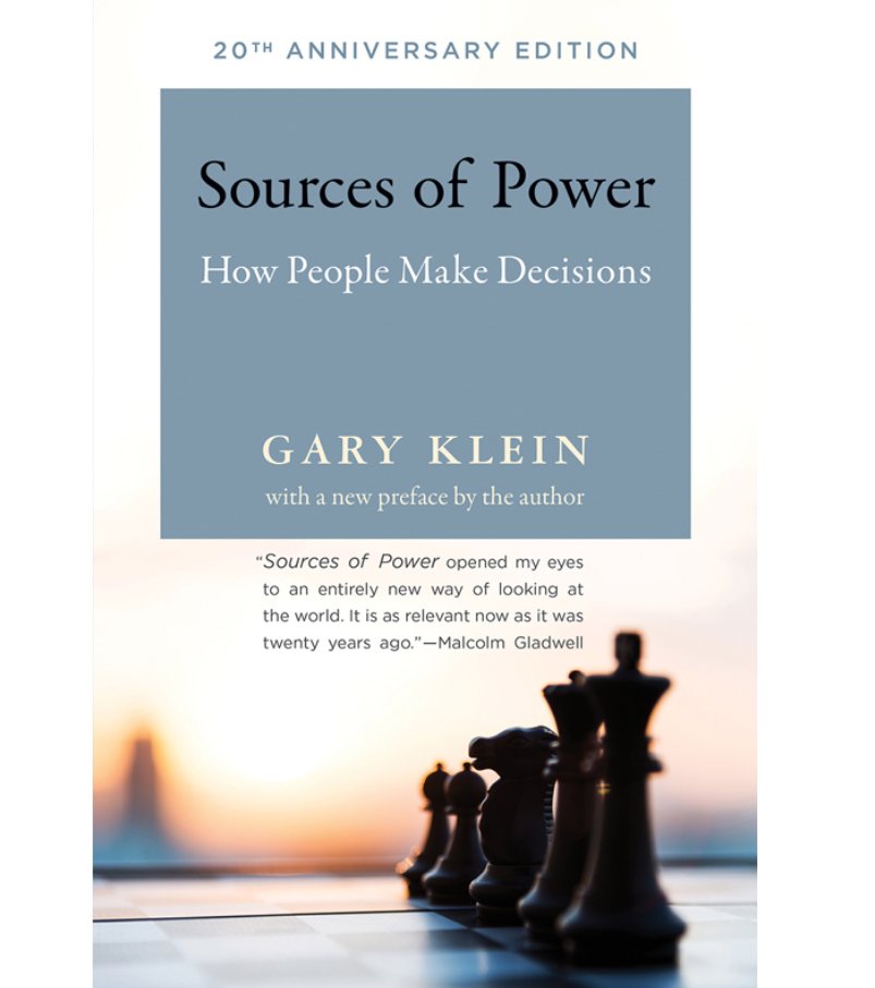
I've read many books on decision making but this one had the most powerful impact on me.

For the approach he takes alone, studying front line workers making life and death decisions, it's a worthy read.

Sources of Power, Gary Klein
Have you ever kept a decision journal? Here's how it works.

When you have a big decision:

1. Write down your thoughts about your options.
2. And your rationale for deciding.
3. Then decide.
4. Experience the outcome.
5. Review 1 & 2 - what can you learn now? write it down
Read 4 tweets
Jul 22, 2021
1. We have 5 basic senses - then why don't designers and experiences use all of them?

It's always fun to step back and ask this question, which often leads down the path to SMELL-O-VISION. Image
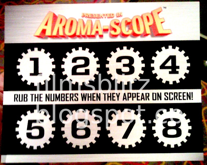
2. It sounds like a joke but Smell-O-Vision was one of many attempted innovations to improve the movie theater experience.

Like many attempted innovations, many approaches were tried. Some tried to pump in scents into the theaters, but the timing was a problem. Image
3. Others tried a simpler approach, using "scratch and sniff" cards - Instructions would appear on the screen telling you when to use which one. Clever. Image
Read 7 tweets
Jun 16, 2021
1. All of the ideas in How Design Makes The World are encapsulated in these four questions every product team should ask regularly. #design #ux #designmtw
2. Many projects have requirements, schedules and cool ideas, but forget to focus on improving something specific for real people. Or get lost along the way.

Good teams refresh the real goals often, like a lighthouse.
3. We're all prone to forgetting our biases and designing for ourselves.

If we don't go out of our way to study our customer's real needs, and how they differ from our own, we will fail them and possibly not even know until it's too late.
Read 7 tweets
May 13, 2021
1. Have you been frustrated by how little your coworkers understand about the value of what you do?

If you're a UX designer, you're an expert. But there's a trap in how this expertise is taught that works against you.

This thread explains what to do about it.
2. Design books/courses are design-centric, but the world isn't. Orgs are business, tech or mission centric. Collision-warning!

"I have to explain my value? And work uphill for respect?"

Yes. The sheer numbers make this likely! But do not despair.
3. We imagine our coworkers should *already know* about design. But how could that possibly happen? Who would have taught them?

We're trained with the presumption non-designers should magically know things - but is that how we approach designing products for people?
Read 11 tweets
Apr 27, 2021
If requirements define the problem, how can a designer succeed if the problems they are supposed to solve are poorly defined or the wrong ones?
If the person writing requirements knows nothing about good design, why would anyone expect good design to be a possible outcome?

It's like someone who has never cooked writing a recipe.
Requirements:

- car that goes 1000mph
- lasts 1000 years
- cures cancer
- creates world peace
- makes selfish people generous for 10mile radius
- easy to use
Read 4 tweets

Did Thread Reader help you today?

Support us! We are indie developers!


This site is made by just two indie developers on a laptop doing marketing, support and development! Read more about the story.

Become a Premium Member ($3/month or $30/year) and get exclusive features!

Become Premium

Don't want to be a Premium member but still want to support us?

Make a small donation by buying us coffee ($5) or help with server cost ($10)

Donate via Paypal

Or Donate anonymously using crypto!

Ethereum

0xfe58350B80634f60Fa6Dc149a72b4DFbc17D341E copy

Bitcoin

3ATGMxNzCUFzxpMCHL5sWSt4DVtS8UqXpi copy

Thank you for your support!

Follow Us!

:(