
Here's the "comparison of deaths" graph that's been missing from the #dailybriefings for a few days now, including the one lead by George Eustace...
It's a really odd coincidence that it was stripped out of the slide show at about the time we definitively passed Italy and Spain.
It's a really odd coincidence that it was stripped out of the slide show at about the time we definitively passed Italy and Spain.
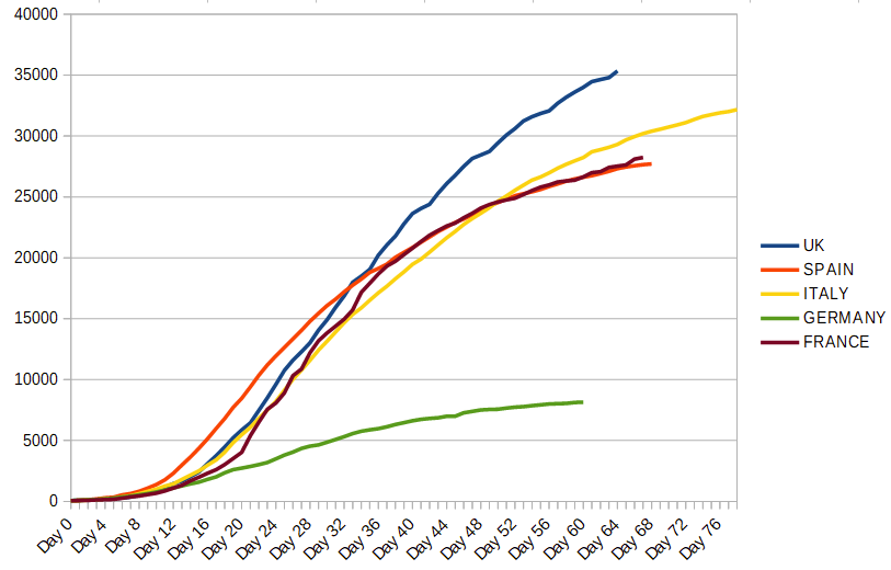
Here's exactly the same data, but mapped onto the calendar rather than how far each country is along its respective infection curve. As before, the first data point is the date of 50+ deaths.
Our curve looks like a rocket. Started late, shot past everyone else. Still soaring.🚀
Our curve looks like a rocket. Started late, shot past everyone else. Still soaring.🚀
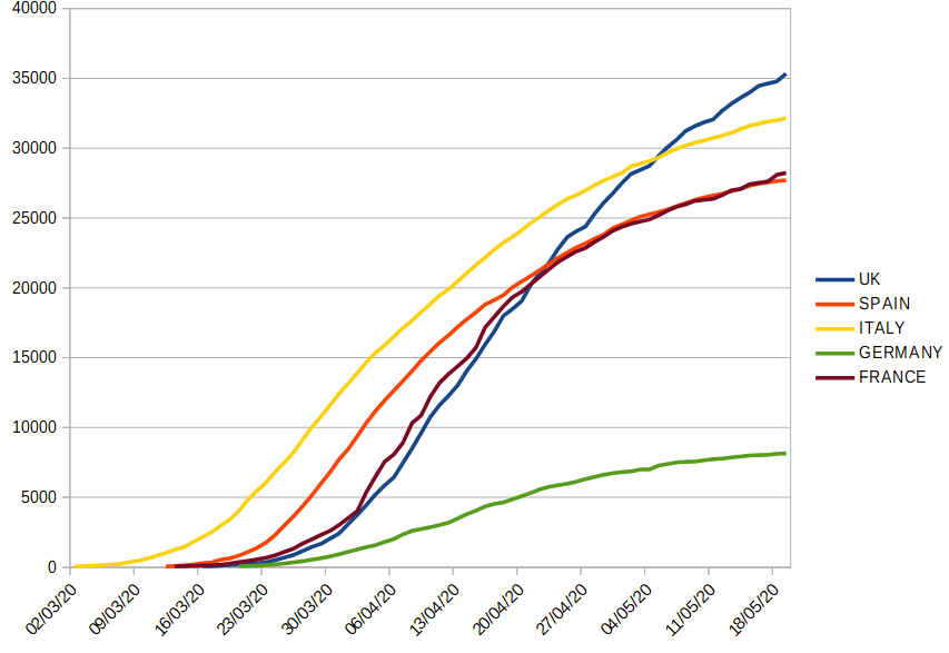
All the other countries have flattened off dramatically. We're still rising fairly steeply, albeit not at the rate of a month ago. But it's something to consider before sending your children back to petri dish - I mean, school.


