@JesseRodriguez 6 largest EU countries (Germany, France, Italy, Spain, Poland and Romania) have 313 million people. The US has 330.
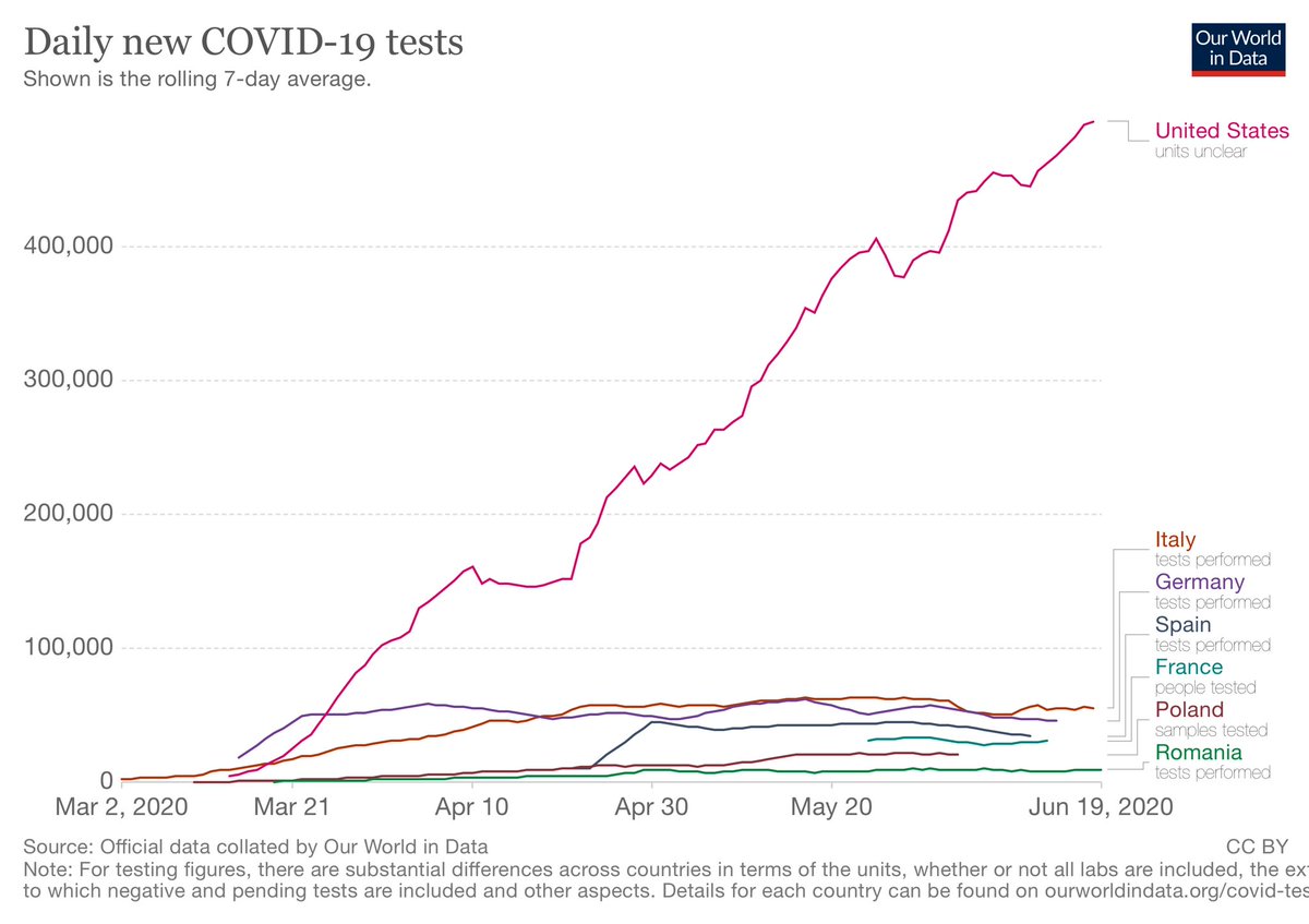
Those 6 countries had 18,036,305 tests; US 27,048,516.
One test per every 17.3 people for the EU6.
One test per every 12.2 people in the US.
cc @Harry_Stevens
Those 6 countries had 18,036,305 tests; US 27,048,516.
One test per every 17.3 people for the EU6.
One test per every 12.2 people in the US.
cc @Harry_Stevens
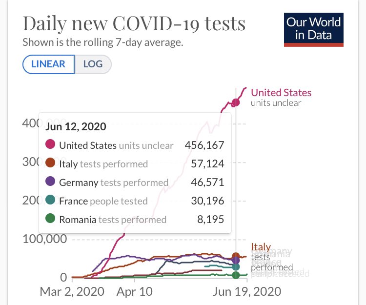
@JesseRodriguez @Harry_Stevens The US has already tested 1 of every 12.2 people (8.1%) of the population while the EU6 tested only 1 of every 17.3 people (5.7%) of the population.
A chart that shows the US versus Europe without testing data is misleading.
cc @NolteNC @AlexBerenson @kerpen @brithume
A chart that shows the US versus Europe without testing data is misleading.
cc @NolteNC @AlexBerenson @kerpen @brithume
@JesseRodriguez @Harry_Stevens @NolteNC @AlexBerenson @kerpen @brithume Here is the 7-day average of testing levels in the US versus that of the EU6. Also note (third attachment) that the infection rate in the US is much closer to the EU6 countries than what @Harry_Stevens’s chart suggests. 
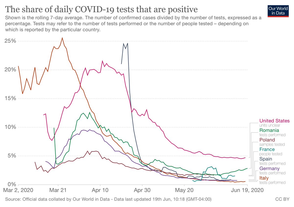
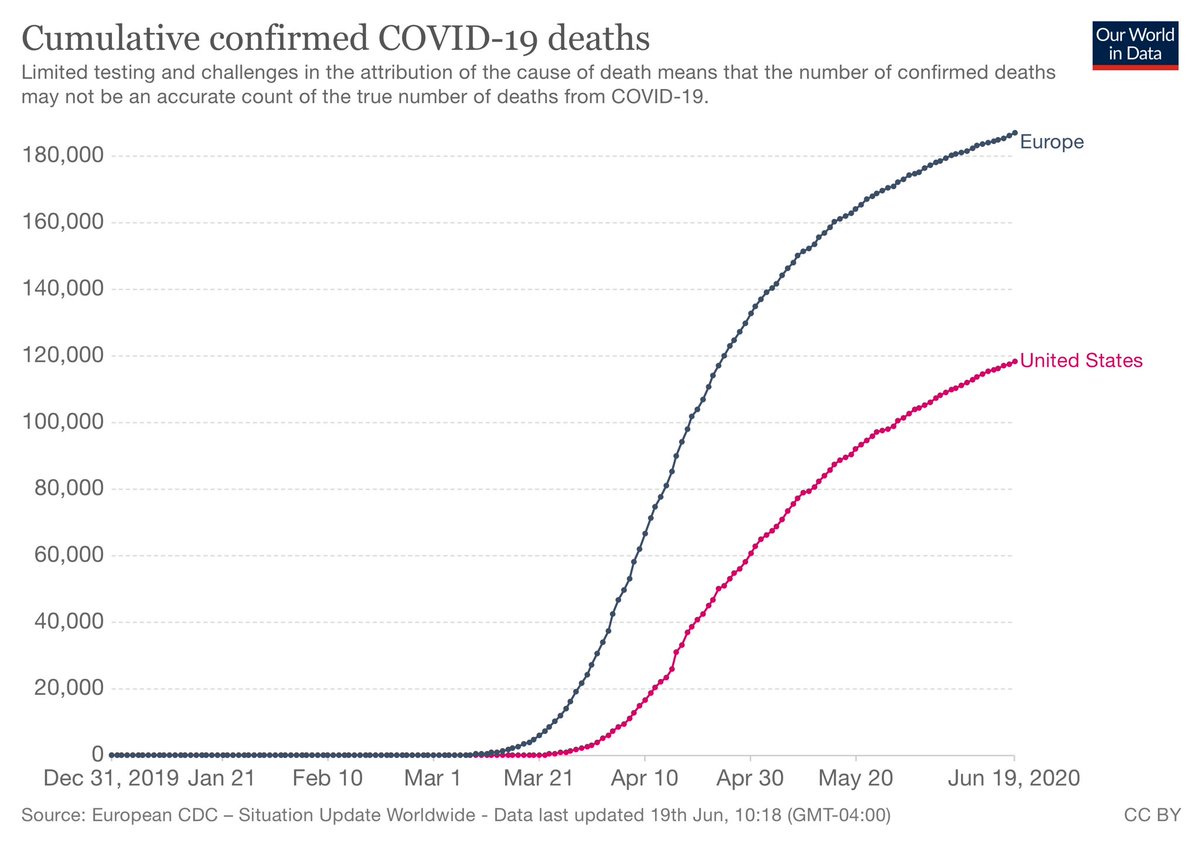
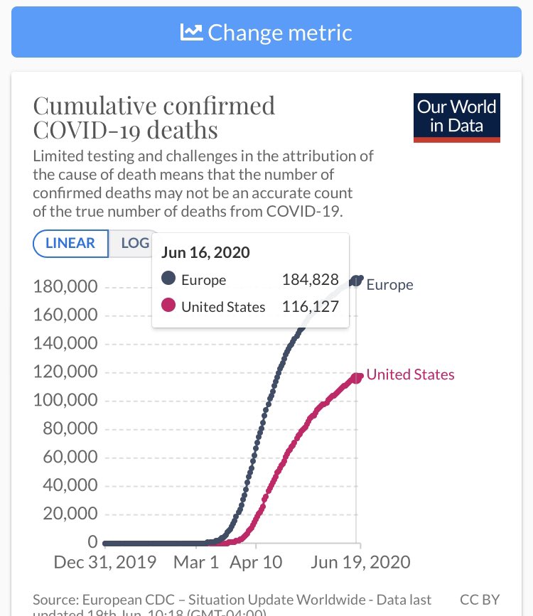
@JesseRodriguez @Harry_Stevens @NolteNC @AlexBerenson @kerpen @brithume @jaketapper @bern_hogan @VPPressSec @benshapiro @Timcast @Heminator @MaxCRoser @TimAlberta @DonaldJTrumpJr @dbongino Attached are charts of Coronavirus deaths in Europe versus the United States. The graphs all over Twitter/TV that show case counts of Europe versus the US do not factor in testing levels differences (see above tweet).
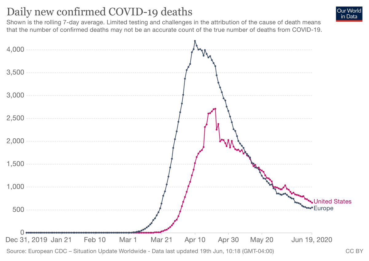
@JesseRodriguez @Harry_Stevens @NolteNC @AlexBerenson @kerpen @brithume @jaketapper @bern_hogan @VPPressSec @benshapiro @Timcast @Heminator @MaxCRoser @TimAlberta @DonaldJTrumpJr @dbongino @JFNYC1 @joelpollak @rww_gop @JamesTodaroMD @jamestaranto @GPIngersoll @JoeSquawk @cvpayne @justin_hart This chart shows the 7-day average of total deaths. Note how similar both places were over recent months but delayed by a nice few weeks. Also note that the US peaked at a lower level than Europe. I don’t know how the future will look but this is how things were until now.
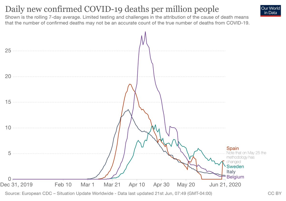
@JesseRodriguez @Harry_Stevens @NolteNC @AlexBerenson @kerpen @brithume @jaketapper @bern_hogan @VPPressSec @benshapiro @Timcast @Heminator @MaxCRoser @TimAlberta @DonaldJTrumpJr @dbongino @JFNYC1 @joelpollak @rww_gop @JamesTodaroMD @jamestaranto @GPIngersoll @JoeSquawk @cvpayne @justin_hart @SohrabAhmari @BuckSexton @maddow @ByronYork @SteveKornacki @MikeEmanuelFox @exjon @jolshan @michaeljknowles @SpoxHHS Chart: 7-day average of Covid Deaths per 1 million people.
Spain/Italy had long/deep lockdowns and Belgium too, but Sweden didn’t. The peak in Sweden was lower than the others.
Sweden is now at 500 deaths/per million.
Italy 573
Spain 606
Belgium 837
NY 1,602
NJ 1,462
Spain/Italy had long/deep lockdowns and Belgium too, but Sweden didn’t. The peak in Sweden was lower than the others.
Sweden is now at 500 deaths/per million.
Italy 573
Spain 606
Belgium 837
NY 1,602
NJ 1,462