1/25 Okay, I’m gonna be all typography geeky again. This time I’ll walk you through how I personally go about setting a body text. There are probably plenty of other methods, but this one’s mine. A thread. And boy will it get nerdy. 

2/25 Note: This method is tedious, inefficient and time-consuming. But thorough. I use it when I layout novels and other projects that depend a lot on body text. But you might find it interesting regardless. Skip some steps if you want.
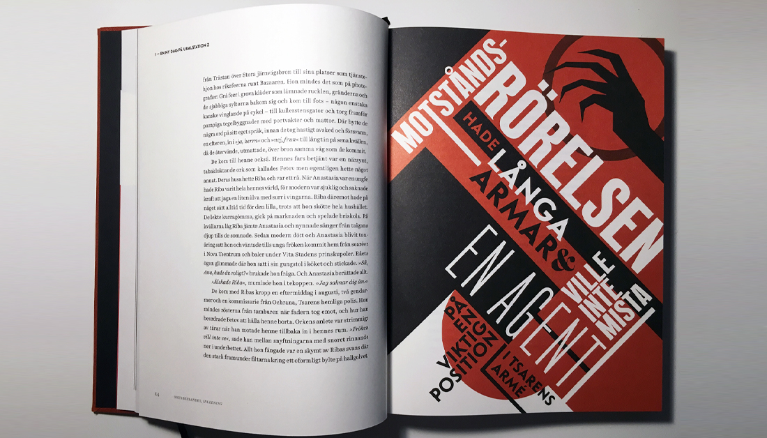
3/25 Projects where I have used this method include Symbaroum, Oktoberlandet, an annual report (that won gold in the Swedish Design Price, yay!) and a bunch of novels. I did NOT use it for MÖRK BORG. I didn’t even have Paragraph Styles or baseline grids there... Ok, here goes:

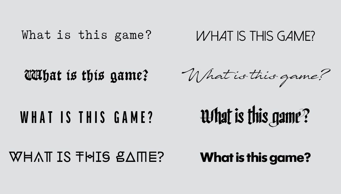
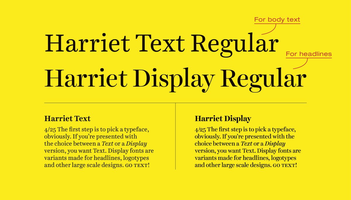
4/25 The first step is to pick a typeface, obviously. If you’re presented with the choice between a Text or a Display version, you want Text. Display fonts are variants made for headlines, logotypes and other large scale designs. Go Text!
5/25 Sometimes the typeface has like a hundred different fonts, such as Light, Roman, Medium etc. Roman or Regular is usually the one intended for body text, but for some typefaces you can also use Light.
6/25 When you got the font its time to determine the size and leading (line height) of your body text. I do this the same way you’d brute-force a password*: By trying out as many combinations as I can.
*Leave people’s passwords alone though.
*Leave people’s passwords alone though.
7/25 Create a new document and fill a text box with maybe 800 characters worth of text. Do NOT use Lorem Ipsum, it’s important that you can actually read and understand this. Make sure every line fits about 55 characters (including blank spaces).

8/25 Set the text to something like 8pt for size and 10pt for leading (I’ll call this 8/10pt). Now make a bunch of copies of this box and change the settings slightly. 7.5/10, 7.5/11, 8/10,5, 8.5/11, 9/10.5 etc. Make like 20-30 variants.

9/25 By now you should get a rough idea on what settings works and not, and maybe you already have a few favorites. But don’t do anything until you have done the most important step: PRINT THIS.

10/25 Unless the project is entirely digital and will never be printed, you CAN’T tell if a body text will read well unless you print it at 100% scale and actually sit down and read it as you would with the final thing. Print the sheet and compare the settings in a normal light.
11/25 First, just eyeball the sheet and see which boxes you instinctively go for. Now focus on these, and read the text, see which one is easiest and most comfortable to read. Ask other people to do the same. Have them point out their favorites.
12/25 Let’s say you like 8.5/11pt best. Remove all the other boxes and make new copies of this one, this time making the changes even smaller. Make one box 8.4/11pt. Another 8.6/11. 8.5/11.5. Etc. The devil is in the details.

13/25 Try even smaller increments like 8.55pt or 11.25pt etc, print it and compare. Even though it might feel silly, they will feel different, if only very, very slightly. Continue doing this until you have a setting that reads well. Remember: PRINT and compare.

14/25 So let’s say we pick 8.55/10.7pt as our favorite. The next step is to adjust word and letter spacing. By default, most fonts are pretty well aligned for this but you might want to fiddle with the settings regardless.

15/25 I use Adobe Indesign but you can most probably do this in any other program. I will also only talk about setting left-aligned text, with a ragged right. If you want a justified body text there are a lot more things to keep in mind to avoid a text full of holes.

16/25 So go to the Justification settings and focus on the boxes labelled “Desired”. We’re only going to mess with word and letter spacing for now and leave glyph scaling out of it. That’s a whole different beast.

17/25 By default this setting is 100% word spacing and 0% letter spacing (100/0%). This is the amount of space between each word and each letter. We will probably want to make that a bit tighter, but it always depends on the typeface.

18/25 So, make a bunch of copies of the text box again, changing the spacing settings for each. One at 100/0%, one at 90/0%, one at 85/0%, one at 100/-2%, 90/-2% etc, etc. Again, maybe 20-30 different versions.

19/25 Print and read, compare. These are the final touches before we have our body text. You're soon done!
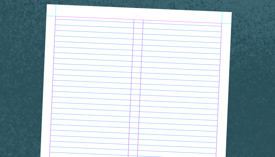
20/25 Ok we have a winner! Now adjust the width of the text box until it fits between 40-60 characters (including blank spaces) per line if you’re using two columns. For a single column layout, around 60-80 characters per line is good.

21/25 This is how wide your column grid should be. Height is depending on book size but my experience is that it should land around 40-55 lines. Again, very much depending on other factors (making a grid is a science all in itself).

22/25 Tip 1: Decide if you want to separate paragraphs with blank spaces or indents. I often prefer indents, and recommend that they are as wide as the font size (so 8.55pt in this case). This unit is called an “em” in typographic nerd-lingo.

23/25 Tip 2: Respect the base-line. If you have more than one column, each line should follow the base-line grid, otherwise it will look messy and won’t be as pleasant to read. But as always, break the rules if you want to.
24/25 And that’s your body text. Save it as a paragraph style. Also make a style for the first paragraph which will be without indent. If you’re using things like italic, small caps etc for certain phrases, create character styles for that.
25/25 The next thing you wanna do is create a grid (with page margins and guidelines to align your layout to), and create styles for headings, secondary body text, captions etc. But that's another story for another time. Thank you!
Bonus round: Some settings from stuff I’ve done. The TTRPG Symbaroum is Skolar Latin Regular 8,9/11,95pt with no spacing adjustments. The secondary body text is Benton Sans Regular 7,85/11,95pt with 87% word spacing and +2% letter spacing.

Bonus round: The TTRPG Oktoberlandet’s game section is Harriet Text 8.3/12pt, 95% word and +2% letter spacing. The novel sections are Harriet Text 9,5/15.1525pt with 110% word and +3% letter spacing. I went all in on this one.
Bonus round: The novel Tändstickan by Aline Gladh is Sabon Next 9,8/14.2pt with 105% word and +5% letter spacing. All quite different projects and thus quite different settings. Hope you enjoyed this geekery!

• • •
Missing some Tweet in this thread? You can try to
force a refresh