1/ A new coronavirus alert app from @PAHealthDept was the focus of today's press conference - you can read about that here - bit.ly/2Ee6zga - but lets go over some of the new case numbers and see what the past couple weeks has looked like in PA and in #BucksCounty
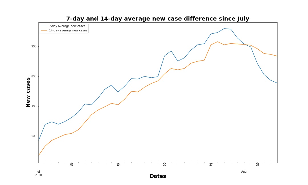
Let's start with the broad overview: 7-day and 14-day average new cases are currently holding fairly steady at about 770 cases as of Monday. That's roughly the same levels the state saw in late May, when new cases were declining after an initial boom 

Looking at August alone, it looks like the 7-day average was valleys and peaks in the first two weeks before almost intersecting with the 14-day average that had a much steadier decline over the past two weeks.

It looks like Union, Northumberland and Fayette counties have the highest 7-day average case per 100,000 people as of Aug. 1. Counties in PA's north central, south central and southwestern regions make up the bulk of these top 10 averages.

Southwestern counties like Allegheny and Beaver took most spots of the 10 highest 7-day averages per 100,000 people about a month ago. Those counties also had lower rates in July than the counties now leading in new case rates.

Before I get into our Bucks County numbers, I did want to note here that Union County's increases seem erratic and I wonder if it's an issue with testing lag that we've seen throughout the state and country in recent weeks.

The spike in new cases nationwide strained the relative few labs able to process testing kits. @MontcoPA signed a deal with @makomedical for rapid testing results in the county bit.ly/32aptNw
Horsham local @RepToddStephens announced this afternoon that deal is already seeing returns as the first results processed Monday came in about 12 hours. bit.ly/3kVZYb9
Bucks and Montgomery counties have seen relatively stable new cases since the statewide spike began showing in mid to late June. While Bucks County's 7-day average has a bit of a spike near the most recent days of August.

Just like in our statewide data, however, the 14-day average cases show a similar steady decline in Bucks and Montgomery Counties.

A news release from @BucksCountyGovt reporting a steady rate of roughly 30 new daily cases over the past two weeks is below. This actually brings me to something else I think is important to talk about with data bit.ly/3h8EBkJ
Tracking a virus is a complicated endeavor and there's really no absolutely correct way to go about it. Part of the reason I've been doing these data threads over the past few weeks is to offer not only the numbers, but how and why the data is presented the way it is
You could track the virus by daily case difference alone, but that can be incredible "noisy" and doesn't account for anomolies like testing delays. A weekend backlog could lead to people thinking the virus spikes on Tuesdays.

Tracking the case difference over time, 7-days or example, can help clean out the noise that daily numbers show. You'd be more likely to see if the virus was likely spreading or if a single-day spike skewed the data that week.

Multi-day averages can further iron out anomolies and help identify long-term trends. I like 7-day averages, but 14-day averages are apt for this virus especially since it can take two weeks for a person to become symptomatic.

Any of these metrics is valid depending on what it is you're trying to learn about the virus. Comparing 3-day, 7-day and 14-day averages contrasting with daily case differences together could help clarify potential problems in reporting, for example.
Comparing cases to other areas can mean having to adjust for populations. For example, here's Bucks, Montgomery and Union counties based on total cases. Union barely moves an inch, but why was it so high in the bar chart I shared earlier?

That's because based on population, Union County's experiencing spread at a rate right now greater than anything seen in Bucks or Montgomery counties. We're also just looking at case counts here. If you want to address the how and the why, new cases alone won't be enough

My point in bringing all of this up isn't to address those questions now, but rather to hopefully help address some of the more common issues I've seen raised on social media about pandemic data in general.
I think we all tend to get hung up on the quantities of things, and that's pretty understandable. Personally, I think we should take every opportunity to help show our work and leave the reader with something more than just the sum totals
With that in mind: as always, data was pulled through the @JohnsHopkins github repo and analyzed using the Python programming language's @Python_Pandas @matplotlib in an @ProjectJupyter environment. @threadreaderapp unroll