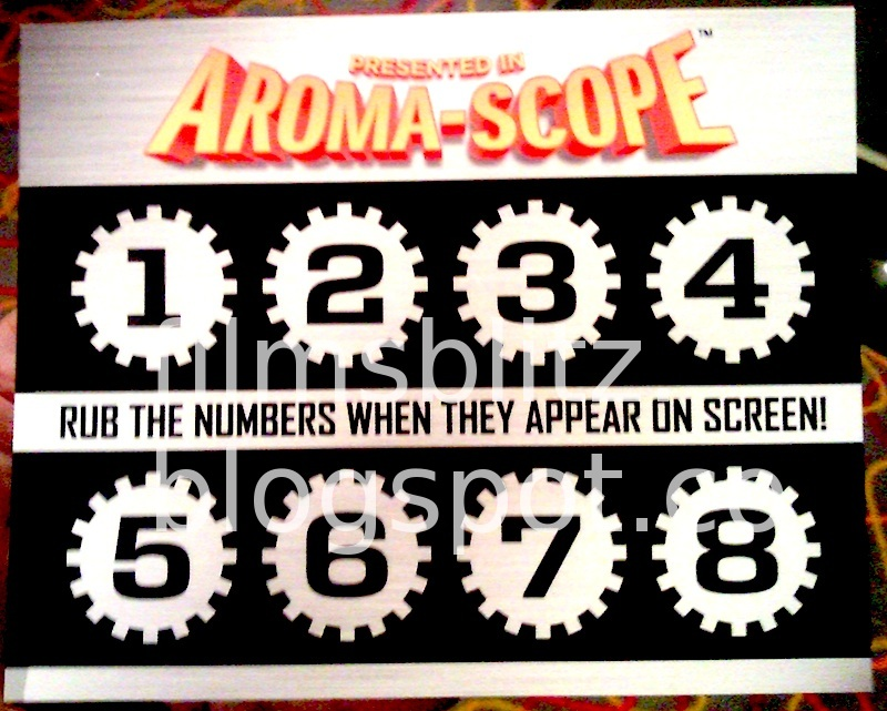
1. The product world has an odd relationship with "designing for humans". Often it's designing to sell rather than designing for actual use.
Take this clever "have a look" feature - it briefly raises toast so you can see how done it is.
Another design that solves this...
Take this clever "have a look" feature - it briefly raises toast so you can see how done it is.
Another design that solves this...
https://twitter.com/tomwarren/status/1298727060706177025
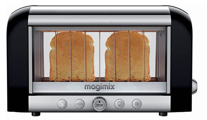
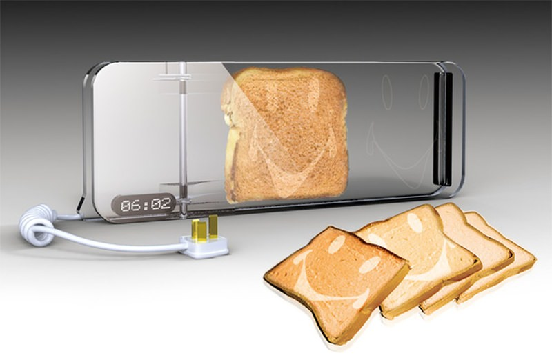
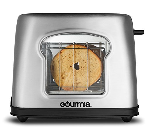
2. Is this one. By just making the toast visible you don't need a button or any extra engineering to raise the toast.
It *eliminates the need for interaction*, which is often a better experience.
But wait... what problem does all this solve? Somehow that question gets lost.
It *eliminates the need for interaction*, which is often a better experience.
But wait... what problem does all this solve? Somehow that question gets lost.
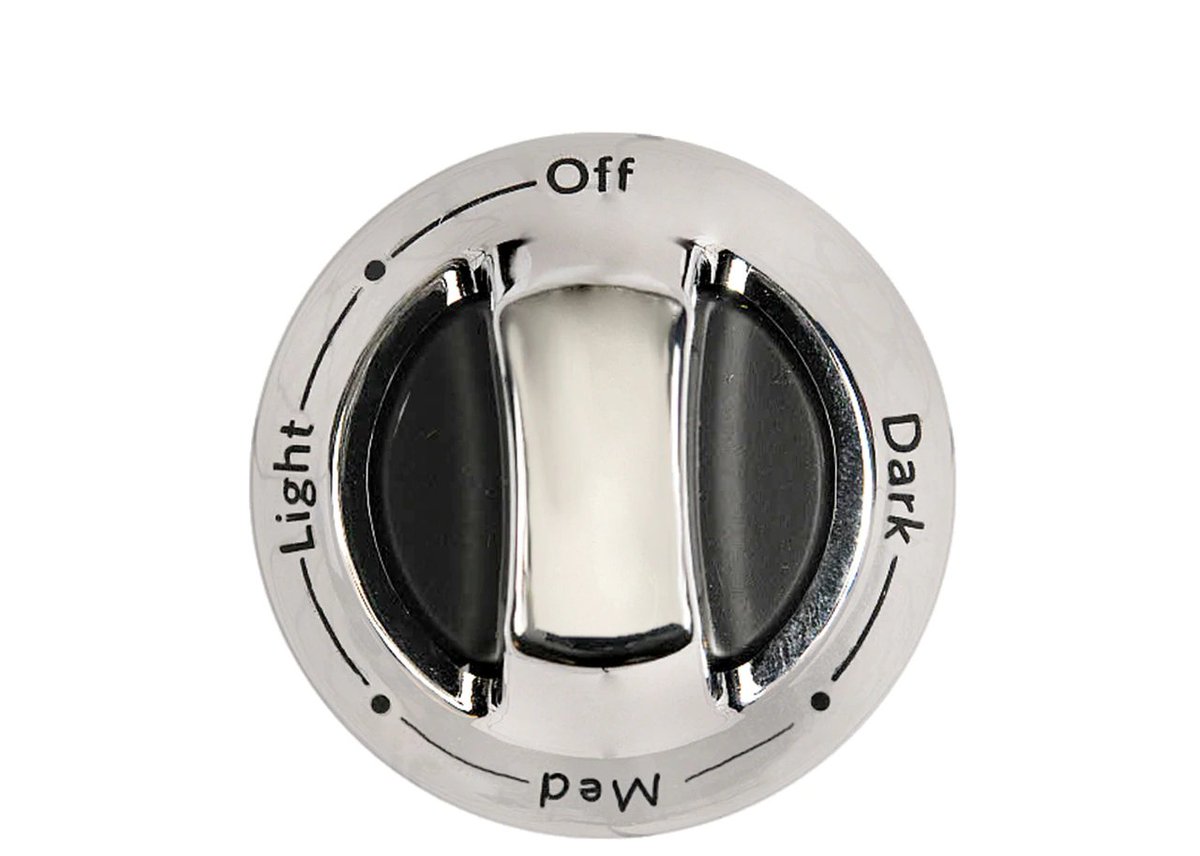
3. The implication is "making toast is unpredictable and I don't want it burned".
Really? Maybe a new toaster take a few attempts to calibrate. After that u just leave it at the right level.
These designs imply a problem u probably don't have but... helps sell the toaster!
Really? Maybe a new toaster take a few attempts to calibrate. After that u just leave it at the right level.
These designs imply a problem u probably don't have but... helps sell the toaster!
4. Toasters, like most of our tech products, promote all sorts of cool seeming but mostly useless features we will never use. Look! A croissant warmer! (wait, wha?) 

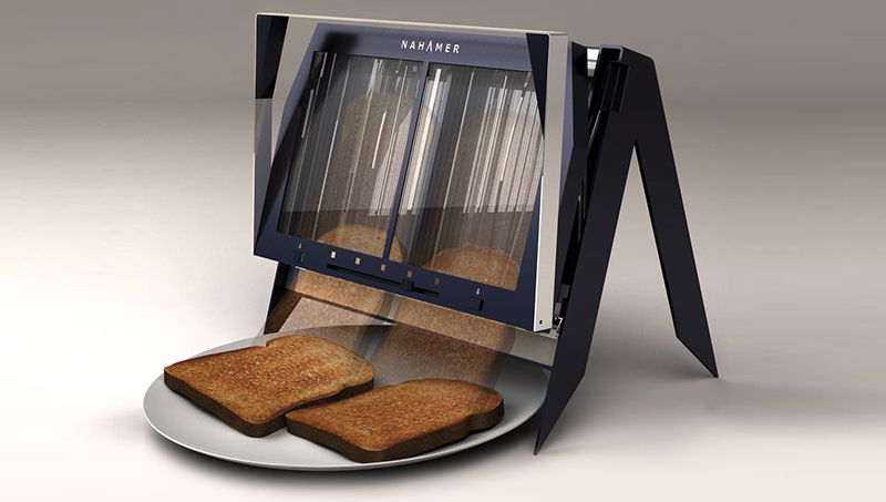
5. Or.. have trouble removing hot toast from the top? No worries!
"CONVENIENT: Toast slides through the bottom onto tray - ready to serve!" (wow! but wait a second... and also, that's a crazy amount of butter, yo).
"CONVENIENT: Toast slides through the bottom onto tray - ready to serve!" (wow! but wait a second... and also, that's a crazy amount of butter, yo).

6. I'm sure all the #toastophiles will be up in arms about this thread so far, as they take toasting seriously and that's OK.
My point is "design for sale" wants you to think, at the point of purchase, that you need something you probably don't.
My point is "design for sale" wants you to think, at the point of purchase, that you need something you probably don't.
7. In How Design Makes The World there's a whole chapter about toasters and how we get distracted by features instead of quality.
Marketers know it's easier for us to evaluate QUANTITY of features, rather than QUALITY of solving our problems. So that's what they emphasize!
Marketers know it's easier for us to evaluate QUANTITY of features, rather than QUALITY of solving our problems. So that's what they emphasize!
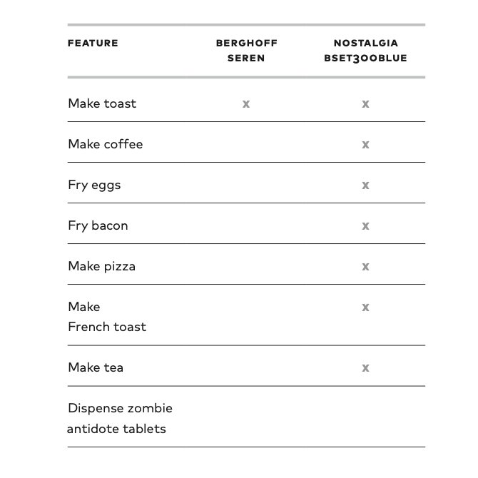
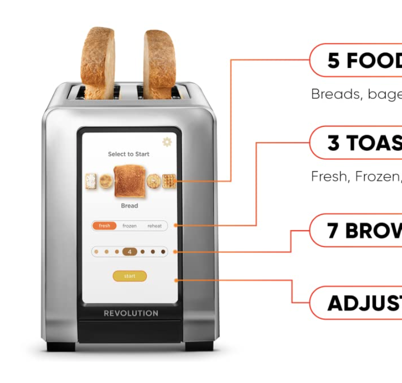
8. Of course if watching your toast get toasted, or having a toaster with a touch screen, or that burns in a smiley emoji makes you happy 4ever, that's lovely.
But many features r quick hit sugar by design. Sounds cool! Gets you excited to pay $$! But r used once & rarely again.

But many features r quick hit sugar by design. Sounds cool! Gets you excited to pay $$! But r used once & rarely again.
9. In the end, what makes a product sell the best isn't necessarily *the best* design for actual use. Often far from it.
This means "best selling" is often taken to mean "the best in most ways for most people" and that's often not true.

This means "best selling" is often taken to mean "the best in most ways for most people" and that's often not true.
10. Designing for humans in truth means starting with people first. What can we observe in how they toast to see what the real problems are?
Products are often engineered the other way "I have this cool technology!" "I have this cool idea!" which is feature first thinking.
Products are often engineered the other way "I have this cool technology!" "I have this cool idea!" which is feature first thinking.
11. Example: this Kitchen Aid Pro automatically and gently reheats toast if it sits there too long. No button. No interaction needed. It just quietly does what is probably the right thing without bothering you.
But...
But...

12. The Kitchen Aid Pro cost $500!
Good design is a kind of quality. It's fair to pay more for quality. But not this much more for a simple appliance for most people.
Yet: when u deal with a "bad design" in a product you bought based on low price, why are u surprised?
Good design is a kind of quality. It's fair to pay more for quality. But not this much more for a simple appliance for most people.
Yet: when u deal with a "bad design" in a product you bought based on low price, why are u surprised?
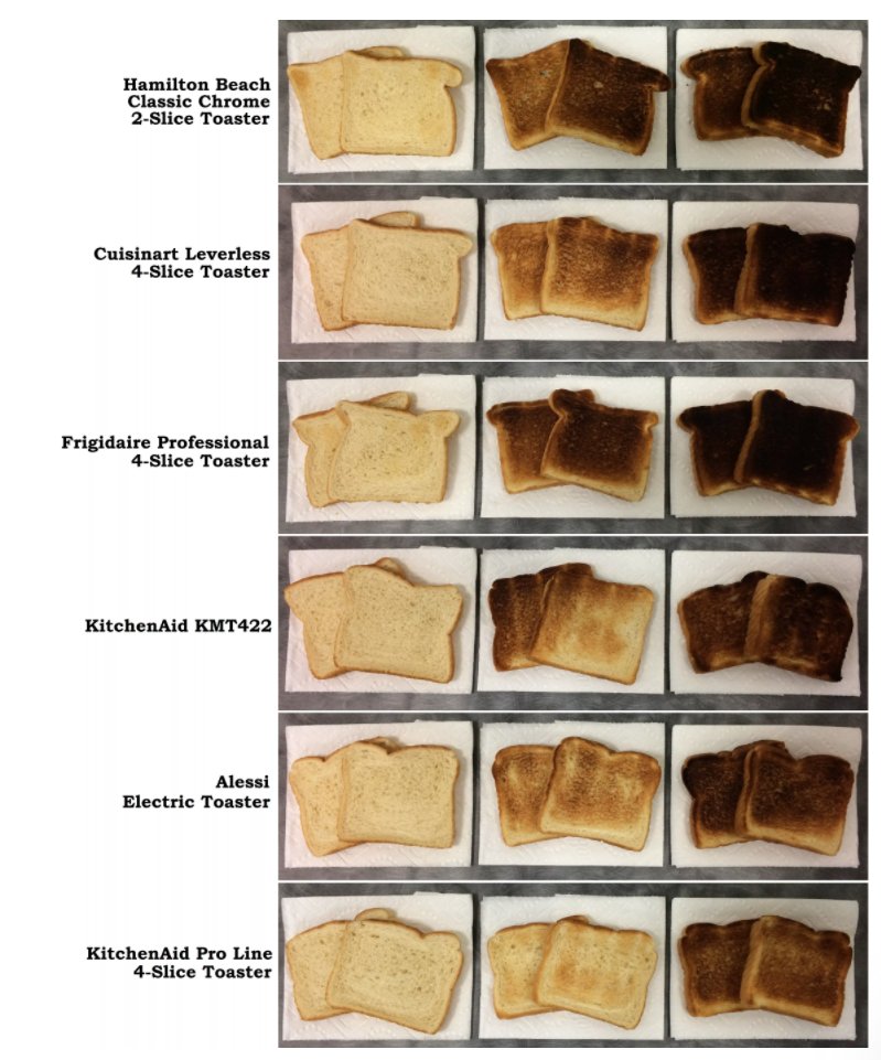
13. I confess I'm toaster obsessed - it's a way to think on design, marketing, culture and how weird humans are.
If you want a reco: this multi-review by @GebAndrew is fantastic and has the thoughtful and #toastnerd details you're hoping for.
cnet.com/news/should-yo… #designmtw

If you want a reco: this multi-review by @GebAndrew is fantastic and has the thoughtful and #toastnerd details you're hoping for.
cnet.com/news/should-yo… #designmtw

• • •
Missing some Tweet in this thread? You can try to
force a refresh


