More of those heavy mansard 80s executive houses that look like they were designed by Supermarket architects ImageImageImageImage
Have to say I'm quite a big fan of this variation in Abbeyhill ImageImageImageImage
These actually quite nicely channel the houses they replaced on Sunnybank Terrace/Place (a sort of 3-storey colonies setup), which had a mansard & dormer roof flickr.com/photos/sixties…
They also built some similar-looking townhouses next door to the little HA scheme. ImageImageImage
This little pocket of land was heavily cleared of housing in the 1960s due to subsidence and generally poor quality of the stock. Everything highlighted was demolished. The industrial premises all went too, and both the churches. Image
Or... were the supermarket and housing architects merely channelling carehome architects? ImageImageImage

• • •

Missing some Tweet in this thread? You can try to force a refresh
 

Keep Current with Andy Arthur

Andy Arthur Profile picture

Stay in touch and get notified when new unrolls are available from this author!

Read all threads

This Thread may be Removed Anytime!

PDF

Twitter may remove this content at anytime! Save it as PDF for later use!

Try unrolling a thread yourself!

how to unroll video
  1. Follow @ThreadReaderApp to mention us!

  2. From a Twitter thread mention us with a keyword "unroll"
@threadreaderapp unroll

Practice here first or read more on our help page!

More from @cocteautriplets

7 Oct
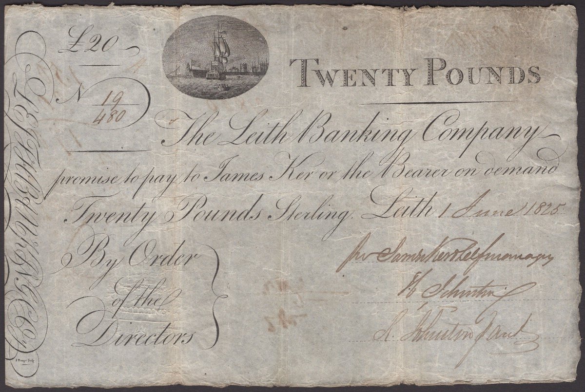
Today's auction house artefact is this Leith Banking Company £20 note from 1825, issued to the payee James Ker Image
James Ker of Blackshiels esq. was the general manager of the Leith Banking Co. and lived at a fine Georgian townhouse at no. 24 Royal Circus Image
So it's rather unusual that a note made out to Ker is also signed on behalf of the bank by... Ker! He was issuing his own pocket money (and that's what it literally was, paper money that a gentleman could carry on his person) Image
Read 30 tweets
7 Oct
Recommendations needed. Because I decided it would be a great idea to paint the box room black (I stand by that), there is very little reflected light in it. This creates a real lighting problem for VC, which was never in my mind at the time. ImageImage
There is no natural ambient light in here, the "big" light is insufficiently bright and casts long shadows down the way, and the desk light just oversaturates the skin.
So I need some sort of soft, ambient light to improve VC quality as that's now how I spend my time in here
Or maybe I just appear in all my meetings like this? ImageImage
Read 7 tweets
7 Oct
Why settle for a single mansard when you can have a double mandard split across 3 levels? ImageImageImage
Built on the site of the Argyle Place Church which burned down in 1974 during renovations (I believe a blow lamp set fire to paint) Image
I suppose the 7-storey corner tower kind of echoes the former steeple tower, and the dropping roofline too is a nod to what was there before. The dormers in the mansard are actually quite a traditional tenement roof style (balconies excepted!). Image
Read 14 tweets
6 Oct
🥁Hold on to your hats everyone. You've seen and you have loved and you have hated the Immensard™ Roof.
It is now my distinct privilege to unveil to you...
The Pansard™ Roof! Image
I believe this style is called East Coast Vernacular Ugly Image
"one of three contemporary, spacious and cleverly designed mews houses"
Read 7 tweets
6 Oct
ESPC white paint and pine minimalism of the day ImageImageImageImage
Given blue skies and greenery and open spaces, and hide the roads and cars away some place else, you can make any otherwise run-of-the-mill 80s housing terrace have a really attractive appearance ImageImageImage
I'd really like a kitchen serving hatch (with a sliding pine door) though for the proper period vibe Image
Read 4 tweets
5 Oct
I have often wondered if something intriguing lay within this little copper-roofed heptagonal offshoot of Basil Spence's Great Michael Rise council housing (whose distinctive walls made from granite setts are just lovely in the light). ImageImageImage
The answer though is that it's actually divided in the middle and is simply two main door bungalow houses. I often thought it must be a chapel or something! espc.com/property/30-an… ImageImage
New Lane / Great Michael Rise are I think a very interesting and successful experiment in how you can do a mix of council and private housing on a small, awkward site and mix both the modern and the traditional styles and materials. And they still look great. ImageImageImageImage
Read 8 tweets

Did Thread Reader help you today?

Support us! We are indie developers!


This site is made by just two indie developers on a laptop doing marketing, support and development! Read more about the story.

Become a Premium Member ($3/month or $30/year) and get exclusive features!

Become Premium

Too expensive? Make a small donation by buying us coffee ($5) or help with server cost ($10)

Donate via Paypal Become our Patreon

Thank you for your support!

Follow Us on Twitter!