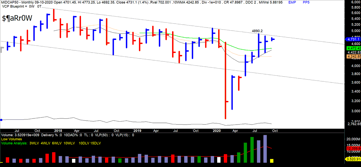
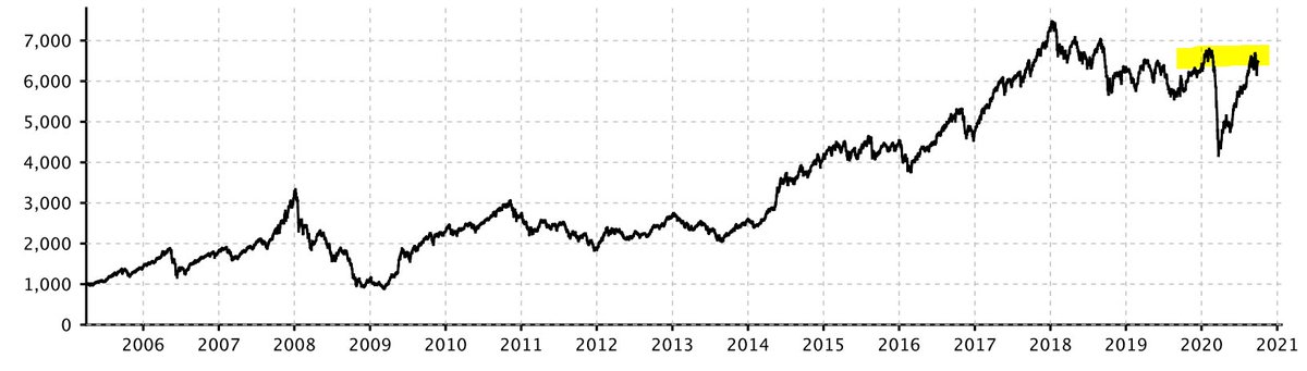
MIDCAP 50: All set. End of the downtrend nearing. Just 1-2 weeks away. Key level marked. 

Monthly:
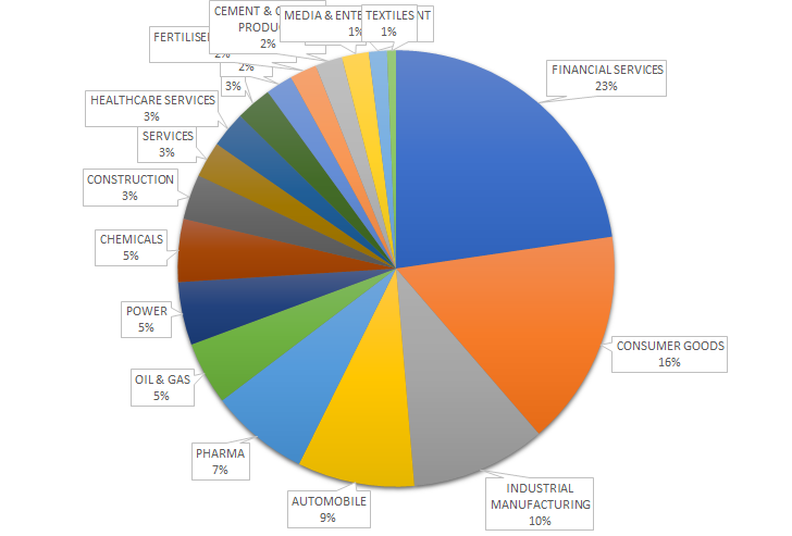
NSEMIDCAP 150: Same case.
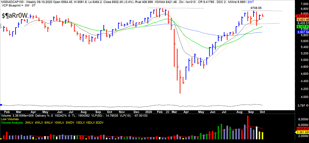
Highly unbalanced.
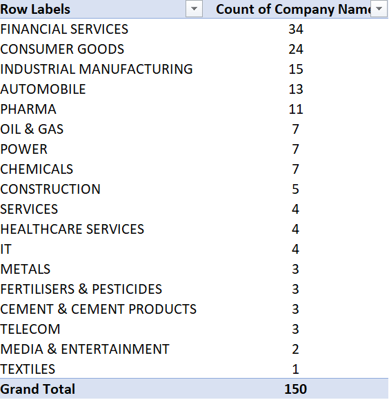
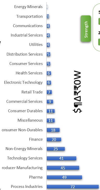
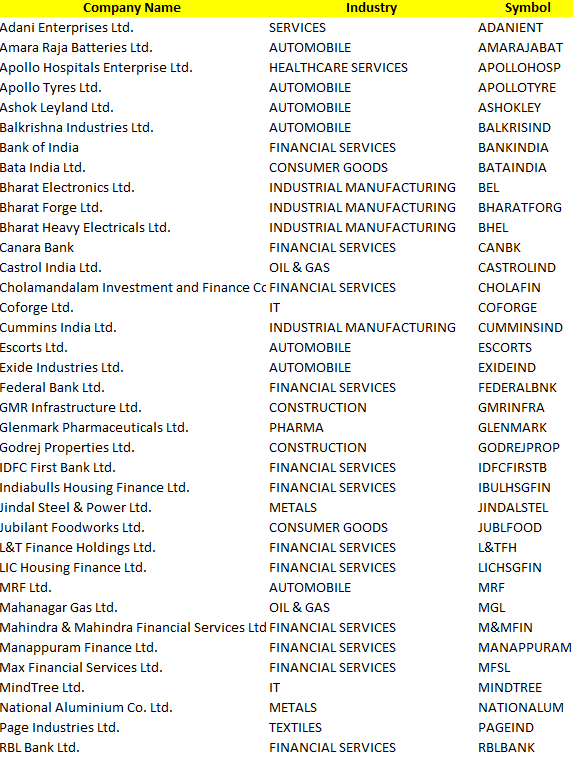
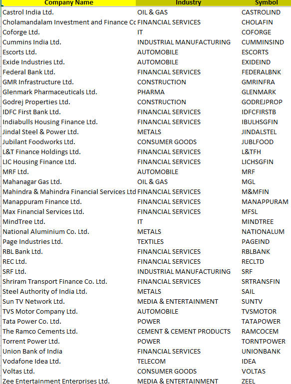
Sector allocation:
• • •
Missing some Tweet in this thread? You can try to
force a refresh