#coronavirus infection rates and case numbers are a growing concern in England. So analysing change-over-time in growth rates, as well as *both* absolute (total number) and relative cases counts (as a proportion of population size) is especially important. (1/n)
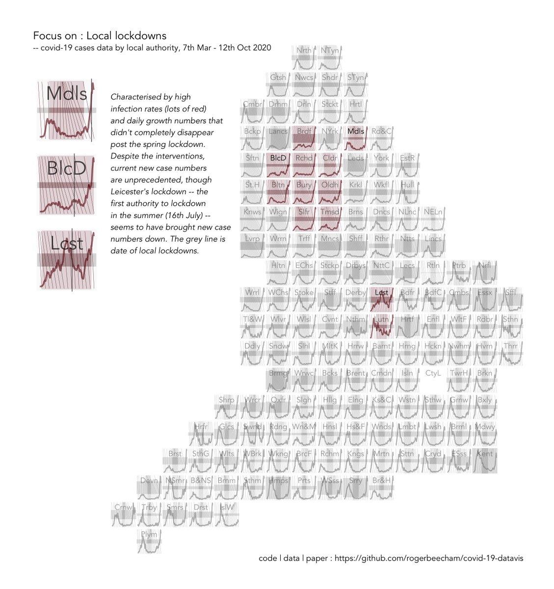
Doing this analysis for multiple areas at the same time (e.g. for Local Authorities in England) is a considerable challenge. But well-designed visualizations can expose some important patterns. Here's three types of area that are of particular interest ...(2/n) 

The graphics are a form of "composite chart" with several chart elements superimposed on top of each other - they are designed to show local trends and the national picture for local authority data in England concurrently. Here's a breakdown for one Local Authority - Hull...(3/n)

... The top row contains elements with a *local* scaling, to see how things change in one area over time and to compare these *trends* across the country. (4/n)

...Top middle, a standard line chart representing daily new case counts with 7-day smoothing. Top right, cumulative case milestone markers sampled every 14 days emphasising periods of slow (\) or fast (/) growth with narrow and wide gaps respectively at the top of the chart.(5/n
... The bottom row contains elements with a *national* scaling so that we can make comparisons about absolute numbers _and rates_ across the country. (6/n)
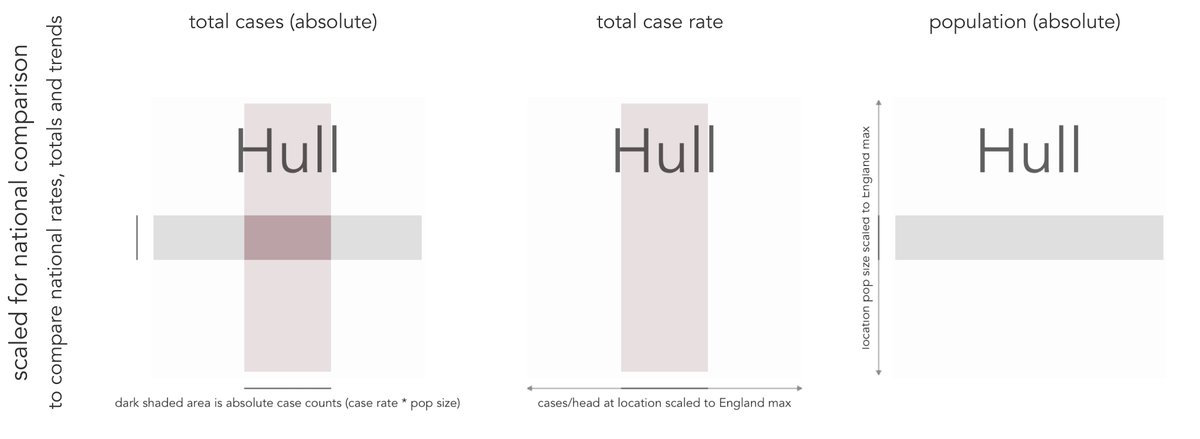
... Bottom right, a grey horizontal band with height varying by population size. Bottom middle, a red vertical band with width varying by cases/head. Bottom left, combined, the dark shaded area is absolute case counts - numbers of people who've had the virus in each area. (7/n)
Combining a per capita graphic (red vertical band) with a graphic showing population (grey horizontal band) means that where the bands overlap (dark rectangle at centre of cross) we show absolute number of cases. We might call this composite chart a *CrossProduct Plot*. (8/n)
The encoding helps expose different categories of case growth and extent for different categories of area... (9/n)

... Larger dark rectangles mean more cases, with horizontal (landscape) rectangles reflecting high rates in less populous areas and vertical (portrait) rectangles revealing more populous areas with lower rates. (10/n)
...And if we arrange them spatially to make a map, we can just about detect the trend lines, but need to space things out to see the additional data in the composite charts. (11/n)
Our grid map gives us the space to show all of the data in their spatial context. (12/n)

And there would appear to be some notable geographic patterns ... (13/n)


To check *whether* there is a geographic pattern, we can produce a sort of hypothetical outcome plot (as described here bit.ly/3dwmZhm by @JessicaHullman), with the detailed new cases lines randomly permuted across locations (can you spot the real dataset?). (14/n)
... If one of these eight looks different, that suggests that any trends that we are seeing are unlikely to be random and so geographic differences occur in the cases and rates. (15/n)
We hope that this use of composite charts might continue the conversation - about the data, but also how visualization might be used to inform our understanding of the progress of the disease. (16/n)
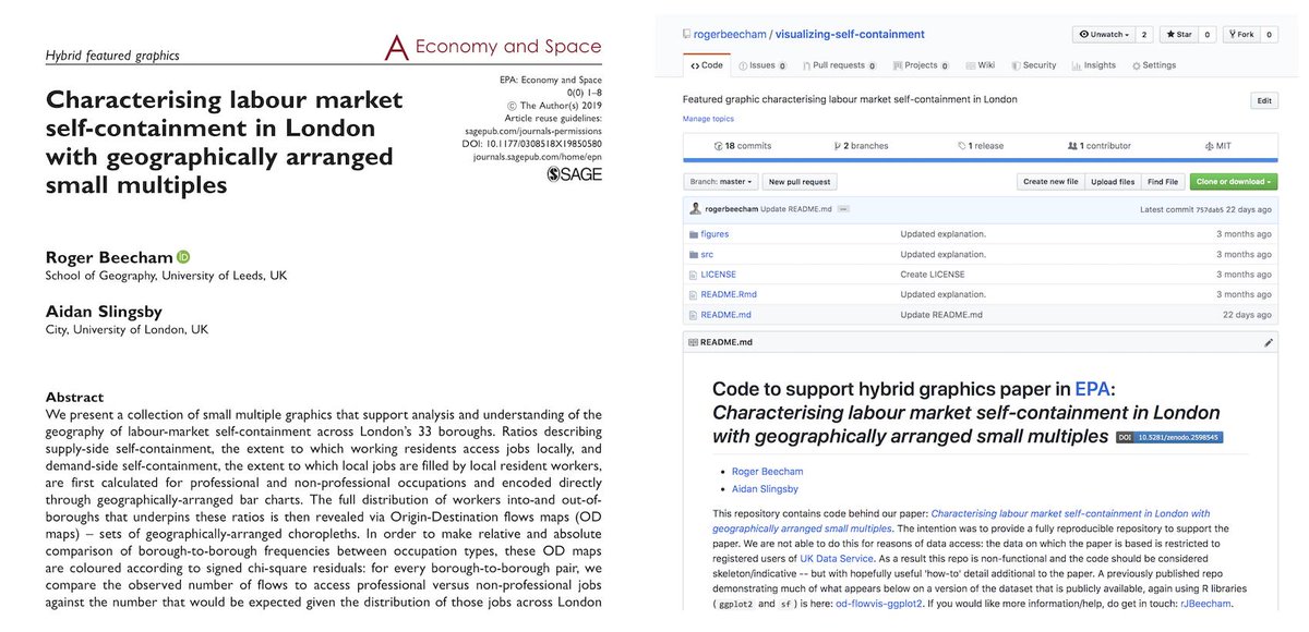
Designed and prepared with @jsndyks @giCentre, using #ggplot2. Other graphics, code, discussion and a pre-print are available at this github repo: github.com/rogerbeecham/c…. (17/n)
• • •
Missing some Tweet in this thread? You can try to
force a refresh