THREAD
I'm at a loss... and I need someone smarter than me to help me figure this out...
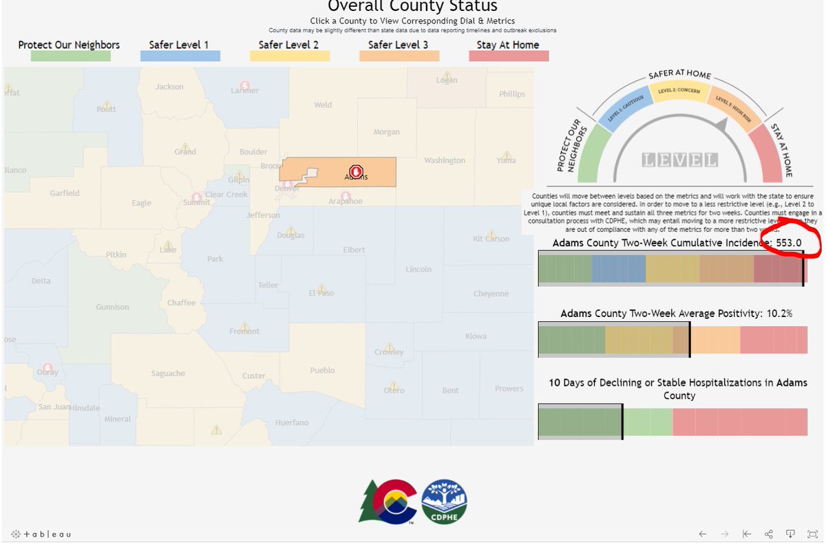
Want to walk you through the @CDPHE dial dashboard for a moment.
This is what it looks like now
Green = good
Blue = ok
yellow = uh oh
orange = you got probs
red = eeks
1/
I'm at a loss... and I need someone smarter than me to help me figure this out...
Want to walk you through the @CDPHE dial dashboard for a moment.
This is what it looks like now
Green = good
Blue = ok
yellow = uh oh
orange = you got probs
red = eeks
1/

You'll now see this...
Looks like a lot of green
remember...
green = good
red = eeks
Now look at Denver.
(for the geographically disinclined... I made an arrow)
Looks like Denver is "good right"?
Looks like a lot of green
remember...
green = good
red = eeks
Now look at Denver.
(for the geographically disinclined... I made an arrow)
Looks like Denver is "good right"?

But wait a second...
haven't we been telling you for days that hospitalizations are going up... quickly?
Out of curiosity... I went to Denver's own data page here:
storymaps.arcgis.com/stories/50dbb5…
haven't we been telling you for days that hospitalizations are going up... quickly?
Out of curiosity... I went to Denver's own data page here:
storymaps.arcgis.com/stories/50dbb5…
Scrolling down... I came across this
Denver's hospital census... You don't need to be a statistician to see what's happening on the far right side of the image
Denver's hospital census... You don't need to be a statistician to see what's happening on the far right side of the image

But wait... the state says Denver's hospital admissions have gone DOWN 8 out of 14 days.
What???
What metric is @CDPHE using here?
Cuz I see a lot of "eek"
So I went to Denver's admissions
Sure, the right side is going down, but Denver's own chart admits it's "incomplete"
What???
What metric is @CDPHE using here?
Cuz I see a lot of "eek"
So I went to Denver's admissions
Sure, the right side is going down, but Denver's own chart admits it's "incomplete"

So I am left to wonder...
what in the world is CDPHE seeing that I'm not?
Remember, HOSPITALIZATIONS represent a HUGE metric when it comes to moving the dial one way or another
Denver is CLEARLY seeing an INCREASE in patient loads in hospitals
But right now Denver is green
what in the world is CDPHE seeing that I'm not?
Remember, HOSPITALIZATIONS represent a HUGE metric when it comes to moving the dial one way or another
Denver is CLEARLY seeing an INCREASE in patient loads in hospitals
But right now Denver is green
Sure, if you look at this "incomplete" chart, Denver's admissions might, in theory. be going down more days than not
but isn't the true test... how much the hospital system is taxed?
And are we really relying on "incomplete" data for a key metric???
but isn't the true test... how much the hospital system is taxed?
And are we really relying on "incomplete" data for a key metric???

(and I gotta be honest... CDPHE walked me through this a week or so ago,... but I still don't get it... and if I don't get it... then I suspect I ain't the only one)
As always, smart people... I could use your help
DM me... or email me at chris@9news.com
Take care,
Me
As always, smart people... I could use your help
DM me... or email me at chris@9news.com
Take care,
Me
• • •
Missing some Tweet in this thread? You can try to
force a refresh


