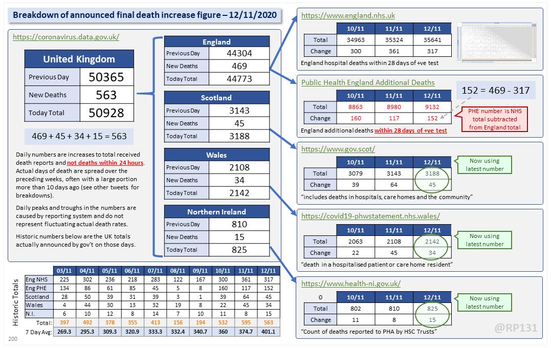
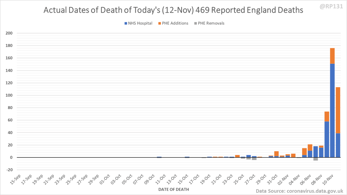
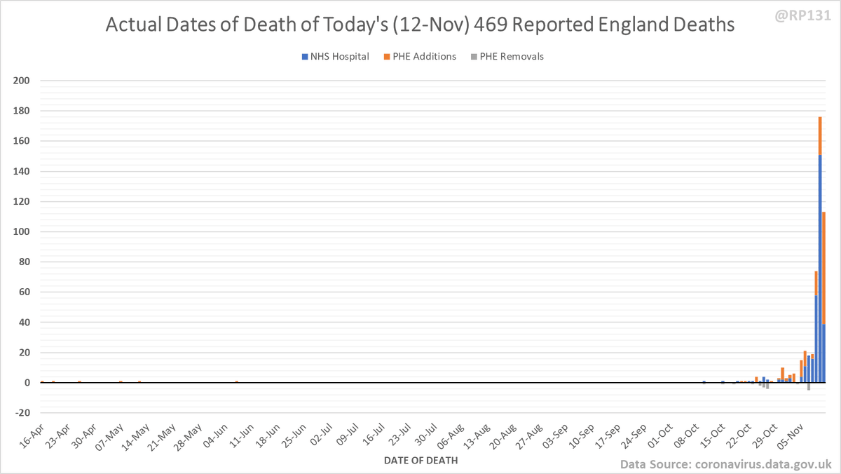
Dashboard for 12-Nov to explain where the #covid19uk total death increase figure of 563 actually comes from. The PHE dataset merge resulted in a net of 152 additional deaths today. This moves the 7 day rolling average up by 26.4 to 401.1.
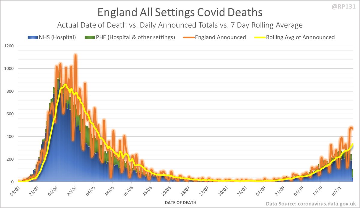
Updated chart from 31-Oct lockdown press conference with latest England date-of-death data (up to 4 days ago to avoid lag):
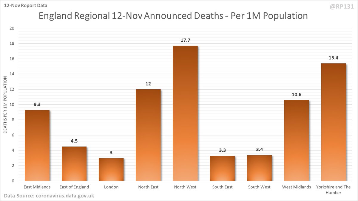
Breakdown of today's newly reported England deaths by region. Note that this data (459) doesn't always quite add up to the total England number they announce (469) possibly due to data merging issues. However I still think it's useful to see the general distribution.
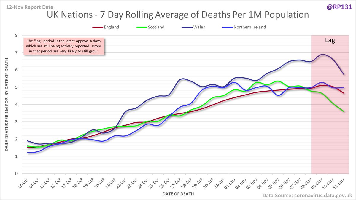
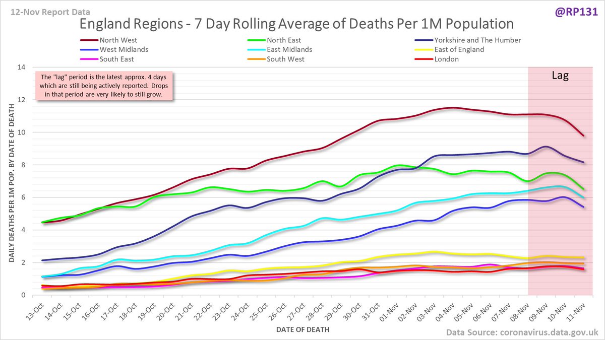
And same data again but normalised to number of deaths per 1M population.
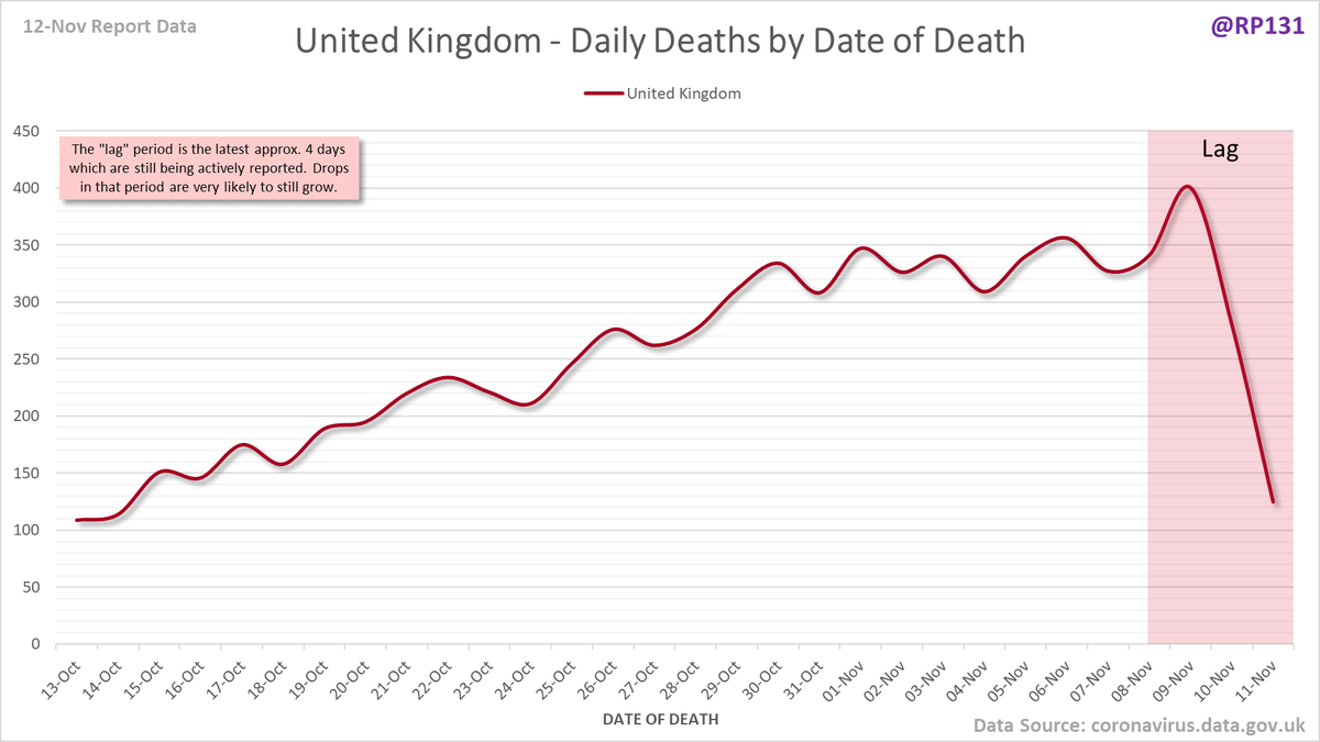
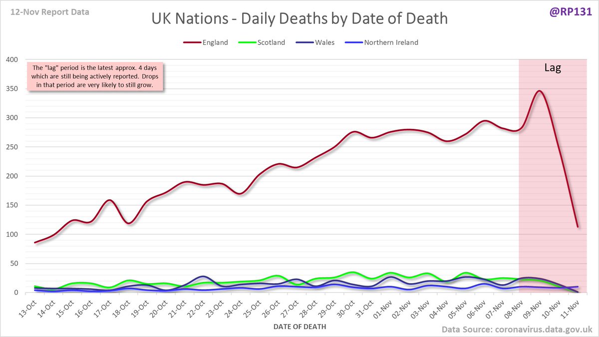
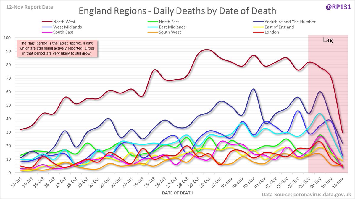
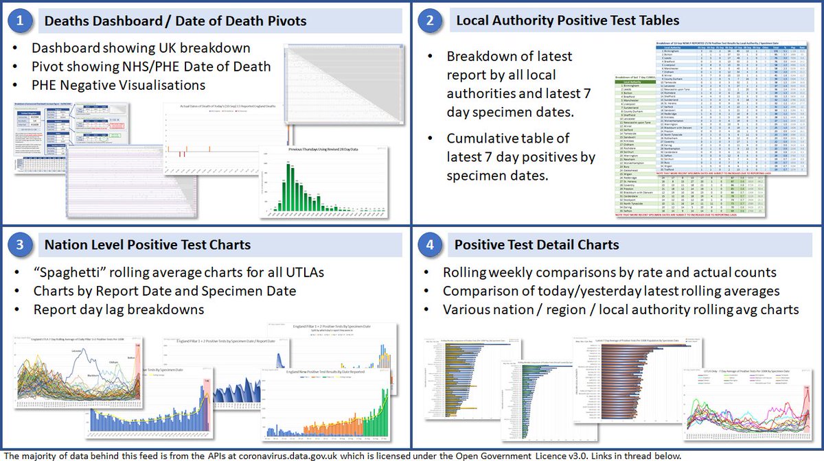
Date of Death charts for UK, UK nations and England regions.
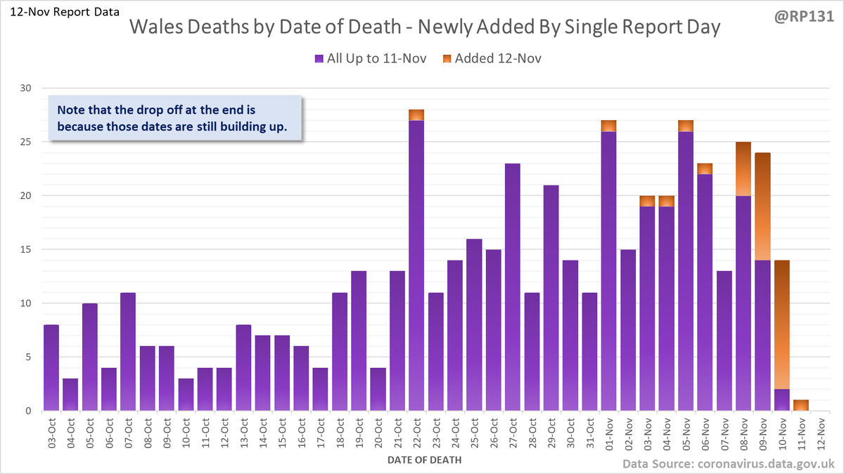
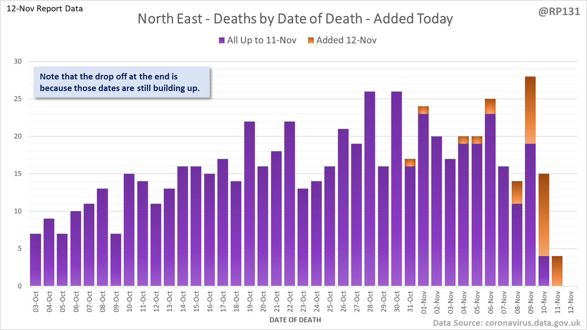
Possibly easier to interpret, date of death charts for UK nations and England regions drawn with 7 day rolling averages of deaths per 1M population.
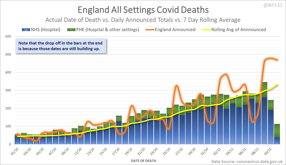
England date-of-death vs. announcement chart. Note that the numbers drop at the end as data is still being actively reported for those dates.
Full view since March for a bit of context.
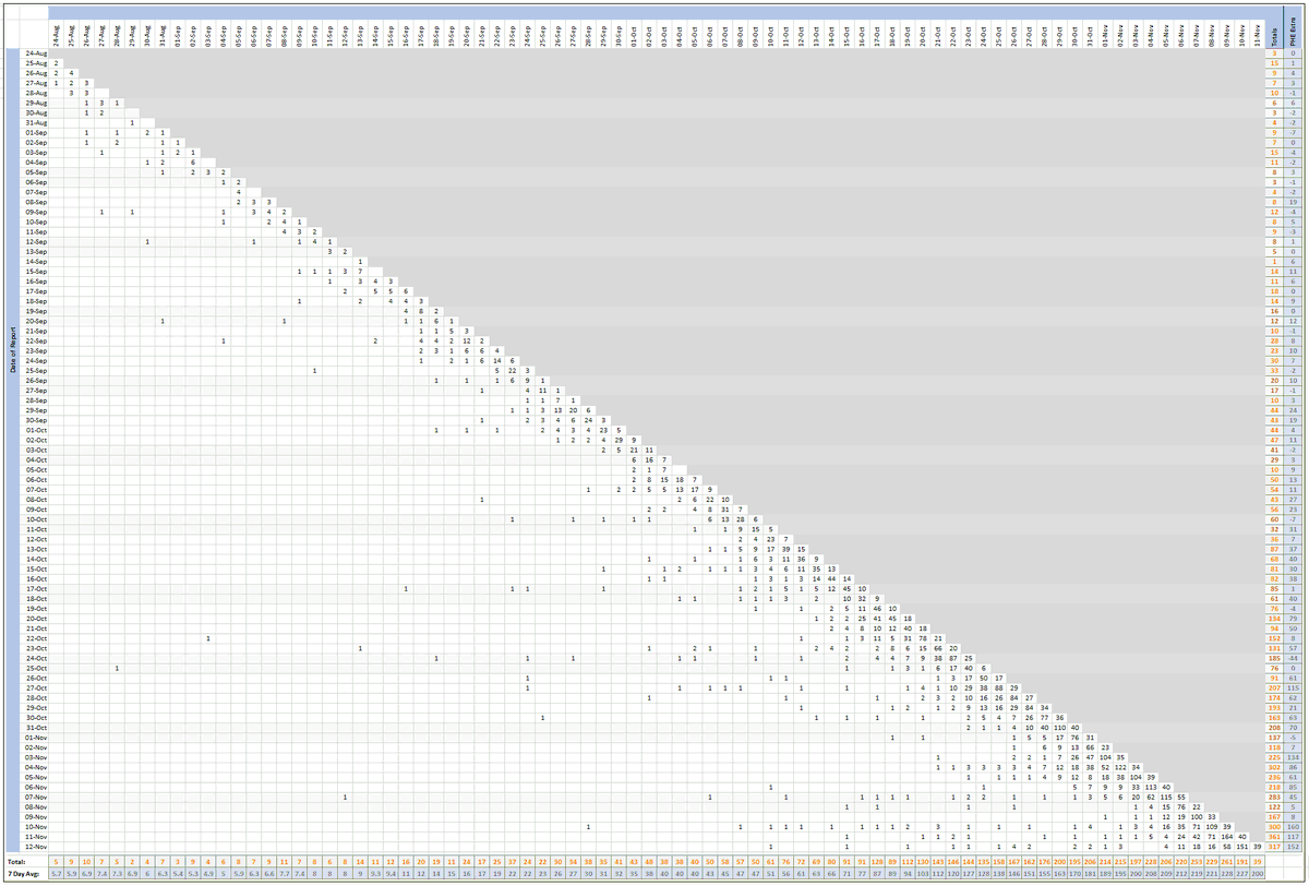
Pivot for 12-Nov to show breakdown of both 317 NHS and 152 (net) PHE deaths by date of death. The negatives are a combination of date of death corrections and accounting for NHS deaths that were already known to PHE. July onward first:
Chart form of dates of since 15-Sept (ignoring some of the corrections noise from earlier in the year):
Full date of death chart (most of the noise earlier in the year is likely due to dataset merge errors and/or corrections).
And the old-style pivot with just NHS data:

• • •

Missing some Tweet in this thread? You can try to force a refresh
 

Keep Current with Richard 📊📉

Richard 📊📉 Profile picture

Stay in touch and get notified when new unrolls are available from this author!

Read all threads

This Thread may be Removed Anytime!

PDF

Twitter may remove this content at anytime! Save it as PDF for later use!

Try unrolling a thread yourself!

how to unroll video
  1. Follow @ThreadReaderApp to mention us!

  2. From a Twitter thread mention us with a keyword "unroll"
@threadreaderapp unroll

Practice here first or read more on our help page!

More from @RP131

12 Nov
#covid19uk - Date of Death vs. Exponential Scenarios, updated for 12-Nov report data. Clearly high levels of variation across the nations and England regions. So very important to note how each of these charts are against different scales and doubling models.
Four nations separately. Note these are all to different scales and doubling models so are not meant to be compared with each other without more detailed consideration.
And now England regions: North West, North East, Yorkshire & Humber and West Midlands. Again, note the different scales and doubling models.
Read 5 tweets
12 Nov
Simple chart to show which dates of death have been added to in today's #covid19uk data update.
Plus all 4 nations separately. Note the different scales.
And England regions, starting with North West, North East, Yorkshire & Humber and West Midlands. Again, note the different scales.
Read 5 tweets
12 Nov
Temporary pinned index post - will replace it later if deaths data comes out.

2. Tables:
3. Nations:
4. Detail:

https://t.co/bayr1Z1PHQ Image
The majority of the data behind this feed is from the APIs at coronavirus.data.gov.uk which is licensed under Open Government Licence v3.0 (nationalarchives.gov.uk/doc/open-gover…)

For any more detail of the data behind any of my work then please just ask.
Read 4 tweets
12 Nov
Updated table of top 30 MSOAs based on latest numbers in today's report. Now running a day further behind due to changes in the source data.
Read 4 tweets
12 Nov
#covid19uk - Detailed positive tests thread. Rolling weekly comparison of totals up to 3 days ago. Now colour-coded by Tier. Red is Tier 3, yellow is Tier 2 and blue is Tier 1. Image
Full version of above chart available here: …ddatashare.s3-eu-west-1.amazonaws.com/Week_20201112.…
Same as above but with actual counts intead of per 100K population numbers. Both can be useful depending on whether your focus is on "relative numbers" or "understanding spread of daily report numbers". Image
Read 23 tweets

Did Thread Reader help you today?

Support us! We are indie developers!


This site is made by just two indie developers on a laptop doing marketing, support and development! Read more about the story.

Become a Premium Member ($3/month or $30/year) and get exclusive features!

Become Premium

Too expensive? Make a small donation by buying us coffee ($5) or help with server cost ($10)

Donate via Paypal Become our Patreon

Thank you for your support!

Follow Us on Twitter!