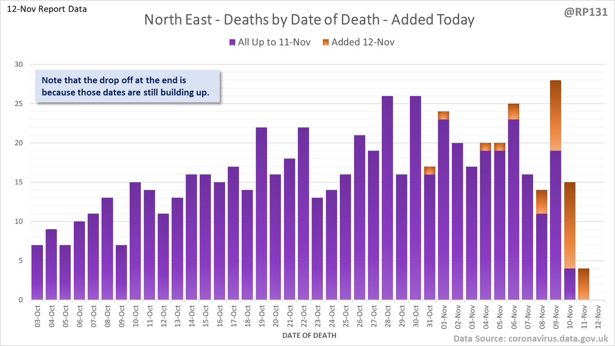
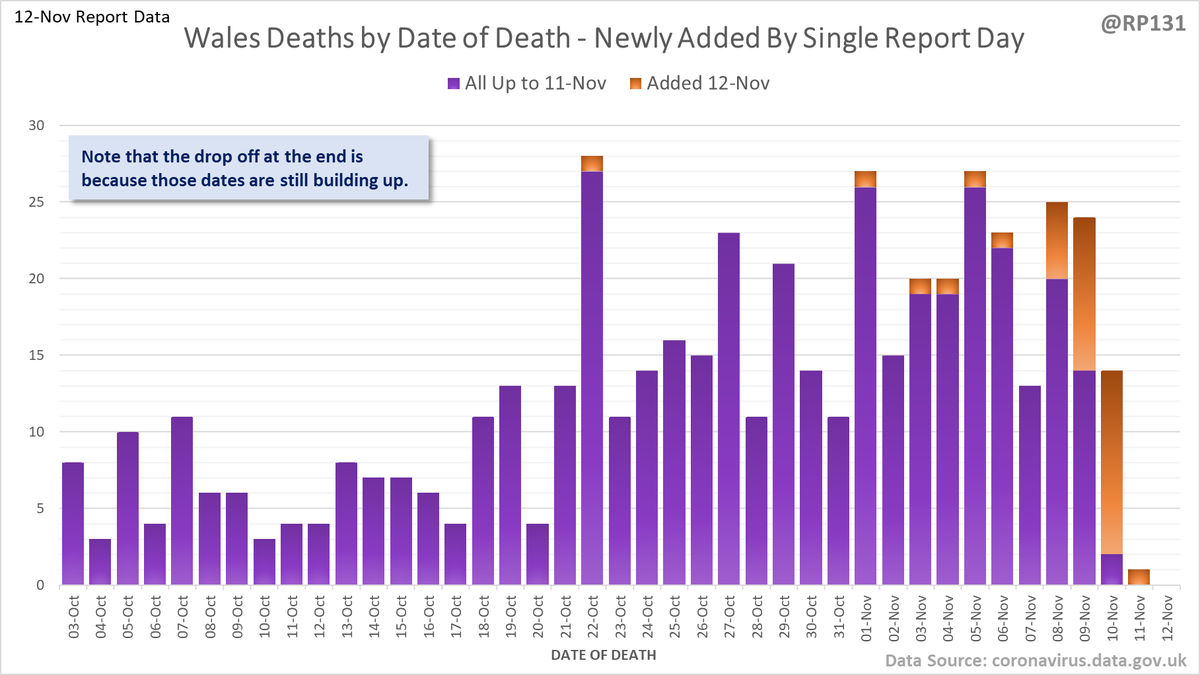
#covid19uk - Date of Death vs. Exponential Scenarios, updated for 12-Nov report data. Clearly high levels of variation across the nations and England regions. So very important to note how each of these charts are against different scales and doubling models.
Four nations separately. Note these are all to different scales and doubling models so are not meant to be compared with each other without more detailed consideration.
And now England regions: North West, North East, Yorkshire & Humber and West Midlands. Again, note the different scales and doubling models.
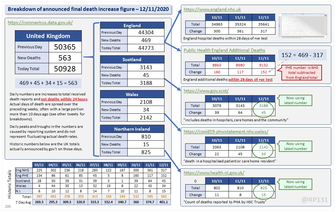
Dashboard for 12-Nov to explain where the #covid19uk total death increase figure of 563 actually comes from. The PHE dataset merge resulted in a net of 152 additional deaths today. This moves the 7 day rolling average up by 26.4 to 401.1.
Updated chart from 31-Oct lockdown press conference with latest England date-of-death data (up to 4 days ago to avoid lag):
Breakdown of today's newly reported England deaths by region. Note that this data (459) doesn't always quite add up to the total England number they announce (469) possibly due to data merging issues. However I still think it's useful to see the general distribution.
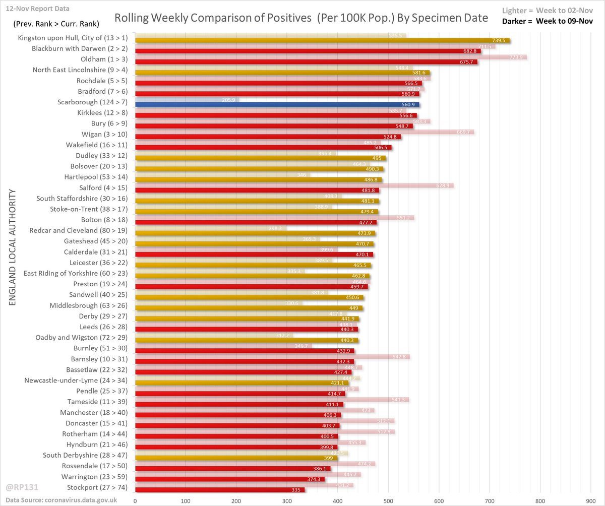
#covid19uk - Detailed positive tests thread. Rolling weekly comparison of totals up to 3 days ago. Now colour-coded by Tier. Red is Tier 3, yellow is Tier 2 and blue is Tier 1.
Same as above but with actual counts intead of per 100K population numbers. Both can be useful depending on whether your focus is on "relative numbers" or "understanding spread of daily report numbers".