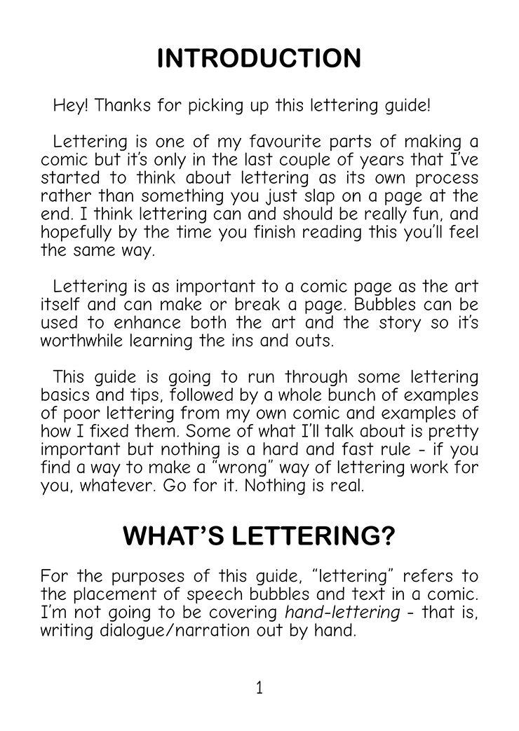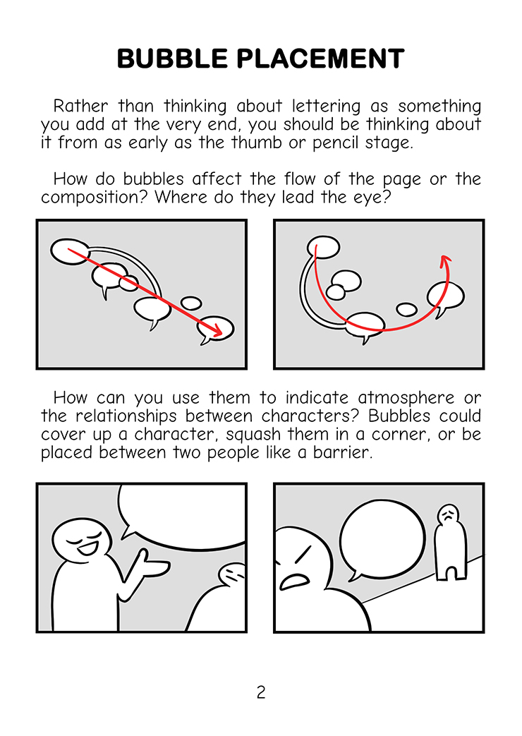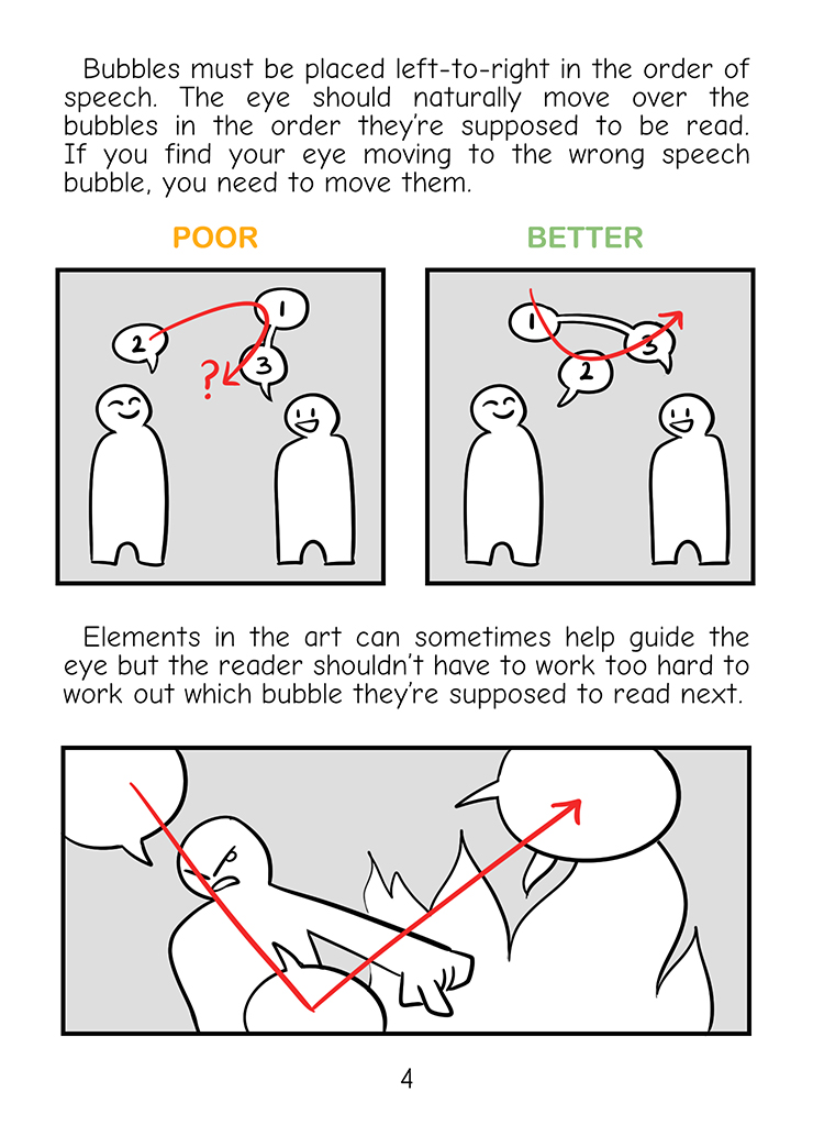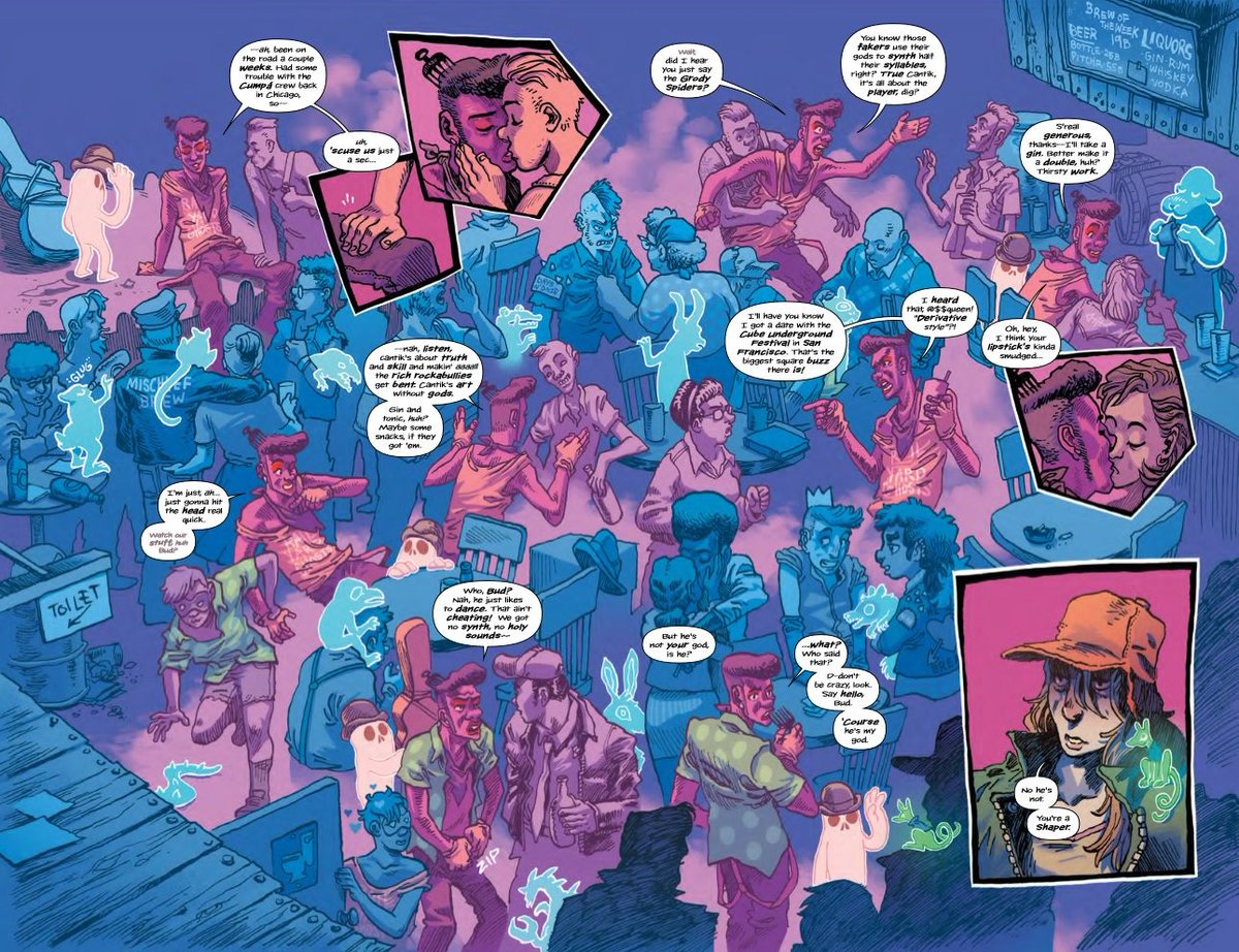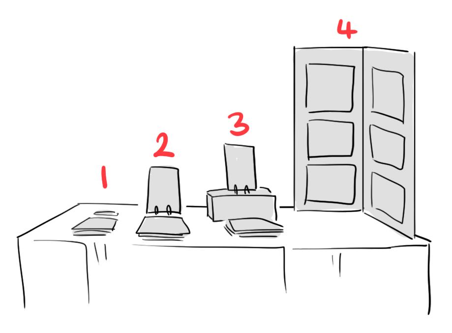
Not sure where to start with #TBF20 this year? Here's a thread of some great creators! I'll also include
🌱 the kinds of things they sell!
⭐️ a couple of keywords describing their work!
💸 any sales or discounts!
🌱 the kinds of things they sell!
⭐️ a couple of keywords describing their work!
💸 any sales or discounts!
@AimeeDraws
🌱 comics, stickers, & prints
⭐️ watercolour - wildlife - soft creepy
🌱 comics, stickers, & prints
⭐️ watercolour - wildlife - soft creepy
https://twitter.com/AimeeDraws/status/1324710977431048192
@AshlingDraws
🌱 comics & prints
⭐️ fantasy - warm - wlw
💸 15% off
🌱 comics & prints
⭐️ fantasy - warm - wlw
💸 15% off
https://twitter.com/AshlingDraws/status/1325782419597824003
@jadedlyco
🌱 comics, coasters, prints, PDfs
⭐️ slice of life - limited palette - romance
💸 lots of splash sales, check the thread!
🌱 comics, coasters, prints, PDfs
⭐️ slice of life - limited palette - romance
💸 lots of splash sales, check the thread!
https://twitter.com/jadedlyco/status/1327219828613132288
@kbaczynski
🌱 comics zines, cards, patches, stickers
⭐️ diary - riso - ZINES!!! ZINES!!!!
🌱 comics zines, cards, patches, stickers
⭐️ diary - riso - ZINES!!! ZINES!!!!
https://twitter.com/kbaczynski/status/1325771092712185856
@OwlRoostArt
🌱 comics, prints, stickers, badges
⭐️ fantasy - fandom - very gay
💸 free UK delivery
🌱 comics, prints, stickers, badges
⭐️ fantasy - fandom - very gay
💸 free UK delivery
https://twitter.com/OwlRoostArt/status/1325788895771037697
@FelixMiall
🌱 zines, prints, posters
⭐️ dark fantasy - grim - knights
🌱 zines, prints, posters
⭐️ dark fantasy - grim - knights
https://twitter.com/FelixMiall/status/1325793250050007041
@haridraws
🌱 comics, stickers, shirts, bags
⭐️ slowburn - queer as hell - cottagecore
💸 halfprice PDF bundle
🌱 comics, stickers, shirts, bags
⭐️ slowburn - queer as hell - cottagecore
💸 halfprice PDF bundle
https://twitter.com/haridraws/status/1325825066177851393
@steveningramart
🌱 comics & prints
⭐️ thoughtful - short stories - compelling
💸 20% off with code TB20
🌱 comics & prints
⭐️ thoughtful - short stories - compelling
💸 20% off with code TB20
https://twitter.com/steveningramart/status/1325913497688023052
@emseeitch
🌱 comics, notebooks, bags, gaming accessories
⭐️ adorable - animals - kid-friendly
💸 free UK postage on orders over £30 with code TBUBS20
🌱 comics, notebooks, bags, gaming accessories
⭐️ adorable - animals - kid-friendly
💸 free UK postage on orders over £30 with code TBUBS20
https://twitter.com/emseeitch/status/1325751038306103297
@littleMURE
🌱 comics, stickers, enamel pins
⭐️ stylised - sharp - teeth
🌱 comics, stickers, enamel pins
⭐️ stylised - sharp - teeth
https://twitter.com/littleMURE/status/1326537230609862662
@Kingfridayjoe
🌱 comics & patches
⭐️ wrestling - kid-friendly - adventure
🌱 comics & patches
⭐️ wrestling - kid-friendly - adventure
https://twitter.com/Kingfridayjoe/status/1326244244932218880
@toadlett
🌱 comics, artbooks, & prints
⭐️ monsters - magical - poetry
🌱 comics, artbooks, & prints
⭐️ monsters - magical - poetry
https://twitter.com/toadlett/status/1325744668051705856
@chip_collective
🌱 a comics collective selling their informative Living With Cancer anthology to raise funds for Cancer Research UK
🌱 a comics collective selling their informative Living With Cancer anthology to raise funds for Cancer Research UK
https://twitter.com/chip_collective/status/1325732413373288448
@MarySafroArt
🌱 comics, stickers, shirts, keychains
⭐️ 90s - miserable cyberpunk - existential
🌱 comics, stickers, shirts, keychains
⭐️ 90s - miserable cyberpunk - existential
https://twitter.com/MarySafroArt/status/1325534676304465926
@Zolwia
🌱 comics & prints
⭐️ striking - colourful - thought provoking
🌱 comics & prints
⭐️ striking - colourful - thought provoking
https://twitter.com/Zolwia/status/1325925466423898117
gotta work that hustle and tack myself onto this thread...
🌱 comics, stickers, & zines
⭐️ energetic - colourful - loud
💸 free UK shipping and halfprice international shipping
🌱 comics, stickers, & zines
⭐️ energetic - colourful - loud
💸 free UK shipping and halfprice international shipping
https://twitter.com/evegwood/status/1325779777454829569
• • •
Missing some Tweet in this thread? You can try to
force a refresh

