
A thread on this viral map, which attempts to paint a very scary picture: depending on where you live, it is almost certain someone at your Thanksgiving gathering will have COVID. Look at all that red! But, the map has massive problems. 1/ 
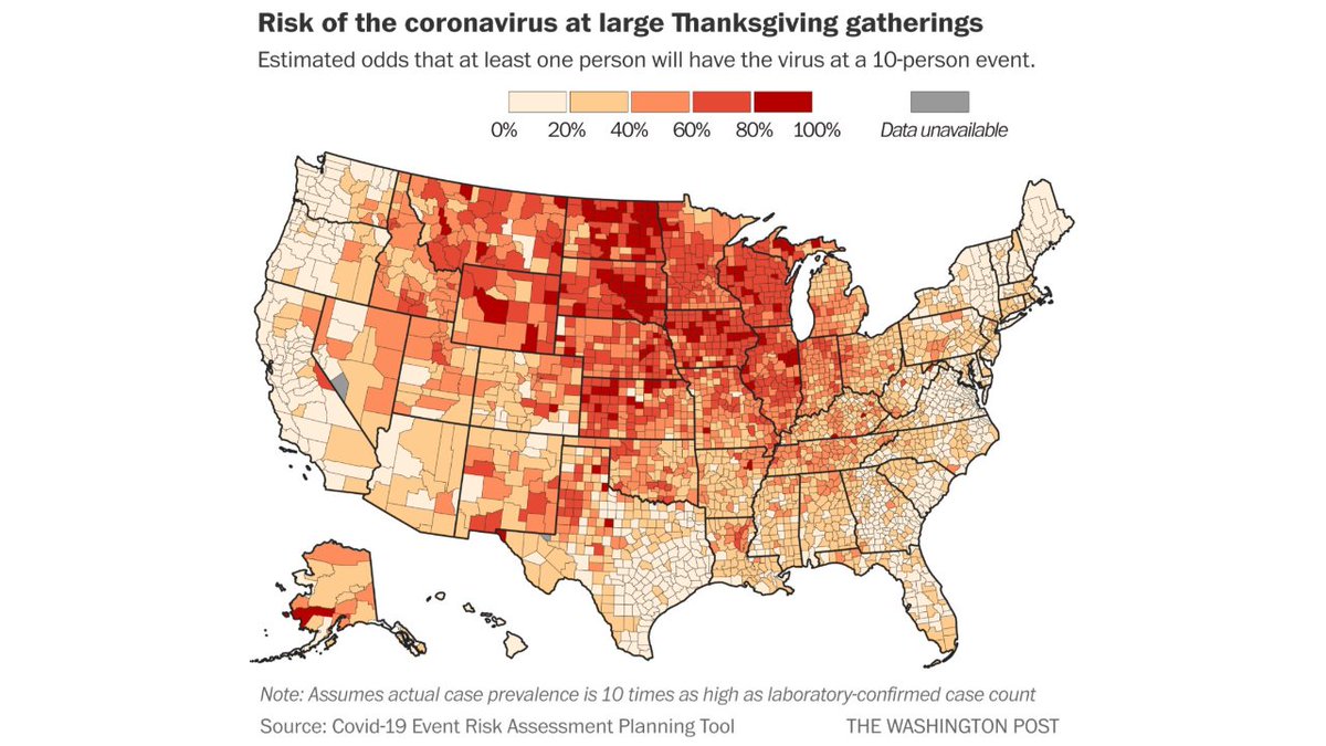
The map comes from the Washington Post, but it is based on the COVID-19 Event Risk Assessment Planning tool from GA Tech. The goal of which is to show what the chances are of having a COVID positive person attend a gathering. A worthwhile project. covid19risk.biosci.gatech.edu 2/
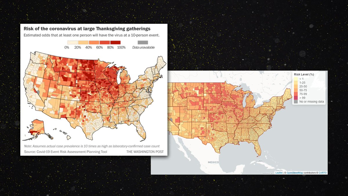
Here is the Washington Post map from the actual data source. First of all, notice anything different? 3/
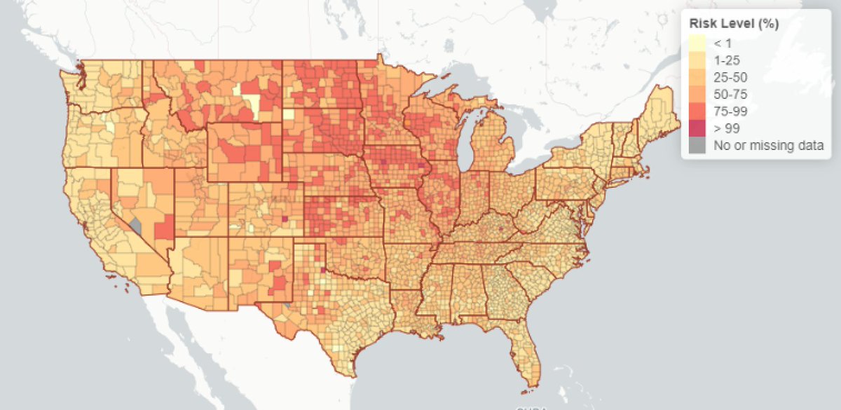
This is the Washington Post map, side by side with the map from the actual data source. Same map, but Wapo makes the "artistic" choice of making the reds much darker and scarier.
Perhaps you might forgive this choice, as the data is really scary! However... 4/
Perhaps you might forgive this choice, as the data is really scary! However... 4/

The larger problem lies at the bottom of the Wapo map. It says the map "assumes actual case prevalence is 10 times as high as laboratory-confirmed case count." This, for lack of a better word, is bonkers. 5/

The idea that we are only catching 1 of 10 cases is the kind of estimate that was being made in March and April. The project was first tweeted about on March 10th, when an estimate like that made some sense.
https://twitter.com/joshuasweitz/status/1237556232304508928?s=206/
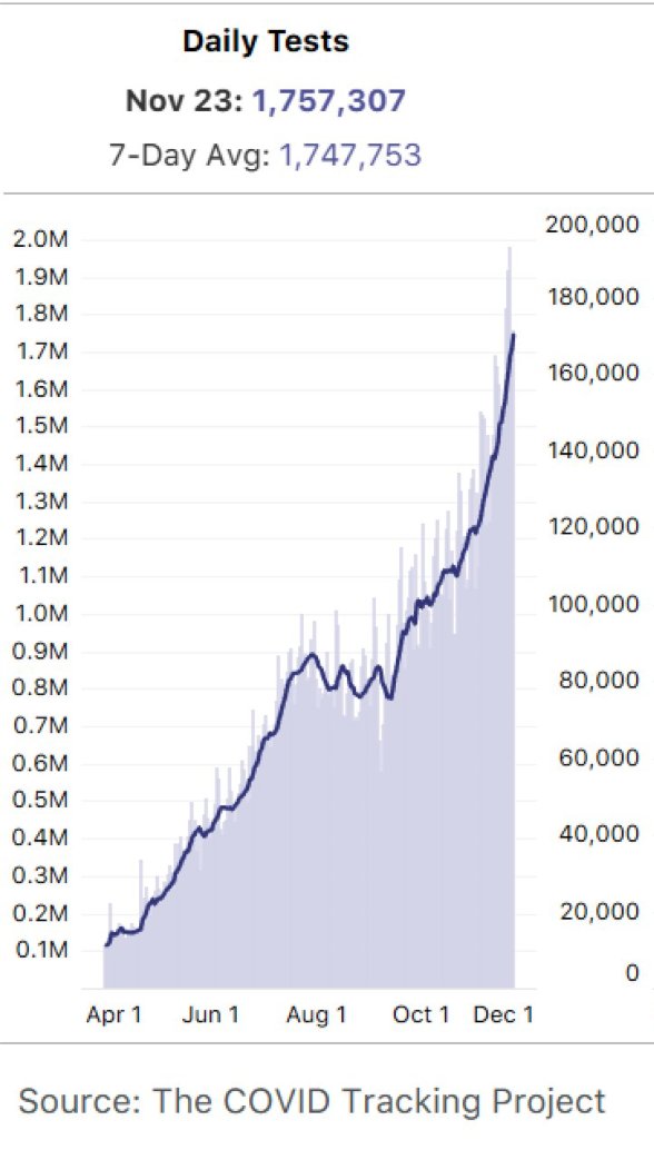
However, on March 10th, the US conducted a *total* of 2,772 tests. Our average this week is close to 1.8 million. Our testing, while not perfect, is detecting far more than 1 in 10 cases today. 7/
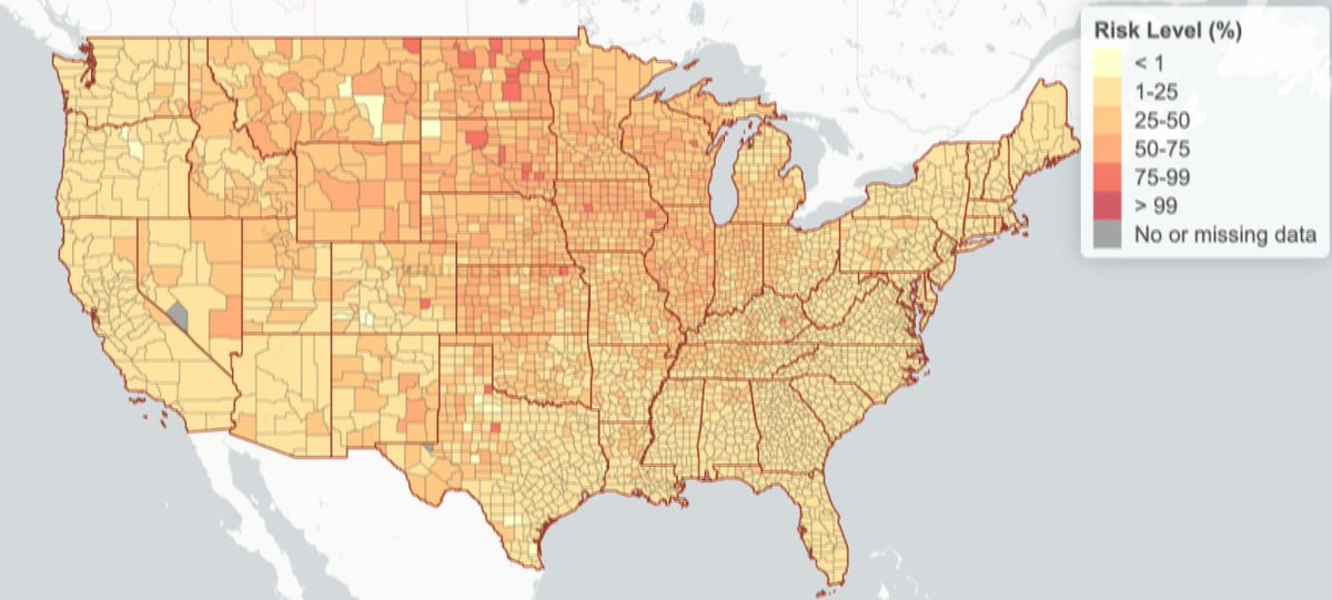
This is probably why Georgia Tech added an option at the bottom of their map to “Select ascertainment bias.” The two options are 5 and 10. Are there really 5 cases for every one we detect? Or are there really 10 cases for every one we detect? This choice is important. 8/
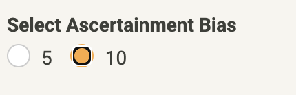
If you choose 10, the whole map lights up red. (Or slightly less red depending on your artistic choices.) 9/
But, if you choose 5, you're left with a much less threatening situation. And a much less scary map. Mostly yellow, and almost no red at all. Click back and forth from this map, and the one Wapo published. 10/

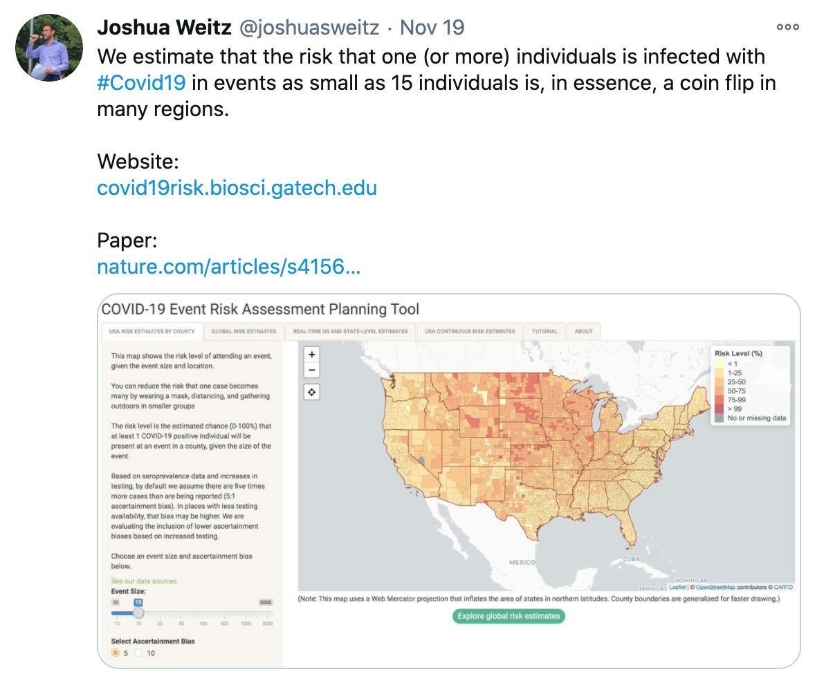
How do we know which choice is right though? 5 or 10? Well, the guy who created the interactive tool and authored the associated paper has tweeted the map several times. Wouldn't you know, every time he tweets it, he chooses the less scary option.
11/
https://twitter.com/joshuasweitz/status/1329478821926486017?s=20
11/

Here are several other recent examples. In all of them he always chooses 5, never chooses 10. 12/
https://twitter.com/joshuasweitz/status/1328861277033271297?s=20
https://twitter.com/joshuasweitz/status/1328328757388607488?s=20
https://twitter.com/joshuasweitz/status/1328325502138945536?s=20
https://twitter.com/joshuasweitz/status/1328057778384949249?s=20
https://twitter.com/joshuasweitz/status/1326512951977783296?s=20
So, perhaps Wapo didn't know the current data, and didn't pay attention to that choice? Seems unlikely, because the site itself explains that the better choice is 5, and therefore makes it the default. In other words, to make the scarier map, you have to change the default. 13/
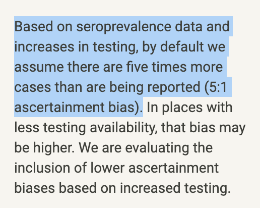
But, read that last line again. Why would they be "evaluating inclusion of lower ascertainment biases based on increased testing" ?? Because there is a lot of reason to believe we are catching significantly MORE than 1 of every 5 cases. 14/

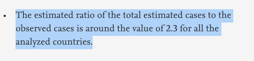
For example, this study of Europe indicates they're catching 1 in every 2.3 cases.
sciencedirect.com/science/articl… 15/
sciencedirect.com/science/articl… 15/
Nate Silver points to a 1 in 3 ratio in the US
https://twitter.com/NateSilver538/status/1328057404722999300?s=2016/
So, you have a very scary map from Wapo with a 10:1 ratio.
A less scary map from the data source with the same 10:1 ratio.
An even less scary map with a more realistic 5:1 ratio.
And then reality. A far less scary map with a 3:1 ratio.
Guess which one goes viral? 17/
A less scary map from the data source with the same 10:1 ratio.
An even less scary map with a more realistic 5:1 ratio.
And then reality. A far less scary map with a 3:1 ratio.
Guess which one goes viral? 17/
Obviously, the point of all of this is to scare you from seeing family at Thanksgiving. Don't travel! It's really red out there! So, these choices were made with a specific outcome in mind, which would explain them. 18/
But, people hate getting screwed with. Don't become a horror movie. Give people accurate, reliable information that you don't change every two weeks, and let them make their own risk assessment. 19/
To be clear, there is elevated risk with gatherings right now. (You should live in Texas where you can just have them outside.) But, if you're inside, this 2 min video gives a few non-invasive ideas that might lower risk. www3.nhk.or.jp/nhkworld/en/on… 20/
If you prefer the youtubes, you can watch this explainer here
21/
21/
Also, every Thanksgiving should have mac and cheese. But, either way, have a great Thanksgiving! END
• • •
Missing some Tweet in this thread? You can try to
force a refresh


