#covid19uk - Tables thread. Re-ordered now to put the more popular rate sorted table at the top. So this is top 50 England Local Authorities by positives per 100K population in last 7 days, up to 3 days ago. Bright green means lower than previous period. 

Link to full versions, sorted by:
Rate: …ddatashare.s3-eu-west-1.amazonaws.com/TableCumulativ…
Count: …ddatashare.s3-eu-west-1.amazonaws.com/TableCumulativ…
Rate: …ddatashare.s3-eu-west-1.amazonaws.com/TableCumulativ…
Count: …ddatashare.s3-eu-west-1.amazonaws.com/TableCumulativ…
Cumulative summary view by regions.

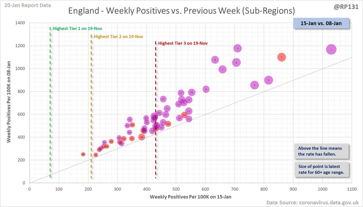
Also view by the sub-regions, based on those used to allocate the new tiers on 26-Nov and now split as necessary for the tiers that have become more granular again.

Table view of today's 34,663 NEWLY REPORTED England positive test results by local authority and recent specimen dates. Here showing top 50 authorities which represent 53% of the population, but have 61% of the positives.

Link to full table: …ddatashare.s3-eu-west-1.amazonaws.com/Table_20210120…
Summary view by regions.

Also view by the sub-regions, based on those used to allocate the new tiers on 26-Nov and now split as necessary for the tiers that have become more granular again.

Top 50 table view of latest availble Local Authority data for the 60+ age range for 7 days to 15-Jan sorted by descending rate per 100K population (of that age range). Change column is compared to previous week with red for increase and green for decrease.

Link to full 60+ table: …ddatashare.s3-eu-west-1.amazonaws.com/TableAge_20210…
Top 30 England local authorities by maximum weekly rate per 100K population recorded to date.

Top 30 UK-wide local areas by maximum weekly rate per 100K population recorded to date.

Link to full versions:
England: …ddatashare.s3-eu-west-1.amazonaws.com/TableMax_20210…
UK: …ddatashare.s3-eu-west-1.amazonaws.com/TableMax_UK_20…
England: …ddatashare.s3-eu-west-1.amazonaws.com/TableMax_20210…
UK: …ddatashare.s3-eu-west-1.amazonaws.com/TableMax_UK_20…
Top 30 England/UK-wide local areas by maximum change in weekly rate per 100K population.


Link to full versions:
England: …ddatashare.s3-eu-west-1.amazonaws.com/TableMaxChange…
UK: …ddatashare.s3-eu-west-1.amazonaws.com/TableMaxChange…
England: …ddatashare.s3-eu-west-1.amazonaws.com/TableMaxChange…
UK: …ddatashare.s3-eu-west-1.amazonaws.com/TableMaxChange…
• • •
Missing some Tweet in this thread? You can try to
force a refresh