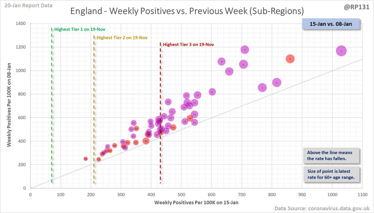
#covid19uk - Detailed positive tests thread. The majority of this thread is a set of views of rolling 7 day average positives per 100K by specimen date. I realise this thread has become rather bloated and it is on my list for some re-work. Starting with England regions: 

Wales - Top and bottom 11 (i.e. all 22 of them). Note they may have different Y axis scales to each other. 


North West - Top 12 and bottom 11 (i.e. all 23 of them). Note they may have different Y axis scales to each other 


Yorkshire & Humber - Top 10 and bottom 11 (i.e. all 21 of them). Note they may have different Y axis scales to each other 


North Yorkshire by itself (with Leeds included as a nearby hotspot example, which I know isn't in North Yorkshire!): 

Charts of top 10 authorities in Tiers 2 and 4 (retained to keep an eye on how those tier allocations panned out): 


Plus to see how it's shifting, here's the same values but with the same day last week for comparison: 

Rolling weekly comparison of totals up to 3 days ago. I think these have mainly been superceded by the bubble charts but keeping them as I know a few people still like them. 

Full version of these LA compare charts here:
Weekly (Rates): …ddatashare.s3-eu-west-1.amazonaws.com/Week_20210120.…
Weekly (Actual): …ddatashare.s3-eu-west-1.amazonaws.com/WeekActual_202…
Daily (7 Day Avg Rates): …ddatashare.s3-eu-west-1.amazonaws.com/Day_20210120.h…
Weekly (Rates): …ddatashare.s3-eu-west-1.amazonaws.com/Week_20210120.…
Weekly (Actual): …ddatashare.s3-eu-west-1.amazonaws.com/WeekActual_202…
Daily (7 Day Avg Rates): …ddatashare.s3-eu-west-1.amazonaws.com/Day_20210120.h…
• • •
Missing some Tweet in this thread? You can try to
force a refresh


