One (perhaps the only?) positive development on the Web since the glory days is that the "normal" size of text on the average website has gone up from minuscule to legible or even a little bigger than it needs to be.
That's not to say there weren't websites with big text in 2004, or websites with small text today. But our visual language for "this is what a website looks like" has evolved. What it means for a website to look "designed" vs "normal" (for lack of better terms) has changed.
Even pages intentionally aiming for an "undesigned" or brutalist feel tack towards larger, rather than smaller, text. bloomberg.com/features/compa…
It's probably unfair to give aesthetic decisions by pro designers all the credit. The sub-4" screen sizes of early smartphones played a huge part in driving the change: if you want users to read it, it can't be small.
But I suspect that the biggest factor is simply that the Web stopped being a "foreign" space with a mainstream aesthetic culture separate from what you'd find in a magazine or a poster and became one of many channels in communication strategies. The message overtook the medium.
The other interesting factor is the rise of alternatives to longform text: microblogging, audio, Stories, and alternative virtual spaces.
When the only text on the page is 2 punchy sentences to get people over to your Twitch stream of Among Us, might as well make the text big.
• • •
Missing some Tweet in this thread? You can try to
force a refresh
One of the most important Enterprise design tools you can learn is PowerPoint
This is not (just) my usual spiel about most visual tools being merely documentation - if you don't know how to make your decks look good, it'll be rough to get your ideas across.
PowerPoint can do almost everything InDesign can do. Take advantage of it.
Smaller teams move quicker, but having the correct team composition and mandate is much more important than size. Unless your team has decision authority, you will fall behind again while getting stakeholders caught up to your progress and insights.
Making polished presentation: 3 hours
Presenting findings to execs: 1 hour
Answering follow-up questions: 1 hour
Arguing with the legacy power centers: 8 hours
vs
Having an exec sit in on a user interview: 45 min
Listening to them having their mind blown in the debrief: 15 min
When your audience doesn't have the same context you do, it's much harder to explain what's going on and why the problem matters or the solution is correct. Narrowing that gap as much as possible will tighten your feedback loops more than anything else can
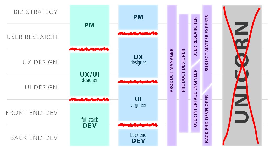
Whichever way you slice it, "clean" handoffs between stages of the software development process create friction and leave each role frustrated due to lack of influence into neighboring spaces.
The solution is working in parallel, not expanding your "slice" until burnout.
1/
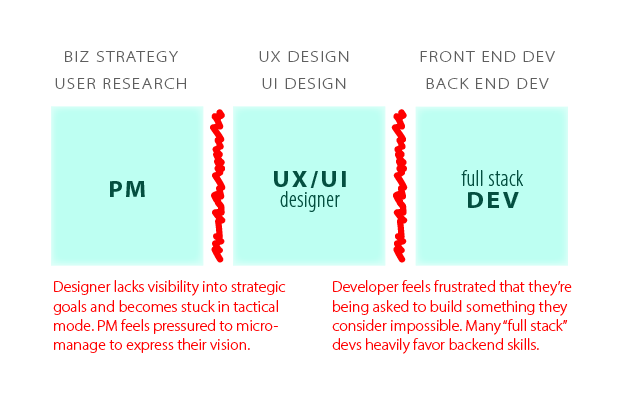
The standard "designer does the design" runs into friction on each side: the PM hands down a constricting definition of the problem space, and the designer's great ideas for the solution rarely translate into code the way they expected. Iteration is very difficult as well.
2/
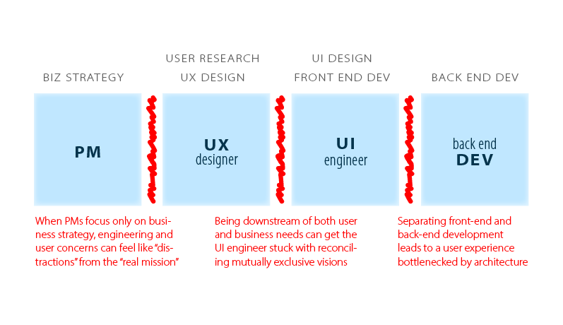
What if we split the design role into UX/R and UI/Dev? Problem not quite solved: separating "business knowledge" & "user knowledge" is a recipe for conflict. Separate front-end and back-end teams can lead to resentment over dependencies when cool UI ideas simply do not work.
Tech career blueprint: some PM adds a dirty growth hack, gets a raise for hitting their metrics, and uses the metric and new salary to get a better paying job elsewhere.
Short-termism and blindly following metrics will erode the foundation of the user experience. Business is UX.
There's a @MrAlanCooper quote - "user experience is a power struggle" - and this is exactly why. When the entire company (or industry) is set up to encourage pillaging customer goodwill for personal aggrandizement, your design system isn't going to solve any of the real problems.
I feel like the undercurrent of "just let us design" and pivot of the "UX Designer" role towards design systems is borne of this: a cynicization of a profession barred from making any real impact by an all-powerful lower level of abstraction.
One power of physical objects is the ability to fill the field of view. Even the smallest one can be held up to the face and force the rest of the world out of focus.
Digital spaces are bound by a viewport, so objects must project their full size into the imagination instead.
One of the simplest ways they do this is to visibly extend offscreen, like most web pages (this is why thou shalt not fuck with browser scroll behavior) but doing it visually isn't the only way.
One of the aspects of good information architecture is implying the content iceberg.
Even though metaphors are ultimately limiting, they are useful to quickly give an impression of depth, through a familiar hook. Like a canned character archetype in a short story, you can get away with "saying" little to sketch the complete outline.
Well, as long as we're committing @blaseball blasphemy
All you need to know about #blaseball - the second most idolized player in the entire league is an automated pitching machine brought into play at the last minute because all of the team's pitchers were trapped in a large peanut
Being idolized will cause the pitching machine to also be trapped in the peanut, which means the @tacoblaseball team will need yet another pitching machine.
Or one of the opposing team's players might ritually destroy it first.