
One of the best decisions I made during a very turbulent 2020 was to leave conventional coding behind and embrace the #nocode movement. @bubble made this a reality. Although my own journey thus far is premature, I’ve learned a lot so here’s a power thread on.... 
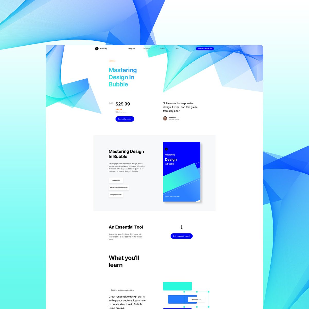
‘How I created @buildcamp sales funnel landing page in under 2hours’.
Preview here 👇
buildcamp.io/guide/masterin…
Power thread here 👇
Preview here 👇
buildcamp.io/guide/masterin…
Power thread here 👇
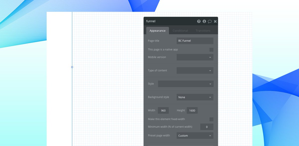
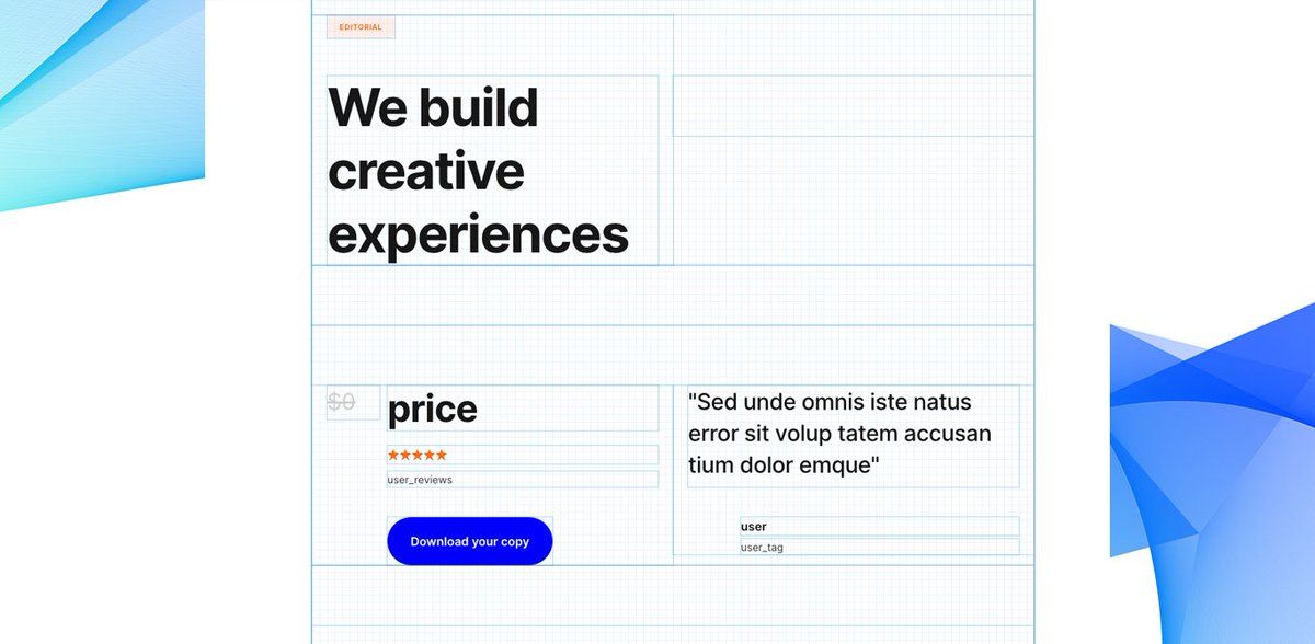
1. Started with a vanilla bubble app ensuring that all styles and UI elements were removed. Created a new page called funnel and set the page size to 960px as this allows the page to render proportionately on both web and mobile when hitting responsive breakpoints. 
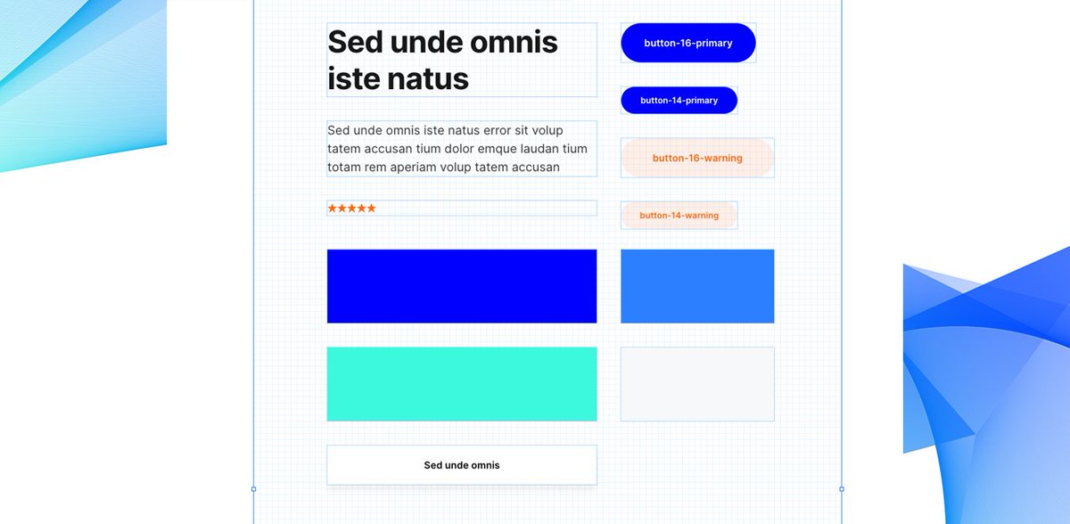
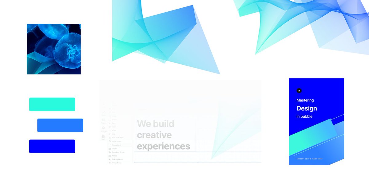
2. Began dropping elements onto the page to ‘find the style’. These had to be closely aligned to our @buildcamp branding so included text, buttons and groups - nothing too heavy. Played around with a few fonts, colors and gradients and thus pinned down the following style guide. 
3. Started to map out sections using groups as my ‘containers’ to hold the relevant information and imagery needed to pad out the sales pitch. At this point, they were merely blocks of color #ff6600 with reduced opacity set to 5% to ease page flair. 
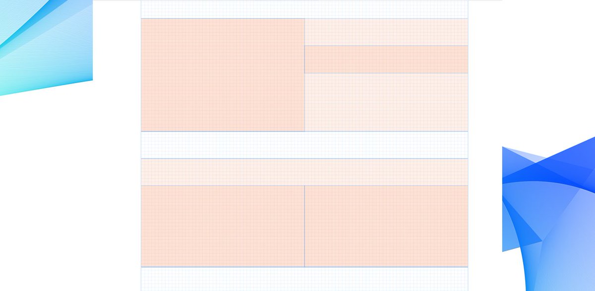
4. Working from top down, I created the page structure using the containers as placeholders and part-filled each with some dummy lipsum content. By using lipsum enables you to not get bogged down with sniffy content creation. A designer's thorn! 
5. Fired up Photoshop and started to create some complimentary images to be used in some of the placeholders. Using the colors I defined in the style guide, I was able to create the following custom imagery to retain page uniform/consistency. 
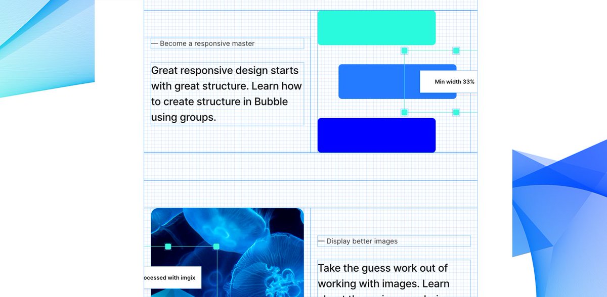
6. At this point I had a firm understanding on how I envisaged the final page to render so my wingman @_gregoryjohn crafted out the content which allowed me to scale and set the correct placeholder heights. 
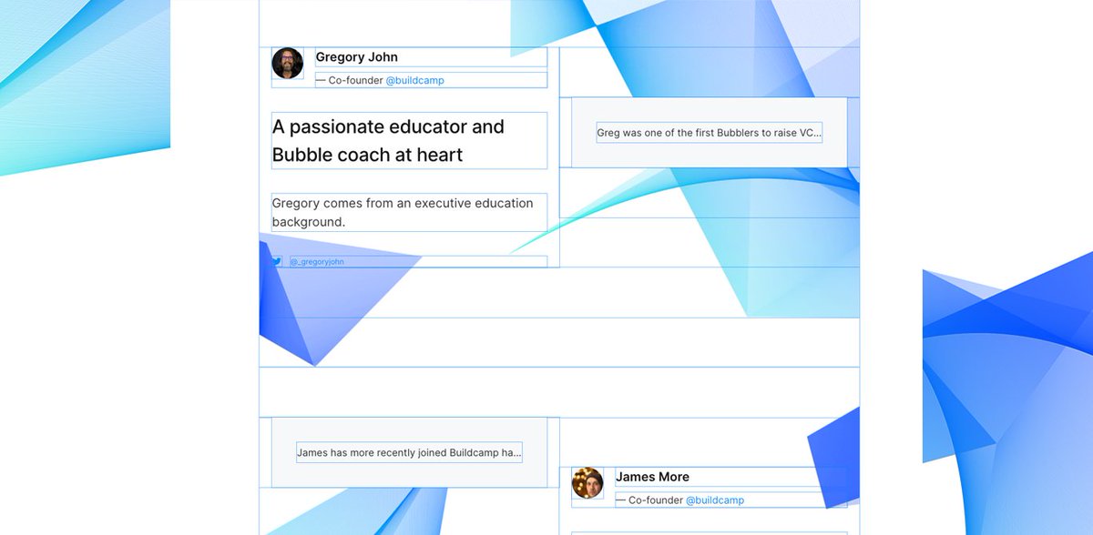
7. Instead of having large open white-space in between sections, I opted to set an image as the groups background to draw attention to certain CTAs and aid page flow. With the parent page itself having its own isometric master-background image. 
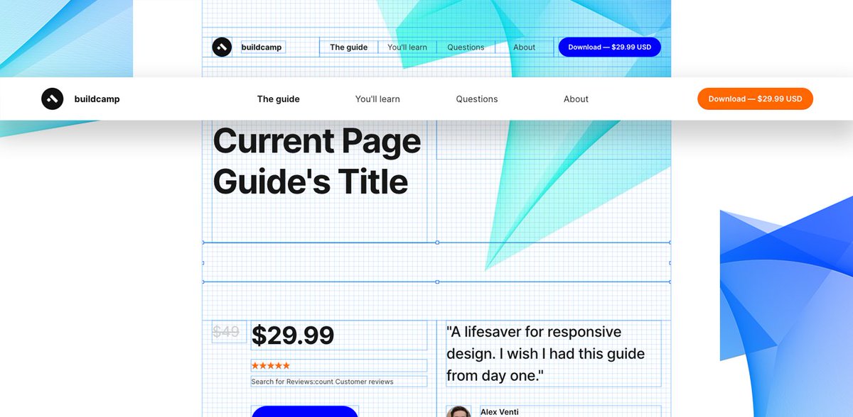
8. I then created a transparent floating header with a conditional to set the background color to #FFFFFF when the current page scrolling is/or above 160. Created 4 anchor text elements which onclick scroll to X_container further down the page. 
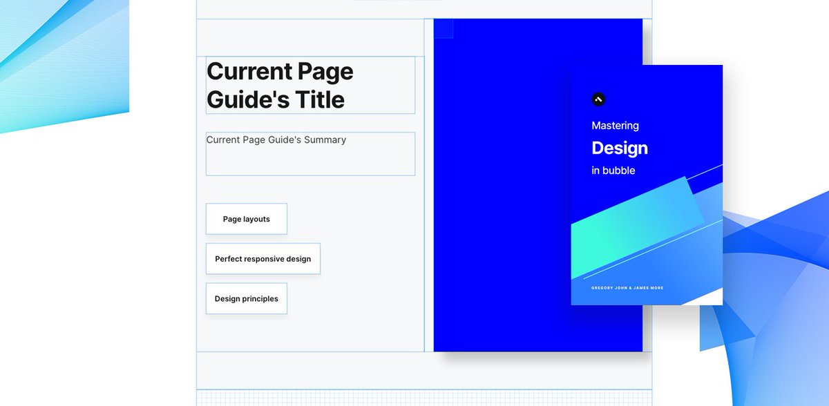
9. Added some further minor UI/UX enhancements. These inc the guide cover shadow by applying an outset shadow style to 20/20/20/0 with #000000 20% opacity. 
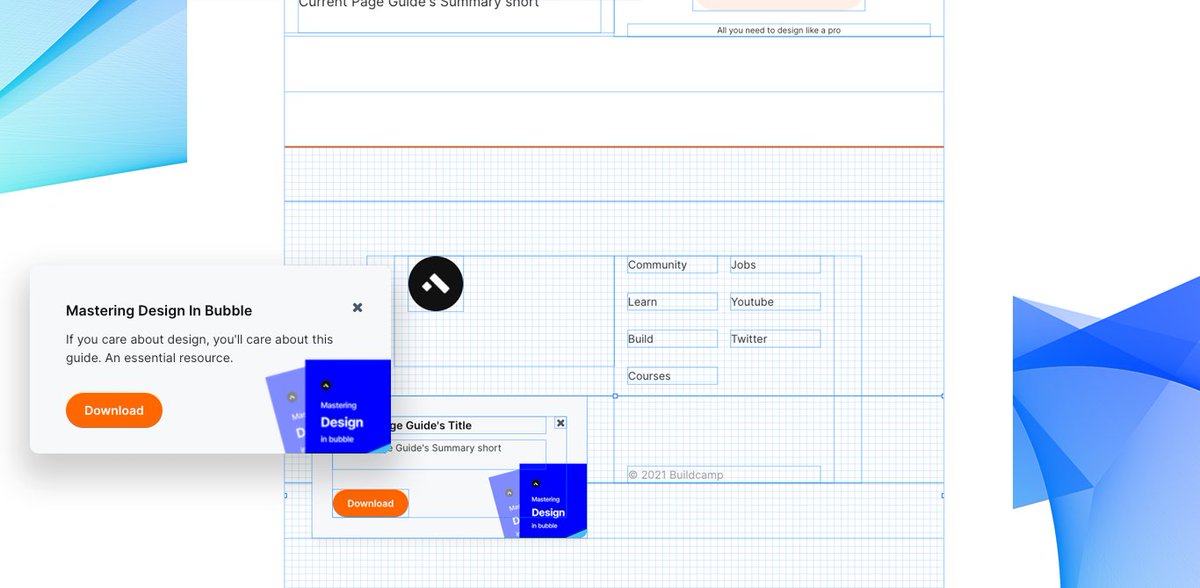
10. A pro-active call-out floating group which is hidden on page load. When current page scrolling is/or above 160 > animate (NoBounceLeftIn) floating group > with the reverse being done to hide when current page scrolling is/or below 160. 
A simple tweet could never portray how much gratitude I have for @estraschnov and @jphaas1 in pursuing their vision into such a powerful and scalable product. @bubble thank you, I applaud you.
• • •
Missing some Tweet in this thread? You can try to
force a refresh


