(Alright, here goes. I may not get this out in one go, so be patient if it's half today, half tomorrow.)
3N's Guide to #Aurebesh Fonts [Adapted for Twitter]
by 3ND-RA [& @AurekFonts]
1/
3N's Guide to #Aurebesh Fonts [Adapted for Twitter]
by 3ND-RA [& @AurekFonts]
1/

Aurebesh, one of countless writing systems used throughout the galaxy, is an alphabet used primarily to transcribe the official language of the Galactic Republic/Empire: Basic.
2/
2/
The aim of this guide is to help you choose the most appropriate and accurate Aurebesh font for a given purpose, (taking it for granted that Aurebesh is the most appropriate writing system for your purpose—a bold supposition, which we shall re-evaluate in a future guide).
3/
3/
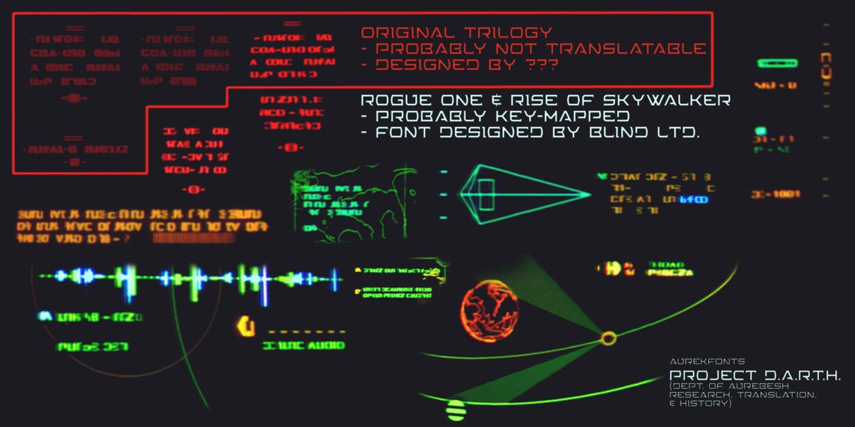
[Priority will be given to fonts that have appeared on-screen or in other official capacity in current Canon media. Therefore, all of these fonts may be termed “Canon Accurate,” and recommendations will be based upon use-case.]
4/
4/
Chapter 1: A Brief History of Aurebesh
Aurebesh has existed in some form or another since antiquity. And like so much of the ancient galaxy, determining its origin with certainty requires weeding through millions of sources, 5/
Aurebesh has existed in some form or another since antiquity. And like so much of the ancient galaxy, determining its origin with certainty requires weeding through millions of sources, 5/
and pruning back the many contradictory histories, legends, and oral traditions that surround such artifacts and sources—all to discover that the answer still eludes you.
6/
6/
[The real-world history of Aurebesh is a little less complicated than all that, but it has still taken a lot of digging, and a little guesswork has been employed. Remind me to stay true to the chapter heading and keep this a “brief history.” (A complete and thorough history 7/
will be the subject of a future guide.)
Various alphabets and writing systems were employed throughout the Original Trilogy of Star Wars films (including the earthly Latin alphabet). The vast majority of these were not intended to represent actual writing, but 8/
Various alphabets and writing systems were employed throughout the Original Trilogy of Star Wars films (including the earthly Latin alphabet). The vast majority of these were not intended to represent actual writing, but 8/
rather to suggest alien languages.
The first thing closely resembling Aurebesh was a script which appears several times in Return of the Jedi (1983). Most likely designed by Joe Johnston, the script appears to have been made by altering and 9/
The first thing closely resembling Aurebesh was a script which appears several times in Return of the Jedi (1983). Most likely designed by Joe Johnston, the script appears to have been made by altering and 9/
rotating Letraset dry-application lettering of Eurostile Black Extended. It was this screen specifically which inspired the creation of the alphabet known as Aurebesh:
10/
10/

In 1993, while working for West End Games, writing books for the Star Wars Roleplaying Game, Stephen Crane “used freeze frame and sketched out the characters [he] saw, then worked at narrowing down how many distinct characters there were.” At the behest 11/
of his editor, he wrote to Lucasfilm for their opinion on setting a Star Wars alphabet in stone. Lucasfilm gave their approval, so long as Crane and West End Games “didn’t state that it was THE alphabet of the Star Wars galaxy.”
12/
12/
This first real version of Aurebesh consisted of 34 letters, corresponding to the 26 letters of the English alphabet with 8 additional digraphs (letters representing a combination of 2 letters):
13/
13/

In 1996, Crane expanded the Aurebesh to include common punctuation marks, as published in West End Games’ Star Wars Miniatures Battles: Imperial Entanglements expansion:
14/
14/

By this time, fans had started to design their own Aurebesh fonts, (starting with “Aurabesh” [sic] by Mike E Webb), while Stephen Crane regrettably 15/
never found time to make an official digital Aurebesh font. (Hold on to that thought, as that information will be relevant a little further on.)
16/
16/
The last major addition to Aurebesh (before returning to the in-universe history) comes to us from the officially licensed Star Wars Monopoly game, which added an Imperial Credit currency symbol:
17/
17/

(The majority of this information comes from Crane himself, which you can read in this archived article he wrote.)
Okay now back to the in-universe commentary….]
18/
Okay now back to the in-universe commentary….]
18/
Suffice it to say that the long history of Aurebesh cannot be so much delineated as explored. That is, the precise chronology of its development and proliferation are difficult to 19/
pinpoint with exactness. However, it is clear that the letters of the Aurebesh bear a familial relationship with the High Galactic Alphabet. [(The High Galactic Alphabet is the in-universe name for the Latin Alphabet).] There are also notable similarities between 20/
both Aurebesh and High Galactic within some ancient runes found in the temples and tombs of ancient Force users such as the Jedi, the Sith, and the Zeffo. The direct relationship between Protobesh (aka Coremaic) is harder to pinpoint; my 21/
professional speculation is that Aurebesh replaced Coremaic as the prominent alphabet among the Core worlds, as it was better suited to digitization.
22/
22/
Several major variants of Aurebesh can be found in current use, such as the ancient Domabesh and the more modern Droidobesh, and Dishabesh. As their contemporary use is well attested, they will be discussed alongside the basic Aurebesh fonts in the following chapters.
23/
23/
Other and future studies may find other variants and evolutions of Aurebesh to be more important, but these few are an adequate survey for our investigation and recommendations of Aurebesh font usage.
24/
24/
Chapter 2: Fonts that are Publicly Available
#1: "Aurabesh" [by Mike E. Webb]
25/
#1: "Aurabesh" [by Mike E. Webb]
25/

[The first Aurebesh fan-font also happens to have been the first digital Aurebesh font, full-stop. The font is most notable for its non-standard approach to capital letters—featuring dropped capital letters. Since punctuation and numerals had yet to be created for Aurebesh, 26/
Webb seems to have invented his own, and interestingly, his numerals stuck around and have become accepted as canonical.
The first confirmed on-screen appearance of Webb’s Aurabesh font was the 2004 DVD release of A New Hope (Special Edition). Adding to 27/
The first confirmed on-screen appearance of Webb’s Aurabesh font was the 2004 DVD release of A New Hope (Special Edition). Adding to 27/
the initial changes made for the 1997 Special Edition, the English text on the Death Star’s tractor beam control panel was changed to Aurebesh. As Lucasfilm had not yet created an official Aurebesh font, Aurabesh was used.
27/
27/
The giveaway? Rather than using Crane’s punctuation, the numerals and punctuation are the ones invented by Webb.
(Included is a comparison between Stephen Crane’s original design and Webb’s font)
28/
(Included is a comparison between Stephen Crane’s original design and Webb’s font)
28/


Confirmed sightings of Aurabesh include:
- A New Hope (2004 DVD onward)
- The Clone Wars
- Rebels
- Resistance
- Battlefront II
- Jedi: Fallen Order
- Squadrons
- The Mandalorian
...]
29/
- A New Hope (2004 DVD onward)
- The Clone Wars
- Rebels
- Resistance
- Battlefront II
- Jedi: Fallen Order
- Squadrons
- The Mandalorian
...]
29/
We are inclined to appraise this font charitably as “quirky and outmoded.” We concede that it has historical merit, but argue that it should not be used generally, on account of its inconsistent spacing and non-standard punctuation.
30/
30/
That being said, it is free to use, and downloadable from the AurekFonts data repository.
[aurekfonts.github.io/?font=Aurabesh]
31/
[aurekfonts.github.io/?font=Aurabesh]
31/
#2 Aurebesh Tycho [by Tycho Ordo]
32/
32/

Aurebesh Tycho was designed by Tycho Ordo in 2015 to support the entire ASCII block of characters, including characters with diacritics (or accents). This feature appears most prominently in Women of the Galaxy by Amy Ratcliffe:
33/
33/

Here, Aurebesh Tycho is used to render the name “Padmé Amidala” with the appropriately accented letter é, which is not included in most Aurebesh fonts.
34/
34/
The typeface also appears on the cover of the in-universe Batuu version of Myths & Legends by George Mann, identifiable by its unique ampersand (&):
35/
35/

Confirmed sightings of Aurebesh Tycho include:
-Myths & Fables (Galaxy’s Edge edition)
...]
Aurebesh Tycho provides support for a more diverse set of characters than other freely available Aurebesh fonts, the kerning and letterspacing leaves 36/
-Myths & Fables (Galaxy’s Edge edition)
...]
Aurebesh Tycho provides support for a more diverse set of characters than other freely available Aurebesh fonts, the kerning and letterspacing leaves 36/
something to be desired. Additionally, the now dated digraphs are codified in the font such that they cannot be disabled. Furthermore, the numerals also feature some line-width issues.
That said, as long as care is taken to 37/
That said, as long as care is taken to 37/
avoid or manually correct kerning errors, we recommend Aurebesh Tycho for titles and display sizes.
It is free for personal, non-commercial use, and is downloadable from the AurekFonts data repository.
[aurekfonts.github.io/?font=Aurebesh…]
38/
It is free for personal, non-commercial use, and is downloadable from the AurekFonts data repository.
[aurekfonts.github.io/?font=Aurebesh…]
38/
#3 Aurebesh [by Pixel Sagas]
39/
39/

[Aurebesh by Neal Davidson (aka Pixel Sagas) is one of the most popular typefaces among fans. It is also the first on our list that intentionally diverges from Stephen Crane’s design. By rounding the edges of the characters, Aurebesh
40/
40/
pays homage to the Eurostile Extended typeface that Aurebesh was originally based upon, but instead of the weightier Eurostile Extended Black, it uses a medium-weight font for its inspiration.
41/
41/
In addition to its popularity among fans, Davidson’s Aurebesh has appeared on props and graphics on screen a number of times. Perhaps the most prominent being an episode of The Mandalorian, wherein a warning flashes on a console:
42/
42/

This graphic highlights the biggest issue with Davidson’s font: Capital letters are reversed along the vertical axis. Davidson likely based this quality upon faulty information that once appeared on the fan wiki Wookieepedia, which 43/
incorrectly stated that “symbols were mirror-inverted to denote capital letters.” (starwars.fandom.com/wiki/Aurebesh/…)
Ironically, while this information was incorrect at the time, the use of this Aurebesh font (as utilized above) has retroactively made that information canonical.
44/
Ironically, while this information was incorrect at the time, the use of this Aurebesh font (as utilized above) has retroactively made that information canonical.
44/
Confirmed sightings of Aurebesh by Pixel Sagas include:
- The Mandalorian
...]
This font must be used carefully. Whilst reversed capital letters are sometimes used in parts of the galaxy, it is broadly considered a faux-pas. If you choose to 45/
- The Mandalorian
...]
This font must be used carefully. Whilst reversed capital letters are sometimes used in parts of the galaxy, it is broadly considered a faux-pas. If you choose to 45/
use this font, we recommend that you meticulously avoid using capital letters at all.
This font is free for personal, non-commercial use, and is downloadable from the AurekFonts data repository.
[aurekfonts.github.io/?font=Aurebesh…]
46/
This font is free for personal, non-commercial use, and is downloadable from the AurekFonts data repository.
[aurekfonts.github.io/?font=Aurebesh…]
46/
#4 Aurek-Besh [by Boba Fonts]
47/
47/

[While the on-screen use of Aurek-Besh by Davide Canavero (aka Boba Fonts) is debatable, its use in the production pipeline is not. For instance, in The Force Awakens, the scavenger 48/
Rey wears an old Rebellion-era starfighter helmet with a decal that reads, (if translated according to the original Stephen Crane assignments), “RAEH”:
49/
49/

According to Leeland Chee, Lucasfilm’s official Holocron Keeper:
50/
50/
https://twitter.com/HolocronKeeper/status/1305284950539657216
The artist (possibly TFA senior prop modeller Roy Halfpenny imdb.com/name/nm2823866…) meant to type “R&H,” though as far as we are aware and have researched, UK keyboards do not map any key to the letter æ.
51/
51/
A far simpler explanation is that the font being used mapped the Aurebesh letter Enth (the “ae” digraph) to the ampersand (&) character.
To our knowledge, at the time of the making of The Force Awakens, only one Aurebesh font did so: Aurek-Besh by Davide Canavero.
52/
To our knowledge, at the time of the making of The Force Awakens, only one Aurebesh font did so: Aurek-Besh by Davide Canavero.
52/
(Later, the Aurebesh letter Enth (ae) would become a canonical form of the ampersand (&) in the first known official standard Aurebesh font, Aurebesh Neue, which we will discuss a little further along.)
53/
53/
Probable uses of this font include:
- The Force Awakens
- The Last Jedi
- The Rise of Skywalker
...]
Aurek-Besh is a functional Aurebesh font that is neither unique, nor superior to other free fonts of similar style (such as Aurebesh AF). 54/
- The Force Awakens
- The Last Jedi
- The Rise of Skywalker
...]
Aurek-Besh is a functional Aurebesh font that is neither unique, nor superior to other free fonts of similar style (such as Aurebesh AF). 54/
We recommend using this font only for simple helmet stencils and vehicular decoration.
It is free to use, and downloadable from the AurekFonts data repository.
aurekfonts.github.io/?font=AurekBesh
55/
It is free to use, and downloadable from the AurekFonts data repository.
aurekfonts.github.io/?font=AurekBesh
55/
#5 Aurebesh Neue [by A.T. & A.L.]*
*[A.T. has asked that I not reveal their name to “protect the magic” of Disneyland. I have not spoken to A.L., so their name has also been redacted.]
56/
*[A.T. has asked that I not reveal their name to “protect the magic” of Disneyland. I have not spoken to A.L., so their name has also been redacted.]
56/

[Aurebesh Neue is the first official Aurebesh font that has been made (unintentionally) available to the public. As such, its use here is merely for educational and commentary purposes.
This font was apparently designed specifically for Galaxy’s Edge 57/
This font was apparently designed specifically for Galaxy’s Edge 57/
more complete than most previous Aurebesh fonts, which is great if you want to know which characters are Canonical, given the many differences in punctuation and extended character sets of the various fan-fonts.
58/
58/
First off, two sets of numerals are included. The first was originally designed by Mike E Webb for the font Aurabesh, and the second set were created by Peter Schuster for his font, New Aurabesh:
59/
59/

We can also look at the punctuation marks that were not included in Stephen Crane’s original design.
60/
60/
Here we see that the ampersand (&) assignment of the Aurebesh letter Enth (ae) has been borrowed from Aurek-Besh. And whether it is borrowed or merely convergent design, the curly braces ( { } ) of Aurebesh Neue are nearly identically to those in @Mantia ’s Sacul Basic font:
61/
61/

@Mantia It is fascinating to see the tangible if unacknowledged influence of so many fan-fonts upon the design and structure of the current “official” version of Aurebesh.
62/
62/
So far, the only confirmed canon use of this font is throughout Black Spire Outpost on Batuu at Galaxy’s Edge park at Disneyland and Walt Disney World, as well as some related products.
63/
63/
Aurebesh Neue is the most complete and extensive Aurebesh typeface yet created, but due to exclusivity contracts and trade agreements, its use is largely limited to the Outer Rim planet of Batuu.
Use of Aurebesh Neue is strictly prohibited 64/
Use of Aurebesh Neue is strictly prohibited 64/
without express written permission from the copyright holders.
We suggest using Aurebesh AF as a free alternative to Aurebesh Neue. We recommend it as your default Aurebesh font for most uses.
65/
We suggest using Aurebesh AF as a free alternative to Aurebesh Neue. We recommend it as your default Aurebesh font for most uses.
65/
Aurebesh AF is free to use, and downloadable from the AurekFonts data repository.
aurekfonts.github.io/?font=Aurebesh…
66/
aurekfonts.github.io/?font=Aurebesh…
66/
[I forgot a closing bracket at the end of tweet 63, sorry]
67/
67/
Droidobesh Neue [by A.T., A.L., & S.N.]*
*[As with Aurebesh Neue, names of the designers have been redacted to “protect the magic,” as it were.]
68/
*[As with Aurebesh Neue, names of the designers have been redacted to “protect the magic,” as it were.]
68/

[Droidobesh Neue is another unintentionally released* variant Aurebesh font found at Galaxy’s Edge and in the DataPad app. It can be seen most prominently around Mubo’s Droid Depot.
69/
69/
*(In point of fact, the version that was unintentionally made public is Droidobesh Neue BETA, indicating that it is an earlier version of the font than the one found in the park.)]
70/
70/
Droidobesh Neue is an Aurebesh variant made up of simple, rounded shapes. As its name suggests, it is strongly associated with Droid sales and repair shops and can easily be made into a stencil.
Use of Droidobesh Neue is strictly prohibited 71/
Use of Droidobesh Neue is strictly prohibited 71/
without express written permission from the copyright holders.
We suggest using Droidobesh Depot [by Vamplify], as a free alternative to Droidobesh Neue. We recommend it for decals, stencils, and signage relating to Droids.
72/
We suggest using Droidobesh Depot [by Vamplify], as a free alternative to Droidobesh Neue. We recommend it for decals, stencils, and signage relating to Droids.
72/
Droidobesh Depot is free to use, and downloadable from the AurekFonts data repository.
[aurekfonts.github.io/?font=Droidobe…]
73/
[aurekfonts.github.io/?font=Droidobe…]
73/
Chapter 3: Aurebesh Fonts with Semi-Accurate Free Alternatives
The following Aurebesh fonts have free alternatives which fall below the standard of accurate recreation.
74/
The following Aurebesh fonts have free alternatives which fall below the standard of accurate recreation.
74/
[Unlike the foregoing fonts, these alternative fonts are “canonical” only insofar as they accurately depict characters seen on screen. Most of them incorporate some amount of guesswork, given the limited information available for some of the Aurebesh variants shown.]
75/
75/
#1: Domabesh
76/
76/

[According to a now-deleted twitter thread by costume designer Glyn Dillon, Domabesh was created for Rogue One, at the request of director Gareth Edwards. This 77/
Aurebesh variant font was used extensively on structures throughout the ancient city of Jedha, and on helmets and crates used by the Rebel Alliance.
78/
78/
Confirmed uses of Domabesh include:
- Rogue One
- Resistance
- Solo
- Galaxy’s Edge
...]
Domabesh is a relatively ancient variant of Aurebesh that is monospaced with irregular line widths.
79/
- Rogue One
- Resistance
- Solo
- Galaxy’s Edge
...]
Domabesh is a relatively ancient variant of Aurebesh that is monospaced with irregular line widths.
79/
We suggest using Domabesh Console as a semi-accurate alternative to Domabesh. Its letters do not match the exact letterforms of Domabesh, and the letters J and V appear to be totally conjectural. However it is the closest match which is available to the public. 80/
We recommend it for use on helmet decals, crate labels, and temple murals.
Domabesh Console is free to use, and downloadable from the AurekFonts data repository.
[aurekfonts.github.io/?font=Domabesh…]
81/
Domabesh Console is free to use, and downloadable from the AurekFonts data repository.
[aurekfonts.github.io/?font=Domabesh…]
81/
#2: Unknown Aurebesh Variant Font N
82/
82/

[The name of this variant Aurebesh font is unknown, as is the identity of its creator. It first and most prominently appeared in The Phantom Menace on the console of Anakin’s N1 Naboo Starfighter. This is the first true Aurebesh font to appear on screen in a Star Wars movie.
83/
83/
Some of its letterforms vary greatly from those of Stephen Crane’s Aurebesh. For instance, the letter A is mirrored,* and many of the letters feature more strokes than their counterparts in Crane’s original design.
84/
84/
*(This is a likely candidate for the origin of the myth-turned-canon that reversed characters in Aurebesh could represent capital letters, as no Aurebesh font prior to 1999 featured mirrored capitals.)
85/
85/
Confirmed uses of this Aurebesh font include:
- The Phantom Menace
- Attack of the Clones
- Revenge of the Sith
...]
This heavily stylized Aurebesh variant from as varied locations as Naboo, Coruscant, and Pammant.
86/
- The Phantom Menace
- Attack of the Clones
- Revenge of the Sith
...]
This heavily stylized Aurebesh variant from as varied locations as Naboo, Coruscant, and Pammant.
86/
We suggest using Auraboo (by @nickytea) as a semi-accurate alternative to this unknown font. Although it is not a direct match—some letters are 87/
@nickytea now known to be incorrect, such as F, J, and M; others are conjectural, such as V and Z—but it is closer than any other options available. We recommend it for cases that call for a softer, more artisanal design.
88/
88/
@nickytea Auraboo is free to use, and downloadable from the AurekFonts data repository.
aurekfonts.github.io/?font=Auraboo
89/
aurekfonts.github.io/?font=Auraboo
89/
#3: Star Wars 76 [by Philip Metschan, original design by Joe Johnston]
90/
90/

[Star Wars 76 is a font created by Philip Metschan for Attack of the Clones. It is based upon Joe Johnston’s pre-Aurebesh design from Return of the Jedi, though all of the letters are rotated 180 degrees, so that they are upside down by comparison.
91/
91/
Metschan’s font contained letter assignments only for letters A-U, while Johnston’s design had at least 30 distinct glyphs and no letter assignments. Despite the given letter assignments, both versions of the font were used in largely decorative capacities, as shown 92/
above, where letters are chosen based on their resemblance to the names “Padmé Amidala” and “Obi-Wan Kenobi” rather than their alphabetical assignments.
93/
93/
Confirmed uses of either Star Wars 76 or Joe Johnstons design include:
- Attack of the Clones
- Revenge of the Sith
- Return of the Jedi
- The Rise of Skywalker
...]
94/
- Attack of the Clones
- Revenge of the Sith
- Return of the Jedi
- The Rise of Skywalker
...]
94/
Star Wars 76 was once used in a wide range of applications, but came to be used almost exclusively in military applications by the end of the Galactic Civil War.
We suggest using Galactic Basic (by Erik Stormtrooper) as a semi-accurate alternative to this font.
95/
We suggest using Galactic Basic (by Erik Stormtrooper) as a semi-accurate alternative to this font.
95/
Galactic Basic uses yet another letter assignment that seeks to generate equivalence with traditional Aurebesh. We recommend using it in contexts where strong Coruscanti influence is appropriate, such as core-world advertisement and encrypted Imperial code transmissions.
96/
96/
Galactic Basic is free to use for personal, non-commercial purposes, and is downloadable from the AurekFonts data repository.
[aurekfonts.github.io/?font=Galactic…]
97/
[aurekfonts.github.io/?font=Galactic…]
97/
Chapter 4: Aurebesh Fonts with No Suitable Free Alternatives or Recreations
The following Aurebesh fonts have no free alternatives, at time of writing.
98/
The following Aurebesh fonts have no free alternatives, at time of writing.
98/
#1: Dishabesh
99/
99/

[Like Domabesh, Dishabesh was first mentioned in a now deleted Twitter-thread by costume designer Glyn Dillon, indicating that it was created for Rogue One, at the request of director Gareth Edwards. To our knowledge, 100/
it was not actually used until the production of Solo, where it appears prominently (and mirrored) in a poem carved into the helmet of Enfys Nest.
Confirmed uses of Dishabesh include:
- Solo
- The Rise of Skywalker
...]
101/
Confirmed uses of Dishabesh include:
- Solo
- The Rise of Skywalker
...]
101/
Dishabesh is a relatively modern Aurebesh variant font. It features highly stylized and broken letterforms, some of which depart quite wildly from traditional Aurebesh.
We currently know of no suitable free alternatives for Dishabesh.
102/
We currently know of no suitable free alternatives for Dishabesh.
102/
#2: Unknown Aurebesh Font M
103/
103/

[This font appears to have been designed specifically for use on the production of The Mandalorian. It features a very distinct letter S, as well as numerous other more subtle differences. It appears more often than any other Aurebesh font in the show.
104/
104/
• • •
Missing some Tweet in this thread? You can try to
force a refresh