TL;DR: Trend lines are an important tool to filter noise from signal. Moving averages is one way to do this, but it's not good at removing noise and introduces a data lag. Using methods like STL that can account for the weekly pattern and don't add extra data lag are preferable.
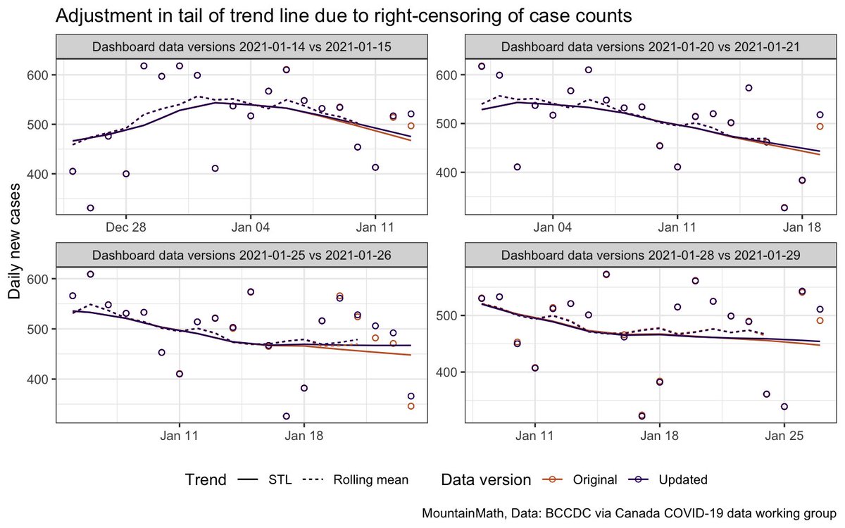
Moving average trend lines do have the advantage that they are simple to understand, but get misleading when they are artificially shifted to the right to obscure the data lag. This problem is particularly acute when overlaid over case counts as for example in this graph.
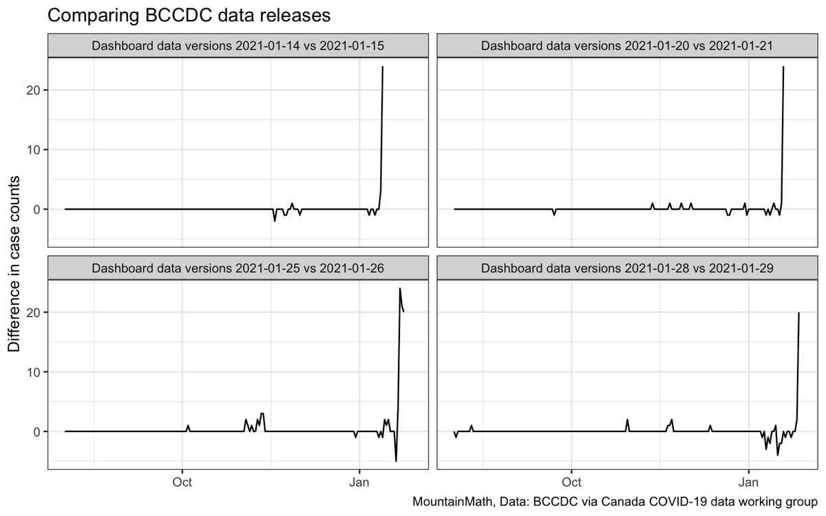
For BC data there the an added problem of right-censoring, with subsequent data releases changing the number of cases on previous days. This systematically biases trend lines down. Less of a problem for moving averages because of their data lag, but problem for modelling.
The effect on the tail of trend lines is not huge but clearly visible. The impact on projections from modelling can be quite a bit larger though, especially for models that emphasize the last week of data points for their projections.
• • •
Missing some Tweet in this thread? You can try to
force a refresh
In BC we don't have useful geographic COVID breakdowns to e.g. guide schools protocols or direct targeted extra resources. But we can (somewhat perversely) turn this around and use kids as an indicator for community spread.
However, this map is not normalized by (children) population, so here is the children density for reference. Part of the Surrey hotspot in Newton is explained by children density, but there is more than just that going on there.
And children don't necessarily go to school close to where they live, but most do. A better way to do this would be to normalize each school by their overall enrolment, but matching exposures to enrolment data using names is messy and takes a lot of time and I am lazy.
The new Health Region level maps are up, and 10yo did a quick scrape of the data. It's for the week ending this past Thursday. Trends have gotten worse for that past week, although there is slight a caveat (at the end of this thread).
Version with regions stable so people can better follow their favourite health region.
And the map version, things are getting very red across Metro Vancouver. Just to pre-empt the usual comments, I won't adjust the colour scale, it's the case numbers that are too night not the colours that are wrong.
Looks like the data backlog is cleared and we got a full week of new data! And revised data for a bit longer changing the earlier trend that we saw. Trend is again showing signs of slowing growth, but we have been here before...
Vancouver Coastal is showing a decline. Fraser exhibits signs of slowing growth, but also has very high volatility in the numbers. Each of Island, Interior and Northern are showing higher growth rates than the VCH and FH, which is also evident in their combined trend.
Of course these tweets might be obsolete again in half an hour if BCCDC again pulls the update as happened last week and also the week before that. ¯\_(ツ)_/¯
This is really quite something, although not unexpected given what we have seen. BCCDC would really benefit from adopting a privacy framework instead of just relying on as-hoc decisions.
It’s really hard to rationalize why publishing weekly counts for Richmond is just fine by doing the same for Burnaby or Surrey would be an “unreasonable invasion of privacy”.
In fact it’s really hard to rationalize disclosure risk at much finer geographies like FSA or City Neighbourhood, when we already identify the existence of cases in school communities.
Thread trying to make sense out of why we still don't have the covid alert app in BC. Yesterday the PHO said that the app in the current form is not useful to augment contact tracing in BC, speaking about this starting at 39:35
The key point seems to be that the covid alert app is designed for maximal privacy, which comes with tradeoffs as to how much information people notified of an exposure and by extension PHO get. In particular the APP is designed so that users won't know when the exposure occurred
In practice this means the app is casting a wide net. Anyone that came into "close contact" with an infected person over the 14 days prior will get notified, even though the infected person likely wasn't infectious for the entire 14 day period.
Folding in today's data release BC looks like it's on a clear upward trajectory again. This is not good. The time for coordinated counter measures was probably two months ago, but better late than never. This train is moving in the wrong direction and need to get off.
Fraser is driving this trend, and we might want to think about a regionally differentiated response. But it's not clear to me that the boundaries between Fraser and Vancouver Coastal at that meaningful, looking at finer geographies would make it easier to tailor the response.
For comparison, people in SK are worried about their 7 day incidence reaching 5 cases per 100k in the near future. From BC's perspective those numbers sounds really nice, Fraser is at 33 right now and Vancouver Coastal is at 25.