Yesterday in the Q&A portion of my conf talk, I got a question asking what I thought about CSS frameworks like Bootstrap.
My answer: I do not suggest using them. Nor do I suggest using fully-styled component libraries like Material UI.
Here’s why 👇🏻
My answer: I do not suggest using them. Nor do I suggest using fully-styled component libraries like Material UI.
Here’s why 👇🏻
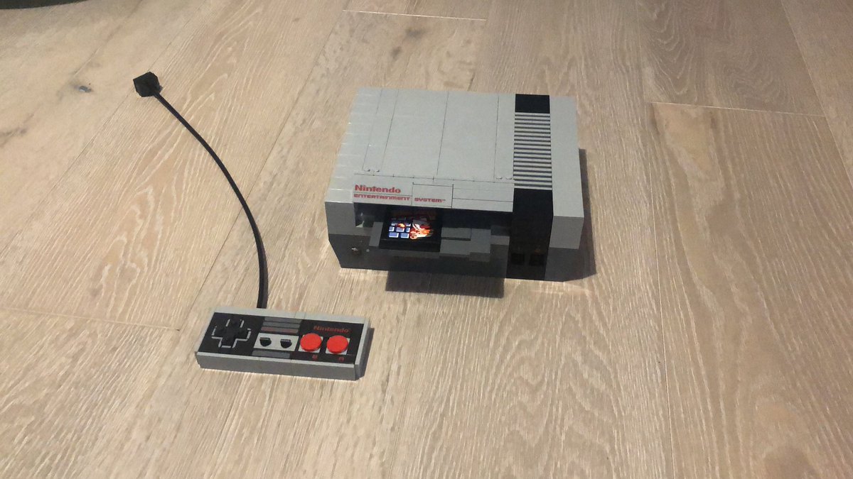
For Christmas this year, I was gifted a Lego NES kit. Was super fun.
Here’s a question, though: what if I had been given all the blocks, but no instructions? What if I wasn’t even shown the final product?
How good would my NES look, do you think?
Here’s a question, though: what if I had been given all the blocks, but no instructions? What if I wasn’t even shown the final product?
How good would my NES look, do you think?
A design is more than the sum of its parts. I can take a bunch of really-nicely-designed components and still wind up with a poorly-designed product.
It’s been said that only Google can produce nice-looking Material Design apps, since their designers understand how to use it.
It’s been said that only Google can produce nice-looking Material Design apps, since their designers understand how to use it.
I teach at a bootcamp, and we strongly discouraged students from using fully-styled component libraries.
Invariably, students would hit a point where they’d spend longer trying to override the styles / get it to work than they would have spent building it from scratch
Invariably, students would hit a point where they’d spend longer trying to override the styles / get it to work than they would have spent building it from scratch
Anecdotally, the students who tried using a component library like Material UI spent longer on styling, and didn’t wind up with a nicer UI.
You get off the ground quicker, but you burn so much more time trying to polish and finish the app.
You get off the ground quicker, but you burn so much more time trying to polish and finish the app.
Now there is one HUGE caveat here. I’m talking specifically about “styled” component libraries.
Style-agnostic libraries like Reach UI, which focus purely on functionality, are a godsend and you should absolutely use them. Please don’t build your own modal from scratch.
Style-agnostic libraries like Reach UI, which focus purely on functionality, are a godsend and you should absolutely use them. Please don’t build your own modal from scratch.
I think of tools like Reach UI as the “missing standard library of the DOM”. They fill in the gaps that the platform really should have natively, things like dialogs and tooltips and comboboxes. But they don’t prescribe any styles. That’s up to you.
What about Tailwind?
I’ve shared before that Tailwind isn’t my favourite tool, but I think it deftly avoids the issues I’ve been talking about here. In Tailwind you pick which utilities you use, and everything is customizable. So I don’t group it in with Bootstrap/MaterialUI.
I’ve shared before that Tailwind isn’t my favourite tool, but I think it deftly avoids the issues I’ve been talking about here. In Tailwind you pick which utilities you use, and everything is customizable. So I don’t group it in with Bootstrap/MaterialUI.
For solo developers without design skills and limited time, it can be really tempting to grab an off-the-shelf component library. I get that.
But it’s like writing code without writing tests — it’s faster at first, until the project becomes complex. Then it slows you way down.
But it’s like writing code without writing tests — it’s faster at first, until the project becomes complex. Then it slows you way down.
I think if you’re a solo dev maker, investing in your design skills is the best thing you can do. You don’t need to spend weeks becoming a design whiz - you just need to learn enough of the fundamentals to make something that looks “real enough”.
I think Refactoring UI is a fantastic resource. It’s relatively short and can go a long way.
I have plans to do some stuff in this space as well 😃 but that’s distant-future stuff.
I have plans to do some stuff in this space as well 😃 but that’s distant-future stuff.
TL;DR — unless you’re building a short-term project (prototype, hackathon), CSS frameworks can be harmful, *increasing* the amount of time you need to spend on the UI.
I recommend using a style-agnostic tool like Reach UI instead. Use third-party functionality, not styles.
I recommend using a style-agnostic tool like Reach UI instead. Use third-party functionality, not styles.
Shameless 🔌: I'm working on a CSS course! It's a comprehensive guide to becoming confident with CSS.
It also features a module all about components 😄 we build our own mini component library.
Learn more: css-for-js.dev
It also features a module all about components 😄 we build our own mini component library.
Learn more: css-for-js.dev
• • •
Missing some Tweet in this thread? You can try to
force a refresh