We start with the LINE chart. Why? Because, just like the bar chart, it's familiar and easy to create. As simple as they are, there are a number of considerations to take into account, some of which are aesthetic, and some of which are substantive.
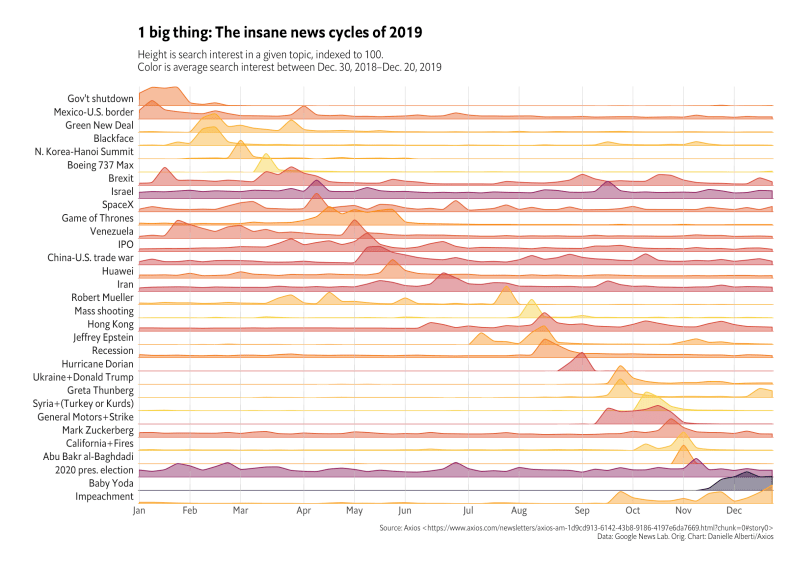
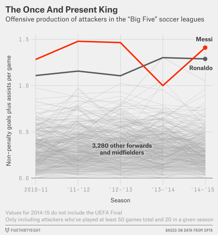
1. There is no limit to the number of lines you plot. This @FiveThirtyEight chart has 3,282 lines, but it's still easy to read, right? The key is not to worry about the sheer amount of data, but instead about the purpose of the graph and how you can direct your reader's focus. Image
2. You don't need to start the vertical axis at zero. There is still some debate about this, but the basic rule-of-thumb is that the axis dimensions in a line chart depend on the data and your communication goal.
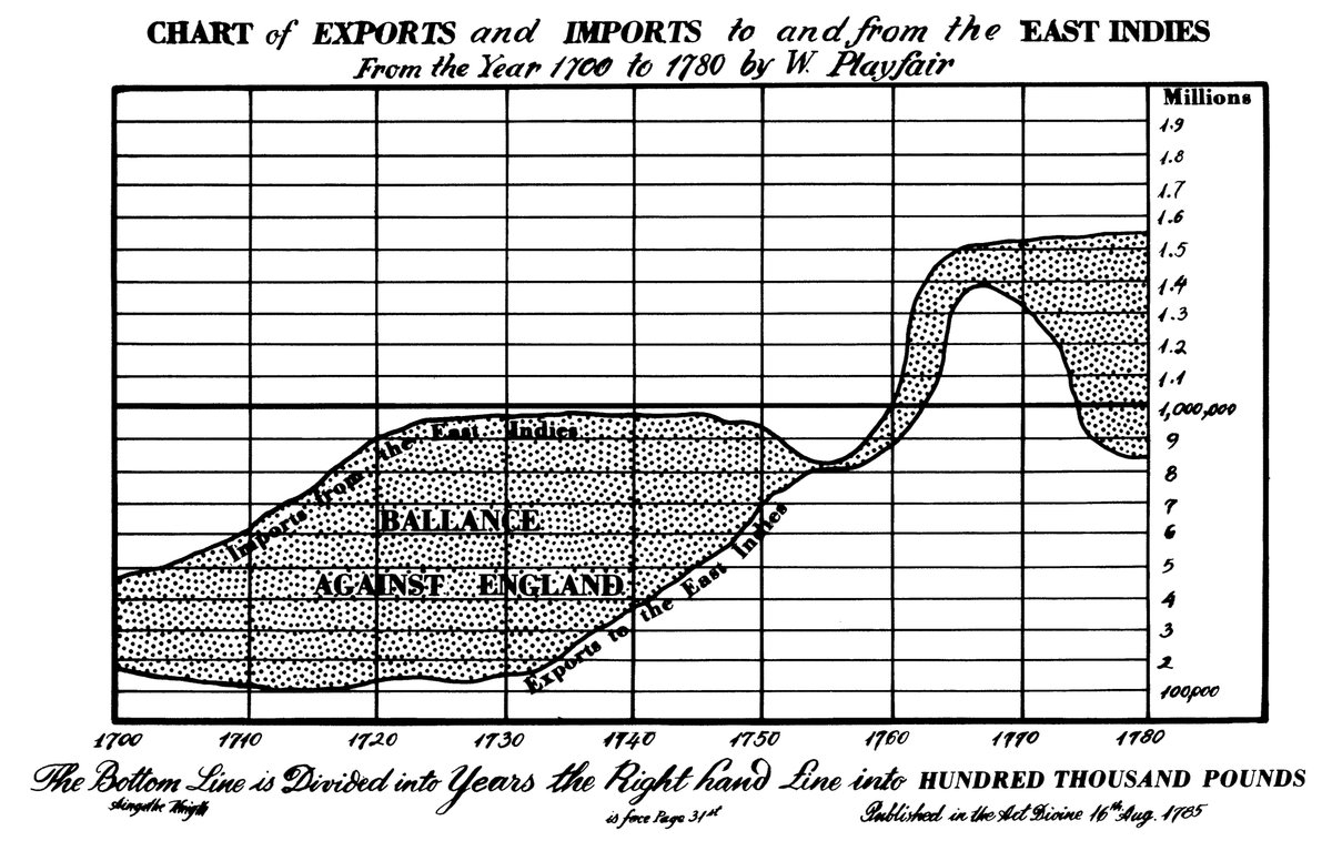
3. Beware the line-width illusion. You probably didn't notice the hump in the trade balance after 1760 in this graph (left) from William Playfair. We tend to assess the distance between curves at the closest point rather than the vertical distance. ImageImage
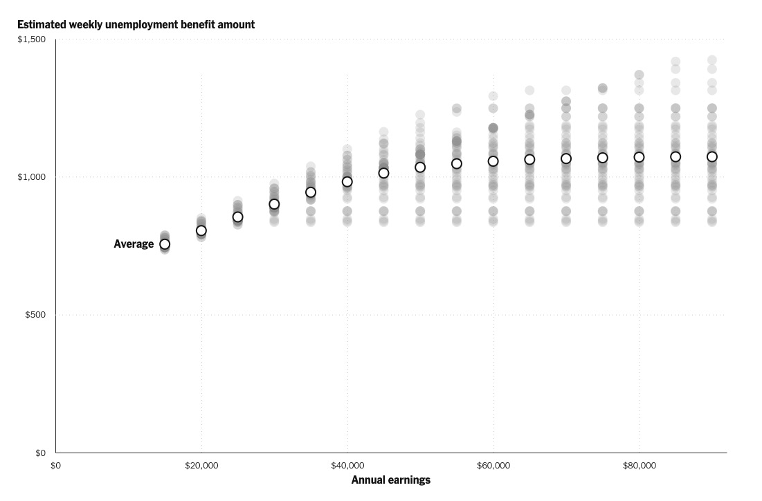
4. Include data markers to mark specific values. Personally,
I include data markers when I have only few lines or data points, or for specific points I want to label or annotate. But putting them on every point can make the graph cluttered.
4a. There may be times when adding data markers are important for reasons of accessibility. Incorporate those considerations about people who have vision, physical, or intellectual impairments into your work, especially at the beginning of the process.
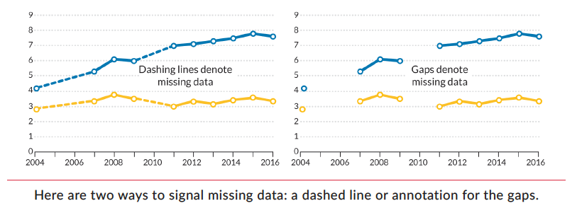
5. Use visual signals for missing data. I plucked this example from my book. Be sure to mark or note gaps where you have missing data. Never just ignore them and connect the line. Image
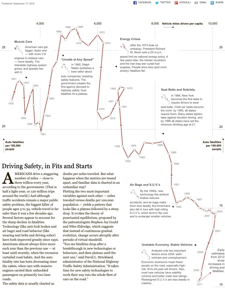
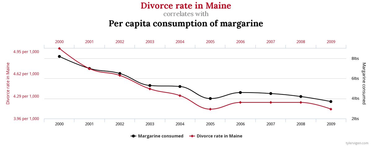
6. Avoid dual-axis line charts. Graphs like these are hard to read, the gridlines can end up floating in space, and they can suggest the crossing point is more important than it is. Image
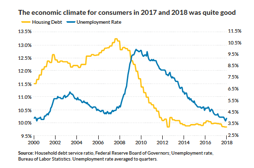
6a. And before folks yell at me, yes, if you are plotting variations on the same metric, then a dual axis chart might work fine; for example, Celsius and Fahrenheit.

If you want some fun dual axis charts, check out tylervigen.com/spurious-corre… from @TylerVigen. Image

• • •

Missing some Tweet in this thread? You can try to force a refresh
 

Keep Current with IAmSciComm | @jschwabish @policyviz

IAmSciComm | @jschwabish @policyviz Profile picture

Stay in touch and get notified when new unrolls are available from this author!

Read all threads

This Thread may be Removed Anytime!

PDF

Twitter may remove this content at anytime! Save it as PDF for later use!

Try unrolling a thread yourself!

how to unroll video
  1. Follow @ThreadReaderApp to mention us!

  2. From a Twitter thread mention us with a keyword "unroll"
@threadreaderapp unroll

Practice here first or read more on our help page!

More from @iamscicomm

24 Feb
So far today, we've talked about graphs that show distributions and uncertainty that in some ways *summarize* the data. But what about showing specific data points in the data set? There are a few:
-Strip charts 🥓
-Beeswarm charts 🐝
-Wheatplots 🌾
-Raincloud plots 🌧
In the strip plot, the data points are plotted along a single horizontal or vertical axis. You might get some overlapping here, but you can use color transparency to show the individual points, if that's important. Here are a few from the NYT. ImageImageImage
The thing about the strip chart (sometimes called the stripe chart) is that you can use dots, points, or lines. And sometimes the important thing is to just your reader know that there are lots of points in some part of the distribution.
Read 7 tweets
24 Feb
There are (at least) two graphs that can be used to show distributions in your data that don't show specific percentile values.
-The violin chart 🎻uses kernel density estimates to generate a shape of the entire distribution. Here's one I made of earnings in industries. Image
The ridgeline plot is a series of histograms or density plots shown for different groups aligned along the same horizontal axis and presented with a slight overlap along the vertical axis. It's kind of a 'small multiples' histogram. This one from @hrbrmstr. Image
If you're really interested in the ridgeline plot, check out this awesome story by @ChristiansenJen from @sciam who dug up the original plot. | blogs.scientificamerican.com/sa-visual/pop-…
Read 4 tweets
24 Feb
For those who are interested, here's a list of some papers relating to uncertainty in data visualization:
S. Belia, F. Fidler, J. Williams, and G. Cumming, “Researchers misunderstand confidence intervals and standard error bars.”, Psychological methods, vol. 10, no. 4, p. 389, 2005.
Brodlie K, Osorio RA, Lopes A. A review of uncertainty in data visualization. Expanding the frontiers of visual analytics and visualization. 2012:81-109.
Read 5 tweets
24 Feb
One of the most common ways to visualize the distribution in your data is the histogram. It's basically a bar chart where the data are divided into bins. I like this one from @JustinWolfers about finishing times in the NY Marathon. | nytimes.com/2014/04/23/ups… Image
Again, while I think many people don't quite understand concepts like variance and percentiles, the histogram resembles a bar chart, so it may be a graph type folks can easily understand. You can also find histograms in Google when you look for restaurants or stores. Image
I thought this was a nice blog post on the difference between histograms and bar charts that appeared on the @storywithdata blog. | storytellingwithdata.com/blog/2021/1/28…
Read 4 tweets
23 Feb
Let's do one more: the connected scatterplot. The CS shows two time series simultaneously—one each along horizontal and vertical axes—and are connected by a line to show relationships of the points over time. It's a great possible alternative to the dreaded dual axis chart. Image
(The connected scatterplot in the previous tweet was from @hfairfield at @NYTScience.)
In general, I find that the connected scatterplot is 🎇awesome🎇 about 2/10 times--the rest of the time, I either get a straight line (e.g., spending and participation) or a hairball mess. But, there are lovely cases where it just works out.
Read 5 tweets
23 Feb
One variation on the area chart is the streamgraph. Bear with me here, as it's kind of a weird looking graph. A streamgraph stacks the data series, but the central horizontal axis does not necessarily signal a zero value. Instead, data can be positive on both sides of the axis. Image
The previous example from @Harry_Stevens when he was at the @HindustanTimes. | hindustantimes.com/static/padmas-…
This is a recent lovely streamgraph from @CedScherer, who has some awesome #RStats material on his website, cedricscherer.com. Image
Read 4 tweets

Did Thread Reader help you today?

Support us! We are indie developers!


This site is made by just two indie developers on a laptop doing marketing, support and development! Read more about the story.

Become a Premium Member ($3/month or $30/year) and get exclusive features!

Become Premium

Too expensive? Make a small donation by buying us coffee ($5) or help with server cost ($10)

Donate via Paypal Become our Patreon

Thank you for your support!

Follow Us on Twitter!