The latest graph and interview from @RealJoelSmalley starts by claiming that the response to covid killed more people than covid itself, and ends with a wild theory that vaccination drove the surge in deaths in January!
Needless to say, there's no real evidence to support this.
Needless to say, there's no real evidence to support this.
First he claims that there have been almost 40,000 deaths over the last year due to denial of healthcare.
Many of them over the summer, when there were no excess deaths!
As he says in his podcast interview, "any analysis is worthless if the data that goes in is not good".
Many of them over the summer, when there were no excess deaths!
As he says in his podcast interview, "any analysis is worthless if the data that goes in is not good".

And his data is not good.
Instead of using the five year average, he generates a baseline curve that he believes deaths would have followed in 2020 without covid and lockdown.
But this is based purely on deaths in late January / early February, extended out to the whole year!
Instead of using the five year average, he generates a baseline curve that he believes deaths would have followed in 2020 without covid and lockdown.
But this is based purely on deaths in late January / early February, extended out to the whole year!

This may seem reasonable at first glance, but winter deaths vary massively from year to year depending on the timing and severity of flu season and cold weather.
And in 2019-20 flu season tailed off early, with respiratory disease deaths below normal just before covid hit.
And in 2019-20 flu season tailed off early, with respiratory disease deaths below normal just before covid hit.

It doesn't follow that all causes deaths would have stayed below normal by a similar margin all year if nothing else had happened.
Summer deaths (as Joel himself says) always fall within a very narrow range.
And his baseline seems to fall well outside of that range!
Summer deaths (as Joel himself says) always fall within a very narrow range.
And his baseline seems to fall well outside of that range!

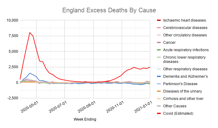
In fact there were no excess deaths over the summer, and there's no evidence of lots of non-covid excess deaths.
The only reason his graph shows them is because he's comparing 2020 deaths to a lower baseline that's not representative of normal deaths.
The only reason his graph shows them is because he's comparing 2020 deaths to a lower baseline that's not representative of normal deaths.
https://twitter.com/_johnbye/status/1355842954204688388?s=20
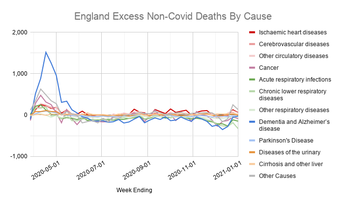
He cites an ONS report on non-covid excess deaths in the first wave, and says "it would be unreasonable to assume it stopped in spring".
But data shows that, apart from a small number of heart disease deaths, that's exactly what happened, as the NHS slowly resumed routine work.
But data shows that, apart from a small number of heart disease deaths, that's exactly what happened, as the NHS slowly resumed routine work.

And the interview uses a new version of his graph that makes even less sense. Now it only shows denial of healthcare deaths happening BETWEEN covid waves!
If anything the opposite should be true, as access to healthcare is more restricted if hospitals are full of covid patients.
If anything the opposite should be true, as access to healthcare is more restricted if hospitals are full of covid patients.

All of this is building up to the big yellow block on the right side of his graph that's euphemistically labelled "unexplained".
The ONS, PHE and NHS all seem pretty clear that these are covid deaths.
But Joel thinks they're wrong...
The ONS, PHE and NHS all seem pretty clear that these are covid deaths.
But Joel thinks they're wrong...
Unlike some sceptics, he does acknowledge there was a second wave in autumn and early winter.
But he says the surge in late December / early January is "very very difficult to explain", and "the data was telling me it wasn't [covid], it was unnatural".
Spoiler: it was covid.
But he says the surge in late December / early January is "very very difficult to explain", and "the data was telling me it wasn't [covid], it was unnatural".
Spoiler: it was covid.

He says that it's a "really rather peculiar uptick, unexpected in terms of time".
But the timing is very similar to a typical flu season.
It's just the scale that is much, much worse, because covid-19 is more transmissible and more deadly than seasonal flu.
But the timing is very similar to a typical flu season.
It's just the scale that is much, much worse, because covid-19 is more transmissible and more deadly than seasonal flu.

In fact, in his interview with the Pandemic Podcast he actually says that there is ALWAYS a "spike [in all causes deaths] in between the first and second week of January", which he had to work around by replacing his smooth modelled curve with a straight line at that point.

"I thought it was unreasonable, but if you look at the data, you can see it absolutely exists."
An hour later he seems to forget about this, and says he's suspicious of the third wave deaths because he can't fit a nice, neat modelled curve to the growth rate over this period in the same way he could in the spring.
Between the usual spike in deaths at the start of January and regional variations in prevalence, prior infection rates, lockdown tiers, viral strains etc going into the third wave, it's not surprising that his model doesn't fit the data as neatly as it did in the spring.
But based on this, he started looking for alternative explanations. And hit on an odd coincidence that he suggests is causality.
The rise in deaths happened right around the time that vaccinations began.
The rise in deaths happened right around the time that vaccinations began.

He's wary of saying it out loud because he's worried about "losing credibility" if he's labelled as anti-vax.
Which is why his Twitter feed is all dog whistles and he waits until an hour into his interview before saying anything.
But he thinks vaccines are killing people.
Which is why his Twitter feed is all dog whistles and he waits until an hour into his interview before saying anything.
But he thinks vaccines are killing people.
Of course, the far more likely explanation is that we started vaccinating people in mid-December.
Just before respiratory deaths start to rise every year.
As he says himself, correlation is not causation.
Just before respiratory deaths start to rise every year.
As he says himself, correlation is not causation.

To be fair, there isn't even much correlation in the graphs he shared.
In all of them there's a vague similarity in vaccinations and deaths, but if you look closer the timing and relative sizes of the peaks are completely different in every graph.
There's no consistent pattern.
In all of them there's a vague similarity in vaccinations and deaths, but if you look closer the timing and relative sizes of the peaks are completely different in every graph.
There's no consistent pattern.


It also ignores actual studies comparing outcomes for vaccinated and unvaccinated people, which show no surge in deaths after vaccination, and a clear drop in deaths a few weeks later.
This one from Israel, for example.
nejm.org/doi/full/10.10…
This one from Israel, for example.
nejm.org/doi/full/10.10…

Joel pointed out that this study looks at outcomes starting two weeks after vaccination, but it also includes a supplementary data table looking at the whole period from the day of vaccination onwards.
This also shows no sign of worse outcomes following vaccination.
This also shows no sign of worse outcomes following vaccination.

Another sign that there's no connection to vaccination is that the third wave hit different regions in the UK at different times.
This matches the spread of the new strain of the virus, starting in Kent, East London and Essex and then spreading out across the country.
This matches the spread of the new strain of the virus, starting in Kent, East London and Essex and then spreading out across the country.

Vaccination is completely the opposite though!
London and the East of England were slowest to vaccinate, but show an early, sharp rise in deaths.
Yorkshire and the North East vaccinated fastest, but deaths there rise later and more gradually.
hsj.co.uk/coronavirus/lo…
London and the East of England were slowest to vaccinate, but show an early, sharp rise in deaths.
Yorkshire and the North East vaccinated fastest, but deaths there rise later and more gradually.
hsj.co.uk/coronavirus/lo…
All of which strongly suggests his hypothesis is wrong:
- The vaccines are safe and effective.
- Winter deaths were driven by seasonality and new strains of the virus.
- There's no sign of huge numbers of deaths due to denial of healthcare.
- Most excess deaths were due to covid.
- The vaccines are safe and effective.
- Winter deaths were driven by seasonality and new strains of the virus.
- There's no sign of huge numbers of deaths due to denial of healthcare.
- Most excess deaths were due to covid.
Perhaps unsurprisingly, Joel has chosen to block me rather than respond to the issues with his analysis.

PS: the MHRA tracks adverse reactions to the vaccines. Most are mild and only last a day or two.
After 16 million doses only 406 deaths were reported and "review of individual reports and patterns of reporting does not suggest the vaccine played a role".
gov.uk/government/pub…
After 16 million doses only 406 deaths were reported and "review of individual reports and patterns of reporting does not suggest the vaccine played a role".
gov.uk/government/pub…
• • •
Missing some Tweet in this thread? You can try to
force a refresh