Just saw that the World Health Organization is now relying on the COVID vaccination database that we are producing at @OurWorldInData!

Great to see that our work is useful for them during this pandemic.
• On our site you find it here: ourworldindata.org/covid-vaccinat…
• On the WHO's site here:
worldhealthorg.shinyapps.io/covid/
And as I mentioned before, this database is maintained by just one person: my colleague Edouard Mathieu.

Edouard started the global vaccination database in December and by now he keeps the entire world informed about the global vaccination campaign.

Follow him here: @redouad
On their main page the @WHO is claiming that their data source for the COVID vaccination data is the WHO itself.

I hope they correct this soon.

• • •

Missing some Tweet in this thread? You can try to force a refresh
 

Keep Current with Max Roser

Max Roser Profile picture

Stay in touch and get notified when new unrolls are available from this author!

Read all threads

This Thread may be Removed Anytime!

PDF

Twitter may remove this content at anytime! Save it as PDF for later use!

Try unrolling a thread yourself!

how to unroll video
  1. Follow @ThreadReaderApp to mention us!

  2. From a Twitter thread mention us with a keyword "unroll"
@threadreaderapp unroll

Practice here first or read more on our help page!

More from @MaxCRoser

7 Mar
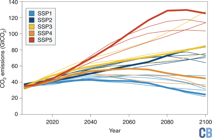
The IPCC climate reports rely on scenarios of how the world will change in the coming decades.

This is the IPCC's description of the 'Sustainability Scenario'.

What does the IPCC assume for economic growth here?
Global GDP per capita increases to over $80,000 per person.
Better health and education, an 'emphasis on human well-being', and lower resource and energy intensity –– the future described in that scenario sounds like a future that I'd like to help achieve.

At the same time that scenario is the most optimistic about global CO2 emissions.
This scenario (SSP1) is also a future in which deforestation comes to an end – and instead we see substantial reforestation and much more space for the wildlife on our planet.

[this paper on the SSPs is very helpful
sciencedirect.com/science/articl…]
Read 6 tweets
5 Mar
I’ve written a new post about global poverty.

Here is the post: ourworldindata.org/higher-poverty…

👇 Below you find a thread with the main points.
The poverty that dominates the public discussion is the 'International Poverty Line'.

It is used by the UN to measure what they call ‘extreme poverty’ and is the relevant poverty definition for the UN’s goal of ‘ending extreme poverty’ by 2030.

2/n
This poverty line is drawn by taking the average poverty lines in 15 of the poorest countries in the world.

As a consequence it is extremely low. It is set at $1.90 per day.

3/n
Read 22 tweets
19 Feb
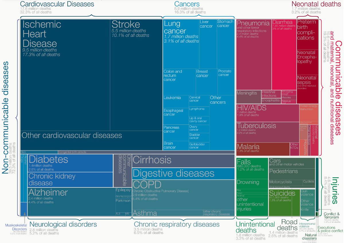
A new draft of a visualization that I’ve done again and again over the years and never quite like.

The 2 question with cause-of-death-charts for me are always:
How much detail should I give on the many causes?
Which chart type to use?

Do you have ideas for how to improve? Image
This is a version of the same that I spent many hours on some years ago and then never published..

While the new one focuses on the big picture, this one gave a much more detailed perspective. Image
Or the other extreme, a very simple stacked bar chart (originally it was vertical, but for Twitter’s landscape format I put it on its side). Image
Read 4 tweets
15 Feb
Israel has been leading on vaccinations: Among people older than 60 years 90% had the 1st dose; 80% had 2 doses.

The peak of hospitalizations in Israel was 24 days ago. Since then hospitalizations among that age group declined by 45%.

[More data ourworldindata.org/vaccination-is…]
The chart looks the way it would look if the vaccines have the impact we hope they have – but the chart could also look like this for other reasons than vaccines and descriptive statistics are not enough to know that some other reason might explain the differences we see.
For example: young people could be less worried about infecting their parents and therefore are less cautious than before so that cases (and hospitalizations) among young people are increasing, while they are falling for older people.
Read 4 tweets
9 Feb
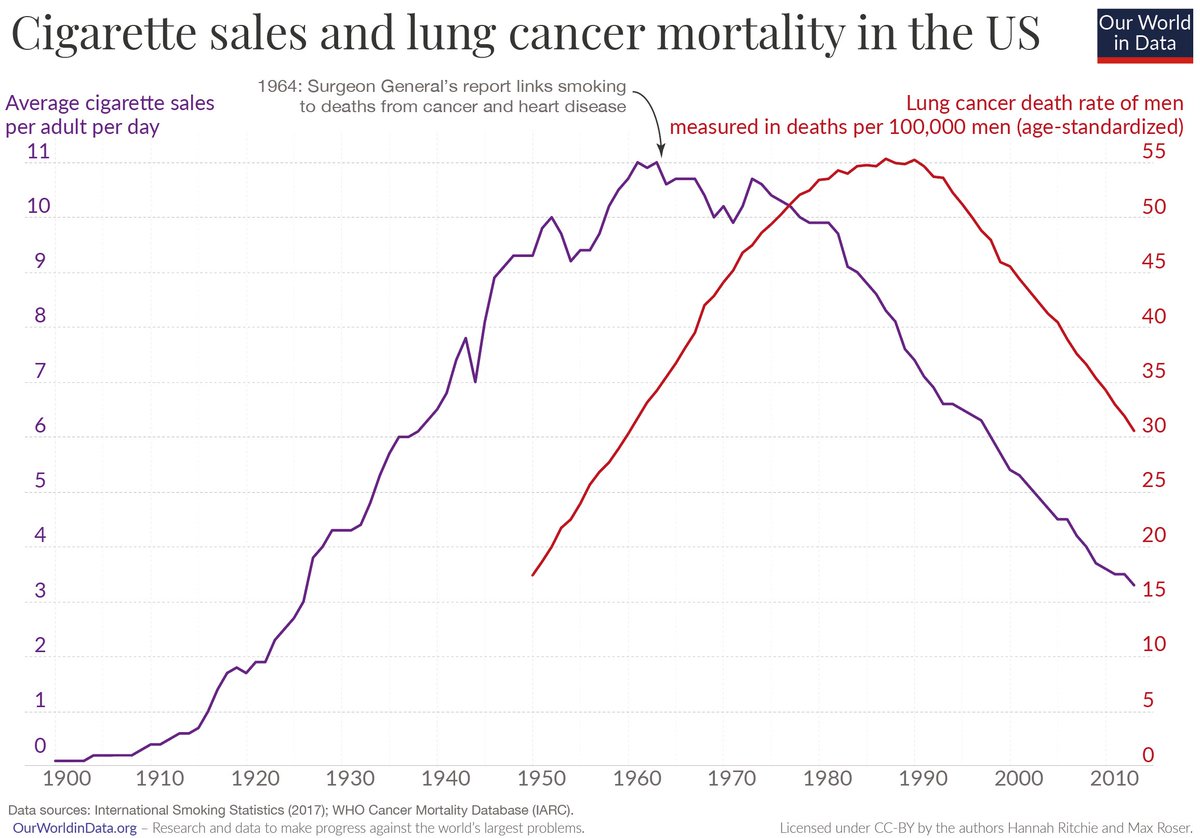
Health researchers estimate that every year 8 million people die an early death due to smoking. This means that 15%(!) of global deaths are attributed to smoking.

Smoking causes incredible suffering globally – but we can win the fight: A thread. 👇
All data and research in this thread can be found in our @OurWorldInData entry on smoking: ourworldindata.org/smoking
With the knowledge that smoking causes cancer and the evidence that cancer didn’t only increase with smoking, but also declined when smoking declined, it may appear obvious that smoking kills.

But it wasn't obvious *at all* until the second half of the 20th century.
Read 26 tweets
7 Feb
The US poverty line for one person is $35/day.

If we would apply the US poverty line for the world – and we would perfectly redistribute the world’s incomes, so that everyone has the average – the world economy would need to more than double to end global poverty.
The world is extremely unequal and extremely poor. For both reasons the world is far away from an end to poverty.
Also worth noting that the US poverty line isn’t high in comparison to other rich countries, in fact it is often criticized for being unethically low.
Read 5 tweets

Did Thread Reader help you today?

Support us! We are indie developers!


This site is made by just two indie developers on a laptop doing marketing, support and development! Read more about the story.

Become a Premium Member ($3/month or $30/year) and get exclusive features!

Become Premium

Too expensive? Make a small donation by buying us coffee ($5) or help with server cost ($10)

Donate via Paypal Become our Patreon

Thank you for your support!

Follow Us on Twitter!