Ilkka Rauvola Profile picture
Mar 25, 2021 10 tweets 6 min read Read on X
Ministeri Jussi Saramo julkaisi eilen 24.3. kolmannen version siitä, millä tavalla tartuntoja pitäisi analysoida kun puhutaan joululomien vaikutuksesta tartuntoihin. Johtopäätös on kuitenkin pysynyt koko ajan samana.
1/x

#FactCheck Image
Vaiheessa 1 ministeri käytti 14 päivän ilmaantuvuutta + 5 päivän itämisaikaa johtopäätöksien tekemiseen siitä, millä tavalla joululomat vaikuttivat tartuntoihin. (Se on hyvä menetelmä.)
2/x

#FactCheck


Image
Tässä vaihe 1 kuvana. Tämä vaihe oli voimassa 20.3.2021 saakka.
3/x Image
Sen jälkeen (21.3.2021) osoitin ministerin väittämän vääräksi (käyttäen 14 päivän ilmaantuvuutta + 5 päivän itämisaikaa).
4/x

#FactCheck

Tässä vaihe 2 kuvana. Tämä vaihe oli voimassa 21.3.-24.3.
6/x Image
Tässä kuva, jota ministeri käytti 2. vaiheessa (21.-24.3.)

- 14 päivän ilmaantuvuuden + 5 päivän itämisajasta siirryttiin käyttämään päiväkohtaista dataa
- samalla siirryttiin tekemällä johtopäätös katsomalla kuvaa.
7/x


Image
Se tapa, miten ministeri vetää johtopäätöksiä muuttui toiseen kertaan 24. maaliskuuta. Tässä versiossa johtopäätökset joululomien vaikutuksesta tartuntoihin saadaan katsomalla jompaa kumpaa kuvaa. (Johtopäätös ei kuitenkaan muuttunut.)
8/x Image
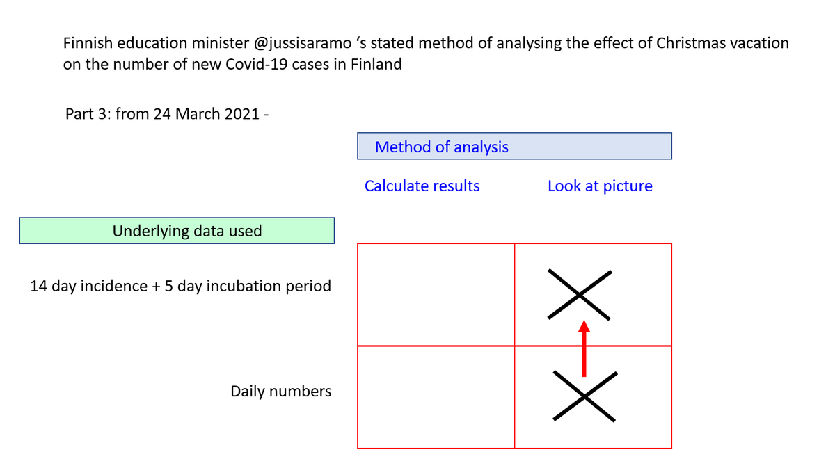
Tässä kolmannessa vaiheessa (24.3. lähtien)
- johtopäätös saadaan katsomalla kuvaa (eikä laskemalla)
- voidaan käyttää joko päiväkohtaista dataa tai 14 päivän ilmaantuvuutta
9/x

#Factcheck


Image
Tässä yhteenveto siitä, miten ministeri Saramon tapa analysoida koulujen joululomien vaikutusta Suomen koronavirustartuntoihin on tähän mennessä kehittynyt.
10/x

#Factcheck Image

• • •

Missing some Tweet in this thread? You can try to force a refresh
 

Keep Current with Ilkka Rauvola

Ilkka Rauvola Profile picture

Stay in touch and get notified when new unrolls are available from this author!

Read all threads

This Thread may be Removed Anytime!

PDF

Twitter may remove this content at anytime! Save it as PDF for later use!

Try unrolling a thread yourself!

how to unroll video
  1. Follow @ThreadReaderApp to mention us!

  2. From a Twitter thread mention us with a keyword "unroll"
@threadreaderapp unroll

Practice here first or read more on our help page!

More from @jukka235

Mar 9
In Sweden, 10% of healthy life years have been lost since the pandemic began.

That’s one out of every ten years gone.
1/x Image
The Swedish model: effectively, Sweden turned the entire adult population into smokers.
3/x

chatgpt.com/share/69af3267…Image
Read 11 tweets
Feb 26
25-29 year olds: cancer and neoplasm related deaths in Sweden (C00-D48).
1/x Image
During 2020-2024, among 25-29 year olds, the share of cancers showing growth in 2023-2024 increased from a historical baseline of 22% of all cancers (1997-2019 average) to 61% in 2024.
2/x Image
This is the same chart in terms of absolute numbers. Among 25-29 year olds, the total number of cancer related deaths bottomed out in 2021.
For the causes showing growth (in red),
- 2020-2024 average is 2.2 times as high as the 1997-2019 baseline
- 2023-2024 average is 3.1 times as high as the 1997-2019 baseline
3/xImage
Read 9 tweets
Feb 25
Cancer and neoplasm related deaths in Sweden (C00-D48).
1/x Image
Among 30-34 year olds, cancer and neoplasm related causes of death have been growing at an average rate of 32.5% per year since 2021 (equivalent to a 10-fold increase in 8.2 years if current growth continues).
2/x Image
Cancer related deaths accounted for 16.8% of all deaths among 30-34 year olds in 2024. If they continue to grow at the rate of 32.5%, they alone could be sufficient to double total mortality in this age group within 4 years, and increase it 10-fold within a further 8 years.
3/x Image
Read 8 tweets
Feb 22
Finland's epidemic 22 Feb 2026: the amount of virus detected in wastewater is now 60% higher than during the first Omicron wave in 2022. The post-Omicron baseline appears permanently higher compared with the pre-Omicron period; repeated waves show no sign of diminishing.
1/x Image
Post-Omicron baseline is permanently higher than pre-Omicron:
- before late 2021, levels were mostly 10³–10⁴.
- from 2022 onward, even troughs sit around 10⁵, or 10-100x higher than before Omicron: a sign of constant background transmission
2/x Image
The first Omicron wave in January 2022 was the first major structural break.
- this wave was an order of magnitude jump compared to the pre-Omicron period (2020-2021)
- the first Omicron wave fundamentally shifted the baseline 10 to 100 times upward
3/x Image
Read 12 tweets
Feb 20
Index / January 2026.
Part 1: fastest growing disease groups in Finland (7 Jan 2026)
1/x

Renal failures in Finland (8 Jan 2026)
2/x
Developmental delays and disorders (F80-F89) (9 Jan 2026)
3/x

Read 4 tweets
Feb 19
This is one beautiful chart.

Between 1997 and 2019, mortality across age groups declined by up to 48 percent. Large amounts of additional life were delivered. Courtesy of the Swedish health system.
1/x Image
Between 2019 and 2024, the Swedish health system took a step back. It would appear that school aged children were sacrificed for the greater good.
2/x Image
As a result, the post-2019 years have seen increasing levels for disease-related mortality for the younger age groups. For 5-9 and 10-14 year olds, mortality is now 66% and 38% higher than in 2019, respectively. 2024 was the worst for both of these age groups.
3/x Image
Read 4 tweets

Did Thread Reader help you today?

Support us! We are indie developers!


This site is made by just two indie developers on a laptop doing marketing, support and development! Read more about the story.

Become a Premium Member ($3/month or $30/year) and get exclusive features!

Become Premium

Don't want to be a Premium member but still want to support us?

Make a small donation by buying us coffee ($5) or help with server cost ($10)

Donate via Paypal

Or Donate anonymously using crypto!

Ethereum

0xfe58350B80634f60Fa6Dc149a72b4DFbc17D341E copy

Bitcoin

3ATGMxNzCUFzxpMCHL5sWSt4DVtS8UqXpi copy

Thank you for your support!

Follow Us!

:(