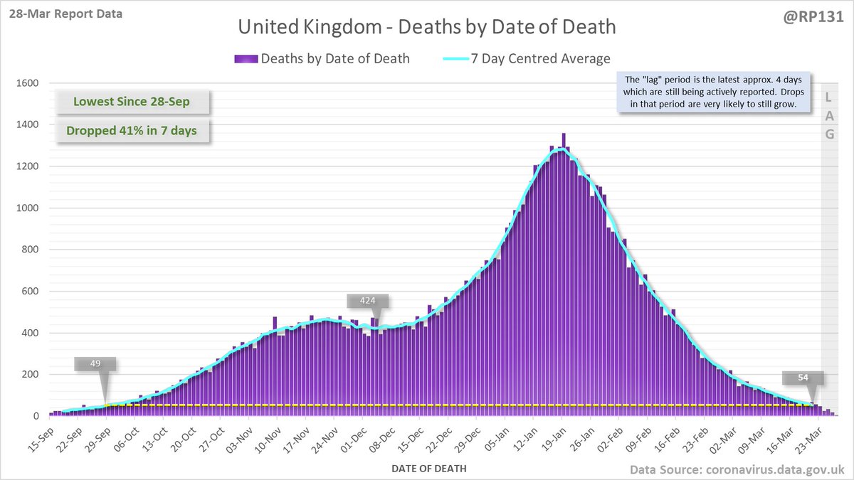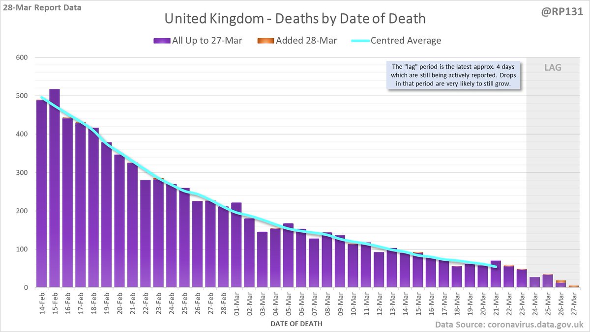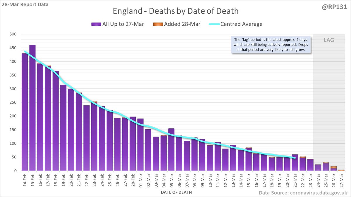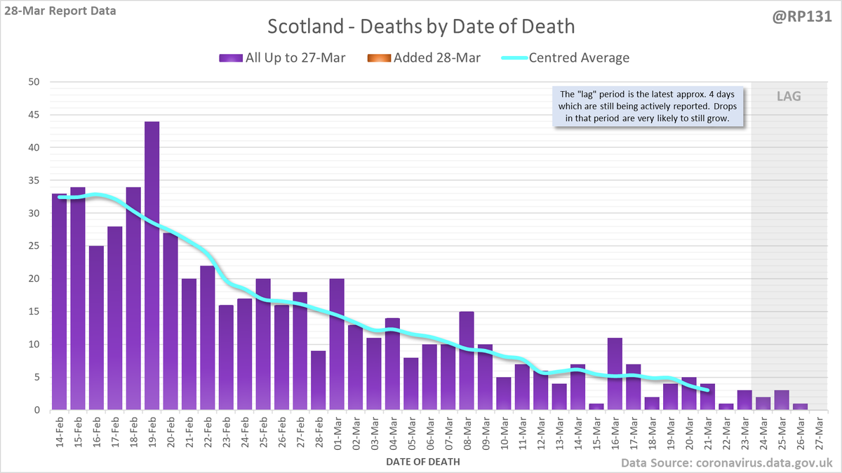
Pinned index post linking to a simple table of contents page to make it easier to find my normal daily posts.
Old style links also inclued in replies below for people who don't like new table of contents...
…ddatashare.s3-eu-west-1.amazonaws.com/index.html
Old style links also inclued in replies below for people who don't like new table of contents...
…ddatashare.s3-eu-west-1.amazonaws.com/index.html
Vaccine:
Deaths:
Nation:
Table:
Detail:
MSOA:
https://twitter.com/RP131/status/1376172785718939651
Deaths:
https://twitter.com/RP131/status/1376204472439947267
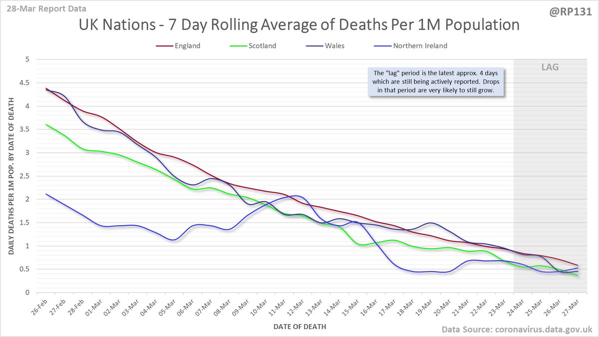
Nation:
https://twitter.com/RP131/status/1376206600487206914
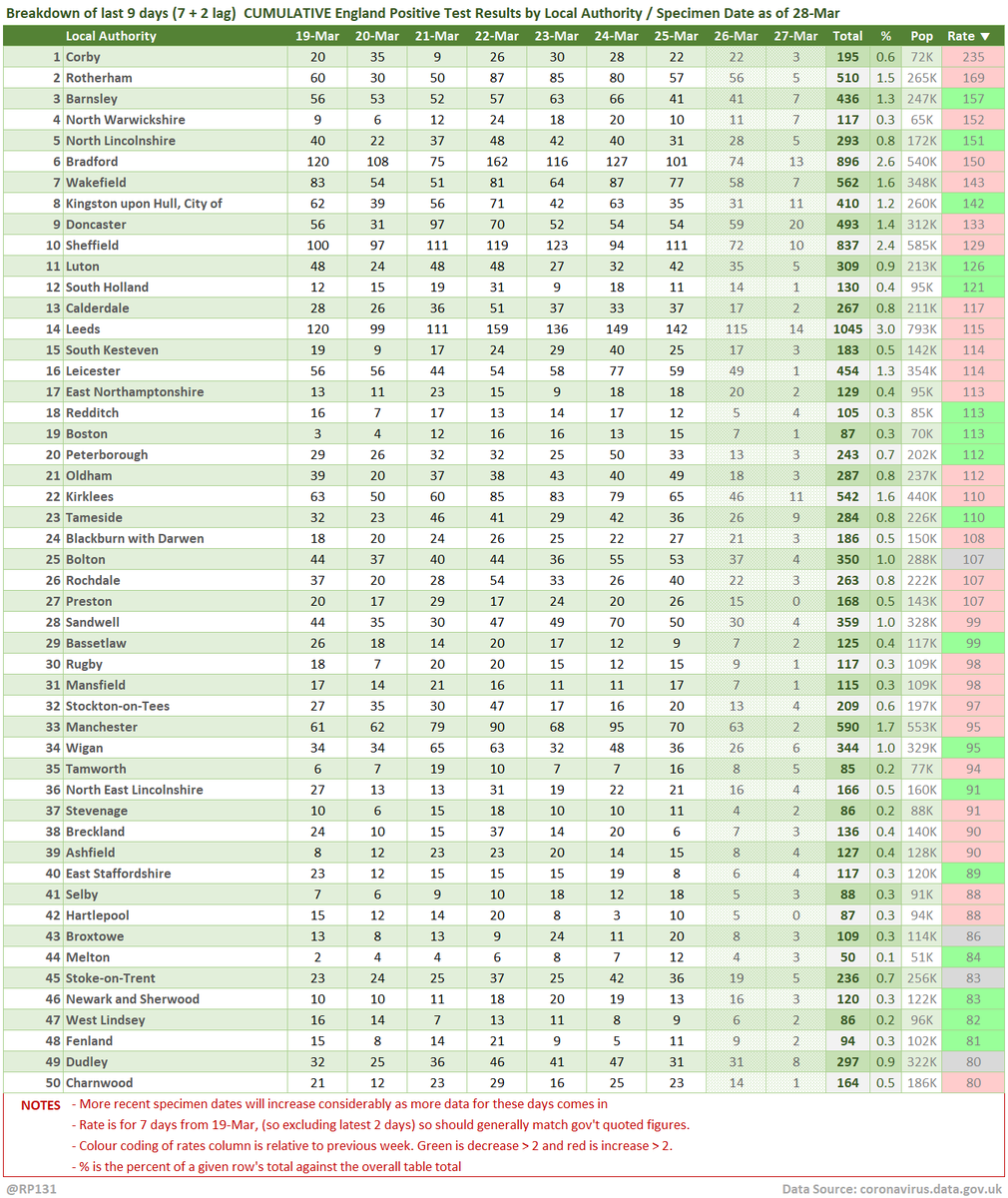
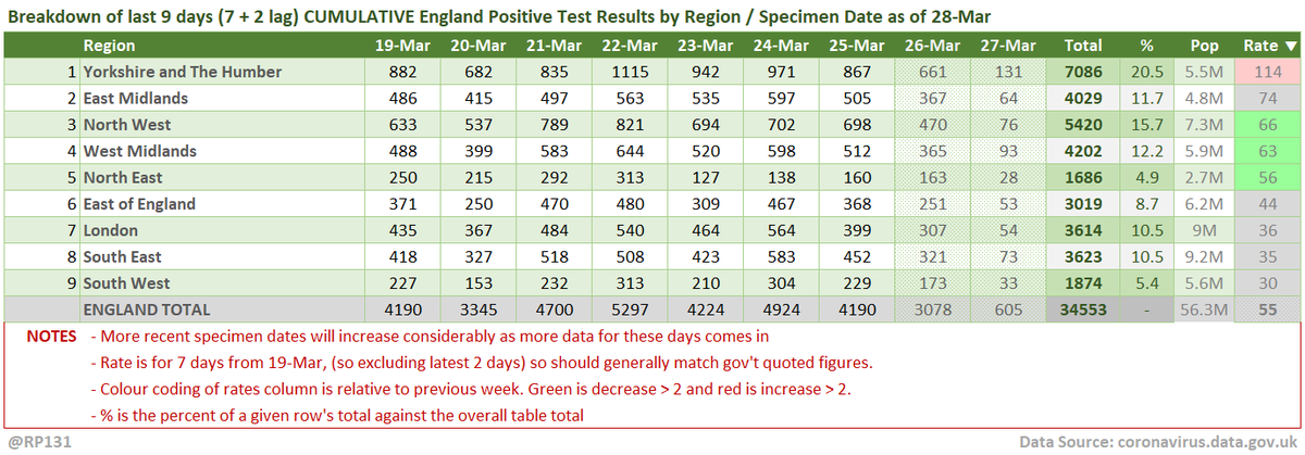
Table:
https://twitter.com/RP131/status/1376208685614166017
Detail:
https://twitter.com/RP131/status/1376209733670014982
MSOA:
https://twitter.com/RP131/status/1376210797345509383
https://twitter.com/RP131/status/1376204472439947267
Hospital data:
Positives test additions (now incl. animation):
Death additions (now incl. animation):
Bubble / Tiers / Sub-Regions:
https://twitter.com/RP131/status/1376203420927983619
Positives test additions (now incl. animation):
https://twitter.com/RP131/status/1376202357458006018
Death additions (now incl. animation):
https://twitter.com/RP131/status/1376205545997221892
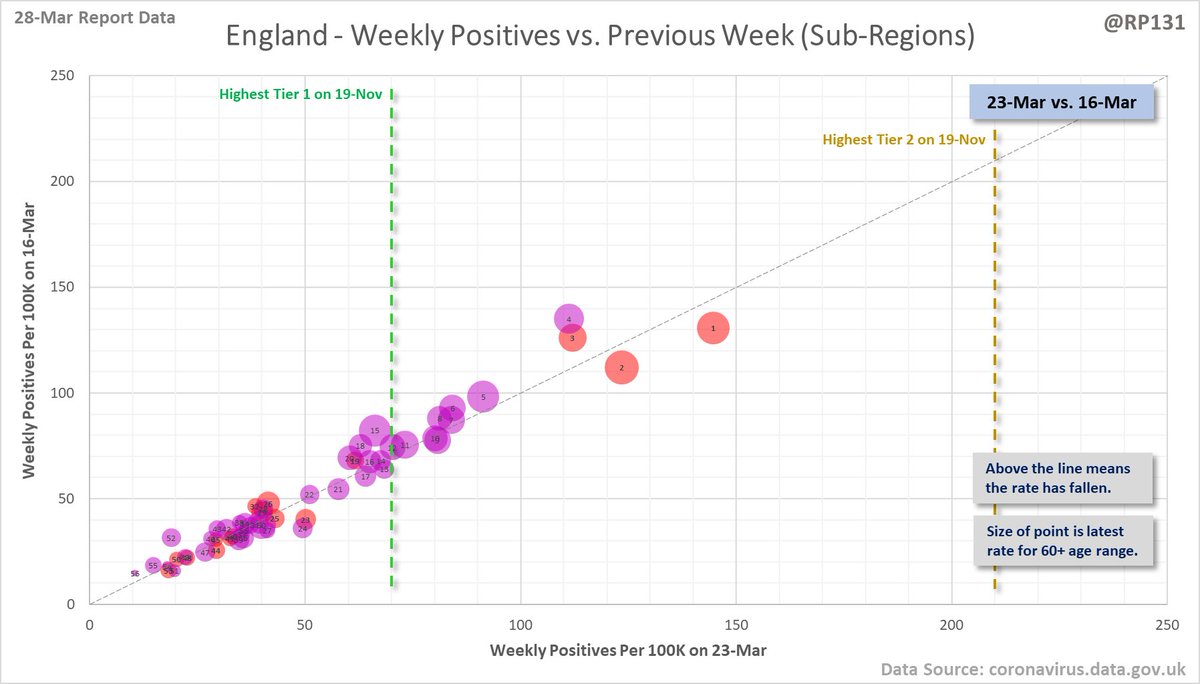
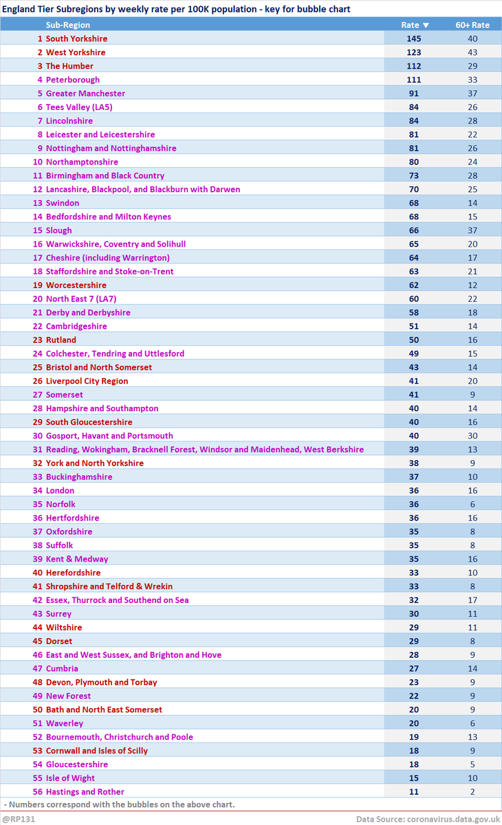
Bubble / Tiers / Sub-Regions:
https://twitter.com/RP131/status/1376207625910632454
https://twitter.com/RP131/status/1376202357458006018
My own work in this feed (usually indicated by the @rp131 watermark) is free for anyone to use however they wish. A link back to this account, or quote-tweet of the original will always be appreciated. And of course, there's still this:
buymeacoffee.com/rp131
buymeacoffee.com/rp131
• • •
Missing some Tweet in this thread? You can try to
force a refresh

