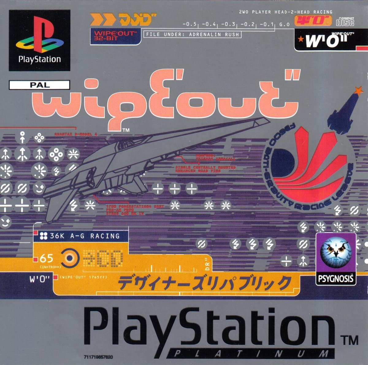
Thread: Early 2000s Aesthetics Overview (CARI In-Progress Research Post)
We've recently been delving more into the early 2000s design/fashion landscape at CARI, and wanted to share some of our finds so far, to help differentiate certain aesthetic strains.


We've recently been delving more into the early 2000s design/fashion landscape at CARI, and wanted to share some of our finds so far, to help differentiate certain aesthetic strains.


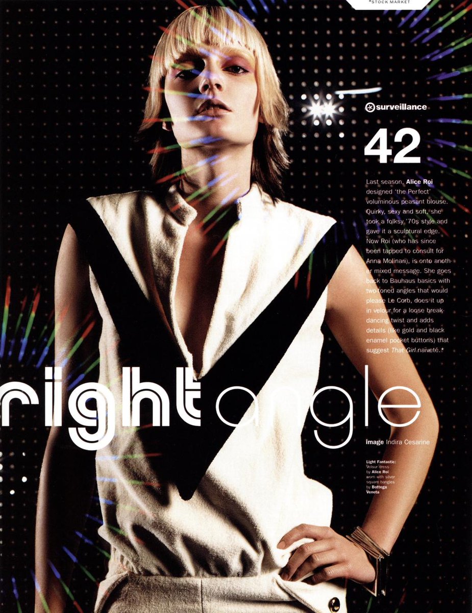
One of the earliest and most prominent aesthetics to carry over from the very late 90s was the newfound appreciation for 70's glam & kitsch, part of an aesthetic we've termed 'Millennium Disco'. 


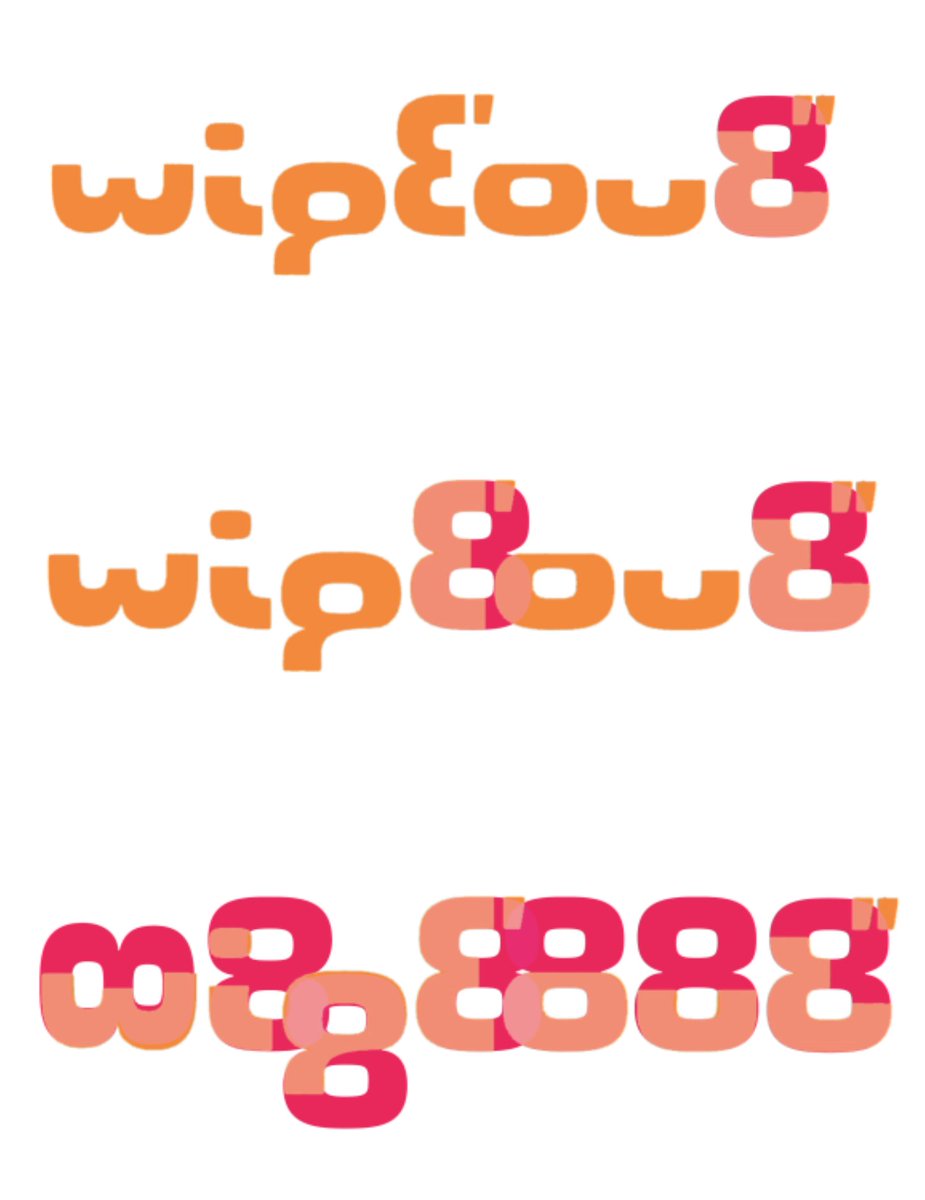
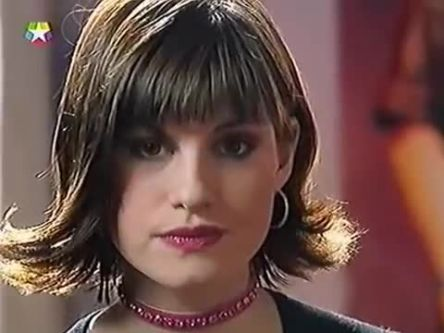
It also helps to lay the foundation for the 2000's love of excess (with a tinge of that leftover 90s knowing irony). It first appears in high-fashion mags & music in the heady days of the dotcom boom in 1999-2000. It may even be the reason for the infamous 'dido flip' (img. 3). 


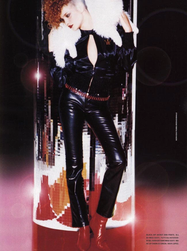
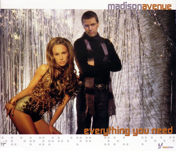
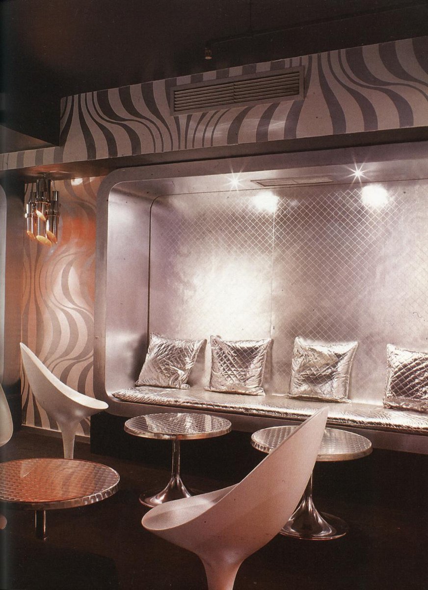
Alongside the kitschy Disco & glam revival, a newfound interest in the early 80s Post-punk/New Wave scene around 99-01 influenced the emerging style termed 'Electroclash'. This one is heavily indebted to the movie 'Liquid Sky', and countless early 80s bands. 


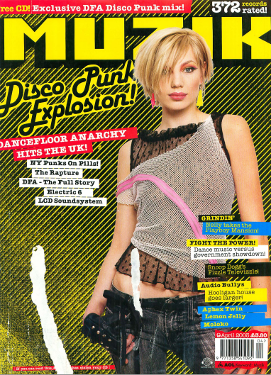
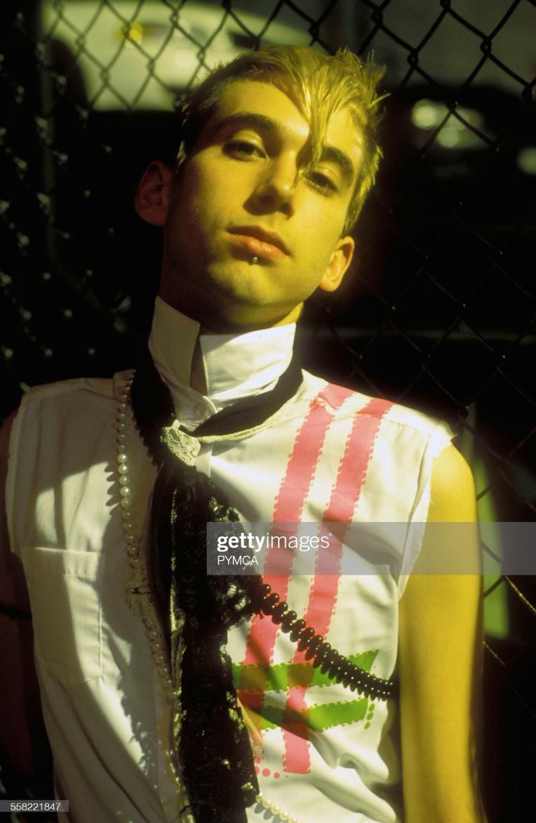
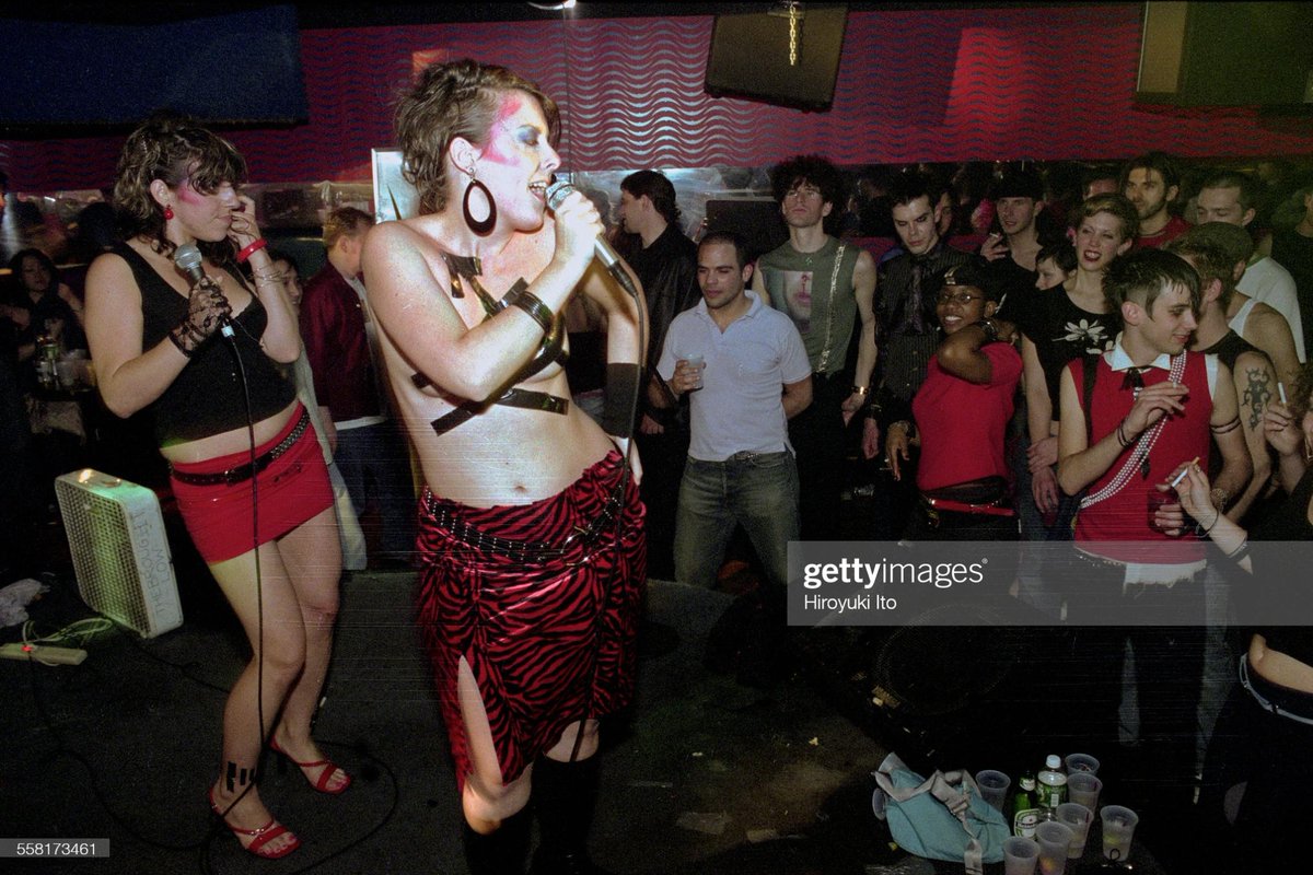
There's so much to talk about with Electroclash; it had a huge influence on that mid-late 2000s indie/bloghaus/hipster/party scene: Lady Gaga pulled from it, suburban Emo fashion took some cues, the 00s hair bump and even the 'Karen' hairstyle have origins in this era. 


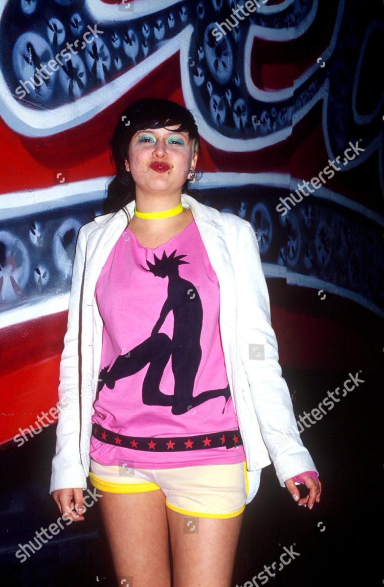
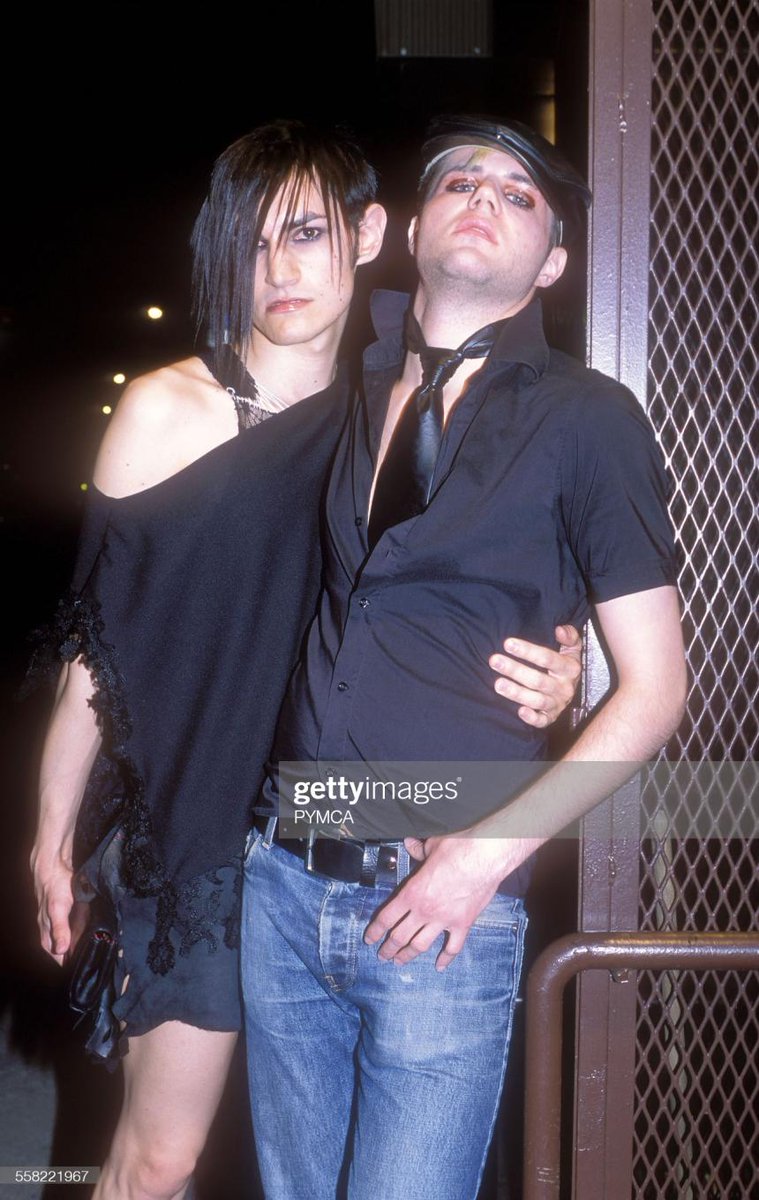
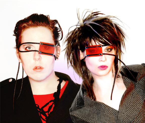
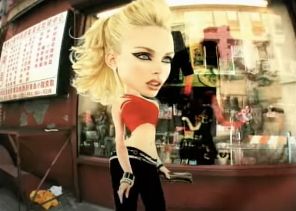
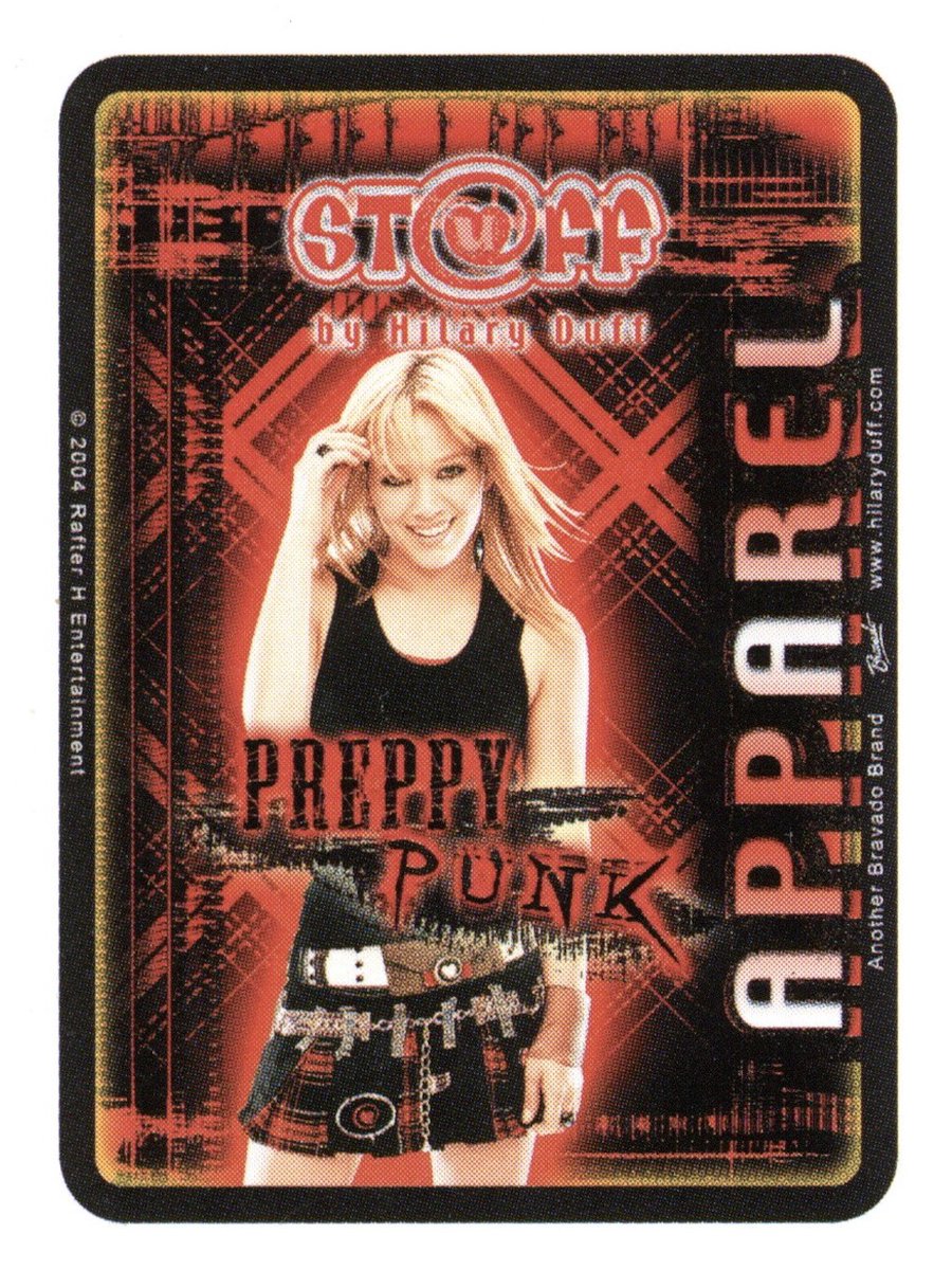
In the more commercialised 'youth' market, by the early 2000s Pop Punk had made enough inroads into the popular consciousness to become a dominant consumer aesthetic. We've termed it 'Teenpunk'; edgy-but-accessible, Hot Topic-centric, zine-influenced, and mainly pink-white-black. 


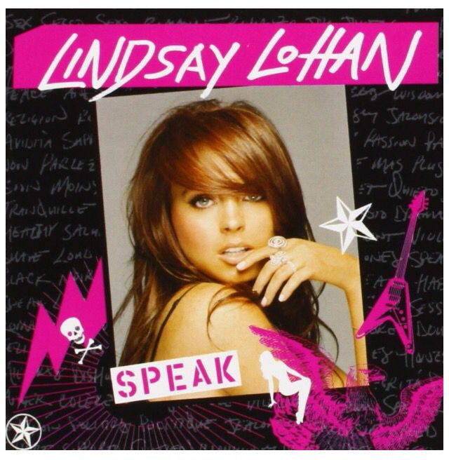

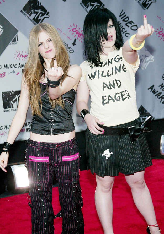
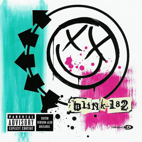
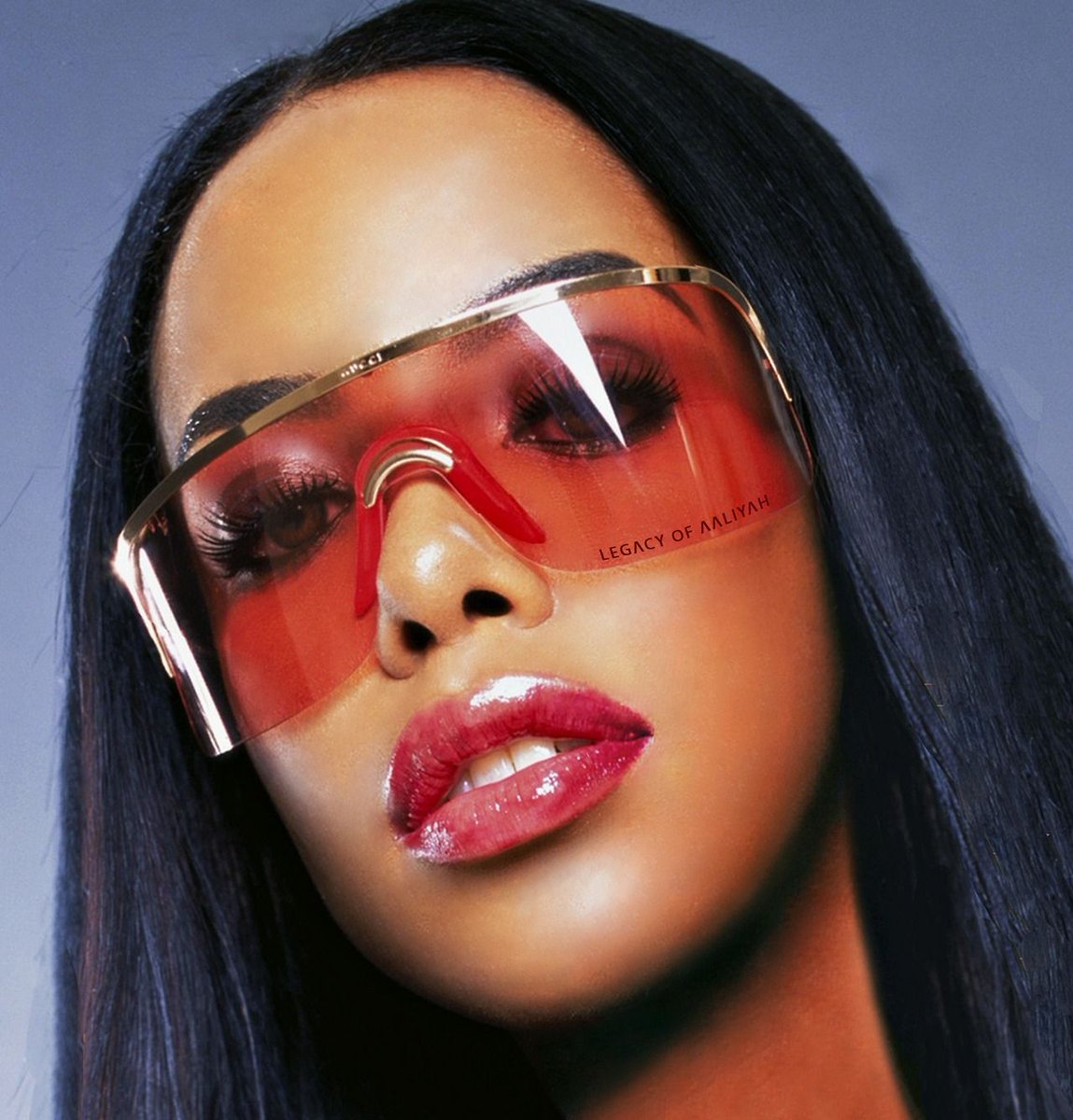
And now for McBling. This term is sometimes used interchangeably with Y2K, though in terms of stylistic qualities they're almost diametrically opposed. McBling emerged in reaction against the prevailing design atmosphere of the 90s, which was typically restrained & minimalist. 


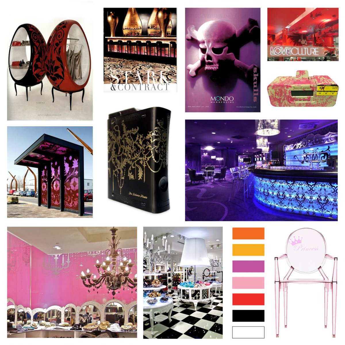
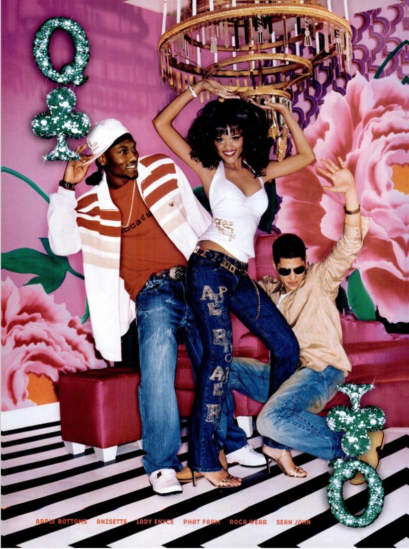
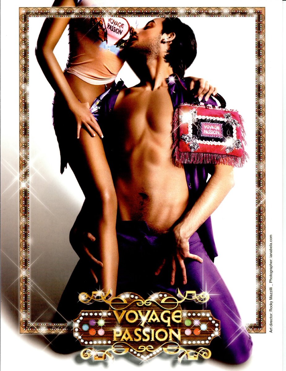
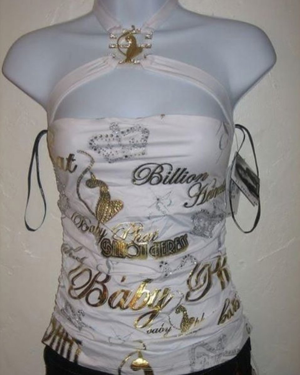
It's a style forever tied to that era of hyper-spending, subprime mortgages, oodles of hip hop & POC culture corporate appropriation, and aspirational luxury expressed in every possible form & medium. It's still astounding how fast it vanished following the '08 economic crash. 


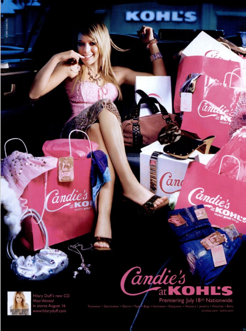
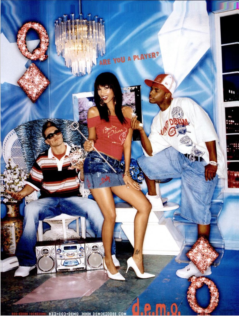
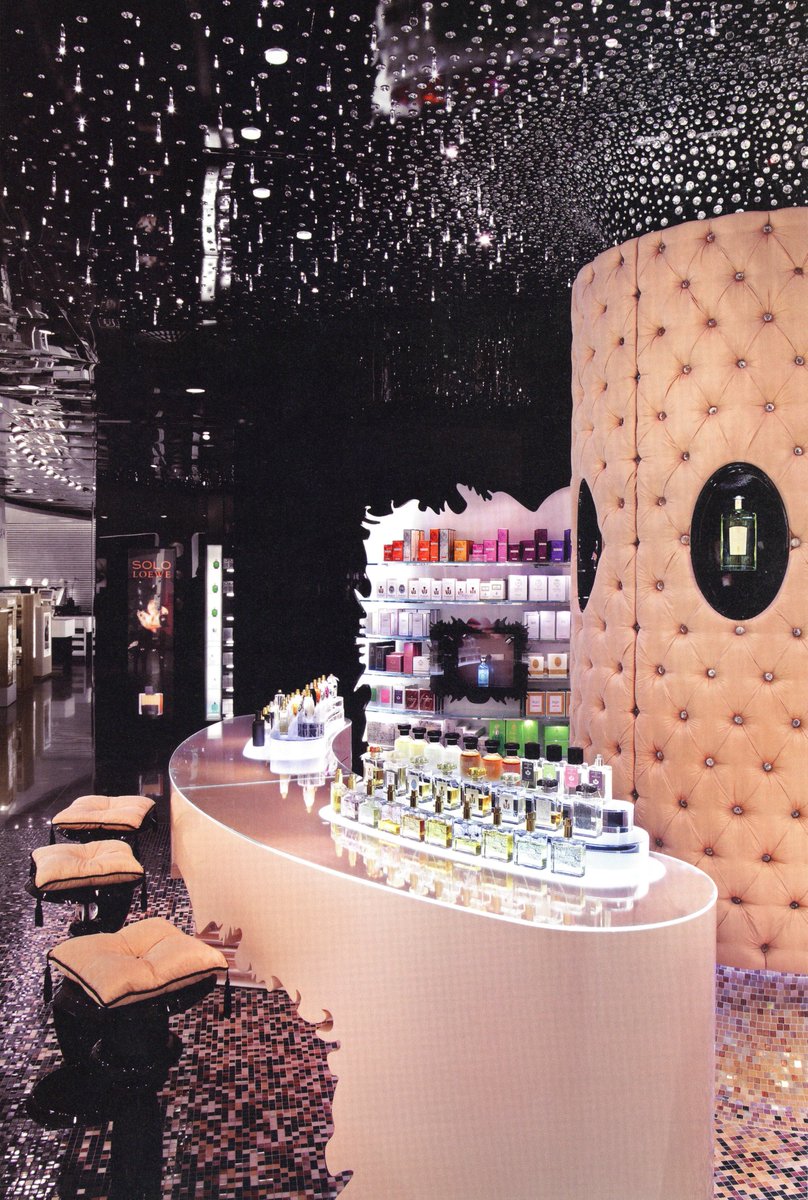
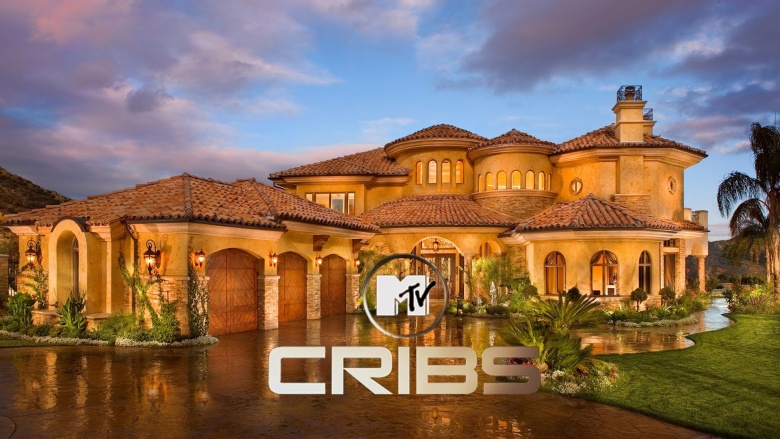
One credit I'll give to the strange aesthetic melange of the early 2000s; it was a complete retro-mix free-for-all. Sometime around 99-2000 the restraints of 'cool minimalism' broke off and let loose some truly odd experiments. 


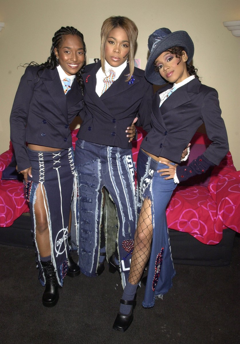
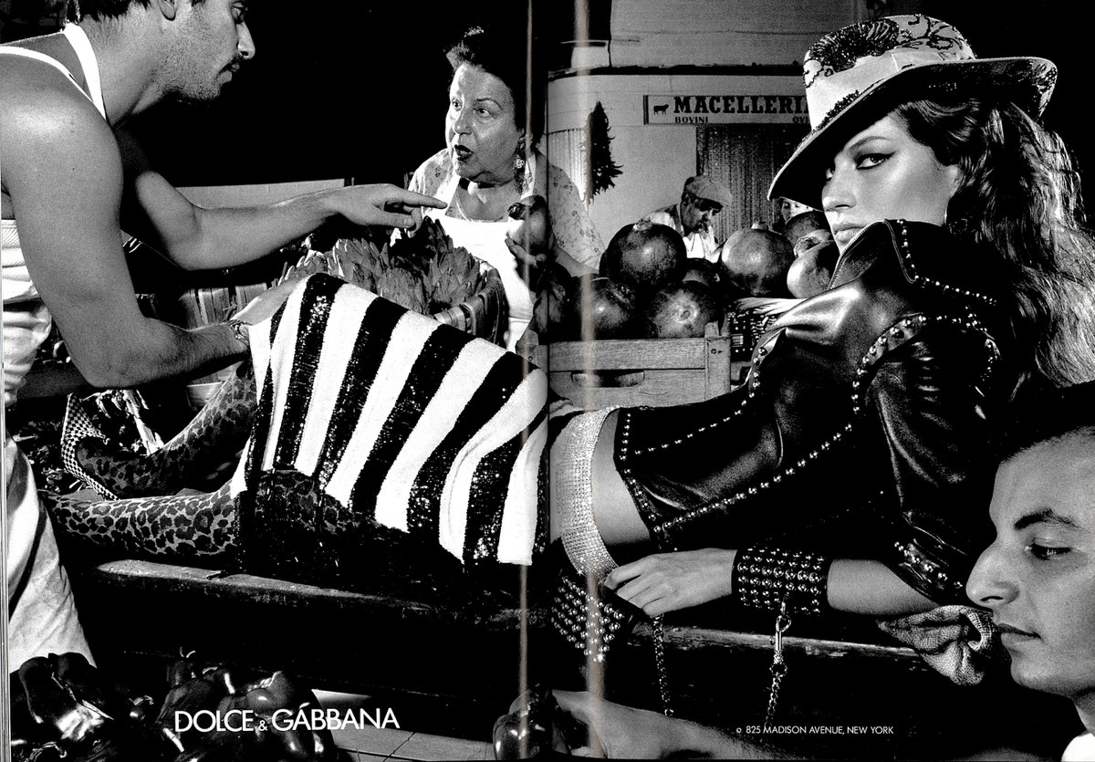
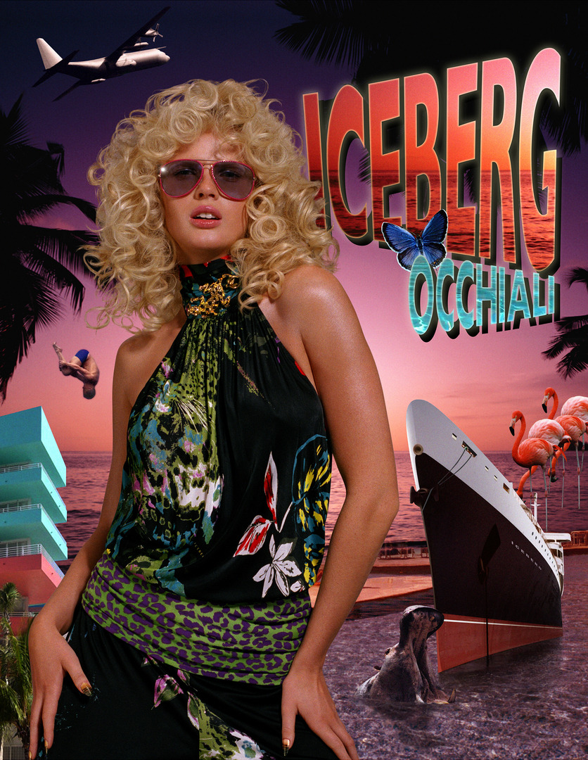
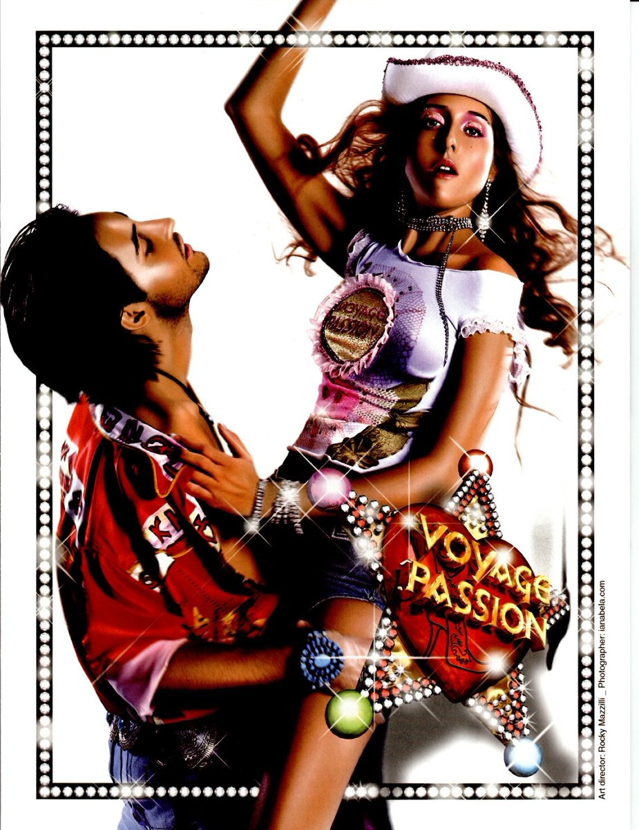
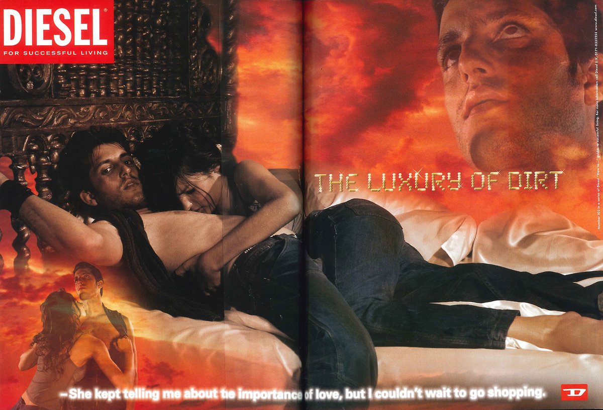
Note: wanted to mention a micro-trend of the era: the messy 'dirty sexy' style (00-02). Possibly a reaction against the typically very clean & sleek Y2K outfits, looks, and environs. 


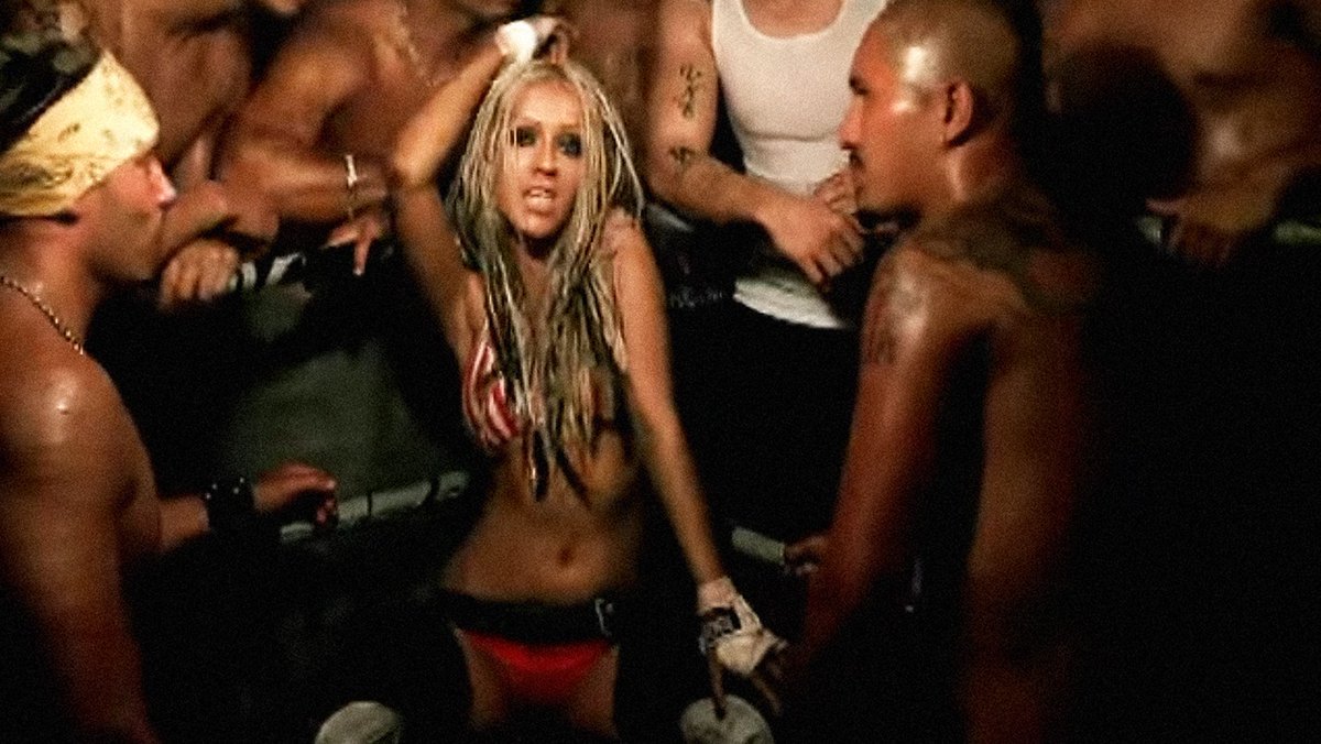
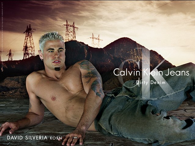
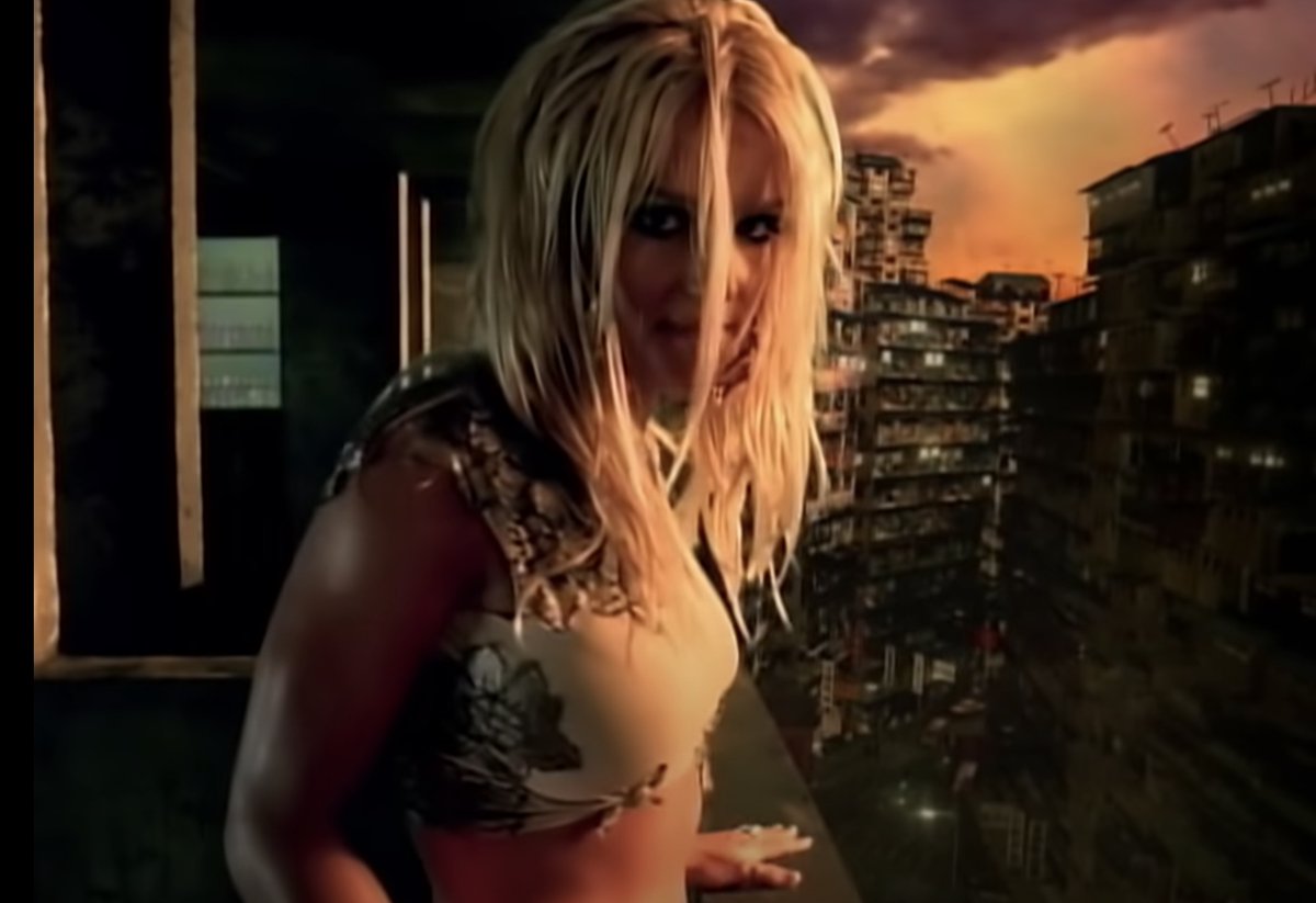
Gonna sign off for tonight 😴, but I'll continue the thread tomorrow! Still have more research dissecting this era to share, and a variety of 2000s design movements we've been investigating.
Just a few more to add in this early 2000s era thread, most of these we don't have good names for yet. 


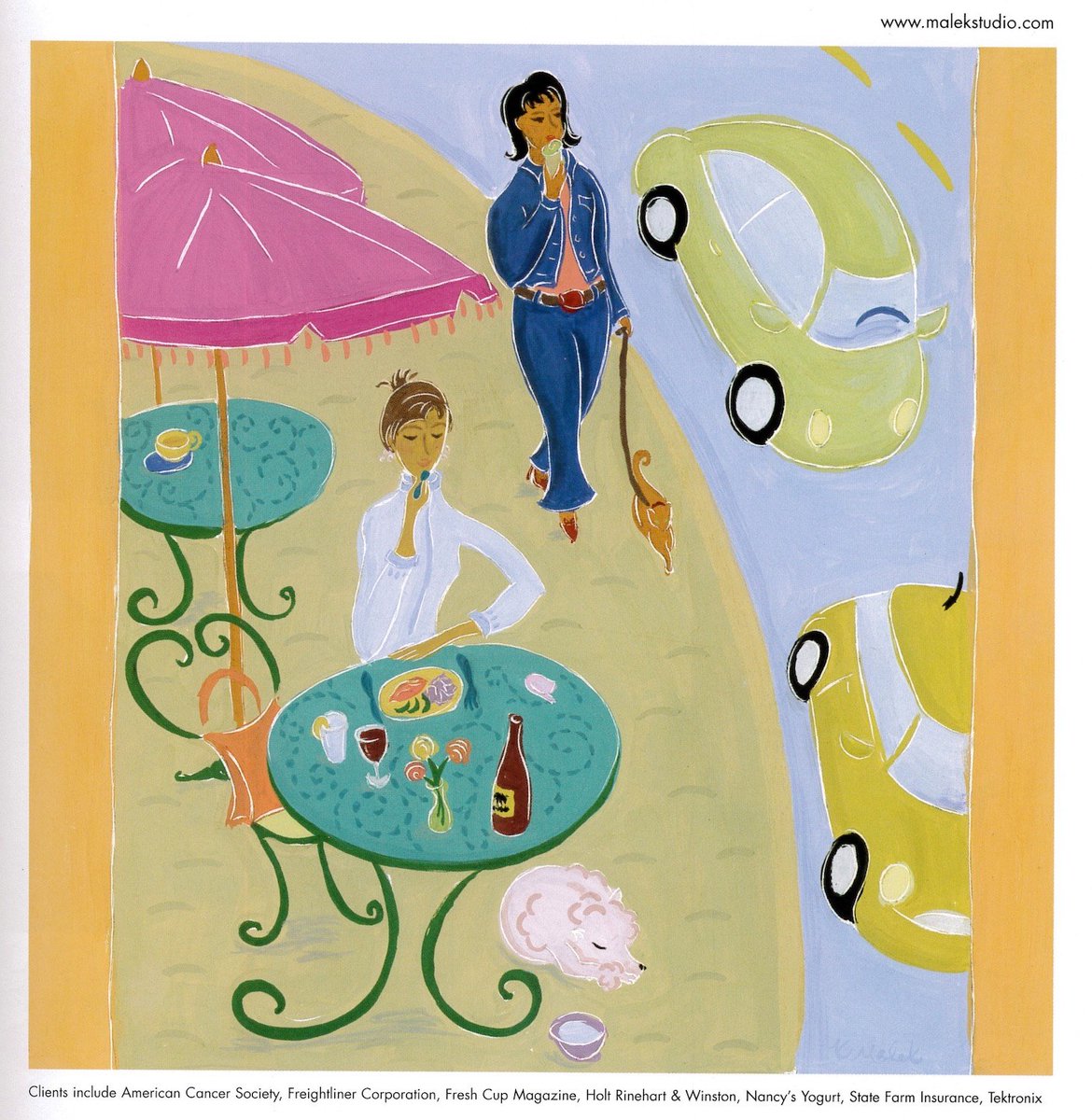
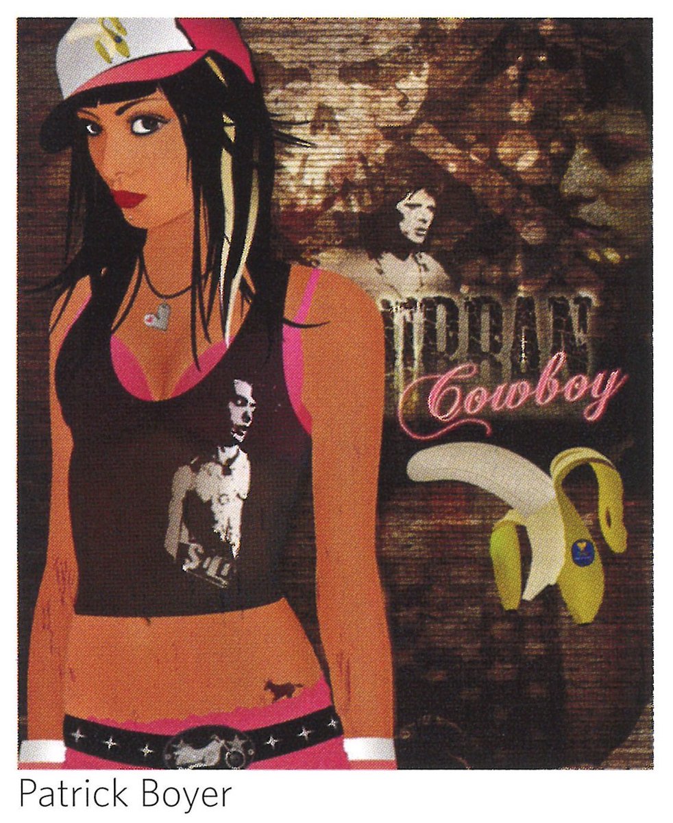
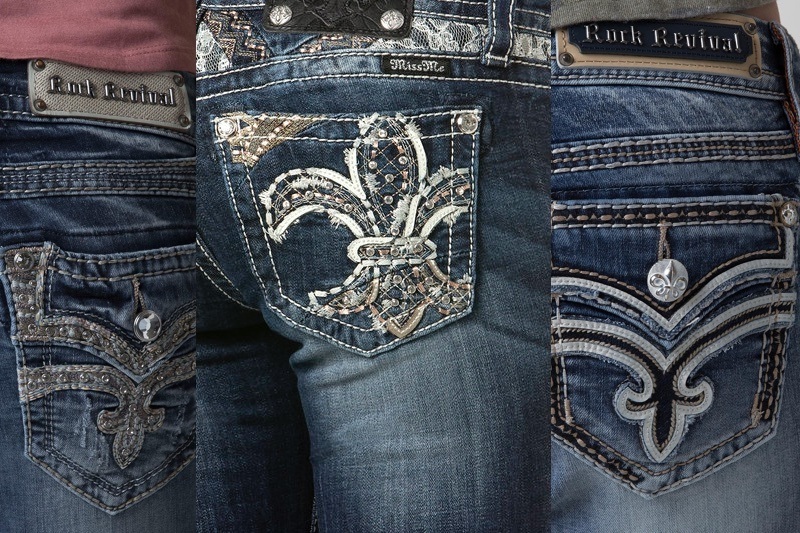
This first one doesn't have a name yet; it emerged from some conversations on McBling. It seemed like there was a visually excessive, but edgier, grungier, 'Spike TV' aesthetic present in those same years. Ripped bedazzled jeans, paint splatters, vector silhouettes 



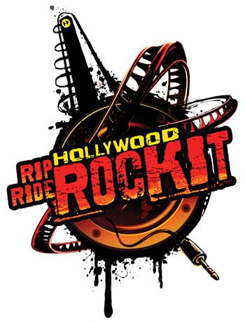

There's some ties to the earlier grunge design movement in the early 90s, graffiti, biker culture & tattoo motifs. I've noticed TV bumpers are a great source for this style, with stylized urban settings, war imagery, grungy filters, and warm/sepia colors 


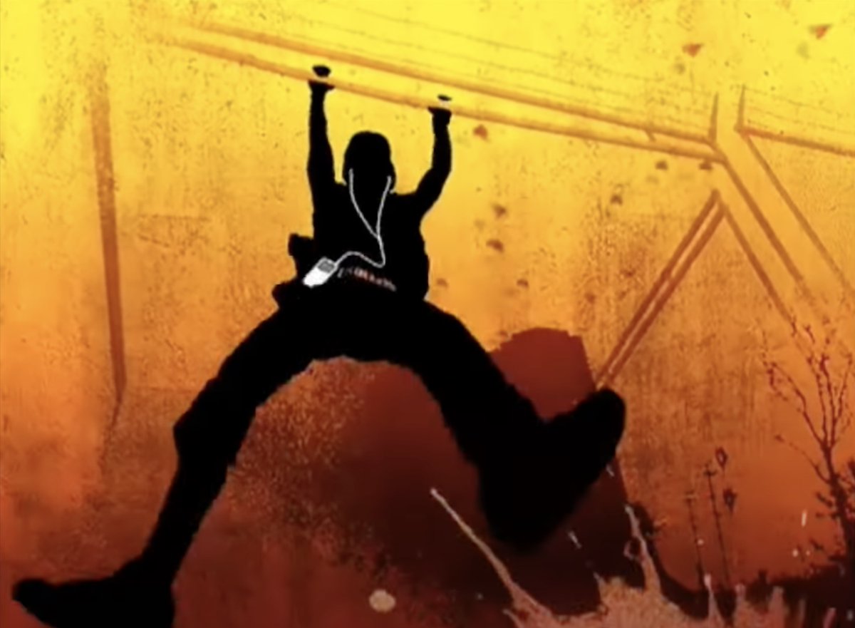

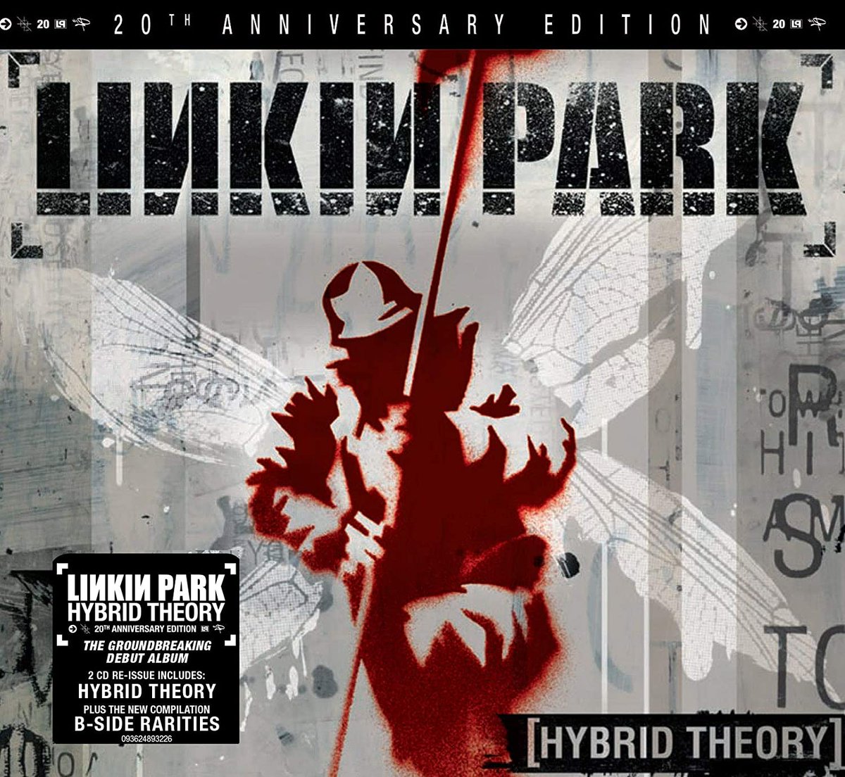
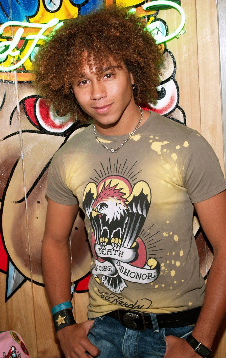
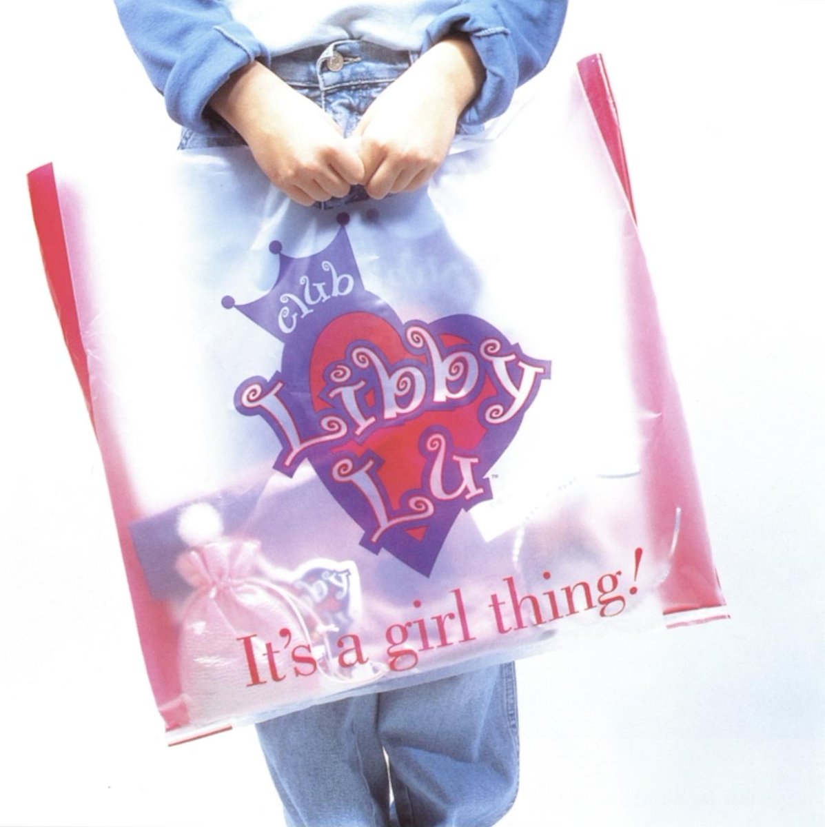
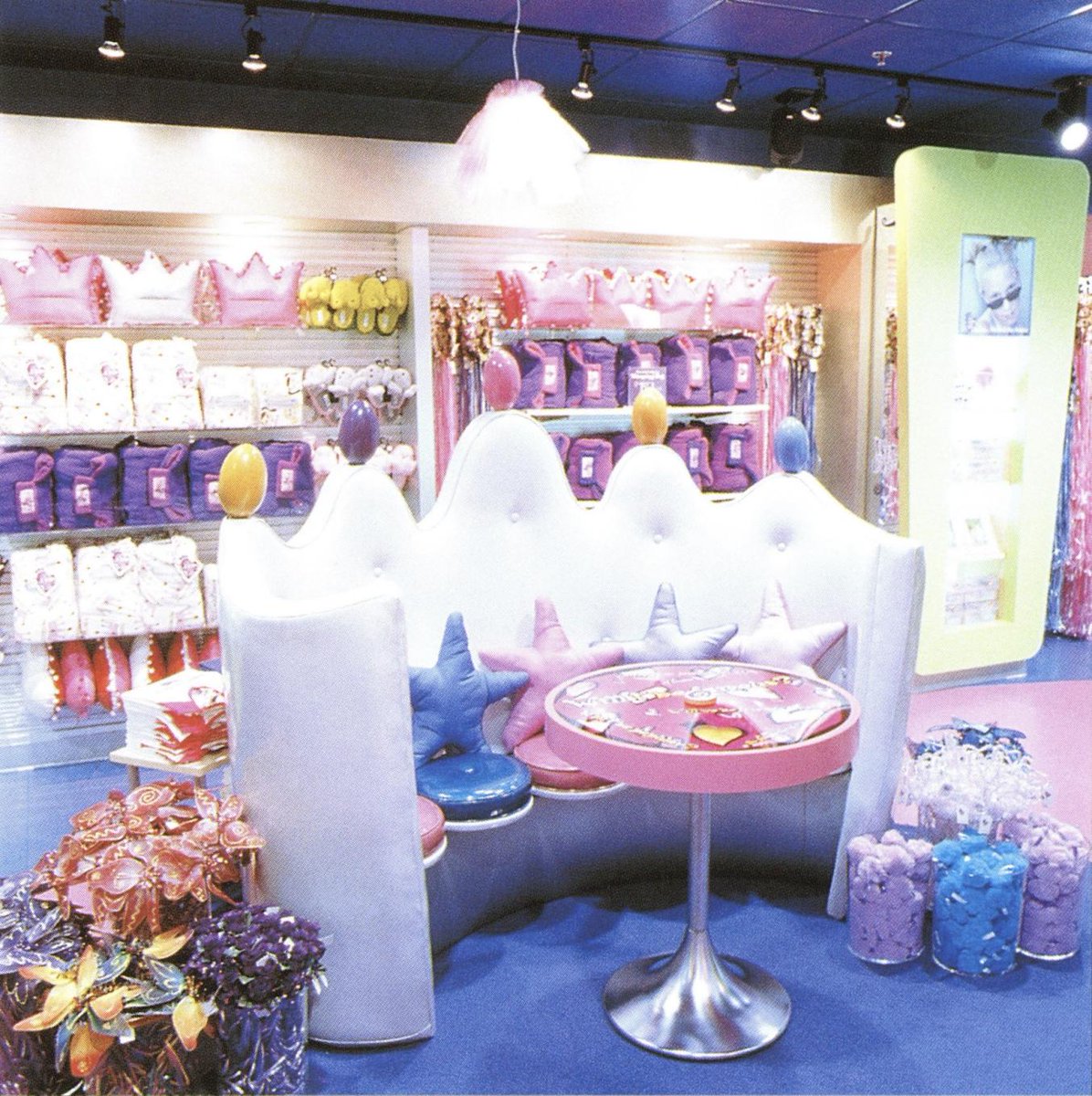
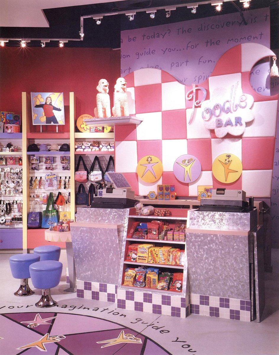
In a totally different realm, we have the 'Libby Lu' aesthetic. Named from the popular chain of 'experiential retail' locations that typified this style. Pink, bright, glittery; it pulls a bit from the hippie-revival of the 90s, but also involves 2000s aspirational luxury/excess 


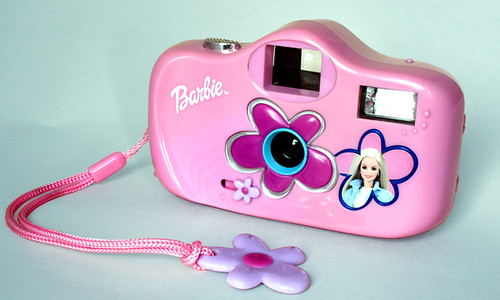
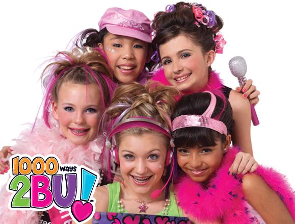
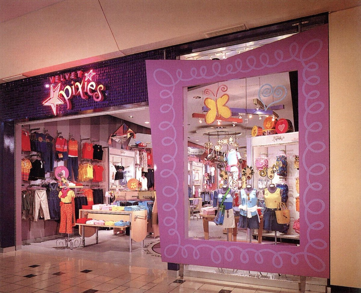
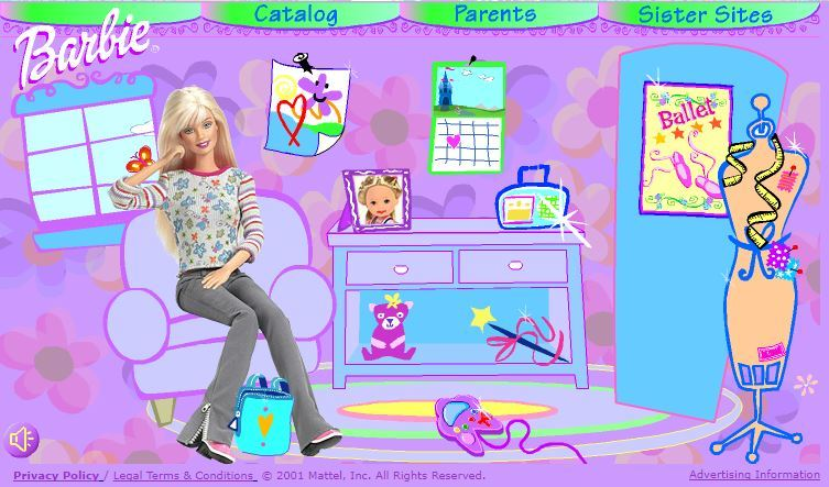
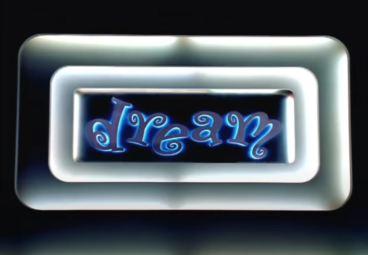
Variations on that playful swirly font, some hybrid of hippie revival with GVC (maybe some 50s in there too?), make an appearance throughout. The interiors of Libby Lu & Velvet Pixies (imgs 2&4) just remind me how much retailers used to spend on design concepts back then. 


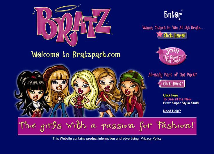
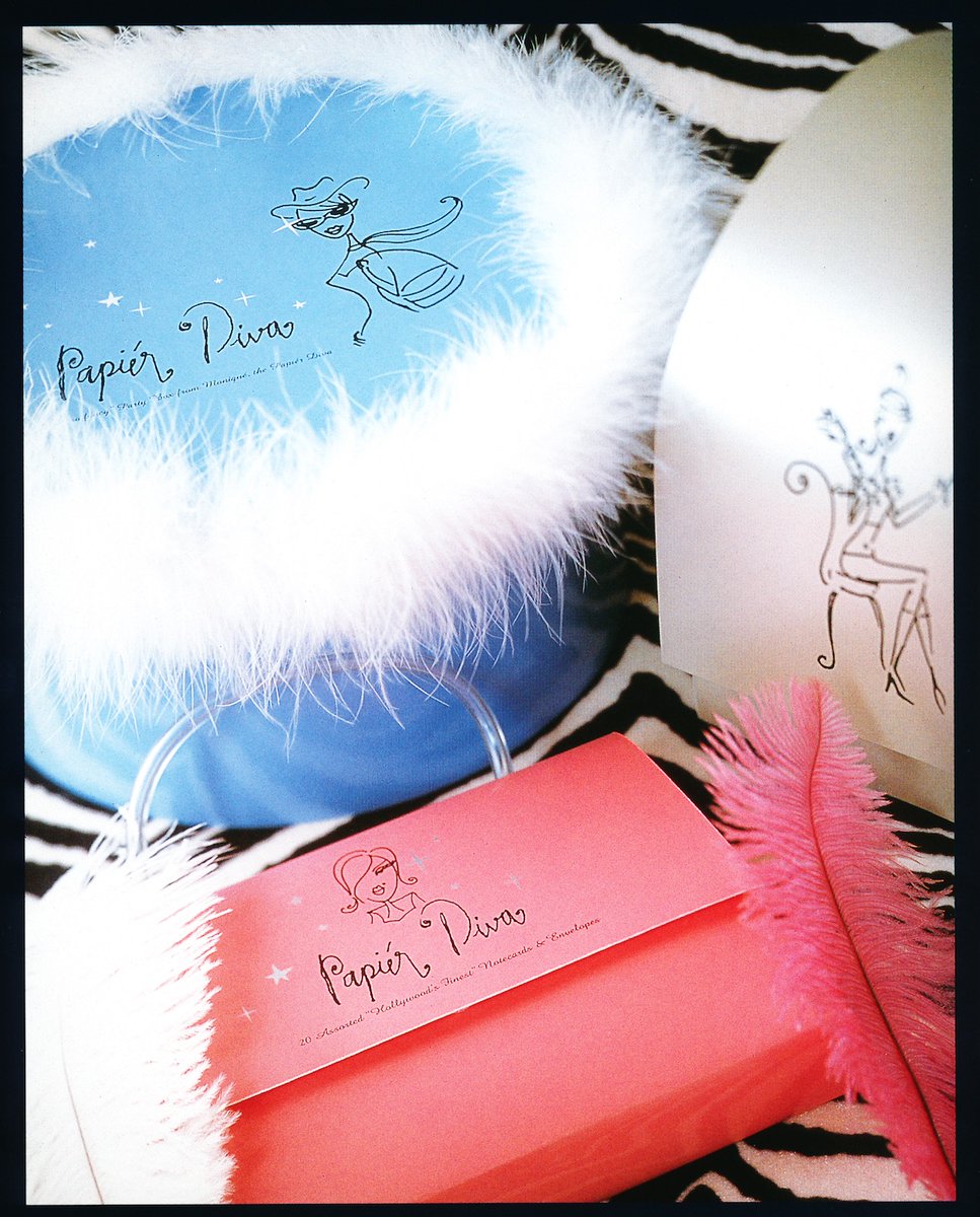
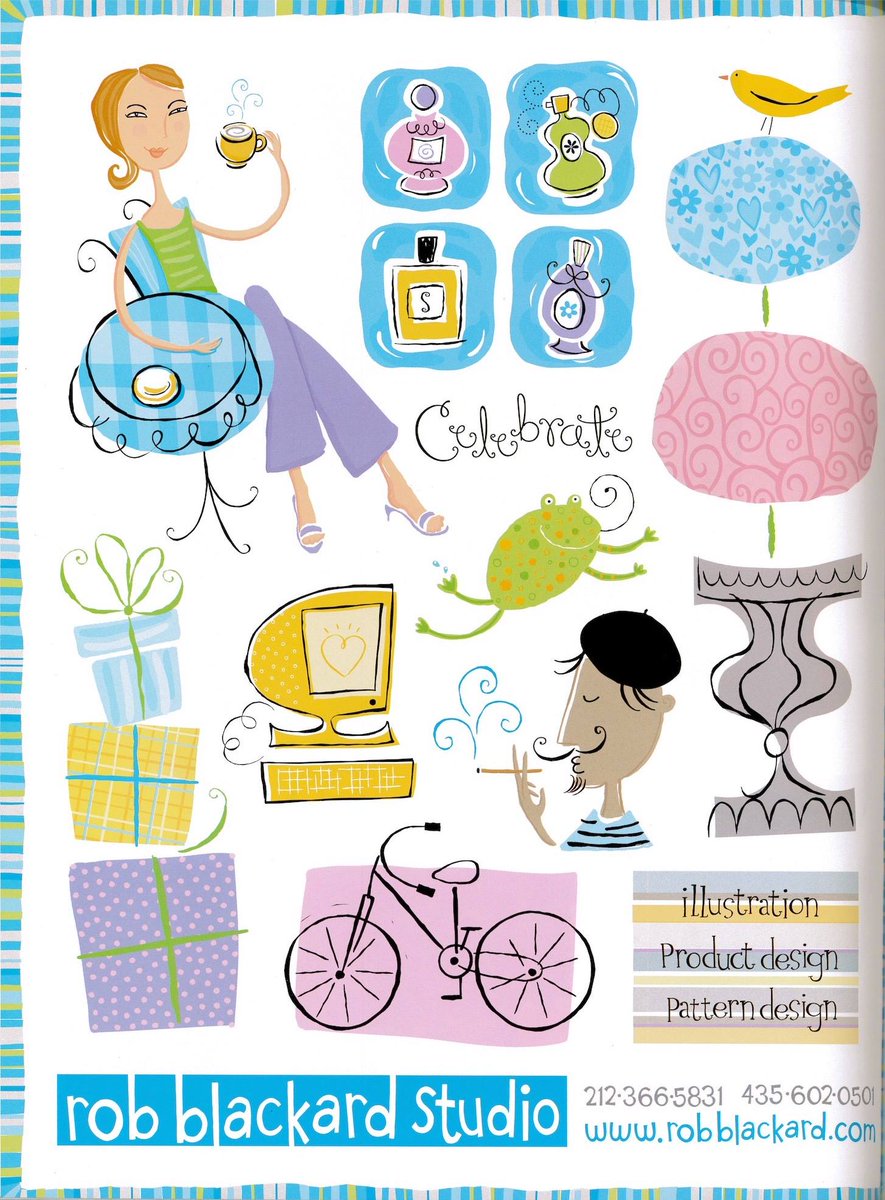
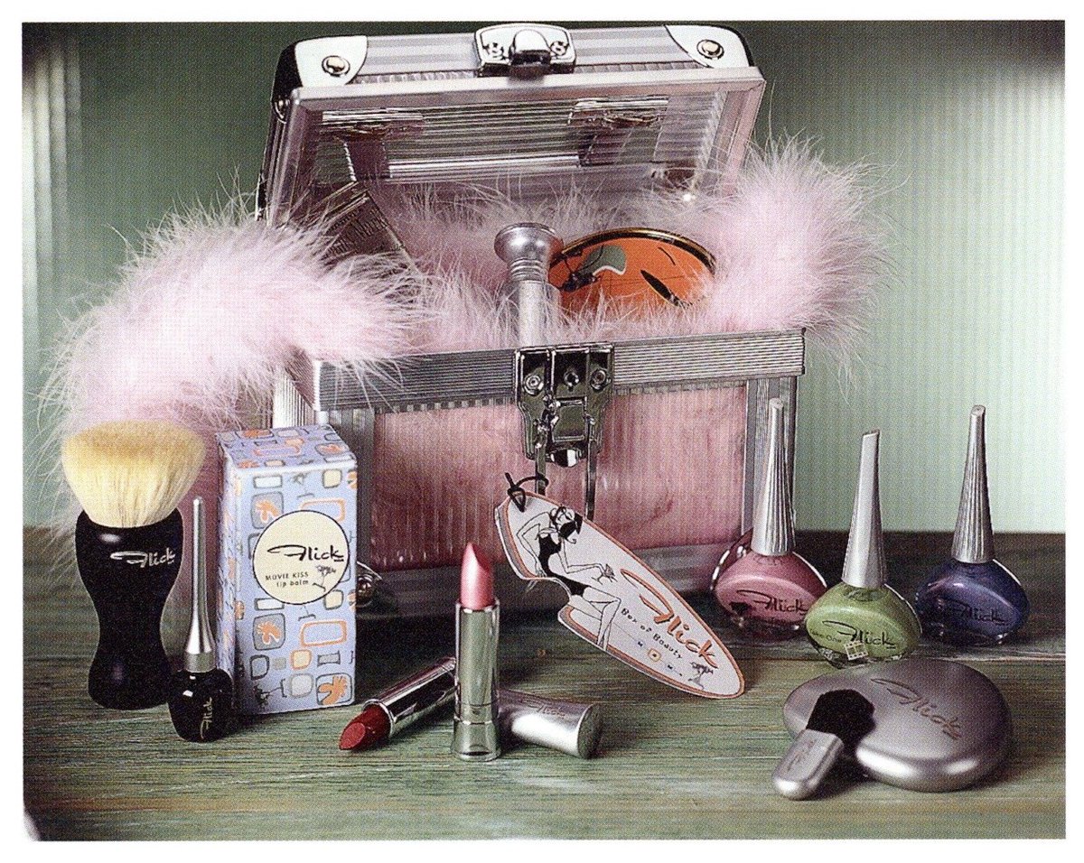
This last one for tonight is also in-progress, the Shoe Diva/Parisian aesthetic. It seems like there was a ton of this 60s fashion illustration & 'Diva'-themed stuff back then. In addition, there was definitely some suburban fascination with Parisian items/motifs. 



• • •
Missing some Tweet in this thread? You can try to
force a refresh

