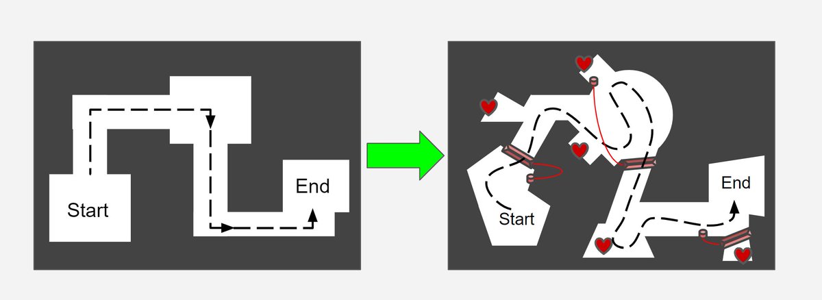
Hi! My name is not @the_Norberg, but I have some #leveldesign tips to share in a thread.
Those practices help me to build better levels from the scratch no matter of a genre or a scale. Hope other #gamedev folks will find them useful🙂
1/10
Those practices help me to build better levels from the scratch no matter of a genre or a scale. Hope other #gamedev folks will find them useful🙂
1/10

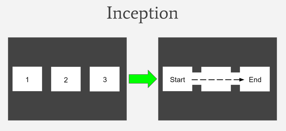
2/10. Inception.
I start with a few random size boxes/planes and combine them together. It’s a simple level with the start and the end. Boring, but solid.
For the sake of the demonstration I pick just three boxes, but any number will do.
I start with a few random size boxes/planes and combine them together. It’s a simple level with the start and the end. Boring, but solid.
For the sake of the demonstration I pick just three boxes, but any number will do.

3/10. Rule of Occlusion.
The straight lines are boring. The player will see the whole level from the start and won’t be surprised by anything.
Keep your content hidden from the eyes and leave some mysteries to discover.
The straight lines are boring. The player will see the whole level from the start and won’t be surprised by anything.
Keep your content hidden from the eyes and leave some mysteries to discover.

4/10. Rule of Themes.
Your apartment probably has a kitchen, a bathroom, etc. Every space has its theme and purpose. Same thing goes with a level. Divide it in pieces. Season them with themes (sand/forest/rocks). This way the player won’t get bored from just a single ‘flavor’.
Your apartment probably has a kitchen, a bathroom, etc. Every space has its theme and purpose. Same thing goes with a level. Divide it in pieces. Season them with themes (sand/forest/rocks). This way the player won’t get bored from just a single ‘flavor’.

5/10. Rule of Shapes.
The blocky, square-shaped spaces are boring if you keep repeating them. In addition they probably don’t fit your themes.
Let’s fix it and come up with something more exciting shape-wise. Use diagonal lines, triangles, semi-circles, etc.
The blocky, square-shaped spaces are boring if you keep repeating them. In addition they probably don’t fit your themes.
Let’s fix it and come up with something more exciting shape-wise. Use diagonal lines, triangles, semi-circles, etc.

6/10. Rule of Exploration.
If you get something effortlessly (or for free) it feels not exciting, boring and even suspicious.
Whenever you want to reward your players make it hard to find. Extend your spaces with extra pockets to hide the treasures, med kits, collectibles, etc.
If you get something effortlessly (or for free) it feels not exciting, boring and even suspicious.
Whenever you want to reward your players make it hard to find. Extend your spaces with extra pockets to hide the treasures, med kits, collectibles, etc.

7/10. Rule of Verticality.
The greatest thing about 3D space is a... 3rd dimension. Flat surfaces are boring, build heights!
The ramps and the platforms work great. Also use terrain tools if you have any natural elevation in your level.
The greatest thing about 3D space is a... 3rd dimension. Flat surfaces are boring, build heights!
The ramps and the platforms work great. Also use terrain tools if you have any natural elevation in your level.

8/10. Rule of Interaction.
Static level feels dead and boring. Let your players to play with something. It could be a not important thing like a piano or a car horn. Or it could be a lever that opens the door. Some easy puzzles to solve are always a nice touch.
Static level feels dead and boring. Let your players to play with something. It could be a not important thing like a piano or a car horn. Or it could be a lever that opens the door. Some easy puzzles to solve are always a nice touch.

9/10. ‘Wow’ moment.
Now we need something to exceed the player's expectations. A cherry on top, to make it memorable. Like an anti-gravity button that flips the whole level upside-down. Or a medieval skateboard that helps you to escape from the dragon. Options are endless.
Now we need something to exceed the player's expectations. A cherry on top, to make it memorable. Like an anti-gravity button that flips the whole level upside-down. Or a medieval skateboard that helps you to escape from the dragon. Options are endless.

10/10. Those were a few rules/methods/lenses you can apply to make levels more fun. The order is not important and you can use them multiple times depending on your needs.
Of course, there are more ways to build levels! Feel free to share them or send me your feedback. Cheers!🙂
Of course, there are more ways to build levels! Feel free to share them or send me your feedback. Cheers!🙂
• • •
Missing some Tweet in this thread? You can try to
force a refresh


